勤能补挫-简单But易错的JS&CSS问题总结
错误频率较高的JS&CSS问题
勤能补拙,不管是哪门子技术,在实践中多多总结,开发效率慢慢就会提升。本篇介绍几个经常出错的JS&CSS问题,包括事件冒泡、(使用offset、scroll、clientHeight定位元素)、模仿JD写个右栏菜单、元素水平和垂直居中、inline元素遇见padding和margin、圆角兼容性处理。这些问题自己都是写代码实验过,所以都会结合Demo一起分析。相信大家也比较容易理解。另外,自己也是小菜一个,有什么解释有误的地方,请大神多多指定。
事件冒泡
DOM的事件冒泡机制和WPF很相似,DOM事件机制包含冒泡和捕获两种,按照topmost element->innermost element方向传递事件被称为捕获方式,而从innermost element->topmost element方向传递事件被称为冒泡方式。
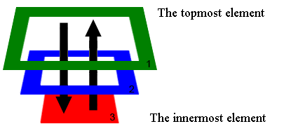
事件传递说明:
1.捕获(Capture)传递方式通过:1>2>3。
2.冒泡(Bubble) 传递方式通过:3>2>1。
这里要特别说明的是,在<IE9的浏览器没有捕获机制,只有冒泡机制。基于W3C标准,事件传递分捕获和冒泡两个阶段。那么我们注册事件时怎样注册到不同的阶段?
大家应该都熟悉addEventListener方法,在使用时很多时候都是传递两个参数:
document.getElementById("d1").addEventListener("click", function(event){

    alert("d1");

});
但addEventListener为我们提高了三个参数,最后一个是bool值,默认是false。正是通过这个参数来区分捕获和冒泡方式。false表示冒泡,true表示隧道。
//冒泡方式

document.getElementById("d1").addEventListener("click", function(event){

     alert("d1");

, false);

//捕获方式

document.getElementById("d1").addEventListener("click", function(event){

     alert("d1");

, true);
在事件的传递阶段,我们怎么取消事件的传递?event参数体提供了取消办法。下面代码说明了取消使用代码:
document.getElementById("d3").addEventListener("click", function(event){

    alert("d3");

    event = event || window.event;

    //W3C标准

    if(event.stopPropagation){

        event.stopPropagation();

    }

    //IE兼容

    else{

        event.cancelBubble = true;

    }

}, false);
下面给出可运行的测试Demo,执行代码可以很清楚的看到事件传递的两个阶段并且可以在两个阶段的任意元素上终止事件的传递。
<!DOCTYPE HTML>

<html>

<head>

    <meta charset="utf-8">

    <style type="text/css">

    .div-class-, .div-class-, .div-class-{

    padding: 30px;

    }

    .div-class-{

    width: 200px;

    height: 200px;

    background: #fd0303;

    }

    .div-class-{

    width: 100px;

    height: 100px;

    background: #fdf403;

    }

    .div-class-{

    width: 50px;

    height: 50px;

    background: #03fd38;

    }

    </style>

    <script type="text/javascript" src="jquery-2.2.3.min.js"></script>

    <script type="text/javascript">

    $(function(){

    document.getElementById("d1").addEventListener("click", function(event){

    alert("d1");

    }, false);

document.getElementById("d2").addEventListener("click", function(event){

    alert("d2");

    }, false);

    document.getElementById("d3").addEventListener("click", function(event){

        alert("d3");

        event = event || window.event;

        //W3C标准

        if(event.stopPropagation){

            event.stopPropagation();

        }

        //IE兼容

        else{

            event.cancelBubble = true;

            }

    }, false);

    document.getElementById("d1").addEventListener("click", function(event){

    alert("d1");

    }, true);

    document.getElementById("d2").addEventListener("click", function(event){

    alert("d2");

    }, true);

    document.getElementById("d3").addEventListener("click", function(event){

    alert("d3");

    }, true);

    });

    </script>

</head>

<body>

    <div id="d1" class="div-class-1">

    <span>d1</span>

    <div id="d2" class="div-class-2">

    <span>d2</span>

    <div id="d3" class="div-class-3">

    <span>d3</span>

    </div>

    </div>

    </div>

</body>

</html>
使用offset、scroll、clientHeight定位元素
有时候我们需要在页面的右边中间位置或者底部位置显示悬浮面板,悬浮面板的定位需要使用offsetXXX、scrollXXX、clientXXX属性。下面我们都拿Vertical方向来说明。
1.scrollHeight: 所有元素内容的高度(只读),也就是页面所有内容的整个高度。
2.scrollTop:当前元素所在位置之前的整个高度,可读可写。如果没有滚动条,scrollTop为0。
3. clientHeight:元素的可见高度,不包含padding和border,只读。
4.offsetHeight: 元素高度,包含了padding和border,只读。
如果我们想在滚动条滚动的同时,让元素始终显示在浏览器页面的中间位置,可以通过以下设置:
div.style.top = winScrolTop + (winclientHeight/2) - (divHeight/2) + "px";
说明:winScrolTop为window的scrollTop,winclientHeight为window的可见高度,divHeight为元素的高度。在使用clientHeight时需要注意兼容性问题,不同版本浏览器取clientHeight方式都不一样。需要根据document.compatMode来判断。
如果document.compatMode等于BackCompat表示关闭标准兼容模式,等于CSS1Compat表示开启标准兼容性模式。BackCompat时浏览器高度等于document.body.clientHeight,CSS1Compat时浏览器高度等于document.documentElement.clientHeight。
下面是测试Demo代码:
<!DOCTYPE HTML>

<html lang="zh">

    <head>

        <meta charset="gb2312">

        <title>offset&scroll&clientHeight元素定位</title>

        <style type="text/css">

            .body-class1{

                position: absolute;

                width: 200px;

                height: 200px;

                background: #CD0000;

                right: 0;

            }

            .body-class2{

                position: fixed;

                width: 200px;

                height: 200px;

                background: #CD0000;

                right: 0;

                bottom: 10px;

            }

        </style>

        <script type="text/javascript" src="jquery-2.2.3.min.js"></script>

        <script type="text/javascript">

            /*

            *    scrollHeight: 元素所有内容的高度(只读) https://developer.mozilla.org/en-US/docs/Web/API/Element/scrollHeight

            *    scrollTop:从元素之前所有内容的高度(可读可写), 如果没有滚动条,则为0。  https://developer.mozilla.org/en-US/docs/Web/API/Element/scrollTop

            *    clientHeight:元素可见高度(只读)。https://developer.mozilla.org/en-US/docs/Web/API/Element/clientHeight

            *    offsetHeight: 元素高度(只读), 包含pading、border

            */

            function setVerticalLocation(){

                var div = document.getElementById("d1");

                //div的高度,包括border和padding

                var divHeight = div.offsetHeight;

                // document.compatMode:BackCompat和CSS1Compat。BackCompat:标准兼容模式关闭。CSS1Compat:标准兼容模式开启。

                //当document.compatMode等于BackCompat时,浏览器客户区宽度是document.body.clientWidth;

                //当document.compatMode等于CSS1Compat时,浏览器客户区宽度是document.documentElement.clientWidth。

                //http://www.cnblogs.com/fullhouse/archive/2012/01/17/2324706.html

                var winclientHeight = /BackCompat/i.test("document.compatMode") ? document.body.clientHeight : document.documentElement.clientHeight;

                var winScrolTop = Math.max(document.body.scrollTop, document.documentElement.scrollTop);

                div.style.top = winScrolTop + (winclientHeight/2) - (divHeight/2) + "px";

            }

            $(document).ready(function(){

                var setTop = function(){

                    setTimeout(function(){

                        setVerticalLocation();

                    }, 100);

                }

                $(window).bind("scroll", function(event){

                        setTop();

                    });

                    $(window).bind("resize", function(event){

                        setTop();

                    });

            });

        </script>

    </head>

    <body>

        <div id="d1" class="body-class1">

            <span>你得把我显示在浏览器垂直中间位置</span>

        </div>

        <div id="d1" class="body-class2">

            <span>你得把我显示在浏览器垂直底部位置</span>

        </div>

        <h1>offset&scroll&clientHeight元素定位</h1>

        ...自己写若干个分行,让浏览器出现滚动条

        <br><span>滚滚滚...</span>

    </body>

</html>
模仿JD写个右栏菜单
大家看到得当前文章页面的右边中间位置有几个菜单,这个功能其实是仿照JD商城页面做了一个悬浮停靠菜单。下面是右栏菜单生成代码:
<!DOCTYPE HTML>

<html lang="zh">

    <head>

        <meta charset="gb2312">

        <title>右栏菜单</title>

        <style type="text/css">

            .h-tab{

                position: fixed;

                width: 36px;

                right: 0;

                top: 100px;

                border-right: 2px solid #7a6e6e;

                padding: 0;

                margin: 0;

            }

            .h-tab .h-bar{

                position: relative;

                background: #7a6e6e;

                width: 35px;

                height: 35px;

                margin-bottom: 3px;

                color: #fff;

                font-weight: bold;

                font-size: 10px;

                line-height: 35px;

            }

            .h-tab .h-bar-title{

                width: 35px;

                height: 35px;

                text-align: center;

                background: #7a6e6e;

                position: absolute;

                z-index: 1000;

                text-indent: 5px;

                right: -1px;

            }

            .h-tab .h-bar-title:hover{

                background: #c81623;

                cursor: pointer;

            }

            .h-tab .h-bar-desc{

                position: absolute;

                background: #c81623;

                height: 35px;

                width: 100px;

                top: 0;

                right: -65px;

                z-index: 900;

                text-align: left;

                text-indent: 5px;

            }

            .hid{

                display: none;

            }

        </style>

        <script type="text/javascript" src="jquery-2.2.3.min.js"></script>

        <script type="text/javascript">

            function Rightmenu(){

            }

            Rightmenu.prototype.removeAdapterMenu = function(){

                $(".h-tab").find("#adapterMenu, #fastcomment, #recommend").parents(".h-bar").remove();

                return this;

            }

            Rightmenu.prototype.createRightMenu = function(){

                var html = '<div class="h-tab">' +

                                '<div class="h-bar">' +

                                    '<div id="goTop" class="h-bar-title">' +

                                        '<span>↑</span>' +

                                    '</div>' +

                                    '<div class="h-bar-desc hid">' +

                                        '<span>顶部</span>' +

                                    '</div>' +

                                '</div>' +

                                '<div class="h-bar">' +

                                    '<div id="adapterMenu" class="h-bar-title">' +

                                        '<span>关</span>' +

                                    '</div>' +

                                    '<div class="h-bar-desc hid">' +

                                        '<span>菜单</span>' +

                                    '</div>' +

                                '</div>' +

                                '<div class="h-bar">' +

                                    '<div id="fastcomment" class="h-bar-title">' +

                                        '<span>注</span>' +

                                    '</div>' +

                                    '<div class="h-bar-desc hid">' +

                                        '<span>评论</span>' +

                                    '</div>' +

                                '</div>' +

                                '<div class="h-bar">' +

                                    '<div id="recommend" class="h-bar-title">' +

                                        '<span>我</span>' +

                                    '</div>' +

                                    '<div class="h-bar-desc hid">' +

                                        '<span>推荐</span>' +

                                    '</div>' +

                                '</div>' +

                                '<div class="h-bar">' +

                                    '<div id="goBottom" class="h-bar-title">' +

                                        '<span>↓</span>' +

                                    '</div>' +

                                    '<div id="" class="h-bar-desc hid">' +

                                        '<span>底部</span>' +

                                    '</div>' +

                                '</div>' +

                            '</div>';

                    $("body").append(html);

                    return this;

            }

            Rightmenu.prototype.registEvent = function(){

                $(".h-tab .h-bar").bind("mouseenter", function(){

                    //停止其他动画

                    $(".h-tab .h-bar").find(".h-bar-desc").finish();

                    $(this).find(".h-bar-desc").removeClass("hid");

                    $(this).find(".h-bar-desc").delay(100).animate({right: "-1px"}, 400);

                });

                $(".h-tab .h-bar").bind("mouseleave", function(){

                    //停止其他动画

                    $(".h-tab .h-bar").find(".h-bar-desc").finish();

                    var desc = $(this).find(".h-bar-desc");

                    $(desc).animate({right: "-65px"}, 100, "linear", function(){

                        $(desc).addClass("hid");

                    });

                });

                //注册go top事件

                $("#goTop").bind("click", function(event){

                    locateElement("#header");

                });

                //注册menu事件

                $("#adapterMenu").bind("click", function(event){

                    if(!$("#footer_menu_container").hasClass("hid")){

                        $("#footer_menu_container").addClass("hid");

                    }else{

                        $("#footer_menu_container").removeClass("hid");

                    }

                });

                //注册fastcomment事件

                $("#fastcomment").bind("click", function(event){

                    locateElement("#footer");

                });

                //注册recommend事件

                $("#recommend").bind("click", function(event){

                    if(!$("#heavifooter").hasClass("hid")){

                        $("#heavifooter").addClass("hid");

                    }else{

                        $("#heavifooter").removeClass("hid");

                    }

                });

                //注册go Bottom事件

                $("#goBottom").bind("click", function(event){

                    locateElement("#footer");

                });

                return this;

            }

            $(document).ready(function(){

                (new Rightmenu()).createRightMenu().registEvent().removeAdapterMenu();

            });

        </script>

    </head>

    <body>

    </body>

</html>
生成元素之后,我们要让元素始终显示在中间位置。基本上有两个步骤,先初始化到中间位置,然后注册浏览器的resize事件,当浏览器大小改变时自动调节位置。下面是我写的一段定位任何元素的代码:
function FloatPage(id, position){

    this.id = id;

    this.position = position;

}

FloatPage.prototype.init = function(){

    var c = this;

    this.autoAdapt();

    $(window).bind("resize", function(event){

        c.autoAdapt();

    });

}

FloatPage.prototype.autoAdapt = function(){

    var element = document.getElementById(this.id);

    var eHeight = element.offsetHeight;

    var winHeight = /BackCompat/i.test("document.compatMode") ? document.body.clientHeight : document.documentElement.clientHeight;

    if(this.position == "top"){

        element.style.top = 0;

    }else if(this.position == "center"){

        element.style.top = (winHeight/2) - (eHeight/2) + 'px';

    }else {

        element.style.top = winHeight - eHeight + 'px';

    }

}
下面一段代码调用创建菜单方法,然后定位元素并且注册resize事件。代码如下:
//创建右栏菜单

var rightMenu = (new Rightmenu()).createRightMenu().registEvent();

//设置右栏菜单停靠位置

(new FloatPage("rightMenuTab", "center")).init();
元素水平和垂直居中
水平居中
居中分为水平和垂直居中,水平居中比较容易解决。如果是非块级别的inline元素(例如显示文字的span)设置水平居中,直接设置样式:
span{

    text-align: center;

}
如果是块级别的inline-block或者block元素,如果已知width的情况下可通过下面方式设置居中:
.children{

    background: red;

    width: 50px;

    height: 50px;

    margin:  auto;

}
垂直居中
级别为inline-block或者inline的元素,可通过设置line-height让元素居中显示。
垂直居中比水平居中稍微复杂些,不管是哪种方式,一般都会设置css属性position为absolute定位元素。在已知height情况下可结合
top和margin-top设置居中:
.children{

        width: 50px;

        height: 50px;

        left: 50%;

        margin-left: -25px;

        position: absolute;

        top: 50%;

        margin-top: -25px;

    }
说明:上面的样式也包含了水平居中的方法。
在不知道height的情况,可以使用W3C提供的transform属性。设置如下:
.children{

        left: 50%;

        top: 50%;

        transform: translate(-50%, -50%);

        -ms-transform: translate(-50%, -50%); /* IE 9 */

        -moz-transform: translate(-50%, -50%); /* Firefox */

        -webkit-transform: translate(-50%, -50%); /* Safari 和 Chrome */

        -o-transform: translate(-50%, -50%); /* Opera */

    }
说明:translate(-50%, -50%)表示元素的位置向左偏移元素宽度的50%,向上偏移高度的50%。完整的测试代码如下:
<!DOCTYPE HTML>

<html>

<head>

    <meta charset="utf-8">

    <style type="text/css">

    .parent{

        background: green;

        width: 300px;

        height: 200px;

        position: relative;

    }

    /*

    * 方法一,inline-block或者block元素水平居中方式

    */

    /*.children{

        background: red;

        width: 50px;

        height: 50px;

        margin: 0 auto;

    }

    */

   /*

    ** 方案二,知道元素的width和height

    .children{

        width: 50px;

        height: 50px;

        left: 50%;

        margin-left: -25px;

        position: absolute;

        top: 50%;

        margin-top: -25px;

    }

    */

    /*

    ** 方案三,不知道元素的width和height

    */

    .children{

        left: 50%;

        top: 50%;

        transform: translate(-50%, -50%);

        -ms-transform: translate(-50%, -50%); /* IE 9 */

        -moz-transform: translate(-50%, -50%); /* Firefox */

        -webkit-transform: translate(-50%, -50%); /* Safari 和 Chrome */

        -o-transform: translate(-50%, -50%); /* Opera */

    }

    </style>

    <script type="text/javascript">

    function submitByNA(value){

    alert(value);

    }

    </script>

</head>

<body>

    <div class="parent">

    <div class="children">

    </div>

    </div>

    <div>

</body>

</html>
inline元素遇见padding和margin
padding和margin对inline-block和block元素都能生效。而对inline来说,padding和margin只对水平设置生效。测试demo如下:
<!DOCTYPE HTML>

<html>

<head>

    <meta charset="utf-8">

    <style type="text/css">

    .body-class-block{

        display: block;

        background: yellow;

        /*margin: 10px; */ /*有效*/

        /*padding: 10px; */ /*有效*/

    }

    .body-class-inlineblock{

        display: inline-block;

        background: red;

        /* margin: 20px 10px; */ /* 有效 */

        /* padding: 20px 10px; */ /* 有效 */

    }

    .body-class-inline{

        display: inline;

        background: green;

        /*margin: 20px 10px; */ /* margin只对左右有效 */

        /*padding: 20px 10px; */ /* padding只对左右有效 */

        line-height: 2em; /* 如果要设置高度,可使用line-height */

    }

    </style>

</head>

<body>

    <div class="body-class-block">

    <span>block element</span>

    </div>

    <div class="body-class-inlineblock">

    <span>inline-block element</span>

    </div>

    <div style="clear: both;"></div>

    <div class="body-class-inline">

    <span>inline element</span>

    </div>

    <div class="body-class-inline">

    <span>inline element</span>

    </div>

</body>

</html>
圆角兼容性处理
在使用CSS3提供的border-radius和graident属性时,我们得考虑兼容性,IE9以下的版本都不支持这些属性,为了解决兼容性,可以使用PIE框架,下面的这段代码大家可以在IE9以下的IE浏览器下测试兼容性。但得自己到PIE官网上去下载PIE框架代码。
<!DOCTYPE HTML>

<html lang="zh">

    <head>

        <meta charset="gb2312">

        <title>圆角兼容性测试</title>

        <style type="text/css">

            .body-radius-class1, .body-radius-class2{

                margin: 10px 20px;

                padding: 10px 20px;

            }

             /* 圆角,没解决兼容性 */

            .body-radius-class1{

                background: #FF0000;

                -moz-border-radius: 8px;

                -webkit-border-radius: 8px;

                border-radius: 8px;

            }

            /* 圆角,解决兼容性 */

            .body-radius-class2{

                background: #8B4C39;

                -moz-border-radius: 8px;

                -webkit-border-radius: 8px;

                border-radius: 8px;

                /* 使用PIE解决兼容性 */

                behavior: url("PIE/PIE.htc");

            }

            .body-gradient-class1, .body-gradient-class2{

                margin: 10px 20px;

                padding: 10px 20px;

            }

            /* 渐变,没解决兼容性 */

            .body-gradient-class1{

                background: #8EE5EE;

                background: -moz-linear-gradient(to bottom, #8EE5EE, #fff);

                background: -webkit-linear-gradient(to bottom, #8EE5EE, #fff);

                background: linear-gradient(to bottom, #8EE5EE, #fff);

            }

            /* 渐变,解决兼容性 */

            .body-gradient-class2{

                background: #8E8E8E;

                background: -moz-linear-gradient(to bottom, #8E8E8E, #fff);

                background: -webkit-linear-gradient(to bottom, #8E8E8E, #fff);

                background: linear-gradient(to bottom, #8E8E8E, #fff);

                /* 使用PIE解决兼容性 */

                -pie-background: linear-gradient(#8E8E8E, #fff);

                behavior: url("PIE/PIE.htc");

            }

        </style>

        <script type="text/javascript" src="jquery-2.2.3.min.js"></script>

    </head>

    <body>

        <h1>border-radius</h1>

        <div class="body-radius-class1">

            <span>没解决兼容性</span>

        </div>

        <div class="body-radius-class2">

            <span>解决兼容性</span>

        </div>

        <h1>gradient</h1>

        <div class="body-gradient-class1">

            <span>没解决兼容性</span>

        </div>

        <div class="body-gradient-class2">

            <span>解决兼容性</span>

        </div>

    </body>

</html>
如果本篇内容对大家有帮助,请点击页面右下角的关注。如果觉得不好,也欢迎拍砖。你们的评价就是博主的动力!下篇内容,敬请期待!
勤能补挫-简单But易错的JS&CSS问题总结的更多相关文章
- 仿淘宝分页按钮效果简单美观易使用的JS分页控件
分页按钮思想: 1.少于9页,全部显示 2.大于9页,1.2页显示,中间页码当前页为中心,前后各留两个页码 附件中有完整例子的压缩包下载.已更新到最新版本 先看效果图: 01输入框焦点效果 ...
- 一道非常易错的js面试题
题目如下: function Foo() { getName = function() { alert(1); }; return this; } Foo.getName = function() { ...
- 细节!重点!易错点!--面试java基础篇(一)
今天来给大家分享一下java的重点易错点部分,也是各位同学面试需要准备的,欢迎大家交流指正. 1.java中的main方法是静态方法,即方法中的代码是存储在静态存储区的. 2.任何静态代码块都会在ma ...
- [SQLXML]FOR XML语法导出XML的易错之处
原文:[SQLXML]FOR XML语法导出XML的易错之处 [SQLXML]FOR XML语法导出XML的易错之处 Version Date Creator Description 1.0.0.1 ...
- *C语言有关指针的变量声明中的几个易错点
转至:http://my.oschina.net/ypimgt/blog/108265 Technorati 标签: 指针, typedef, const, define 我们都知道,至少听说过 ...
- bootstrap-typeahead 自动补全简单的使用教程
参考链接: 参考1 : https://segmentfault.com/a/1190000006036166参考2 : https://blog.csdn.net/u010174173/articl ...
- forEach、map、filter、find、sort、some等易错点整理
一.常用方法解析 说起数组操作,我们肯定第一反应就是想到forEach().map().filter()等方法,下面分别阐述一下各方法的优劣. 1.forEach 1.1 基础点 forEac ...
- Strapi 安装易错位置
Strapi官网(https://strapi.io)介绍:最先进的开源内容管理框架,可以毫不费力地构建功能强大的API,建立在Node.js平台之上,为您的API提供高速惊人的表现. 简单点说,(对 ...
- 【笔试题】Java 易错题精选
笔试题 Java 易错题精选 1.写出下列程序的运行结果( )String 不变性Java 值传递 public class Test { public static void main(String ...
随机推荐
- reactor & proactor 笔记
1. 基本概念 1.1 同步/异步,针对应用程序和内核交互而言. 同步:进程触发IO操作等待或轮询查看IO操作是否完成: 异步:进程触发IO操作后仅需自身的处理,IO操作完成后会得到通知(异步的特点) ...
- 冲刺阶段 day11
项目进展:系部,专业,班级管理这三项没有学生,教师管理部分输入项目多,所以窗体搭建比较简单,代码也简单一些,进行的还算顺利,有了之前的编写经验,很多代码可以直接copy过来,越进行编写越顺利了,已经进 ...
- 5天玩转C#并行和多线程编程 —— 第一天 认识Parallel
5天玩转C#并行和多线程编程系列文章目录 5天玩转C#并行和多线程编程 —— 第一天 认识Parallel 5天玩转C#并行和多线程编程 —— 第二天 并行集合和PLinq 5天玩转C#并行和多线程编 ...
- java实现输入一行字符,分别统计出其中英文字母、空格、数字和其它字符的个数。
package JingDian; import java.util.Scanner; public class charKind { public static void main(String[] ...
- video.js html5 视频播放器
我个人感觉很不错 https://github.com/videojs/video.js <head> <title>Video.js | HTML5 Video Player ...
- Unity3D热更新全书-脚本(三) C#LightEvil语法与调试
调试,这是一个无法规避的问题 C#Light 由于有 词法解释.语法解释.运行时三种情况 所以和C#也是有类似的问题 出错大致可以分为编译错误和运行时错误 拼写出莫名的东西或者语法不正确,会在编译阶段 ...
- DNS拾遗(一)
最近帮朋友注册域名配置主机,碰到一些DNS上的一些概念,惭愧于有一些东西已经忘记是啥意思,于是决定重新学习一下DNS方面的基本概念. 常用概念: TTL: TTL为Time to live的缩写,网络 ...
- IOS 多线程01-线程基础知识
大部分现代操作系统,包括IOS,都支持执行线程的概念.每个进程可以包含多个线程,他们可以同时运行.如果只有一个处理器核心,操作系统将在所有执行线程之间切换,非常类似于在所有执行线程之间切换.如果拥有多 ...
- PHP中Trait特性
Trait是自 PHP 5.4.0 起添加的一个新特性,是 PHP 多重继承的一种解决方案.例如,需要同时继承两个 Abstract Class, 这将会是件很麻烦的事情,Trait 就是为了解决这个 ...
- Ajax技术
1.ajax技术的背景 不可否认,ajax技术的流行得益于google的大力推广,正是由于google earth.google suggest以及gmail等对ajax技术的广泛应用,催生了ajax ...