#8.12.16总结#background transition、animation、transform
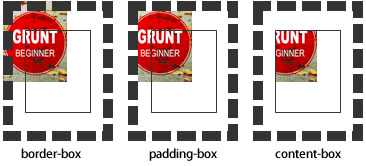
background-origin
设置元素背景图片的原始起始位置。必须保证背景是background-repeat为no-repeat此属性才会生效。
background-origin :border-box | padding-box | content-box;
padding-box:从padding区域(含padding)开始显示背景图像。
border-box:从border区域(含border)开始显示背景图像。
content-box:从content区域开始显示背景图像。

background-clip
设定背景图像向外裁剪的区域。
background-clip : border-box | padding-box | content-box | text
background-size
设置背景图片的大小,以长度值或百分比显示,还可以通过cover和contain来对图片进行伸缩。

background
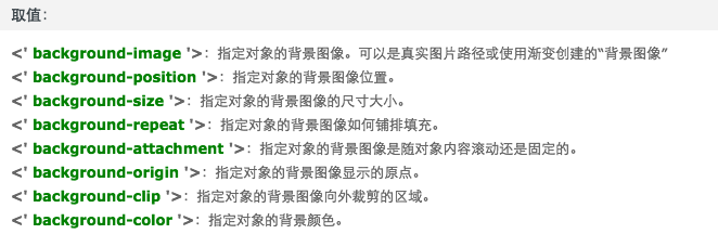
例如:

background:url(test1.jpg) no-repeat scroll 10px 20px/50px 60px padding-box,

       url(test1.jpg) no-repeat scroll 10px 20px/70px 90px padding-box,

       url(test1.jpg) no-repeat scroll 10px 20px/110px 130px padding-box #aaa;
transition
简写格式如下:
- transition:<transition-property><transition-duration><transition-timing-function><transition-delay>
- <' transition-property '>:检索或设置对象中的参与过渡的属性
- <' transition-duration '>:检索或设置对象过渡的持续时间
- <' transition-timing-function '>:检索或设置对象中过渡的动画类型
- <' transition-delay '>:检索或设置对象延迟过渡的时间
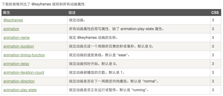
animation
当在 @keyframes 创建动画,把它绑定到一个选择器,否则动画不会有任何效果。
指定至少这两个CSS3的动画属性绑定向一个选择器:
- 规定动画的名称
- 规定动画的时长
 <!DOCTYPE html>

 <html>

 <head>

 <meta charset="utf-8">

 <title>菜鸟教程(runoob.com)</title>

 <style>

 div

 {

     width:100px;

     height:100px;

     background:red;

     position:relative;

     animation:myfirst 5s linear 2s infinite alternate;

     /* Firefox: */

     -moz-animation:myfirst 5s linear 2s infinite alternate;

     /* Safari and Chrome: */

     -webkit-animation:myfirst 5s linear 2s infinite alternate;

     /* Opera: */

     -o-animation:myfirst 5s linear 2s infinite alternate;

 }

 @keyframes myfirst

 {

     0%   {background:red; left:0px; top:0px;}

     25%  {background:yellow; left:200px; top:0px;}

     50%  {background:blue; left:200px; top:200px;}

     75%  {background:green; left:0px; top:200px;}

     100% {background:red; left:0px; top:0px;}

 }

 @-moz-keyframes myfirst /* Firefox */

 {

     0%   {background:red; left:0px; top:0px;}

     25%  {background:yellow; left:200px; top:0px;}

     50%  {background:blue; left:200px; top:200px;}

     75%  {background:green; left:0px; top:200px;}

     100% {background:red; left:0px; top:0px;}

 }

 @-webkit-keyframes myfirst /* Safari and Chrome */

 {

     0%   {background:red; left:0px; top:0px;}

     25%  {background:yellow; left:200px; top:0px;}

     50%  {background:blue; left:200px; top:200px;}

     75%  {background:green; left:0px; top:200px;}

     100% {background:red; left:0px; top:0px;}

 }

 @-o-keyframes myfirst /* Opera */

 {

     0%   {background:red; left:0px; top:0px;}

     25%  {background:yellow; left:200px; top:0px;}

     50%  {background:blue; left:200px; top:200px;}

     75%  {background:green; left:0px; top:200px;}

     100% {background:red; left:0px; top:0px;}

 }

 </style>

 </head>

 <body>

 <p><b>注意:</b> 该实例在 Internet Explorer 9 及更早 IE 版本是无效的。</p>

 <div></div>

 </body>

 </html>
transform

#8.12.16总结#background transition、animation、transform的更多相关文章
- css 动画 transform transition animation
1.transform transform 是通过在浏览器里面让网页元素 移动 旋转 透明 模糊 等方法来实现改变其外观的技术 -webkit-transform : translate(3em,0 ...
- CSS动画:animation、transition、transform、translate
https://blog.csdn.net/px01ih8/article/details/80780470 一.区分容易混淆的几个属性和值 先区分一下css中的几个属性:animation(动画). ...
- css3之transition、transform、animation比较
css3动画多少都有些了解,但是对于transition.transform.animation这几个属性一直是比较模糊的,所以啊,这里做一个总结,也希望大家都可以对此有一个更好地理解. 其实, ...
- css3 transition animation nick
时光转眼即逝,又到周六了,今天写点某部分人看不起的css玩玩! 转换 转换属性transform: 浏览器前缀: -webkit-transform;-o-transform;-moz-transfo ...
- Atitti css transition Animation differ区别
Atitti css transition Animation differ区别 1.1. transition的优点在于简单易用,但是它有几个很大的局限. 1 1.2. Transition ...
- Atitti css transition Animation differ区别
Atitti css transition Animation differ区别 1.1. transition的优点在于简单易用,但是它有几个很大的局限. 1 1.2. js 动态改变 st ...
- A transition animation compatible Library.
Android5.0之后为我们提供了许多炫酷的界面过渡效果,其中共享元素过渡也是很有亮点的一个效果,但这个效果只能在Android5.0之后使用,那今天我们就来将共享元素过渡效果兼容到Android4 ...
- CSS3 & transition & animation
CSS3 & transition & animation https://developer.mozilla.org/en-US/docs/Web/CSS/transition-ti ...
- css3动画transition animation
CSS动画简介 transition animation transition过渡:css3通过transitions属性引入时间概念,通过开始.结束状态自动计算中间状态,实现状态改变的过渡效果 ...
随机推荐
- RobotFramework - 基础入门
Robot Framework Wiki HomePage Robot Framework User Guide Robot Framework documentation Robot Framewo ...
- QT学习笔记1
不准备用MFC了,想切换到QT.所以跟着网上的一个笔记学习. 1 开发环境是VS2008+QT4.7+VassistX 具体如何配置看这个帖子:http://qimo601.iteye.com/blo ...
- 多语言架构下如何正确的使用SQL视图
产品的定位 做产品的都知道,是否支持多语言直接影响到产品的定位问题. 如果一个产品周期是一年的话,要完美支持多语言最少也得在加3个月!所需时间和页面数量.数据库表的数量和表的数据量成正比. 可以看出代 ...
- angularJS配合bootstrap动态加载弹出提示内容
1.bootstrp的弹出提示 bootstrap已经帮我们封装了非常好用的弹出提示Popover. http://v3.bootcss.com/javascript/#popovers 2.自定义p ...
- [译]学习IPython进行交互式计算和数据可视化(六)
第五章:高性能并行计算 一个反复被提及的反对使用Python进行高性能数值计算的言论是这种语言是动态解释型的,速度太慢.一种编译型低级语言,如C,能提供比它快几个数量级的运算速度.我们在第三章--使用 ...
- IOS 通用颜色快速生成代码
通常情况下我们是直接使用类似于#EE1289这样的代码来直接表示RGB颜色的.但是在IOS语言中,它的颜色表示方式比较另类,他是使用一个0-1的小数来表示颜色值的.这样的实现,或许能够表示更多的颜色值 ...
- c#中 HttpWebRequest请求抛异常,基础连接已经关闭: 连接被意外关闭
在用httpWebRequest模拟请求的时候有时因为服务器等方面做了请求的限制, 在请求会出现基础连接已经关闭: 接收时发生意外错误的错误 一般原因是因为服务器不允许与 Internet 资源建立持 ...
- [Asp.net 5] DependencyInjection项目代码分析4-微软的实现(3)
这个系列已经写了5篇,链接地址如下: [Asp.net 5] DependencyInjection项目代码分析 [Asp.net 5] DependencyInjection项目代码分析2-Auto ...
- winform时钟c#代码
代码如下: using System; using System.Collections.Generic; using System.ComponentModel; using System.Data ...
- 检索 COM 类工厂中 CLSID 为 {28E68F9A-8D75-11D1-8DC3-3C302A000000} 的组件失败,原因是出现以下错误: 80040154 没有注册类 (异常来自 HRESULT:0x80040154 (REGDB_E_CLASSNOTREG))
Resvr32 .net中引用控件的名称 如果注册成功,问题不在出现 但是如果是在x64位的系统中,即使控件注册成功,错误依照提示,是因为大多数第三方写的COM控件,只支持32位的系统, 在VS中找到 ...