#8.12.16总结#background transition、animation、transform
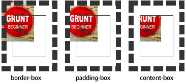
background-origin
设置元素背景图片的原始起始位置。必须保证背景是background-repeat为no-repeat此属性才会生效。
background-origin :border-box | padding-box | content-box;
padding-box:从padding区域(含padding)开始显示背景图像。
border-box:从border区域(含border)开始显示背景图像。
content-box:从content区域开始显示背景图像。

background-clip
设定背景图像向外裁剪的区域。
background-clip : border-box | padding-box | content-box | text
background-size
设置背景图片的大小,以长度值或百分比显示,还可以通过cover和contain来对图片进行伸缩。

background
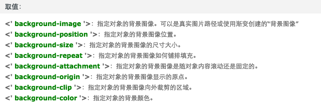
例如:

background:url(test1.jpg) no-repeat scroll 10px 20px/50px 60px padding-box,

       url(test1.jpg) no-repeat scroll 10px 20px/70px 90px padding-box,

       url(test1.jpg) no-repeat scroll 10px 20px/110px 130px padding-box #aaa;
transition
简写格式如下:
- transition:<transition-property><transition-duration><transition-timing-function><transition-delay>
- <' transition-property '>:检索或设置对象中的参与过渡的属性
- <' transition-duration '>:检索或设置对象过渡的持续时间
- <' transition-timing-function '>:检索或设置对象中过渡的动画类型
- <' transition-delay '>:检索或设置对象延迟过渡的时间
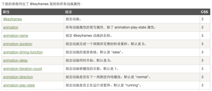
animation
当在 @keyframes 创建动画,把它绑定到一个选择器,否则动画不会有任何效果。
指定至少这两个CSS3的动画属性绑定向一个选择器:
- 规定动画的名称
- 规定动画的时长
 <!DOCTYPE html>

 <html>

 <head>

 <meta charset="utf-8">

 <title>菜鸟教程(runoob.com)</title>

 <style>

 div

 {

     width:100px;

     height:100px;

     background:red;

     position:relative;

     animation:myfirst 5s linear 2s infinite alternate;

     /* Firefox: */

     -moz-animation:myfirst 5s linear 2s infinite alternate;

     /* Safari and Chrome: */

     -webkit-animation:myfirst 5s linear 2s infinite alternate;

     /* Opera: */

     -o-animation:myfirst 5s linear 2s infinite alternate;

 }

 @keyframes myfirst

 {

     0%   {background:red; left:0px; top:0px;}

     25%  {background:yellow; left:200px; top:0px;}

     50%  {background:blue; left:200px; top:200px;}

     75%  {background:green; left:0px; top:200px;}

     100% {background:red; left:0px; top:0px;}

 }

 @-moz-keyframes myfirst /* Firefox */

 {

     0%   {background:red; left:0px; top:0px;}

     25%  {background:yellow; left:200px; top:0px;}

     50%  {background:blue; left:200px; top:200px;}

     75%  {background:green; left:0px; top:200px;}

     100% {background:red; left:0px; top:0px;}

 }

 @-webkit-keyframes myfirst /* Safari and Chrome */

 {

     0%   {background:red; left:0px; top:0px;}

     25%  {background:yellow; left:200px; top:0px;}

     50%  {background:blue; left:200px; top:200px;}

     75%  {background:green; left:0px; top:200px;}

     100% {background:red; left:0px; top:0px;}

 }

 @-o-keyframes myfirst /* Opera */

 {

     0%   {background:red; left:0px; top:0px;}

     25%  {background:yellow; left:200px; top:0px;}

     50%  {background:blue; left:200px; top:200px;}

     75%  {background:green; left:0px; top:200px;}

     100% {background:red; left:0px; top:0px;}

 }

 </style>

 </head>

 <body>

 <p><b>注意:</b> 该实例在 Internet Explorer 9 及更早 IE 版本是无效的。</p>

 <div></div>

 </body>

 </html>
transform

#8.12.16总结#background transition、animation、transform的更多相关文章
- css 动画 transform transition animation
1.transform transform 是通过在浏览器里面让网页元素 移动 旋转 透明 模糊 等方法来实现改变其外观的技术 -webkit-transform : translate(3em,0 ...
- CSS动画:animation、transition、transform、translate
https://blog.csdn.net/px01ih8/article/details/80780470 一.区分容易混淆的几个属性和值 先区分一下css中的几个属性:animation(动画). ...
- css3之transition、transform、animation比较
css3动画多少都有些了解,但是对于transition.transform.animation这几个属性一直是比较模糊的,所以啊,这里做一个总结,也希望大家都可以对此有一个更好地理解. 其实, ...
- css3 transition animation nick
时光转眼即逝,又到周六了,今天写点某部分人看不起的css玩玩! 转换 转换属性transform: 浏览器前缀: -webkit-transform;-o-transform;-moz-transfo ...
- Atitti css transition Animation differ区别
Atitti css transition Animation differ区别 1.1. transition的优点在于简单易用,但是它有几个很大的局限. 1 1.2. Transition ...
- Atitti css transition Animation differ区别
Atitti css transition Animation differ区别 1.1. transition的优点在于简单易用,但是它有几个很大的局限. 1 1.2. js 动态改变 st ...
- A transition animation compatible Library.
Android5.0之后为我们提供了许多炫酷的界面过渡效果,其中共享元素过渡也是很有亮点的一个效果,但这个效果只能在Android5.0之后使用,那今天我们就来将共享元素过渡效果兼容到Android4 ...
- CSS3 & transition & animation
CSS3 & transition & animation https://developer.mozilla.org/en-US/docs/Web/CSS/transition-ti ...
- css3动画transition animation
CSS动画简介 transition animation transition过渡:css3通过transitions属性引入时间概念,通过开始.结束状态自动计算中间状态,实现状态改变的过渡效果 ...
随机推荐
- 使用Weka进行数据挖掘
1.简介 数据挖掘.机器学习这些字眼,在一些人看来,是门槛很高的东西.诚然,如果做算法实现甚至算法优化,确实需要很多背景知识.但事实是,绝大多数数据挖掘工程师,不需要去做算法层面的东西.他们的精力,集 ...
- iOS_UIImage_给图片添加水印
github地址: https://github.com/mancongiOS/UIImage.git UIImage的Category UIImage+ImageWaterPrint.h #impo ...
- [转载]—— Android JNI知识点
Java Native Interface (JNI)标准是java平台的一部分,它允许Java代码和其他语言写的代码进行交互.JNI 是本地编程接口,它使得在 Java 虚拟机 (VM) 内部运行的 ...
- c语言读取字符在记事本中出现次数
程序使用说明: 此程序可以统计出名称为1.txt的文件中/出现的次数 但是仅支持单个英文字母和标点符号查询,不支持汉字. 在本程序生成的exe根目录下放一个1.txt, 即可查询出该字符在1.txt记 ...
- 微软公有云Windows Azure 2014-03-26 国内正式商用
新浪科技讯 3月27日早间消息,微软国昨天下午宣布由世纪互联负责运营的Microsoft Azure公有云服务正式商用.这是国内首个正式商用的国际公有云服务平台.而开正式开放商用,意味着任何企业现在都 ...
- java并发编程(3):ThreadLocal
转载:http://www.cnblogs.com/dolphin0520/p/3920407.html 一. 对ThreadLocal的理解 ThreadLocal,很多地方叫做线程本地变量,也有地 ...
- jQuery DOM操作
对节点的操作 查找节点 查找节点可以直接利用jQuery选择器来完成,非常便利. 插入节点 jQuery提供了8种插入节点的方法. 序号 方法 描述 实例 1 append() 向每个匹配的元素内部追 ...
- linux的计划
我接触linux也有好几年了,至少有5年了.最近公司在搞内部培训,人人都可以报名培训别人.想到自己在linux浸淫多年,应该出来出一份力.一直以来想就linux写一个专题.今天刚好在做相关的ppt,借 ...
- Python语言特性之1:函数参数传递
问题:在Python文档中好像没有明确指出一个函数参数传递的是值传递还是引用传递.如下面的代码中"原始值"是不放生变化的: class PassByReference: def _ ...
- 基于C#的MongoDB数据库开发应用(3)--MongoDB数据库的C#开发之异步接口
在前面的系列博客中,我曾经介绍过,MongoDB数据库的C#驱动已经全面支持异步的处理接口,并且接口的定义几乎是重写了.本篇主要介绍MongoDB数据库的C#驱动的最新接口使用,介绍基于新接口如何实现 ...