深入理解 CSS 的 :before 和 :after 选择器(制作select下拉列表美化插件)
原文链接:http://www.cnblogs.com/LY-leo/p/5765598.html
对于 :before 和 :after 选择器,大家并不陌生,但是很少有人会主动去用它们。先解释下它们的定义和用法:
:before 选择器在被选元素的内容前面插入内容,:after 选择器在被选元素的内容后面插入内容,都会使用 content 属性来指定要插入的内容。
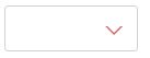
有时候,项目中或多或少需要一些箭头,如果用图片来做,感觉就有点 low 了,而上面这两个选择器是最好的选择。效果如下:
html 代码如下:
<div class="test"></div>
css 代码如下:

.test {

    position: relative;

    width: 120px;

    height: 40px;

    border: 1px solid #d2d2d2;

    border-radius: 3px;

}

.test:after {

    position: absolute;

    right: 15px;

    top: 18px;

    width: 0;

    height: 0;

    content: "";

    border-width: 6px 6px 0 6px;     /*border-width: 6px 6px 6px 6px;*/

    border-style: solid;

    border-color: #fff transparent;    /*red transparent transparent transparent;*/

    -webkit-transition: all .25s;

       -moz-transition: all .25s;

        -ms-transition: all .25s;

         -o-transition: all .25s;

            transition: all .25s;

}

.test:before {

    position: absolute;

    right: 13px;

    top: 18px;

    width: 0;

    height: 0;

    content: "";

    border-width: 8px 8px 0 8px;

    border-style: solid;

    border-color: #d36969 transparent;

    -webkit-transition: transform .25s;

       -moz-transition: transform .25s;

        -ms-transition: transform .25s;

         -o-transition: transform .25s;

            transition: transform .25s;

}

.test.active:after{

    top: 20px;

    -webkit-transform: rotate(180deg);

       -moz-transform: rotate(180deg);

        -ms-transform: rotate(180deg);

         -o-transform: rotate(180deg);

            transform: rotate(180deg);

}

.test.active:before{

    -webkit-transform: rotate(180deg);

       -moz-transform: rotate(180deg);

        -ms-transform: rotate(180deg);

         -o-transform: rotate(180deg);

            transform: rotate(180deg);

}
通过 :before 和 :after 两个伪元素,设置 content 为空,宽高为零,边框和颜色,生成两个等边三角形,一个是红色的三角,其边长稍大,一个是白色的三角。会有人问为什么白色三角是通过 :after 生成的,因为 :after 生成的白色三角才能覆盖在 :before 生成的红色三角,而形成一个箭头(一定要设置好定位的 top 值,使两个三角的底边重合)。
js 代码如下:
$('.test').on('click',function(){

      $(this).toggleClass('active');

})
点击的时候箭头会旋转180度,效果如下:

分析:
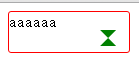
加z-index: 10前后:
<!DOCTYPE html>
<html> <head>
<meta charset="UTF-8">
<title></title>
<style type="text/css">
.test {
position: relative;
width: 120px;
height: 40px;
border: 1px solid red;
border-radius: 3px;
} .test:after {
position: absolute;
right: 15px;
top: 18px;
width: 0;
height: 0;
content: "";
border-width: 6px 6px 6px 6px;
border-style: solid;
border-color: red transparent transparent transparent;
transition: all .25s;
} .test:before {
position: absolute;
right: 13px;
top: 18px;
width: 0;
height: 0;
content: "";
border-width: 8px 8px 8px 8px;
border-style: solid;
border-color: green transparent;
transition: transform .25s;
/*z-index: 10;*/
}
</style>
</head> <body>
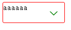
<div class="test">aaaaaa</div>
</body> </html>
修改1:
.test:before {

				position: absolute;

				right: 13px;

				top: 18px;

				width: 0;

				height: 0;

				content: "";

				border-width: 8px 8px 8px 8px;

				border-style: solid;

				border-color: green transparent transparent transparent;

				transition: transform .25s;

				/*z-index: 10;*/

			}
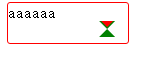
 修改后的样式:
	.test:after {

				position: absolute;

				right: 15px;

				top: 18px;

				width: 0;

				height: 0;

				content: "";

				border-width: 6px 6px 6px 6px;

				border-style: solid;

				border-color: white transparent transparent transparent;

				transition: all .25s;

			}

			.test:before {

				position: absolute;

				right: 13px;

				top: 18px;

				width: 0;

				height: 0;

				content: "";

				border-width: 8px 8px 8px 8px;

				border-style: solid;

				border-color: green transparent transparent transparent;

				transition: transform .25s;

				/*z-index: 10;*/

			}
制作美化select 插件:
<!DOCTYPE html>
<html> <head>
<meta charset="UTF-8">
<title></title>
<style type="text/css">
ul li {
list-style: none;
} .test {
position: relative;
float: left;
width: 120px;
height: 40px;
padding-left: 11px;
font-size: 15px;
line-height: 40px;
cursor: pointer;
border: 1px solid red;
border-radius: 3px;
margin: 0px 20px;
outline: none;
} .test:before {
position: absolute;
right: 13px;
top: 18px;
width: 0;
height: 0;
content: "";
border-width: 8px 8px 0 8px;
border-style: solid;
border-color: red transparent;
-webkit-transition: transform .25s;
-moz-transition: transform .25s;
-ms-transition: transform .25s;
-o-transition: transform .25s;
transition: transform .25s;
} .test:after {
position: absolute;
right: 15px;
top: 18px;
width: 0;
height: 0;
content: "";
border-width: 6px 6px 0 6px;
border-style: solid;
border-color: #fff transparent;
-webkit-transition: all .25s;
-moz-transition: all .25s;
-ms-transition: all .25s;
-o-transition: all .25s;
transition: all .25s;
} .test.active:before {
-webkit-transform: rotate(180deg);
-moz-transform: rotate(180deg);
-ms-transform: rotate(180deg);
-o-transform: rotate(180deg);
transform: rotate(180deg);
} .test.active:after {
top: 20px;
-webkit-transform: rotate(180deg);
-moz-transform: rotate(180deg);
-ms-transform: rotate(180deg);
-o-transform: rotate(180deg);
transform: rotate(180deg);
} .test .dropdown {
position: absolute;
right: 0;
left: 0;
display: none;
padding: 0;
border-radius: inherit;
border: 1px solid #d2d2d2;
box-shadow: 2px 2px 5px rgba(0, 0, 0, .4);
} .test.active .dropdown {
display: block;
} .test .dropdown:before {
position: absolute;
right: 13px;
bottom: 100%;
width: 0;
height: 0;
content: "";
border-width: 0 8px 8px 8px;
border-style: solid;
border-color: #d2d2d2 transparent;
} .test .dropdown:after {
position: absolute;
right: 15px;
bottom: 100%;
width: 0;
height: 0;
content: "";
border-width: 0 6px 6px 6px;
border-style: solid;
border-color: #fff transparent;
} .test .dropdown li {
float: left;
width: 129px;
font-size: 14px;
-webkit-transition: all .3s ease-out;
-moz-transition: all .3s ease-out;
-ms-transition: all .3s ease-out;
-o-transition: all .3s ease-out;
transition: all .3s ease-out;
text-align: center;
} .test .dropdown li:first-of-type {
border-radius: 3px 3px 0 0;
} .test .dropdown li:last-of-type {
border-radius: 0 0 3px 3px;
} .test .dropdown li:hover {
color: #fff;
background: red;
}
</style>
<script src="http://libs.baidu.com/jquery/2.0.0/jquery.min.js"></script>
<script type="text/javascript">
$(function(){ function DropDown(el) {
this.dd = el;
this.span = this.dd.children('span');
this.li = this.dd.find('ul.dropdown li');
this.val = '';
}
DropDown.prototype.initEvents = function() {
var obj = this;
obj.dd.on('click', function(event) {
$(this).toggleClass('active').siblings().removeClass('active');
event.stopPropagation();
});
obj.li.on('click', function() {
var opt = $(this);
obj.val = opt.html();
if(obj.span.html() == obj.val) return;
obj.span.html(obj.val);
$(document).click(function() {
$('.test').removeClass('active');
});
})
}
var test1 = new DropDown($('#type'));
var test2 = new DropDown($('#kind'));
test1.initEvents();
test2.initEvents();
})
</script>
</head> <body>
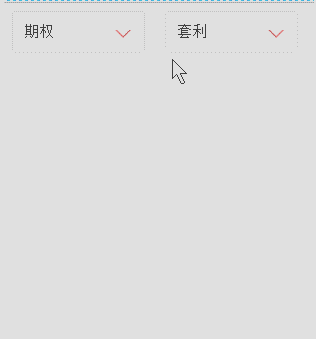
<div id="type" class="test">
<span>投资种类</span>
<ul class="dropdown">
<li>期货</li>
<li>股票</li>
<li>期权</li>
</ul>
</div>
<div id="kind" class="test">
<span>投资类型</span>
<ul class="dropdown">
<li>趋势</li>
<li>震荡</li>
<li>套利</li>
<li>选股</li>
<li>择时</li>
</ul>
</div>
</body> </html>
深入理解 CSS 的 :before 和 :after 选择器(制作select下拉列表美化插件)的更多相关文章
- 理解CSS中的三种选择器>+~
1. p~ul p和ul有相同的父元素,选择出p元素之后的所有ul元素,其中,p和ul不一定是紧随,但是必须有相同的父元素 E+F 相邻兄弟选择器.选择匹配F的元素,且该元素位于 ...
- 理解CSS
写在前面的话:对于web开发,html完成网页的structure,css完成网页的presentation,js完成网页的behavior,今天就来说一说css,通过理解一些css的基础概念,能够更 ...
- CSS学习摘要-语法和选择器
主要摘自网络开发者. 从最基本的层次来看,CSS是由两块内容组合而成的: 属性(Property):一些人类可理解的标识符,这些标识符指出你想修改哪一些样式,例如:字体,宽度,背景颜色等. 属性值(V ...
- css 03-CSS样式表和选择器
03-CSS样式表和选择器 #本文主要内容 CSS概述 CSS和HTML结合的三种方式:行内样式表.内嵌样式表.外部样式表 CSS四种基本选择器:标签选择器.类选择器.ID选择器.通用选择器 CSS几 ...
- 深入理解css BFC 模型
如果要深入理解css布局的各种原理,要在重构页面做得心应手的话,那么你就必须先理解这玩意 "BFC" , BlockFormatting Context(块级格式化上下文): 这里 ...
- 深入理解CSS中的层叠上下文和层叠顺序(转)
by zhangxinxu from http://www.zhangxinxu.com 本文地址:http://www.zhangxinxu.com/wordpress/?p=5115 零.世间的道 ...
- 深入理解CSS溢出overflow & overflow:hidden真的失效了吗[转载]
深入理解CSS溢出overflow http://www.cnblogs.com/xiaohuochai/p/5289653.html overflow:hidden真的失效了吗 http://www ...
- CSS中模拟父元素选择器
很多情况下,我们需要找到父元素,但可惜的是css中并没有这样的一个选择器. 至于原因可以看张鑫旭的如何在CSS中实现父选择器效果这篇文章. 简单来说这个实现并不是真正的父元素选择器,只是利用其它思路来 ...
- 深入理解css中的margin属性
深入理解css中的margin属性 之前我一直认为margin属性是一个非常简单的属性,但是最近做项目时遇到了一些问题,才发现margin属性还是有一些“坑”的,下面我会介绍margin的基本知识以及 ...
随机推荐
- Android之activity中新建控件
了解了5大布局,我们会发现这些布局都是静态的,如何让系统自动生成控件呢?这就需要activity来帮忙了 今天我们讲的就是用activity新建布局 用案例来说吧! 实现一个输入行和列自动生成表格并生 ...
- Python全栈--7模块--random os sys time datetime hashlib pickle json requests xml
模块分为三种: 自定义模块 内置模块 开源模块 一.安装第三方模块 # python 安装第三方模块 # 加入环境变量 : 右键计算机---属性---高级设置---环境变量---path--分号+py ...
- 让spark运行在mesos上 -- 分布式计算系统spark学习(五)
mesos集群部署参见上篇. 运行在mesos上面和 spark standalone模式的区别是: 1)stand alone 需要自己启动spark master 需要自己启动spark slav ...
- 解决 webx.ml 中The superclass "javax.servlet.http.HttpServlet" was not found on the Java Build Path 问题
在Eclipse 的项目 上,点击鼠标右键 选中 ,并 Finish 即可.
- wkwebview 和 JS 自用
-(void)webView:(WKWebView *)webView didCommitNavigation:(null_unspecified WKNavigation *)navigation{ ...
- AngularJs自定义指令详解(3) - scope
我们之所以要定义指令,目的是重用指令.假设有这么一个应用场景:在同一个html里使用了两次my-directive,第一个my-directive要展示的是Hello World,第二个my-dire ...
- Visual Studio Professional 2015 key
Visual Studio Professional 2015 Key : HMGNV-WCYXV-X7G9W-YCX63-B98R2 Visual Studio Enterprise 2015 Ke ...
- MapReduce几个简单的例子
文件合并和去重: 可以把每一行文本作为key,value为随意值. 数字排序: MapReduce过程中就有排序,它是按照key值进行排序的,如果key为封装int的IntWritable类型,那么M ...
- 0909 45作业one
1.编译原理学什么? 答: 初遇编译原理,我知道编译原理是计算机专业设置的一门重要的专业课程,主要是介绍编译程序构造的一般原理和基本方法.其内容大概包括语言和文法.词法分析.语法分析.语法制导翻译.中 ...
- Wall--POJ1113(极角排序+求凸包)
http://poj.org/problem?id=1113 题目大意:现在要给n个点,让你修一个围墙把这些点围起来,距离最小是l 分析 :现在就是求凸包的周长然后再加上一个圆的周长 #includ ...