Blend 修改TreeViewItem样式
Blend 修改TreeViewItem样式
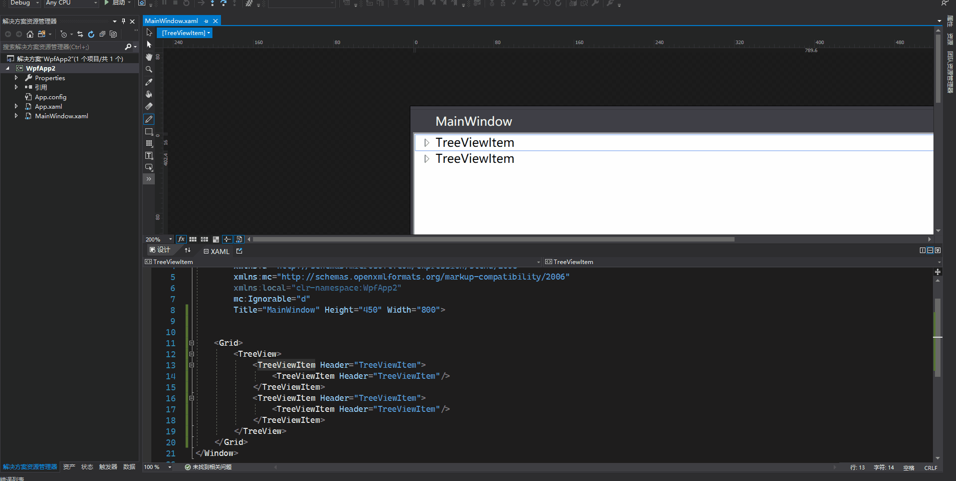
1、用Blend for Visual Studio 2019 新建Wpf项目,拖动一个TreeView控件到Grid上
    <Grid>

        <TreeView>

            <TreeViewItem Header="TreeViewItem">

                <TreeViewItem Header="TreeViewItem"/>

            </TreeViewItem>

            <TreeViewItem Header="TreeViewItem">

                <TreeViewItem Header="TreeViewItem"/>

            </TreeViewItem>

        </TreeView>

    </Grid>
2、在绘图窗口选中TreeViewItem,右键编辑模版->编辑副本
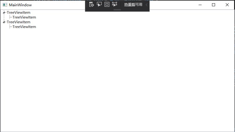
3、绘制水平、垂直虚线(参考博文)
在TreeViewItem ControlTemplate模板中增加
<!-- Connecting Lines -->

<!-- Horizontal line -->

<Rectangle x:Name="HorLn"

           Margin="10,0,0,0"

           Height="1"

           Stroke="#FF565656"

           SnapsToDevicePixels="True"

           StrokeDashCap="Square"

           StrokeDashOffset="1"/>

<!-- Vertical line -->

<Rectangle x:Name="VerLn"

           Width="1"

           Stroke="#FF565656"

           Margin="0,0,-2,0"

           Grid.RowSpan="2"

           SnapsToDevicePixels="true"

           Fill="White"

           StrokeDashCap="Square"

           StrokeDashArray="1,5"/>
对于当前层最后一个节点,不再画它水平方向线以下的垂直线,这里使用到转换器完成
    class TreeViewLineConverter : IValueConverter

    {

        public object Convert(object value, Type targetType, object parameter, System.Globalization.CultureInfo culture)

        {

            var item = value as TreeViewItem;

            ItemsControl ic = ItemsControl.ItemsControlFromItemContainer(item);

            return ic.ItemContainerGenerator.IndexFromContainer(item) == ic.Items.Count - 1;

        }

        public object ConvertBack(object value, Type targetType, object parameter, System.Globalization.CultureInfo culture)

        {

            return false;

        }

    }
触发器需增加代码
                            <!-- 当前层最后一个元素不画下方垂直线 -->

                            <DataTrigger Binding="{Binding RelativeSource={RelativeSource Self}, Converter={StaticResource LineConverter}}" Value="true">

                                <Setter TargetName="VerLn" Property="Height" Value="15"/>

                                <Setter TargetName="VerLn" Property="VerticalAlignment" Value="Top"/>

                            </DataTrigger>

                            <!-- Root第一个元素不显示上方垂直线 -->

                            <Trigger Property="TabIndex" Value="1">

                                <Setter TargetName="VerLn" Property="Margin" Value="0,12,1,0"/>

                                <Setter TargetName="VerLn" Property="Height" Value="Auto"/>

                            </Trigger>
完整样式代码
        <Style x:Key="TreeViewItemFocusVisual">

            <Setter Property="Control.Template">

                <Setter.Value>

                    <ControlTemplate>

                        <Rectangle/>

                    </ControlTemplate>

                </Setter.Value>

            </Setter>

        </Style>

        <SolidColorBrush x:Key="TreeViewItem.TreeArrow.Static.Checked.Fill" Color="#FF595959"/>

        <SolidColorBrush x:Key="TreeViewItem.TreeArrow.Static.Checked.Stroke" Color="#FF262626"/>

        <SolidColorBrush x:Key="TreeViewItem.TreeArrow.MouseOver.Stroke" Color="#FF27C7F7"/>

        <SolidColorBrush x:Key="TreeViewItem.TreeArrow.MouseOver.Fill" Color="#FFCCEEFB"/>

        <SolidColorBrush x:Key="TreeViewItem.TreeArrow.MouseOver.Checked.Stroke" Color="#FF1CC4F7"/>

        <SolidColorBrush x:Key="TreeViewItem.TreeArrow.MouseOver.Checked.Fill" Color="#FF82DFFB"/>

        <PathGeometry x:Key="TreeArrow" Figures="M0,0 L0,6 L6,0 z"/>

        <SolidColorBrush x:Key="TreeViewItem.TreeArrow.Static.Fill" Color="#FFFFFFFF"/>

        <SolidColorBrush x:Key="TreeViewItem.TreeArrow.Static.Stroke" Color="#FF818181"/>

        <Style x:Key="ExpandCollapseToggleStyle" TargetType="{x:Type ToggleButton}">

            <Setter Property="Focusable" Value="False"/>

            <Setter Property="Width" Value="16"/>

            <Setter Property="Height" Value="16"/>

            <Setter Property="Template">

                <Setter.Value>

                    <ControlTemplate TargetType="{x:Type ToggleButton}">

                        <Border Background="Transparent" Height="16" Padding="5,5,5,5" Width="16">

                            <Path x:Name="ExpandPath" Data="{StaticResource TreeArrow}" Fill="{StaticResource TreeViewItem.TreeArrow.Static.Fill}" Stroke="{StaticResource TreeViewItem.TreeArrow.Static.Stroke}">

                                <Path.RenderTransform>

                                    <RotateTransform Angle="135" CenterY="3" CenterX="3"/>

                                </Path.RenderTransform>

                            </Path>

                        </Border>

                        <ControlTemplate.Triggers>

                            <Trigger Property="IsChecked" Value="True">

                                <Setter Property="RenderTransform" TargetName="ExpandPath">

                                    <Setter.Value>

                                        <RotateTransform Angle="180" CenterY="3" CenterX="3"/>

                                    </Setter.Value>

                                </Setter>

                                <Setter Property="Fill" TargetName="ExpandPath" Value="{StaticResource TreeViewItem.TreeArrow.Static.Checked.Fill}"/>

                                <Setter Property="Stroke" TargetName="ExpandPath" Value="{StaticResource TreeViewItem.TreeArrow.Static.Checked.Stroke}"/>

                            </Trigger>

                            <Trigger Property="IsMouseOver" Value="True">

                                <Setter Property="Stroke" TargetName="ExpandPath" Value="{StaticResource TreeViewItem.TreeArrow.MouseOver.Stroke}"/>

                                <Setter Property="Fill" TargetName="ExpandPath" Value="{StaticResource TreeViewItem.TreeArrow.MouseOver.Fill}"/>

                            </Trigger>

                            <MultiTrigger>

                                <MultiTrigger.Conditions>

                                    <Condition Property="IsMouseOver" Value="True"/>

                                    <Condition Property="IsChecked" Value="True"/>

                                </MultiTrigger.Conditions>

                                <Setter Property="Stroke" TargetName="ExpandPath" Value="{StaticResource TreeViewItem.TreeArrow.MouseOver.Checked.Stroke}"/>

                                <Setter Property="Fill" TargetName="ExpandPath" Value="{StaticResource TreeViewItem.TreeArrow.MouseOver.Checked.Fill}"/>

                            </MultiTrigger>

                        </ControlTemplate.Triggers>

                    </ControlTemplate>

                </Setter.Value>

            </Setter>

        </Style>

        <local:TreeViewLineConverter x:Key="LineConverter"/>

        <Style TargetType="{x:Type TreeViewItem}">

            <Setter Property="Background" Value="Transparent"/>

            <Setter Property="HorizontalContentAlignment" Value="{Binding HorizontalContentAlignment, RelativeSource={RelativeSource AncestorType={x:Type ItemsControl}}}"/>

            <Setter Property="VerticalContentAlignment" Value="{Binding VerticalContentAlignment, RelativeSource={RelativeSource AncestorType={x:Type ItemsControl}}}"/>

            <Setter Property="Padding" Value="1,0,0,0"/>

            <Setter Property="Foreground" Value="{DynamicResource {x:Static SystemColors.ControlTextBrushKey}}"/>

            <Setter Property="FocusVisualStyle" Value="{StaticResource TreeViewItemFocusVisual}"/>

            <Setter Property="Template">

                <Setter.Value>

                    <ControlTemplate TargetType="{x:Type TreeViewItem}">

                        <Grid>

                            <Grid.ColumnDefinitions>

                                <ColumnDefinition MinWidth="19" Width="Auto"/>

                                <ColumnDefinition Width="Auto"/>

                                <ColumnDefinition Width="*"/>

                            </Grid.ColumnDefinitions>

                            <Grid.RowDefinitions>

                                <RowDefinition Height="Auto"/>

                                <RowDefinition/>

                            </Grid.RowDefinitions>

                             <!--Connecting Lines-->

                             <!--Horizontal line-->

                            <Rectangle x:Name="HorLn" Margin="10,0,0,0" Height="1" Stroke="#FF565656" SnapsToDevicePixels="True" StrokeDashCap="Square" StrokeDashOffset="1"/>

                             <!--Vertical line-->

                            <Rectangle x:Name="VerLn" Width="1" Stroke="#FF565656" Margin="0,0,-2,0" Grid.RowSpan="2" SnapsToDevicePixels="true" Fill="White" StrokeDashCap="Square" StrokeDashArray="1,5"/>

                            <ToggleButton x:Name="Expander" ClickMode="Press" IsChecked="{Binding IsExpanded, RelativeSource={RelativeSource TemplatedParent}}" Style="{StaticResource ExpandCollapseToggleStyle}"/>

                            <Border x:Name="Bd" BorderBrush="{TemplateBinding BorderBrush}" BorderThickness="{TemplateBinding BorderThickness}" Background="{TemplateBinding Background}" Grid.Column="1" Padding="{TemplateBinding Padding}" SnapsToDevicePixels="true">

                                <ContentPresenter x:Name="PART_Header" ContentSource="Header" HorizontalAlignment="{TemplateBinding HorizontalContentAlignment}" SnapsToDevicePixels="{TemplateBinding SnapsToDevicePixels}"/>

                            </Border>

                            <ItemsPresenter x:Name="ItemsHost" Grid.ColumnSpan="2" Grid.Column="1" Grid.Row="1"/>

                        </Grid>

                        <ControlTemplate.Triggers>

                            <Trigger Property="IsExpanded" Value="false">

                                <Setter Property="Visibility" TargetName="ItemsHost" Value="Collapsed"/>

                            </Trigger>

                            <Trigger Property="HasItems" Value="false">

                                <Setter Property="Visibility" TargetName="Expander" Value="Hidden"/>

                            </Trigger>

                            <Trigger Property="IsSelected" Value="true">

                                <Setter Property="Background" TargetName="Bd" Value="{DynamicResource {x:Static SystemColors.HighlightBrushKey}}"/>

                                <Setter Property="Foreground" Value="{DynamicResource {x:Static SystemColors.HighlightTextBrushKey}}"/>

                            </Trigger>

                            <MultiTrigger>

                                <MultiTrigger.Conditions>

                                    <Condition Property="IsSelected" Value="true"/>

                                    <Condition Property="IsSelectionActive" Value="false"/>

                                </MultiTrigger.Conditions>

                                <Setter Property="Background" TargetName="Bd" Value="{DynamicResource {x:Static SystemColors.InactiveSelectionHighlightBrushKey}}"/>

                                <Setter Property="Foreground" Value="{DynamicResource {x:Static SystemColors.InactiveSelectionHighlightTextBrushKey}}"/>

                            </MultiTrigger>

                            <Trigger Property="IsEnabled" Value="false">

                                <Setter Property="Foreground" Value="{DynamicResource {x:Static SystemColors.GrayTextBrushKey}}"/>

                            </Trigger>

                            <!-- 当前层最后一个元素不画下方垂直线 -->

                            <DataTrigger Binding="{Binding RelativeSource={RelativeSource Self}, Converter={StaticResource LineConverter}}" Value="true">

                                <Setter TargetName="VerLn" Property="Height" Value="15"/>

                                <Setter TargetName="VerLn" Property="VerticalAlignment" Value="Top"/>

                            </DataTrigger>

                            <!-- Root第一个元素不显示上方垂直线 -->

                            <Trigger Property="TabIndex" Value="1">

                                <Setter TargetName="VerLn" Property="Margin" Value="0,12,1,0"/>

                                <Setter TargetName="VerLn" Property="Height" Value="Auto"/>

                            </Trigger>

                        </ControlTemplate.Triggers>

                    </ControlTemplate>

                </Setter.Value>

            </Setter>

            <Style.Triggers>

                <Trigger Property="VirtualizingPanel.IsVirtualizing" Value="true">

                    <Setter Property="ItemsPanel">

                        <Setter.Value>

                            <ItemsPanelTemplate>

                                <VirtualizingStackPanel/>

                            </ItemsPanelTemplate>

                        </Setter.Value>

                    </Setter>

                </Trigger>

            </Style.Triggers>

        </Style>
效果图如下
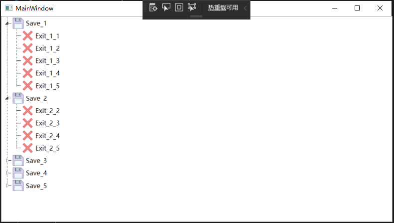
4、TreeViewItem显示图片以及名称
        <TreeView ItemsSource="{Binding Tools}">

            <TreeView.Resources>

                <local:UriToImageSourceConverter x:Key="UriToImageSource"/>

            </TreeView.Resources>

            <TreeView.ItemTemplate>

                <HierarchicalDataTemplate ItemsSource="{Binding Nodes}">

                    <DockPanel>

                        <Image Source="{Binding PicPath, Converter={StaticResource UriToImageSource}}" Width="25" Height="25"/>

                        <TextBlock Text="{Binding Name}" FontSize="13" VerticalAlignment="Center" Margin="3,0,0,0"/>

                    </DockPanel>

                </HierarchicalDataTemplate>

            </TreeView.ItemTemplate>

        </TreeView>
Tools是数据集合,节点集合Nodes。PicPath保存图片名称,使用UriToImageSourceConverter转换器转换成BitmapImage类型显示。
    class UriToImageSourceConverter : IValueConverter

    {

        public object Convert(object value, Type targetType, object parameter, System.Globalization.CultureInfo culture)

        {

            string path = (string)value;

            if (string.IsNullOrEmpty(path))

            {

                path = "pack://application:,,,/WpfApp2;component/position.ico";//默认图片

            }

            return new BitmapImage(new Uri(path, UriKind.Absolute));

        }

        public object ConvertBack(object value, Type targetType, object parameter, System.Globalization.CultureInfo culture)

        {

            return false;

        }

    }
效果图如下
完整代码
<Window x:Class="WpfApp2.MainWindow"

        xmlns="http://schemas.microsoft.com/winfx/2006/xaml/presentation"

        xmlns:x="http://schemas.microsoft.com/winfx/2006/xaml"

        xmlns:d="http://schemas.microsoft.com/expression/blend/2008"

        xmlns:mc="http://schemas.openxmlformats.org/markup-compatibility/2006"

        xmlns:local="clr-namespace:WpfApp2"

        mc:Ignorable="d"

        Title="MainWindow" Height="450" Width="800">

    <Window.Resources>

        <Style x:Key="TreeViewItemFocusVisual">

            <Setter Property="Control.Template">

                <Setter.Value>

                    <ControlTemplate>

                        <Rectangle/>

                    </ControlTemplate>

                </Setter.Value>

            </Setter>

        </Style>

        <SolidColorBrush x:Key="TreeViewItem.TreeArrow.Static.Checked.Fill" Color="#FF595959"/>

        <SolidColorBrush x:Key="TreeViewItem.TreeArrow.Static.Checked.Stroke" Color="#FF262626"/>

        <SolidColorBrush x:Key="TreeViewItem.TreeArrow.MouseOver.Stroke" Color="#FF27C7F7"/>

        <SolidColorBrush x:Key="TreeViewItem.TreeArrow.MouseOver.Fill" Color="#FFCCEEFB"/>

        <SolidColorBrush x:Key="TreeViewItem.TreeArrow.MouseOver.Checked.Stroke" Color="#FF1CC4F7"/>

        <SolidColorBrush x:Key="TreeViewItem.TreeArrow.MouseOver.Checked.Fill" Color="#FF82DFFB"/>

        <PathGeometry x:Key="TreeArrow" Figures="M0,0 L0,6 L6,0 z"/>

        <SolidColorBrush x:Key="TreeViewItem.TreeArrow.Static.Fill" Color="#FFFFFFFF"/>

        <SolidColorBrush x:Key="TreeViewItem.TreeArrow.Static.Stroke" Color="#FF818181"/>

        <Style x:Key="ExpandCollapseToggleStyle" TargetType="{x:Type ToggleButton}">

            <Setter Property="Focusable" Value="False"/>

            <Setter Property="Width" Value="16"/>

            <Setter Property="Height" Value="16"/>

            <Setter Property="Template">

                <Setter.Value>

                    <ControlTemplate TargetType="{x:Type ToggleButton}">

                        <Border Background="Transparent" Height="16" Padding="5,5,5,5" Width="16">

                            <Path x:Name="ExpandPath" Data="{StaticResource TreeArrow}" Fill="{StaticResource TreeViewItem.TreeArrow.Static.Fill}" Stroke="{StaticResource TreeViewItem.TreeArrow.Static.Stroke}">

                                <Path.RenderTransform>

                                    <RotateTransform Angle="135" CenterY="3" CenterX="3"/>

                                </Path.RenderTransform>

                            </Path>

                        </Border>

                        <ControlTemplate.Triggers>

                            <Trigger Property="IsChecked" Value="True">

                                <Setter Property="RenderTransform" TargetName="ExpandPath">

                                    <Setter.Value>

                                        <RotateTransform Angle="180" CenterY="3" CenterX="3"/>

                                    </Setter.Value>

                                </Setter>

                                <Setter Property="Fill" TargetName="ExpandPath" Value="{StaticResource TreeViewItem.TreeArrow.Static.Checked.Fill}"/>

                                <Setter Property="Stroke" TargetName="ExpandPath" Value="{StaticResource TreeViewItem.TreeArrow.Static.Checked.Stroke}"/>

                            </Trigger>

                            <Trigger Property="IsMouseOver" Value="True">

                                <Setter Property="Stroke" TargetName="ExpandPath" Value="{StaticResource TreeViewItem.TreeArrow.MouseOver.Stroke}"/>

                                <Setter Property="Fill" TargetName="ExpandPath" Value="{StaticResource TreeViewItem.TreeArrow.MouseOver.Fill}"/>

                            </Trigger>

                            <MultiTrigger>

                                <MultiTrigger.Conditions>

                                    <Condition Property="IsMouseOver" Value="True"/>

                                    <Condition Property="IsChecked" Value="True"/>

                                </MultiTrigger.Conditions>

                                <Setter Property="Stroke" TargetName="ExpandPath" Value="{StaticResource TreeViewItem.TreeArrow.MouseOver.Checked.Stroke}"/>

                                <Setter Property="Fill" TargetName="ExpandPath" Value="{StaticResource TreeViewItem.TreeArrow.MouseOver.Checked.Fill}"/>

                            </MultiTrigger>

                        </ControlTemplate.Triggers>

                    </ControlTemplate>

                </Setter.Value>

            </Setter>

        </Style>

        <local:TreeViewLineConverter x:Key="LineConverter"/>

        <Style TargetType="{x:Type TreeViewItem}">

            <Setter Property="Background" Value="Transparent"/>

            <Setter Property="HorizontalContentAlignment" Value="{Binding HorizontalContentAlignment, RelativeSource={RelativeSource AncestorType={x:Type ItemsControl}}}"/>

            <Setter Property="VerticalContentAlignment" Value="{Binding VerticalContentAlignment, RelativeSource={RelativeSource AncestorType={x:Type ItemsControl}}}"/>

            <Setter Property="Padding" Value="1,0,0,0"/>

            <Setter Property="Foreground" Value="{DynamicResource {x:Static SystemColors.ControlTextBrushKey}}"/>

            <Setter Property="FocusVisualStyle" Value="{StaticResource TreeViewItemFocusVisual}"/>

            <Setter Property="Template">

                <Setter.Value>

                    <ControlTemplate TargetType="{x:Type TreeViewItem}">

                        <Grid>

                            <Grid.ColumnDefinitions>

                                <ColumnDefinition MinWidth="19" Width="Auto"/>

                                <ColumnDefinition Width="Auto"/>

                                <ColumnDefinition Width="*"/>

                            </Grid.ColumnDefinitions>

                            <Grid.RowDefinitions>

                                <RowDefinition Height="Auto"/>

                                <RowDefinition/>

                            </Grid.RowDefinitions>

                             <!--Connecting Lines-->

                             <!--Horizontal line-->

                            <Rectangle x:Name="HorLn" Margin="10,0,0,0" Height="1" Stroke="#FF565656" SnapsToDevicePixels="True" StrokeDashCap="Square" StrokeDashOffset="1"/>

                             <!--Vertical line-->

                            <Rectangle x:Name="VerLn" Width="1" Stroke="#FF565656" Margin="0,0,-2,0" Grid.RowSpan="2" SnapsToDevicePixels="true" Fill="White" StrokeDashCap="Square" StrokeDashArray="1,5"/>

                            <ToggleButton x:Name="Expander" ClickMode="Press" IsChecked="{Binding IsExpanded, RelativeSource={RelativeSource TemplatedParent}}" Style="{StaticResource ExpandCollapseToggleStyle}"/>

                            <Border x:Name="Bd" BorderBrush="{TemplateBinding BorderBrush}" BorderThickness="{TemplateBinding BorderThickness}" Background="{TemplateBinding Background}" Grid.Column="1" Padding="{TemplateBinding Padding}" SnapsToDevicePixels="true">

                                <ContentPresenter x:Name="PART_Header" ContentSource="Header" HorizontalAlignment="{TemplateBinding HorizontalContentAlignment}" SnapsToDevicePixels="{TemplateBinding SnapsToDevicePixels}"/>

                            </Border>

                            <ItemsPresenter x:Name="ItemsHost" Grid.ColumnSpan="2" Grid.Column="1" Grid.Row="1"/>

                        </Grid>

                        <ControlTemplate.Triggers>

                            <Trigger Property="IsExpanded" Value="false">

                                <Setter Property="Visibility" TargetName="ItemsHost" Value="Collapsed"/>

                            </Trigger>

                            <Trigger Property="HasItems" Value="false">

                                <Setter Property="Visibility" TargetName="Expander" Value="Hidden"/>

                            </Trigger>

                            <Trigger Property="IsSelected" Value="true">

                                <Setter Property="Background" TargetName="Bd" Value="{DynamicResource {x:Static SystemColors.HighlightBrushKey}}"/>

                                <Setter Property="Foreground" Value="{DynamicResource {x:Static SystemColors.HighlightTextBrushKey}}"/>

                            </Trigger>

                            <MultiTrigger>

                                <MultiTrigger.Conditions>

                                    <Condition Property="IsSelected" Value="true"/>

                                    <Condition Property="IsSelectionActive" Value="false"/>

                                </MultiTrigger.Conditions>

                                <Setter Property="Background" TargetName="Bd" Value="{DynamicResource {x:Static SystemColors.InactiveSelectionHighlightBrushKey}}"/>

                                <Setter Property="Foreground" Value="{DynamicResource {x:Static SystemColors.InactiveSelectionHighlightTextBrushKey}}"/>

                            </MultiTrigger>

                            <Trigger Property="IsEnabled" Value="false">

                                <Setter Property="Foreground" Value="{DynamicResource {x:Static SystemColors.GrayTextBrushKey}}"/>

                            </Trigger>

                            <!-- 当前层最后一个元素不画下方垂直线 -->

                            <DataTrigger Binding="{Binding RelativeSource={RelativeSource Self}, Converter={StaticResource LineConverter}}" Value="true">

                                <Setter TargetName="VerLn" Property="Height" Value="15"/>

                                <Setter TargetName="VerLn" Property="VerticalAlignment" Value="Top"/>

                            </DataTrigger>

                            <!-- Root第一个元素不显示上方垂直线 -->

                            <Trigger Property="TabIndex" Value="1">

                                <Setter TargetName="VerLn" Property="Margin" Value="0,12,1,0"/>

                                <Setter TargetName="VerLn" Property="Height" Value="Auto"/>

                            </Trigger>

                        </ControlTemplate.Triggers>

                    </ControlTemplate>

                </Setter.Value>

            </Setter>

            <Style.Triggers>

                <Trigger Property="VirtualizingPanel.IsVirtualizing" Value="true">

                    <Setter Property="ItemsPanel">

                        <Setter.Value>

                            <ItemsPanelTemplate>

                                <VirtualizingStackPanel/>

                            </ItemsPanelTemplate>

                        </Setter.Value>

                    </Setter>

                </Trigger>

            </Style.Triggers>

        </Style>

    </Window.Resources>

    <Grid>

        <TreeView x:Name="tree" ItemsSource="{Binding Tools}">

            <TreeView.Resources>

                <local:UriToImageSourceConverter x:Key="UriToImageSource"/>

            </TreeView.Resources>

            <TreeView.ItemTemplate>

                <HierarchicalDataTemplate ItemsSource="{Binding Nodes}">

                    <DockPanel>

                        <Image Source="{Binding PicPath, Converter={StaticResource UriToImageSource}}" Width="25" Height="25"/>

                        <TextBlock Text="{Binding Name}" FontSize="13" VerticalAlignment="Center" Margin="3,0,0,0"/>

                    </DockPanel>

                </HierarchicalDataTemplate>

            </TreeView.ItemTemplate>

        </TreeView>

    </Grid>

</Window>
using System;

using System.Collections.Generic;

using System.Linq;

using System.Text;

using System.Threading.Tasks;

using System.Windows;

using System.Windows.Controls;

using System.Windows.Data;

using System.Windows.Documents;

using System.Windows.Input;

using System.Windows.Media;

using System.Windows.Media.Imaging;

using System.Windows.Navigation;

using System.Windows.Shapes;

namespace WpfApp2

{

    /// <summary>

    /// MainWindow.xaml 的交互逻辑

    /// </summary>

    public partial class MainWindow : Window

    {

        public MainWindow()

        {

            InitializeComponent();

            Tools = new List<NodeX>();

            for (int i = 0; i < 5; i++)

            {

                Tools.Add(new NodeX()

                {

                    Name = $"Save_{i + 1}",

                    PicPath = "pack://application:,,,/WpfApp2;component/Save.png",

                });

                for (int j = i; j < 5; j++)

                {

                    if (Tools[i].Nodes == null)

                    {

                        Tools[i].Nodes = new List<NodeX>();

                    }

                    Tools[i].Nodes.Add(new NodeX()

                    {

                        Name = $"Exit_{i + 1}_{j + 1}",

                        PicPath = "pack://application:,,,/WpfApp2;component/Exit.png",

                    });

                }

            }

            tree.ItemsSource = Tools;

        }

        public List<NodeX> Tools { get; set; }

    }

    class TreeViewLineConverter : IValueConverter

    {

        public object Convert(object value, Type targetType, object parameter, System.Globalization.CultureInfo culture)

        {

            var item = value as TreeViewItem;

            ItemsControl ic = ItemsControl.ItemsControlFromItemContainer(item);

            return ic.ItemContainerGenerator.IndexFromContainer(item) == ic.Items.Count - 1;

        }

        public object ConvertBack(object value, Type targetType, object parameter, System.Globalization.CultureInfo culture)

        {

            return false;

        }

    }

    class UriToImageSourceConverter : IValueConverter

    {

        public object Convert(object value, Type targetType, object parameter, System.Globalization.CultureInfo culture)

        {

            string path = (string)value;

            if (string.IsNullOrEmpty(path))

            {

                path = "pack://application:,,,/WpfApp2;component/position.ico";

            }

            return new BitmapImage(new Uri(path, UriKind.Absolute));

        }

        public object ConvertBack(object value, Type targetType, object parameter, System.Globalization.CultureInfo culture)

        {

            return false;

        }

    }

   public class NodeX

    {

        #region Property

        /// <summary>显示内容</summary>

        public string Name { get; set; }

        /// <summary>显示图片路径</summary>

        public string PicPath { get; set; }

        /// <summary>子节点,默认null</summary>

        public IList<NodeX> Nodes { get; set; }

        #endregion

    }

}
Blend 修改TreeViewItem样式的更多相关文章
- MFC学习 修改窗口样式
1. 在PreCreateWindow中可用CREATESTRUCT cs, cs.lpszName修改窗口标题, cs.lpszClass = AfxRegisterWndClass 修改图标与样式 ...
- JS笔记一:动态修改css样式
---恢复内容开始--- 最近在学习CSS/JS的样式,两个合学习一起学习,加深JS的书写和了解. 一.通过Javasript修改图片大小 通过函数来传递图片id,height,width,使用doc ...
- ASP.NET中直接用C# 动态修改CSS样式
ASP.NET中直接用C# 动态修改CSS样式 wonsoft (wonsoft@163.com) 使用JavaScript控制CSS样式有点麻烦,还是觉得直接使用C#操作更方便快捷,本文通过两个B ...
- js介绍,js三种引入方式,js选择器,js四种调试方式,js操作页面文档DOM(修改文本,修改css样式,修改属性)
js介绍 js运行编写在浏览器上的脚本语言(外挂,具有逻辑性) 脚本语言:运行在浏览器上的独立的代码块(具有逻辑性) 操作BOM 浏览器对象盒子 操作DOM 文本对象 js三种引入方式 (1)行间式: ...
- vue-cli —— 局部修改Element样式
最近在做vue项目时用到了Element,发现这玩意儿用起来很舒服,很新颖,上手也很快,而且效果足够酷炫.但是后面发现一个很大的问题,那就是Element的样式有限,这极大地限制了项目的应用广度,所以 ...
- vue修改框架样式/deep/
/deep/ 父元素的样式名 /deep/ 要修改的样式名 使用 ... 貌似不行
- 【转】如何修改 video 样式
我们这里说的“修改 video 样式”并不是要自己实现一套 controls,而是尝试修改 video 的默认样式 隐藏全屏按钮 这个很容易查到 video::-webkit-media-contro ...
- Android spinner默认样式不支持换行和修改字体样式的解决方法
在spinner中显示的数据过多,需要换行,而Android自身提供的android.R.layout.simple_spinner_dropdown_item样式不支持换行,因此参考android提 ...
- 修改placeholder样式
/* 修改placeholder样式,兼容性 新版火狐,IE10+ */ .login-input::-webkit-input-placeholder { color: #000; font-siz ...
随机推荐
- org.mybatis.spring.MyBatisSystemException: nested exception is org.apache.ibatis.exceptions.TooManyResultsException: Expected one result (or null) to be returned by selectOne(), but found: 3报错解决
报错的原因翻译出来: 预期的一个结果(或null)返回selectOne(),但发现:3 意思就是你想得到一个结果值,但是返回了三个结果值. 一般可能测试的时候我们存了几条一样的数据,在登录时,会把同 ...
- BZOJ 3691 游行
题目传送门 分析: 没被访问的点要C费用,跑一次路要C费用 把这两个统一一下试试... 那就是每次不标记起点或者终点 那就是路径覆盖了2333 二分图,x 部 i 号点与 y 部 j 号点连 i 到 ...
- 废旧手机改造之给你的手机安装win10系统
最近又开始琢磨把我这个即将退出的二手手机再利用一下 发现了一个不错的软件 先上图 是不是感觉逼格很高啊 点击下面链接即可下载使用 https://www.lanzous.com/i4gpsib 欢迎交 ...
- 面试系列-面试官:你能给我解释一下javascript中的this吗?
一.前言 关于javascript中的this对象,可能已经被大家说烂了. 即使是这样,我依然决定将这篇文章给水出来.毕竟全国在新型肺炎的影响下,公司没法正常复工. 除了刷刷手机,还是要适当的学习一下 ...
- Shell字符串比较相等、不相等方法小结【转】
#!/bin/sh #测试各种字符串比较操作. #shell中对变量的值添加单引号,爽引号和不添加的区别:对类型来说是无关的,即不是添加了引号就变成了字符串类型, #单引号不对相关量进行替换,如不对$ ...
- Charles的安装及使用过程
一.charles的使用 1.1 charles的说明 Charles其实是一款代理服务器,通过过将自己设置成系统(电脑或者浏览器)的网络访问代理服务器,然后截取请求和请求结果达到分析抓包的目的.该 ...
- GC原理---垃圾收集算法
垃圾收集算法 Mark-Sweep(标记-清除算法) 标记清除算法分为两个阶段,标记阶段和清除阶段.标记阶段任务是标记出所有需要回收的对象,清除阶段就是清除被标记对象的空间. 优缺点:实现简单,容易产 ...
- php--->底层的运行机制与数据结构原理
PHP 底层的运行机制与数据结构原理 1. PHP的设计理念及特点 多进程模型:由于PHP是多进程模型,不同请求间互不干涉,这样保证了一个请求挂掉不会对全盘服务造成影响,当然,随着时代发展,PHP也早 ...
- code review工具之codebrag安装使用
code review之codebrag安装使用 1.说明 codebrag是一款审核代码的工具,安装部署很简单.现在网上有很多代码审核工具,收费的开源的一大堆,开源的比较好的是Facebook的ph ...
- 曹工说Spring Boot源码(15)-- Spring从xml文件里到底得到了什么(context:load-time-weaver 完整解析)
写在前面的话 相关背景及资源: 曹工说Spring Boot源码(1)-- Bean Definition到底是什么,附spring思维导图分享 曹工说Spring Boot源码(2)-- Bean ...