
WPF自定义TabControl样式
WPF自定义TabControl,TabControl美化
XAML代码:
<TabControl x:Class="SunCreate.Common.Controls.TabControlEx"

             xmlns="http://schemas.microsoft.com/winfx/2006/xaml/presentation"

             xmlns:x="http://schemas.microsoft.com/winfx/2006/xaml"

             xmlns:mc="http://schemas.openxmlformats.org/markup-compatibility/2006"

             xmlns:d="http://schemas.microsoft.com/expression/blend/2008"

             xmlns:local="clr-namespace:SunCreate.Common.Controls"

             mc:Ignorable="d"

             d:DesignHeight="300" d:DesignWidth="300" SelectionChanged="TabControl_SelectionChanged" >

    <TabControl.Resources>

        <ResourceDictionary>

            <ResourceDictionary.MergedDictionaries>

            </ResourceDictionary.MergedDictionaries>

            <!--菜单样式-->

            <ControlTemplate x:Key="menuTemplate" TargetType="ContextMenu">

                <Border Name="bd" Background="#99001133">

                    <ItemsPresenter/>

                </Border>

            </ControlTemplate>

            <ControlTemplate x:Key="menuSeperatorTemplate" TargetType="Separator">

                <Border Background="#6fff">

                </Border>

            </ControlTemplate>

            <ControlTemplate x:Key="menuItemTemplate" TargetType="MenuItem">

                <Border Name="bd" Height="30" Background="Transparent">

                    <StackPanel Orientation="Horizontal">

                        <Image x:Name="img" Stretch="None" Margin="10,0,10,0" Source="/SunCreate.Common.Controls;Component/Images/Controls/二级菜单左箭头.png"></Image>

                        <TextBlock x:Name="tb" Margin="0,0,10,0" Foreground="#fff" VerticalAlignment="Center" Text="{Binding Header, RelativeSource={RelativeSource TemplatedParent}}"/>

                    </StackPanel>

                </Border>

                <ControlTemplate.Triggers>

                    <Trigger Property="IsMouseOver" Value="True">

                        <Setter TargetName="bd" Property="Background" Value="#99001133" />

                        <Setter TargetName="tb" Property="Foreground" Value="#ff5e5e" />

                        <Setter TargetName="tb" Property="Margin" Value="0,0,9,0" />

                        <Setter TargetName="img" Property="Source" Value="/SunCreate.Common.Controls;Component/Images/Controls/左箭头_选中.png"></Setter>

                    </Trigger>

                </ControlTemplate.Triggers>

            </ControlTemplate>

        </ResourceDictionary>

    </TabControl.Resources>

    <TabControl.Template>

        <ControlTemplate TargetType="TabControl" >

            <ControlTemplate.Resources>

                <Style TargetType="TabItem">

                    <Setter Property="Template">

                        <Setter.Value>

                            <ControlTemplate TargetType="TabItem">

                                <Grid x:Name="gridTabItem" Tag="{Binding ElementName=tabCloseBtn}" HorizontalAlignment="Center" MouseLeftButtonDown="tabItem_MouseLeftButtonDown" MouseRightButtonUp="tabItem_MouseRightButtonUp" >

                                    <Grid.ColumnDefinitions>

                                        <ColumnDefinition></ColumnDefinition>

                                        <ColumnDefinition></ColumnDefinition>

                                        <ColumnDefinition Width="16"></ColumnDefinition>

                                        <ColumnDefinition></ColumnDefinition>

                                    </Grid.ColumnDefinitions>

                                    <Path x:Name="pathLeft" Height="4" Width="5" Data="M 0,4 L 5,4 5,0 C 5,0 5,4 0,4 Z" Fill="#096691" StrokeThickness="0" VerticalAlignment="Bottom" Visibility="Collapsed" SnapsToDevicePixels="True" >

                                    </Path>

                                    <Path x:Name="pathRight" Height="4" Width="5" Data="M 0,0 L 0,4 5,4 C 5,4 0,4 0,0 Z" Grid.Column="3" Fill="#096691" StrokeThickness="0" VerticalAlignment="Bottom" Visibility="Collapsed" SnapsToDevicePixels="True" >

                                    </Path>

                                    <Border x:Name="bdText" Grid.Column="1" Margin="0 0 0 0" Background="#096691" CornerRadius="3 0 0 0" SnapsToDevicePixels="True" >

                                        <TextBlock x:Name="txt" Margin="15 0 10 0" FontSize="12" Foreground="#fff" FontFamily="微软雅黑,黑体" Text="{TemplateBinding Header}" VerticalAlignment="Center"></TextBlock>

                                    </Border>

                                    <Border x:Name="bdBtn" Grid.Column="2" Margin="0 0 0 0" Background="#096691" CornerRadius="0 3 0 0" SnapsToDevicePixels="True" >

                                    </Border>

                                    <Button x:Name="btnTabItemClose" Grid.Column="2" Width="7" Height="7" HorizontalAlignment="Right" Click="btnTabItemClose_Click" VerticalAlignment="Top"  Margin="0,5,5,0">

                                        <Button.Template>

                                            <ControlTemplate TargetType="{x:Type Button}">

                                                <Border Background="Transparent">

                                                    <Image Stretch="Fill" x:Name="imgTabClose" Source="/SunCreate.Common.Controls;Component/Images/Controls/菜单关闭.png" ></Image>

                                                </Border>

                                                <ControlTemplate.Triggers>

                                                    <Trigger Property="IsPressed" Value="true">

                                                        <Setter TargetName="imgTabClose"  Property="Margin" Value="1"></Setter>

                                                    </Trigger>

                                                    <Trigger Property="IsMouseOver" Value="true">

                                                        <Setter TargetName="imgTabClose"  Property="Margin" Value="1"></Setter>

                                                    </Trigger>

                                                </ControlTemplate.Triggers>

                                            </ControlTemplate>

                                        </Button.Template>

                                    </Button>

                                </Grid>

                                <ControlTemplate.Triggers>

                                    <Trigger Property="IsSelected" Value="true">

                                        <Setter TargetName="bdText" Property="Background" Value="#012f3f"></Setter>

                                        <Setter TargetName="bdBtn" Property="Background" Value="#012f3f"></Setter>

                                        <Setter TargetName="pathLeft" Property="Fill" Value="#012f3f"></Setter>

                                        <Setter TargetName="pathRight" Property="Fill" Value="#012f3f"></Setter>

                                        <Setter TargetName="pathLeft" Property="Visibility" Value="Visible"></Setter>

                                        <Setter TargetName="pathRight" Property="Visibility" Value="Visible"></Setter>

                                        <Setter TargetName="gridTabItem" Property="Margin" Value="0 0 -8 0"></Setter>

                                    </Trigger>

                                    <Trigger Property="IsSelected" Value="false">

                                        <Setter TargetName="gridTabItem" Property="Margin" Value="5 0 -3 0"></Setter>

                                        <Setter TargetName="txt" Property="Foreground" Value="#78a7c1"></Setter>

                                    </Trigger>

                                    <Trigger Property="IsMouseOver" Value="true">

                                        <Setter TargetName="txt" Property="Foreground" Value="#f2f5f7"/>

                                    </Trigger>

                                </ControlTemplate.Triggers>

                            </ControlTemplate>

                        </Setter.Value>

                    </Setter>

                </Style>

            </ControlTemplate.Resources>

            <Grid>

                <Grid.RowDefinitions>

                    <RowDefinition Height="26"></RowDefinition>

                    <RowDefinition Height="1*"></RowDefinition>

                </Grid.RowDefinitions>

                <Border>

                    <StackPanel MinWidth="{TemplateBinding Property=ActualWidth}" Orientation="Horizontal" Margin="2,0,0,0" IsItemsHost="True"></StackPanel>

                </Border>

                <Border Grid.Row="1" Background="#012f3f" CornerRadius="2" >

                    <ContentPresenter  Content="{TemplateBinding Property=SelectedContent }">

                    </ContentPresenter>

                </Border>

            </Grid>

        </ControlTemplate>

    </TabControl.Template>

    <TabControl.ContextMenu>

        <ContextMenu Name="menu" Template="{StaticResource menuTemplate}">

            <MenuItem Header="关闭标签" Template="{StaticResource menuItemTemplate}" CommandParameter="0" Click="menuItemClick"></MenuItem>

            <Separator Height="1" Template="{StaticResource menuSeperatorTemplate}" Margin="1 0 1 0"></Separator>

            <MenuItem Header="关闭其他标签" Template="{StaticResource menuItemTemplate}" CommandParameter="1" Click="menuItemClick"></MenuItem>

            <MenuItem Header="关闭左侧标签" Template="{StaticResource menuItemTemplate}" CommandParameter="2" Click="menuItemClick"></MenuItem>

            <MenuItem Header="关闭右侧标签" Template="{StaticResource menuItemTemplate}" CommandParameter="3" Click="menuItemClick"></MenuItem>

        </ContextMenu>

    </TabControl.ContextMenu>

</TabControl>
C#代码:
using System;

using System.Collections.Generic;

using System.Linq;

using System.Text;

using System.Threading.Tasks;

using System.Windows;

using System.Windows.Controls;

using System.Windows.Controls.Primitives;

using System.Windows.Data;

using System.Windows.Documents;

using System.Windows.Input;

using System.Windows.Media;

using System.Windows.Media.Imaging;

using System.Windows.Navigation;

using System.Windows.Shapes;

namespace SunCreate.Common.Controls

{

    /// <summary>

    /// TabControl控件封装

    /// </summary>

    public partial class TabControlEx : TabControl

    {

        /// <summary>

        /// TabItem右键菜单源

        /// </summary>

        private TabItem _contextMenuSource;

        public TabControlEx()

        {

            InitializeComponent();

        }

        private void tabItem_MouseLeftButtonDown(object sender, MouseButtonEventArgs e)

        {

        }

        private void tabItem_MouseRightButtonUp(object sender, MouseButtonEventArgs e)

        {

            _contextMenuSource = (sender as Grid).TemplatedParent as TabItem;

            this.menu.PlacementTarget = sender as Grid;

            this.menu.Placement = PlacementMode.MousePoint;

            this.menu.IsOpen = true;

        }

        #region TabItem右键菜单点击事件

        private void menuItemClick(object sender, RoutedEventArgs e)

        {

            MenuItem btn = e.Source as MenuItem;

            int data = Convert.ToInt32(btn.CommandParameter.ToString());

            if (_contextMenuSource != null)

            {

                List<TabItem> tabItemList = new List<TabItem>();

                if (data == )

                {

                    tabItemList.Add(_contextMenuSource);

                }

                if (data == )

                {

                    for (int i = ; i < this.Items.Count; i++)

                    {

                        TabItem tabItem = this.Items[i] as TabItem;

                        if (tabItem != _contextMenuSource)

                        {

                            tabItemList.Add(tabItem);

                        }

                    }

                }

                if (data == )

                {

                    for (int i = ; i < this.Items.Count; i++)

                    {

                        TabItem tabItem = this.Items[i] as TabItem;

                        if (tabItem != _contextMenuSource)

                        {

                            tabItemList.Add(tabItem);

                        }

                        else

                        {

                            break;

                        }

                    }

                }

                if (data == )

                {

                    for (int i = this.Items.Count - ; i >= ; i--)

                    {

                        TabItem tabItem = this.Items[i] as TabItem;

                        if (tabItem != _contextMenuSource)

                        {

                            tabItemList.Add(tabItem);

                        }

                        else

                        {

                            break;

                        }

                    }

                }

                foreach (TabItem tabItem in tabItemList)

                {

                    CloseTabItem(tabItem);

                }

            }

        }

        #endregion

        private void btnTabItemClose_Click(object sender, RoutedEventArgs e)

        {

            var btn = sender as Button;

            var tmplParent = (btn.Parent as Grid).TemplatedParent;

            var tabItem = tmplParent as TabItem;

            CloseTabItem(tabItem);

        }

        #region 关闭TabItem

        /// <summary>

        /// 关闭TabItem

        /// </summary>

        private void CloseTabItem(TabItem tabItem)

        {

            if (tabItem.Content is WorkSpaceContent)

            {

                var content = tabItem.Content as WorkSpaceContent;

                if (content != null)

                {

                    content.Disposed();

                }

                tabItem.Content = null;

                content = null;

            }

            this.Items.Remove(tabItem);

        }

        #endregion

        private void TabControl_SelectionChanged(object sender, SelectionChangedEventArgs e)

        {

            foreach (TabItem tabItem in e.RemovedItems)

            {

                Panel.SetZIndex(tabItem, );

            }

            foreach (TabItem tabItem in e.AddedItems)

            {

                Panel.SetZIndex(tabItem, );

            }

        }

    }

}
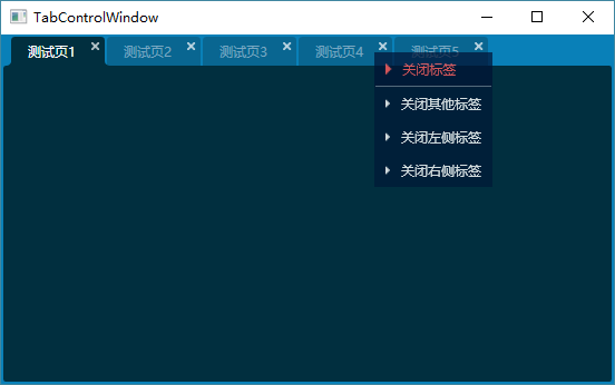
效果图:
WPF自定义TabControl样式的更多相关文章
- WPF自定义Window样式(2)
1. 引言 在上一篇中,介绍了如何建立自定义窗体.接下来,我们需要考虑将该自定义窗体基类放到类库中去,只有放到类库中,我们才能在其他地方去方便的引用该基类. 2. 创建类库 接上一篇的项目,先添加一个 ...
- WPF自定义Window样式(1)
1. 引言 WPF是制作界面的一大利器.最近在做一个项目,用的就是WPF.既然使用了WPF了,那么理所当然的,需要自定义窗体样式.所使用的代码是在网上查到的,遗憾的是,整理完毕后,再找那篇帖子却怎么也 ...
- WPF 自定义ComboBox样式,自定义多选控件
原文:WPF 自定义ComboBox样式,自定义多选控件 一.ComboBox基本样式 ComboBox有两种状态,可编辑和不可编辑状态.通过设置IsEditable属性可以切换控件状态. 先看基本样 ...
- WPF 自定义MenuItem样式
原文:WPF 自定义MenuItem样式 一.前言 默认的MenuItem样式比较普通,这次自定义MenuItem的样式也只是对MenuItem的颜色风格进行变化.需要其他功能的变化,大家可以根据样式 ...
- WPF 自定义TabControl控件样式
一.前言 程序中经常会用到TabControl控件,默认的控件样式很普通.而且样式或功能不一定符合我们的要求.比如:我们需要TabControl的标题能够居中.或平均分布:或者我们希望TabContr ...
- WPF 自定义滚动条样式
先看一下效果: 先分析一下滚动条有哪儿几部分组成: 滚动条总共有五部分组成: 两端的箭头按钮,实际类型为RepeatButton Thumb 两端的空白,实际也是RepeatButton 最后就是Th ...
- WPF 自定义CheckBox样式
自定义CheckBox样式,mark一下,方便以后参考复用 设计介绍: 1.一般CheckBox模板太难看了,肯定要重写其中的模板 2.模板状态为未选中状态和选中状态,设置为默认未选中就好了. 默认状 ...
- WPF 自定义Calendar样式(日历样式,周六周日红色显示)
一.WPF日历控件基本样式 通过Blend获取到Calendar需要设置的三个样式CalendarStyle.CalendarButtonStyle.CalendarDayButtonStyle.Ca ...
- WPF:自定义Metro样式文件夹选择对话框FolderBrowserDialog
1.前言 WPF并没有文件选择对话框,要用也就只有使用Winform版的控件.至今我也没有寻找到一个WPF版本的文件选择对话框. 可能是我眼浊,如果各位知道有功能比较健全的WPF版文件选择对话框.文件 ...
随机推荐
- MySQL复制(Replication)
引自:http://www.cnblogs.com/hustcat/archive/2009/12/19/1627525.html 1.复制概述 1.1.复制解决的问题数据复制技术有以下一些特点:(1 ...
- maven install 找不到符号问题
看报错信息是找不到 javax.servlet 包 .这个是tomcat 内的jar包.但是我build path 查看是加了tomcat 的.. 最后在pom.xml 添加依赖 <depend ...
- 安装linux子系统, 如何用win10 里面的linux子系统来进行通信
cd /mnt/d/linux_share即可 就把linux_share这个目录挂载到linux里面了.这样windows和linux可以同时修改和访问这个文件夹里面的内容. 安装:cmd中输入ba ...
- javascript对象bind()方法兼容处理
bind() 函数在 ECMA-262 第五版才被加入:它可能无法在所有浏览器上运行.你可以部份地在脚本开头加入以下代码,就能使它运作,让不支持的浏览器也能使用 bind() 功能 if (!Func ...
- rails 数据迁移出问题
数据migrate重置 rails db:migrate:reset 具体的,,还不清楚,想起来了再去补充
- ATM自动取款机程序感想
上周四的Java考试,老师并没有我们考暑假给我们布置的样卷的java程序,而是让我们做一个设计ATM的程序,然而这个对于我们来说好难,因为暑假没有学好java,首先基础知识还没有掌握,输入数据一开始都 ...
- MySql常用命令集
MySql 常用命令集 Mysql常用命令 show databases; 显示数据库 create database name; 创建数据库 use databasename; 选择数据库 drop ...
- 2018.11.06 NOIP训练 简单的计数问题(计数dp)
传送门 直接f[i][j]f[i][j]f[i][j]表示已经到第iii个位置已经找到jjj个的方案数. 简单转移一下就行了. 代码
- java的Scanner获取输入内容
//导入 scanner的包 import java.util.Scanner; Scanner scanner = new Scanner(System.in); System.out.printl ...
- hadoop配置分区
1.运行MR,得出HDFS路径下数据 2.创建 Hive 表 映射 HDFS下的数据 3.为数据创建分区,在hive下执行 source 分区表: TIPS:结果集的时间,必须在分区范围内: 可以理解 ...