UI设计师的 Android 备忘录
Dimensions
Screen densities and icon dimensions
| Qualifier | DPI | Coefficient | Launcher icon | Action bar, tab icon | Notification icon (API 11) | Notification icon (API 9) | Notification icon (older) |
|---|---|---|---|---|---|---|---|
| ldpi | 120 | 0.75 | 36 x 36 32 x 32 |
24 x 24 18 x 18 |
18 x 18 16 x 16 |
12 x 19 12 x 12 |
19 x 19 16 x 16 |
| mdpi | 160 | 1.0 | 48 x 48 42 x 42 |
32 x 32 24 x 24 |
24 x 24 22 x 22 |
16 x 25 16 x 16 |
25 x 25 21 x 21 |
| hdpi | 240 | 1.5 | 72 x 72 64 x 64 |
48 x 48 36 x 36 |
36 x 36 33 x 33 |
24 x 38 24 x 24 |
38 x 38 32 x 32 |
| xhdpi | 320 | 2.0 | 96 x 96 84 x 84 |
64 x 64 48 x 48 |
48 x 48 44 x 44 |
32 x 50 32 x 32 |
50 x 50 42 x 42 |
| xxhdpi | 480 | 3.0 | 144 x 144 126 x 126 |
96 x 96 72 x 72 |
72 x 72 66 x 66 |
48 x 75 48 x 48 |
75 x 75 63 x 63 |
Notice: the first icon dimension in table cell is full asset size, the second icon dimension is optical square. Dimension values are in pixels.
Sources and useful links: Iconography, Supporting
Multiple Screens, Icon Design Guidelines, Dimension
Google Play asset dimensions
| Asset Type | Required | Image type | Dimension |
|---|---|---|---|
| Screenshot | yes | JPEG or 24-bit PNG (no alpha) |
min length for any side: 320 px max length for any side: 3840 px |
| High-res app icon | yes | 32-bit PNG (with alpha) |
512 x 512 px |
| Feature graphic | no | JPEG or 24-bit PNG (no alpha) |
1024 x 500 px |
| Promotional graphic | no | JPEG or 24-bit PNG (no alpha) |
180 x 120 px |
| Video link | no | URL of YouTube video | - |
Sources and useful links: Graphic and Image Assets, Google
Play Featured-Image Guidelines, Iconography
Size buckets
| Type | Dimension |
|---|---|
| Handset | smaller than 600 dp |
| Tablet | larger than or equal 600 dp |
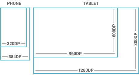
Notice: one dp (density-independent pixels) is one pixel on a 160 DPI screen.
Sources and useful links: Metrics and Grids
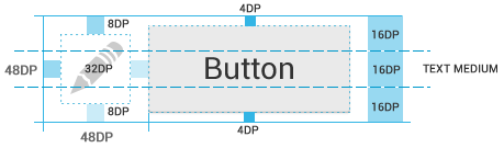
Views dimensions and spacing
Touchable UI components are generally laid out along 48 dp units. Spacing between each UI element is 8 dp.

Sources and useful links: Metrics and Grids
Action bar height
| Qualifier | Dimension |
|---|---|
| Portrait | 48 dp |
| Landscape | 40 dp |
| Tablet | 56 dp |
Sources and useful links: Action Bar
Text size
| Type | Dimension |
|---|---|
| Micro | 12 sp |
| Small | 14 sp |
| Medium | 18 sp |
| Large | 22 sp |
Notice: one sp (scale-independent pixels) is one pixel on a 160 DPI screen if the user’s global text scale is set to 100%.
Sources and useful links: Typography
Images and themes
Nine-patch
A Nine-patch drawable is a stretchable bitmap image, which Android will automatically resize to accommodate the contents of the view in which you have placed it as the background, e.g. nine-patch background
for button, which must stretch to accommodate strings of various lengths. The rules for nine-patch image are following:
- Standard PNG image with alpha
- Filename suffix is “.9.png”, e.g. “btn_login_normal.9.png”
- Image has an extra 1 pixel wide border, used to define the stretchable/static/padding areas
- Stretchable sections are indicated by 1 px wide black line(s) in the left and top part of the border
- Static sections are indicated by fully transparent or white pixels
- Padding area (optional) is indicated by 1 px wide black line in the right and bottom part of the border

Sources and useful links: Canvas and Drawables, Draw
9-patch
Colors
Use color primarily for emphasis. Blue is the standard accent color in Android’s color palette. Note that red and green may be indistinguishable to color-blind users. Primary colors are as follows:
- #33B5E5
- #AA66CC
- #99CC00
- #FFBB33
- #FF4444
- #0099CC
- #9933CC
- #669900
- #FF8800
- #CC0000
Sources and useful links: Color
Holo themes
Android provides three system themes:
- Holo Light
- Holo Dark
- Holo Light with dark action bar
Sources and useful links: Themes, Holo
Everywhere
Naming conventions
Naming conventions for drawables
File names must contain only lowercase a-z, 0-9, or _.
Drawables for the specific views (ListView, TextView, EditText, ProgressBar, CheckBox etc.) should be named like this
views keeping the naming rules, e.g. drawable for CheckBox should be named “checkbox_on_bg.png”.
| Asset Type | Prefix | Example |
|---|---|---|
| Action bar | ab_ |
ab_stacked.9.png |
| Button | btn_ |
btn_send_pressed.9.png |
| Dialog | dialog_ |
dialog_top.9.png |
| Divider | divider_ |
divider_horizontal.9.png |
| Icon | ic_ |
ic_star.png |
| Menu | menu_ |
menu_submenu_bg.9.png |
| Notification | notification_ |
notification_bg.9.png |
| Tabs | tab_ |
tab_pressed.9.png |
Sources and useful links: naming conventions taken from the Android SDK
Naming conventions for icon assets
| Asset Type | Prefix | Example |
|---|---|---|
| Icons | ic_ |
ic_star.png |
| Launcher icons | ic_launcher |
ic_launcher_calendar.png |
| Action bar icons | ic_menu |
ic_menu_archive.png |
| Status bar icons | ic_stat_notify |
ic_stat_notify_msg.png |
| Tab icons | ic_tab |
ic_tab_recent.png |
| Dialog icons | ic_dialog |
ic_dialog_info.png |
Sources and useful links: Icon Design Guidelines
Naming conventions for selector states
| State | Suffix | Example |
|---|---|---|
| Normal | _normal |
btn_order_normal.9.png |
| Pressed | _pressed |
btn_order_pressed.9.png |
| Focused | _focused |
btn_order_focused.9.png |
| Disabled | _disabled |
btn_order_disabled.9.png |
| Selected | _selected |
btn_order_selected.9.png |
Sources and useful links: Touch Feedback
Organizing drawables to directories
One drawable must have the same file name for all screen densities (ldpi, mdpi, hdpi etc.) and all these files must be organized according to density into the following directories. Here’s the resources directory structure
for drawables:
- res
- drawable-ldpi
- drawable-mdpi
- drawable-hdpi
- drawable-xhdpi
- drawable-xxhdpi
Resources
Graphic generators
Useful links for designers
- Android Design Guidelines
- Android Design in Action
- Android Niceties
- Android Views
- Droidstyle
- Holo Everywhere
Download
Android Icon Templates Pack v4.0
Source: Android Developers
Android Design 08/2012
Source: Android Developers
Android UI Design Kit PSD 4.2
Source: Taylor Ling on Android UI & UX
Android Developer Icons – Photoshop Shapes
Source: Spiderfly Apps
Written by
Copyright © 2013 Petr Nohejl, www.petrnohejl.cz
Found some mistake? Something is missing? Let me know or send pull request.
Thanks to Peter Kahoun for KUCSS and Google Android for great documentation.
This work is licensed under a Creative Commons Attribution-ShareAlike 3.0 Unported License.
Read more: http://blog.chengyunfeng.com/?p=487#ixzz31Jcg6utq
UI设计师的 Android 备忘录的更多相关文章
- UI设计师给的px尺寸单位,安卓如何换算成dp?
很多UI工程师为了适配IOS,常常拿IOS手机作用参考模型,设计出来的UI稿只有PX标注的.他们也不懂Android的dp和sp单位是怎么回事.这个时候我们Android工程师如果不注意怎么转换的话, ...
- 2019,UI设计师必备神器
2019年将会是你全新起航的一年,相信你已经制定了很多规划,正在开启第一步的推动. 作为对UI设计师更大程度的支持,今天特意为你分享一款释放你双手的设计神器.让你可以把时间和精力投入到设计本身,这 ...
- 那些年,UI设计师还在手工标注和切图时走的弯路
在我从事UI设计师这几年的工作中逐渐发现,最让人糟心的不是应付各种奇葩的需求,完成设计稿,而是交付.每次交付的设计稿和最后开发出来的产品总是让我心塞无比,很少最终产品和我的设计稿是完全一致的. UI设 ...
- UI设计师不可不知的安卓屏幕知识-安卓100分享
http://www.android100.org/html/201505/24/149342.html UI设计师不可不知的安卓屏幕知识-安卓100分享 不少设计师和工程师都被安卓设备纷繁的屏幕搞得 ...
- 《好设计不简单Ⅱ:UI设计师必须了解的那些事》
<好设计不简单Ⅱ:UI设计师必须了解的那些事> 基本信息 作者: (日)古贺直树 译者: 张君艳 丛书名: 图灵交互设计丛书 出版社:人民邮电出版社 ISBN:9787115363435 ...
- 原来这就是 UI 设计师的门槛
本文主要分享 UI 设计师入行的一些个人经验指南,希望可以带给新入行业的设计师一点帮助! 写在前面 随着互联网的不断发展,特别是移动互联网的不断成熟,视觉设计师也进行了迭代与细分.衍生出的 UI 设计 ...
- 如何减少UI设计师产品与前端工程师的沟通成本
在日常工作中,UI设计师/产品与前端工程师难免会有一些冲突,这是我的一些小建议. 1.如何减少时间成本 先制作UI组件,再拼接页面 如果UI给前端的是一堆页面,前端需要花一些时间去整理提取UI组件.另 ...
- 网易微专业 UI设计师
网易云课堂的UI设计师微专业,需要的留言
- 超全面!UI设计师如何适配2018新款iPhone
北京时间9月13日凌晨1点,苹果在美国加利福尼亚州的Apple Park园区召开了2018年苹果秋季新品发布会. 很多人对这次科技界的春晚充满了期待,除了那些让人“剁手”的新品,设计师关注的还有新手机 ...
随机推荐
- 第五篇:web之前端之float的几种清除浮动方式
前端之float的几种清除浮动方式 前端之float的几种清除浮动方式 本节内容 1.float清除方式1 2.float清除方式2 3.float清除方式3 4.float清除方式4 1.flo ...
- H TML5 之 (6)下雨效果
在对HTML5进行研究之后,有了一点想法,思考出游戏其实感觉就是四个步骤 1.创建一个你需要的对象,赋予属性(一些影响方法的属性),方法(运动,叫....) 2.实例化这个对象,让它成为一个或者多个个 ...
- 在.Net框架中 C# 实现多线程的同步方法详解
本文主要描述在C#中线程同步的方法.线程的基本概念网上资料也很多就不再赘述了.直接接入主题,在多线程开发的应用中,线程同步是不可避免的.在.Net框架中,实现线程同步主要通过以下的几种方式来实现,在M ...
- delphi 截取指定符号之间的字符串-随机读取
unit Unit1; interface uses Winapi.Windows, Winapi.Messages, System.SysUtils, System.Variants, Syste ...
- Android 点击事件,4种回调。
1. 继承监听接口. 2. xml方式 : 设置 android:onClick 3. 内部类 4. 匿名类 ------------------------------------------- ...
- lower_bound()函数
头文件 # include<algorithm> 函数简介 lower_bound()返回一个 iterator 它指向在[first,last)标记的有序序列中可以插入value,而不会 ...
- ARM开发板系统移植-----kernel的编译
前面一篇文章http://www.cnblogs.com/linzizhang/p/4817336.html介绍了开发板上系统软件的第一部分--bootloader的编译方法. 背景:把bootloa ...
- tomcat gc问题总结
Java内存泄露监控工具:JVM监控工具介绍 http://developer.51cto.com/art/201203/321431.htm 关于施用full gc频繁的分析及解决 http:/ ...
- Centos 6 设置静态 IP 地址
编辑文件进行IP设置: [root@test1 ~]# vi /etc/sysconfig/network-scripts/ifcfg-eth0 原文件内容前面加#被注释掉 下面为新加的内容 #DEV ...
- DOM 操作内容 innerText/innerHTML
DOM 操作内容 innerText/innerHTML innerText属性(firefox不支持,可用 textContent)var div = document.getElementById ...