[WPF自定义控件库]了解如何自定义ItemsControl
1. 前言
对WPF来说ContentControl和ItemsControl是最重要的两个控件。
顾名思义,ItemsControl表示可用于呈现一组Item的控件。大部分时候我们并不需要自定义ItemsControl,因为WPF提供了一大堆ItemsControl的派生类:HeaderedItemsControl、TreeView、Menu、StatusBar、ListBox、ListView、ComboBox;而且配合Style或DataTemplate足以完成大部分的定制化工作,可以说ItemsControl是XAML系统灵活性的最佳代表。不过,既然它是最常用的控件,那么掌握一些它的原理对所有WPF开发者都有好处。
我以前写过一篇文章介绍如何模仿ItemsControl,并且博客园也已经很多文章深入介绍ItemsControl的原理,所以这篇文章只介绍简单的自定义ItemsControl知识,通过重写GetContainerForItemOverride和IsItemItsOwnContainerOverride、PrepareContainerForItemOverride函数并使用ItemContainerGenerator等自定义一个简单的IItemsControl控件。
2. 介绍作为例子的Repeater
作为教学我创建了一个继承自ItemsControl的控件Repeater(虽然简单,用来展示资料的话好像还真的有点用)。它的基本用法如下:
<local:Repeater>

    <local:RepeaterItem Content="1234999"

                        Label="Product ID" />

    <local:RepeaterItem Content="Power Projector 4713"

                        Label="IGNORE" />

    <local:RepeaterItem Content="Projector (PR)"

                        Label="Category" />

    <local:RepeaterItem Content="A very powerful projector with special features for Internet usability, USB"

                        Label="Description" />

</local:Repeater>
也可以不直接使用Items,而是绑定ItemsSource并指定DisplayMemberPath和LabelMemberPath。
public class Product

{

    public string Key { get; set; }

    public string Value { get; set; }

    public static IEnumerable<Product> Products

    {

        get

        {

            return new List<Product>

            {

                new Product{Key="Product ID",Value="1234999" },

                new Product{Key="IGNORE",Value="Power Projector 4713" },

                new Product{Key="Category",Value="Projector (PR)" },

                new Product{Key="Description",Value="A very powerful projector with special features for Internet usability, USB" },

                new Product{Key="Price",Value="856.49 EUR" },

            };

        }

    }

}
<local:Repeater ItemsSource="{x:Static local:Product.Products}"

                DisplayMemberPath="Value"

                LabelMemberPath="Key"/>
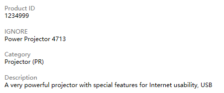
运行结果如下图:
3. 实现
确定好需要实现的ItemsControl后,通常我大致会使用三步完成这个ItemsControl:
- 定义ItemContainer
- 关联ItemContainer和ItemsControl
- 实现ItemsControl的逻辑
3.1 定义ItemContainer
派生自ItemsControl的控件通常都会有匹配的子元素控件,如ListBox对应ListBoxItem,ComboBox对应ComboBoxItem。如果ItemsControl的Items内容不是对应的子元素控件,ItemsControl会创建对应的子元素控件作为容器再把Item放进去。
<ListBox>

    <system:String>Item1</system:String>

    <system:String>Item2</system:String>

</ListBox>
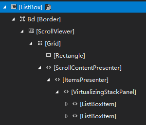
例如这段XAML中,Item1和Item2是ListBox的LogicalChildren,而它们会被ListBox封装到ListBoxItem,ListBoxItem才是ListBox的VisualChildren。在这个例子中,ListBoxItem可以称作ItemContainer。
ItemsControl派生类的ItemContainer控件要使用父元素名称做前缀、-Item做后缀,例如ComboBox的子元素ComboBoxItem,这是WPF约定俗成的做法(不过也有TabControl和TabItem这种例外)。Repeater也派生自ItemsControl,Repeatertem即为Repeater的ItemContainer控件。
public RepeaterItem()

{

    DefaultStyleKey = typeof(RepeaterItem);

}

public object Label

{

    get => GetValue(LabelProperty);

    set => SetValue(LabelProperty, value);

}

public DataTemplate LabelTemplate

{

    get => (DataTemplate)GetValue(LabelTemplateProperty);

    set => SetValue(LabelTemplateProperty, value);

}
<Style TargetType="local:RepeaterItem">

    <Setter Property="Padding"

            Value="8" />

    <Setter Property="Template">

        <Setter.Value>

            <ControlTemplate TargetType="local:RepeaterItem">

                <Border BorderBrush="{TemplateBinding BorderBrush}"

                        BorderThickness="{TemplateBinding BorderThickness}"

                        Background="{TemplateBinding Background}">

                    <StackPanel Margin="{TemplateBinding Padding}">

                        <ContentPresenter Content="{TemplateBinding Label}"

                                          ContentTemplate="{TemplateBinding LabelTemplate}"

                                          VerticalAlignment="Center"

                                          TextBlock.Foreground="#FF777777" />

                        <ContentPresenter x:Name="ContentPresenter" />

                    </StackPanel>

                </Border>

            </ControlTemplate>

        </Setter.Value>

    </Setter>

</Style>
上面是RepeaterItem的代码和DefaultStyle。RepeaterItem继承ContentControl并提供Label、LabelTemplate。DefaultStyle的做法参考ContentControl。
3.2 关联ItemContainer和ItemsControl
<Style TargetType="{x:Type local:Repeater}">

    <Setter Property="ScrollViewer.VerticalScrollBarVisibility"

            Value="Auto" />

    <Setter Property="Template">

        <Setter.Value>

            <ControlTemplate TargetType="{x:Type local:Repeater}">

                <Border BorderBrush="{TemplateBinding BorderBrush}"

                        BorderThickness="{TemplateBinding BorderThickness}"

                        Background="{TemplateBinding Background}">

                    <ScrollViewer Padding="{TemplateBinding Padding}">

                        <ItemsPresenter />

                    </ScrollViewer>

                </Border>

            </ControlTemplate>

        </Setter.Value>

    </Setter>

</Style>
如上面XAML所示,Repeater的ControlTemplate中需要提供一个ItemsPresenter,用于指定ItemsControl中的各Item摆放的位置。
[StyleTypedProperty(Property = "ItemContainerStyle", StyleTargetType = typeof(RepeaterItem))]

public class Repeater : ItemsControl

{

    public Repeater()

    {

        DefaultStyleKey = typeof(Repeater);

    }

    protected override bool IsItemItsOwnContainerOverride(object item)

    {

        return item is RepeaterItem;

    }

    protected override DependencyObject GetContainerForItemOverride()

    {

        var item = new RepeaterItem();

        return item;

    }

}
Repeater的基本代码如上所示。要将Repeater和RepeaterItem关联起来,除了使用约定俗成的命名方式告诉用户,还需要使用下面两步:
重写 GetContainerForItemOverride
protected virtual DependencyObject GetContainerForItemOverride () 用于返回Item的Container。Repeater返回的是RepeaterItem。
重写 IsItemItsOwnContainer
protected virtual bool IsItemItsOwnContainerOverride (object item),确定Item是否是(或者是否可以作为)其自己的Container。在Repeater中,只有RepeaterItem返回True,即如果Item的类型不是RepeaterItem,就将它作使用RepeaterItem包装起来。
完成上面几步后,为Repeater设置ItemsSource的话Repeater将会创建对应的RepeaterItem并添加到自己的VisualTree下面。
使用 StyleTypedPropertyAttribute
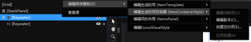
最后可以在Repeater上添加StyleTypedPropertyAttribute,指定ItemContainerStyle的类型为RepeaterItem。添加这个Attribute后在Blend中选择“编辑生成项目的容器(ItemContainerStyle)”就会默认使用RepeaterItem的样式。
3.3 实现ItemsControl的逻辑
public string LabelMemberPath

{

    get => (string)GetValue(LabelMemberPathProperty);

    set => SetValue(LabelMemberPathProperty, value);

}

/*LabelMemberPathProperty Code...*/

protected virtual void OnLabelMemberPathChanged(string oldValue, string newValue)

{

    // refresh the label member template.

    _labelMemberTemplate = null;

    var newTemplate = LabelMemberPath;

    int count = Items.Count;

    for (int i = 0; i < count; i++)

    {

        if (ItemContainerGenerator.ContainerFromIndex(i) is RepeaterItem RepeaterItem)

            PrepareRepeaterItem(RepeaterItem, Items[i]);

    }

}

private DataTemplate _labelMemberTemplate;

private DataTemplate LabelMemberTemplate

{

    get

    {

        if (_labelMemberTemplate == null)

        {

            _labelMemberTemplate = (DataTemplate)XamlReader.Parse(@"

            <DataTemplate xmlns=""http://schemas.microsoft.com/winfx/2006/xaml/presentation""

                        xmlns:x=""http://schemas.microsoft.com/winfx/2006/xaml"">

            		<TextBlock Text=""{Binding " + LabelMemberPath + @"}"" VerticalAlignment=""Center""/>

            </DataTemplate>");

        }

        return _labelMemberTemplate;

    }

}

protected override void PrepareContainerForItemOverride(DependencyObject element, object item)

{

    base.PrepareContainerForItemOverride(element, item);

    if (element is RepeaterItem RepeaterItem )

    {

        PrepareRepeaterItem(RepeaterItem,item);

    }

}

private void PrepareRepeaterItem(RepeaterItem RepeaterItem, object item)

{

    if (RepeaterItem == item)

        return;

    RepeaterItem.LabelTemplate = LabelMemberTemplate;

    RepeaterItem.Label = item;

}
Repeater本身没什么复杂的逻辑,只是模仿DisplayMemberPath添加了LabelMemberPath和LabelMemberTemplate属性,并把这个属性和RepeaterItem的Label和'LabelTemplate'属性关联起来,上面的代码即用于实现这个功能。
LabelMemberPath和LabelMemberTemplate
Repeater动态地创建一个内容为TextBlock的DataTemplate,这个TextBlock的Text绑定到LabelMemberPath。
XamlReader相关的技术我在如何使用代码创建DataTemplate这篇文章里讲解了。
ItemContainerGenerator.ContainerFromIndex
ItemContainerGenerator.ContainerFromIndex(Int32)返回ItemsControl中指定索引处的Item,当Repeater的LabelMemberPath改变时,Repeater首先强制更新了LabelMemberTemplate,然后用ItemContainerGenerator.ContainerFromIndex找到所有的RepeaterItem并更新它们的Label和LabelTemplate。
PrepareContainerForItemOverride
protected virtual void PrepareContainerForItemOverride (DependencyObject element, object item) 用于在RepeaterItem添加到UI前为其做些准备工作,其实也就是为RepeaterItem设置Label和LabelTemplate而已。
4. 结语
实际上WPF的ItemsControl很强大也很复杂,源码很长,对初学者来说我推荐参考Moonlight中的实现(Moonlight, an open source implementation of Silverlight for Unix systems),上面LabelMemberTemplate的实现就是抄Moonlight的。Silverlight是WPF的简化版,Moonlight则是很久没维护的Silverlight的简陋版,这使得Moonlight反而成了很优秀的WPF教学材料。
当然,也可以参考Silverlight的实现,使用JustDecompile可以轻松获取Silverlight的源码,这也是很好的学习材料。不过ItemsControl的实现比Moonlight多了将近一倍的代码。

5. 参考
ItemsControl Class (System.Windows.Controls) Microsoft Docs
moon_ItemsControl.cs at master
ItemContainer Control Pattern - Windows applications _ Microsoft Docs
[WPF自定义控件库]了解如何自定义ItemsControl的更多相关文章
- [WPF自定义控件库]使用WindowChrome自定义RibbonWindow
原文:[WPF自定义控件库]使用WindowChrome自定义RibbonWindow 1. 为什么要自定义RibbonWindow 自定义Window有可能是设计或功能上的要求,可以是非必要的,而自 ...
- WPF自定义控件与样式(13)-自定义窗体Window & 自适应内容大小消息框MessageBox
一.前言 申明:WPF自定义控件与样式是一个系列文章,前后是有些关联的,但大多是按照由简到繁的顺序逐步发布的等,若有不明白的地方可以参考本系列前面的文章,文末附有部分文章链接. 本文主要内容: 自定义 ...
- WPF自定义控件与样式(2)-自定义按钮FButton
一.前言.效果图 申明:WPF自定义控件与样式是一个系列文章,前后是有些关联的,但大多是按照由简到繁的顺序逐步发布的等,若有不明白的地方可以参考本系列前面的文章,文末附有部分文章链接. 还是先看看效果 ...
- WPF 如何创建自己的WPF自定义控件库
在我们平时的项目中,我们经常需要一套自己的自定义控件库,这个特别是在Prism这种框架下面进行开发的时候,每个人都使用一套统一的控件,这样才不会每个人由于界面不统一而造成的整个软件系统千差万别,所以我 ...
- [WPF自定义控件库] 关于ScrollViewer和滚动轮劫持(scroll-wheel-hijack)
原文:[WPF自定义控件库] 关于ScrollViewer和滚动轮劫持(scroll-wheel-hijack) 1. 什么是滚动轮劫持# 这篇文章介绍一个很简单的继承自ScrollViewer的控件 ...
- [WPF自定义控件库] 让Form在加载后自动获得焦点
原文:[WPF自定义控件库] 让Form在加载后自动获得焦点 1. 需求 加载后让第一个输入框或者焦点是个很基本的功能,典型的如"登录"对话框.一般来说"登录" ...
- 【转】WPF自定义控件与样式(13)-自定义窗体Window & 自适应内容大小消息框MessageBox
一.前言 申明:WPF自定义控件与样式是一个系列文章,前后是有些关联的,但大多是按照由简到繁的顺序逐步发布的等. 本文主要内容: 自定义Window窗体样式: 基于自定义窗体实现自定义MessageB ...
- [WPF自定义控件库]简单的表单布局控件
1. WPF布局一个表单 <Grid Width="400" HorizontalAlignment="Center" VerticalAlignment ...
- 【转】WPF自定义控件与样式(2)-自定义按钮FButton
一.前言.效果图 申明:WPF自定义控件与样式是一个系列文章,前后是有些关联的,但大多是按照由简到繁的顺序逐步发布的等 还是先看看效果图吧: 定义Button按钮名称叫FButton,主要是集成了 ...
随机推荐
- django 模板中通过变量替代key取字典内容
模板中通过变量替代key取字典内容 templatetags/├── get_item.py├── __init__.py ###get_item.py # coding=utf-8 from dja ...
- 使用mutt+msmtp做linux邮件客户端
下载MSMTP wget http://nchc.dl.sourceforge.net/sourceforge/msmtp/msmtp-1.4.17.tar.bz2 tar xvf msmtp-1 ...
- CodeForcesdiv1:995C - Leaving the Bar(随机算法+贪心)
For a vector →v=(x,y)v→=(x,y), define |v|=√x2+y2|v|=x2+y2. Allen had a bit too much to drink at the ...
- 关于Django ORM filter方法小结
django filter是一个过滤器,相当于SQL的select * from where. filter返回一个QuerySet对象,还可以在该对象上继续进行django orm 该有的操作. 有 ...
- DB2 Error Messages (Sorted by SQLCODE)
DB2 Error Messages (Sorted by SQLCODE) DB2 Error Messages (Sorted by SQLCODE) SQLCODE SQLSTATE Descr ...
- LED接口
通常我们都听到别人说DVI接口.VGA接口等,可是这些接口是什么意思,led显示屏厂家小编为您解析其含义与不同之处. 1.DVI接口 DVI接口相校于VGA.HDMI.DP等接口来说体积较大,是目 ...
- maven+eclpse+jmeter+jenkis
1.maven配置:http://www.cnblogs.com/AlanLee/p/6133189.html 2.在eclipse中创建maven项目:https://jingyan.baidu.c ...
- bzoj4453
单调栈+set+后缀数组 一道奇妙的题 这道题如果对于每个询问$r$是固定的,那么就很简单了,可惜并不是 由于r会变化,那么对于两个子串$[i...r],[j...r]$,他们的大小关系随着r的变化也 ...
- 【opencv学习笔记六】图像的ROI区域选择与复制
图像的数据量还是比较大的,对整张图片进行处理会影响我们的处理效率,因此常常只对图像中我们需要的部分进行处理,也就是感兴趣区域ROI.今天我们来看一下如何设置图像的感兴趣区域ROI.以及对ROI区域图像 ...
- BootStrap 概念
网格系统中的缩写; xs extra small sm smal md middle/medium lg large