Vue【原创】下划线动态效果按钮,一般按钮模式,开关切换模式
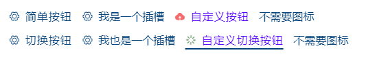
效果图:
1.icon-button 一般按钮模式:
  1 <template>

  2     <div class="icon-button" :style="{ color: font.color }" @click="onclick">

  3         <i :class="[icon.type]" :style="{ color: icon.color, fontSize: icon.size }" class="right" v-if="showIcon"></i>

  4         <slot>

  5             <span class="text" :style="{ fontSize: font.size }">{{ title }}</span>

  6         </slot>

  7     </div>

  8 </template>

  9

 10 <script>

 11 export default {

 12     name: 'LiloIconButton',

 13     props: {

 14         title: {

 15             type: String,

 16             default: '',

 17             required: false

 18         },

 19         showIcon: {

 20             type: Boolean,

 21             default: true

 22         },

 23         icon: {

 24             type: Object,

 25             default() {

 26                 return {

 27                     type: 'el-icon-setting',

 28                     size: '1em',

 29                     color: '#00417a'

 30                 };

 31             },

 32             required: false

 33         },

 34         font: {

 35             type: Object,

 36             default() {

 37                 return {

 38                     size: '1em',

 39                     color: '#00417a'

 40                 };

 41             },

 42             required: false

 43         }

 44     },

 45     data() {

 46         return {

 47             selected: true

 48         };

 49     },

 50     methods: {

 51         onclick() {

 52             this.selected = !this.selected;

 53             this.$emit('toggle', this.selected);

 54         }

 55     }

 56 };

 57 </script>

 58

 59 <style lang="scss" scoped>

 60

 61 $blue: #00417a;

 62

 63 .icon-button {

 64     -webkit-transition: all 0.3s ease 0s;

 65     transition: all 0.3s ease 0s;

 66     cursor: pointer;

 67     text-align: center;

 68     display: inline-block;

 69     -moz-user-select: none;

 70     -webkit-user-select: none;

 71     user-select: none;

 72     .right{

 73         margin-right: 3px;

 74     }

 75     &:after {

 76         content: ' ';

 77         // position: absolute;

 78         z-index: 2;

 79         // bottom: -5px;

 80         margin-left: 50%;

 81         margin-top: 2px;

 82         display: block;

 83         width: 100%;

 84         height: 2px;

 85         transform: translate(-50%);

 86     }

 87     &:hover:after {

 88         height: 2px;

 89         animation: add_width 0.2s ease forwards;

 90         background: $blue;

 91     }

 92     @keyframes add_width {

 93         from {

 94             width: 0;

 95         }

 96         to {

 97             width: 100%;

 98         }

 99     }

100     .text {

101         letter-spacing: 1px;

102     }

103 }

104 </style>
2.icon-switcher 开关切换按钮模式:
  1 <template>

  2     <div class="icon-switcher" :style="{ color: font.color }" :class="[selected ? 'active' : 'deactive']" @click="onclick">

  3         <i :class="[icon.type]" :style="{ color: icon.color, fontSize: icon.size }" class="right"></i>

  4         <slot>

  5             <span class="text" :style="{ fontSize: font.size }">{{ title }}</span>

  6         </slot>

  7     </div>

  8 </template>

  9

 10 <script>

 11 export default {

 12     name: 'LiloIconSwitcher',

 13     props: {

 14         title: {

 15             type: String,

 16             default: '',

 17             required: false

 18         },

 19         icon: {

 20             type: Object,

 21             default() {

 22                 return {

 23                     type: 'el-icon-setting',

 24                     size: '1em',

 25                     color: '#00417a'

 26                 };

 27             },

 28             required: false

 29         },

 30         font: {

 31             type: Object,

 32             default() {

 33                 return {

 34                     size: '1em',

 35                     color: '#00417a'

 36                 };

 37             },

 38             required: false

 39         },

 40         checked: {

 41             type: Boolean,

 42             default: false,

 43             required: false

 44         }

 45     },

 46     data() {

 47         return {

 48             selected: this.checked

 49         };

 50     },

 51     methods: {

 52         onclick() {

 53             this.selected = !this.selected;

 54             this.$emit('toggle', this.selected);

 55         }

 56     }

 57 };

 58 </script>

 59

 60 <style lang="scss" scoped>

 61

 62 $blue: #00417a;

 63

 64 .icon-switcher {

 65     -webkit-transition: all 0.3s ease 0s;

 66     transition: all 0.3s ease 0s;

 67     cursor: pointer;

 68     text-align: center;

 69     display: inline-block;

 70     -moz-user-select: none;

 71     -webkit-user-select: none;

 72     user-select: none;

 73     .right {

 74         margin-right: 3px;

 75     }

 76     &.active {

 77         &:after {

 78             content: ' ';

 79             z-index: 2;

 80             margin-left: 50%;

 81             margin-top: 2px;

 82             display: block;

 83             width: 100%;

 84             height: 2px;

 85             transform: translate(-50%);

 86             background: $blue;

 87         }

 88     }

 89     &.deactive {

 90         &:after {

 91             content: ' ';

 92             z-index: 2;

 93             margin-left: 50%;

 94             margin-top: 2px;

 95             display: block;

 96             width: 100%;

 97             height: 2px;

 98             transform: translate(-50%);

 99         }

100     }

101     &:hover:after {

102         height: 2px;

103         animation: add_width 0.2s ease forwards;

104         background: $blue;

105     }

106     @keyframes add_width {

107         from {

108             width: 0;

109         }

110         to {

111             width: 100%;

112         }

113     }

114     .text {

115         letter-spacing: 1px;

116     }

117 }

118

119 </style>
调用示例:
 1     <div class="mt-10">

 2             <lilo-icon-button class="mr-10" title="简单按钮"></lilo-icon-button>

 3             <lilo-icon-button class="mr-10"><span>我是一个插槽</span></lilo-icon-button>

 4             <lilo-icon-button

 5                 class="mr-10"

 6                 title="自定义按钮"

 7                 :icon="{ type: 'el-icon-upload', color: '#f56c6c', size: '1rem' }"

 8                 :font="{ color: '#5500ff', size: '1rem' }"

 9                 @toggle="toggle"

10             ></lilo-icon-button>

11             <lilo-icon-button class="mr-10" :showIcon="false"><span>不需要图标</span></lilo-icon-button>

12         </div>

13         <div class="mt-10">

14             <lilo-icon-switcher class="mr-10" title="切换按钮"></lilo-icon-switcher>

15             <lilo-icon-switcher class="mr-10"><span>我也是一个插槽</span></lilo-icon-switcher>

16             <lilo-icon-switcher

17                 class="mr-10"

18                 title="自定义切换按钮"

19                 :icon="{ type: 'el-icon-loading', color: '#005500', size: '1rem' }"

20                 :font="{ color: '#5500ff', size: '1rem' }"

21                 :checked="true"

22                 @toggle="toggle"

23             ></lilo-icon-switcher>

24             <lilo-icon-button class="mr-10" :showIcon="false"><span>不需要图标</span></lilo-icon-button>

25         </div>
Vue【原创】下划线动态效果按钮,一般按钮模式,开关切换模式的更多相关文章
- UI-切圆角、透明度、取消按钮点击高亮效果、按钮文字带下划线
一.切UIView的某个角为圆角 如果需要将UIView的4个角全部都为圆角,做法相当简单,只需设置其Layer的cornerRadius属性即可(项目需要使用QuartzCore框架).而若要指定某 ...
- 实现按钮跳转&下划线等
按钮点击跳转页面:(在java文件里写) 1 public class MainActivity extends AppCompatActivity { 2 3 private Button mbtn ...
- atitit.按钮光标滑过高亮切换以及其他动态效果的实现css html js --attilax总结
atitit.按钮光标滑过高亮切换以及其他动态效果的实现css html js --attilax总结 4. 鼠标越过动态图片切换实现 1 4.1. 优先模式::css模式... 1 4.2. 其次 ...
- _ 下划线 vue mixins 混入 变量前有下划线 变量不起作用
_ 下划线 vue mixins 混入 变量前有下划线 变量不起作用
- Textview下划线注册用户跳转实现
在xml中: <TextView android:id="@+id/textView_regtext" android:layout_width="wrap_con ...
- Android 如何自定义EditText 下划线?
项目要求: 笔者曾经做过一个项目,其中登录界面的交互令人印象深刻.交互设计师给出了一个非常作的设计,要求做出包含根据情况可变色的下划线,左侧有可变图标,右侧有可变删除标志的输入框,如图 记录制作过程: ...
- UILabletext去掉乱码 控制颜色 行高 自定义大小 。显示不同的字体颜色、字体大小、行间距、首行缩进、下划线等属性(NSMutableAttributedString)
text去掉乱码 设置不同颜色 行高 自定义大小 #import <Foundation/Foundation.h> @interface TextsForRow : NSObject @ ...
- Vue框架下的node.js安装教程
Vue框架下的node.js安装教程 python服务器.php ->aphche.java ->tomcat. iis -->它是一个可以运行JAVASCRIPTR 的运行环 ...
- Button的几种常用的xml背景,扁平化,下划线,边框包裹,以及按压效果
Button的几种常用的xml背景,扁平化,下划线,边框包裹,以及按压效果 分享下我项目中用到的几种Button的效果,说实话,还真挺好看的 一.标准圆角 效果是这样的 他的实现很简单,我们只需要两个 ...
- Android开发 ---SQLite数据库,lock文件,结果集游标,适配器,安全退出,给连接设置下划线,编辑器,投影,ContentValues存储,DbHelper,activity栈
目录截图: 1.activity_main.xml 主界面效果: <?xml version="1.0" encoding="utf-8"?> &l ...
随机推荐
- Python-查询所有python版本
C:\Users\liujun>where pythonD:\Python\Python310\python.exeD:\Python\Python38\python.exeC:\Users\l ...
- MultiBoot SPI
对于7系列FPGA来说,计算器件启动时间按照以下公式: Config time = Bitstream size / (Config clk freq * Config interface width ...
- 图数据库 NebulaGraph 的内存管理实践之 Memory Tracker
数据库的内存管理是数据库内核设计中的重要模块,内存的可度量.可管控是数据库稳定性的重要保障.同样的,内存管理对图数据库 NebulaGraph 也至关重要. 图数据库的多度关联查询特性,往往使图数据库 ...
- Net 如何获取私有属性
.Net的私有属性.成员变量.方法,都可以通过反射获取调用,当然正常我们不会这么操作 此章只是做一个反射科普,像EFCore从数据库取值的底层框架就是通过反射直接操作私有的成员变量,而不是方法. 直接 ...
- 代码随想录算法训练营Day52 动态规划
代码随想录算法训练营 代码随想录算法训练营Day52 动态规划| 300.最长递增子序列 674. 最长连续递增序列 718. 最长重复子数组 300.最长递增子序列 题目链接:300.最长递增子序列 ...
- filler 抓取手机app的数据,手机wifi设置
1.处于同一局域网下, 2.手机的代服务器修改为手动 3.代理服务器,名称为本机ip地址端口为8888,可以自己设置 4.fillder上面选择允许远程链接
- ChatGLM 拉取清华git项目
windows使用nvdia显卡运行ChatGLM 1. 安装nvidia显卡驱动 https://developer.nvidia.com/cuda-11-8-0-download-archive? ...
- CANoe_系统变量的创建过程
在Canoe中创建系统变量,可以用于定义和管理与CAN网络通信相关的参数和配置.遵循以下步骤: 1.打开Canoe 启动Canoe软件. 2.打开项目 在Canoe的菜单栏中,选择"File ...
- tvm relay IR 可视化
本文地址: https://www.cnblogs.com/wanger-sjtu/p/16819877.html 发现最近relay 的可视化已经在tvm主线上支持了,这里有一个简单的demo代码记 ...
- LeetCode 周赛 352(2023/07/02)一场关于子数组的专题周赛
本文已收录到 AndroidFamily,技术和职场问题,请关注公众号 [彭旭锐] 和 [BaguTree Pro] 知识星球提问. 往期回顾:LeetCode 单周赛第 350 场 · 滑动窗口与离 ...