CSS之创意hover效果
一.发送效果
HTML
<div id="send-btn">

  <button>

    // 这里是一个svg的占位

    Send

  </button>

</div>
CSS
#send-btn{

  display: flex;

  align-items: center;

  justify-content: center;

  height: 100vh;

}

button {

  background: #5f55af;

  border: 0;

  border-radius: 5px;

  padding: 10px 30px 10px 20px;

  color: white;

  text-transform: uppercase;

  font-weight: bold;

}

button svg {

  display: inline-block;

  vertical-align: middle;

  padding-right: 5px;

}

button:hover svg {

  animation: fly 2s ease 1;

}

@keyframes fly {

  0% {

    transform: translateX(0%);

  }

  50% {

    transform: translateX(300%);

  }

  100% {

    transform: translateX(0);

  }

}
GIF图
二.霓虹效果
HTML
<div id="neon-btn">

  <button class="btn one">Hover me</button>

  <button  class="btn two">Hover me</button>

  <button  class="btn three">Hover me</button>

</div>
CSS
#neon-btn {

  display: flex;

  align-items: center;

  justify-content: space-around;

  height: 100vh;

  background: #031628;

}

.btn {

  border: 1px solid;

  background-color: transparent;

  text-transform: uppercase;

  font-size: 14px;

  padding: 10px 20px;

  font-weight: 300;

}

.one {

  color: #4cc9f0;

}

.two {

  color: #f038ff;

}

.three {

  color: #b9e769;

}

.btn:hover {

  color: white;

  border: 0;

}

.one:hover {

  background-color: #4cc9f0;

  -webkit-box-shadow: 10px 10px 99px 6px rgba(76,201,240,1);

  -moz-box-shadow: 10px 10px 99px 6px rgba(76,201,240,1);

  box-shadow: 10px 10px 99px 6px rgba(76,201,240,1);

}

.two:hover {

  background-color: #f038ff;

  -webkit-box-shadow: 10px 10px 99px 6px rgba(240, 56, 255, 1);

  -moz-box-shadow: 10px 10px 99px 6px rgba(240, 56, 255, 1);

  box-shadow: 10px 10px 99px 6px rgba(240, 56, 255, 1);

}

.three:hover {

  background-color: #b9e769;

  -webkit-box-shadow: 10px 10px 99px 6px rgba(185, 231, 105, 1);

  -moz-box-shadow: 10px 10px 99px 6px rgba(185, 231, 105, 1);

  box-shadow: 10px 10px 99px 6px rgba(185, 231, 105, 1);

}
GIF图
三.边框效果
HTML
<div id="draw-border">

  <button>Hover me</button>

</div>
CSS
#draw-border {

  display: flex;

  align-items: center;

  justify-content: center;

  height: 100vh;

}

button {

  border: 0;

  background: none;

  text-transform: uppercase;

  color: #4361ee;

  font-weight: bold;

  position: relative;

  outline: none;

  padding: 10px 20px;

  box-sizing: border-box;

}

button::before, button::after {

  box-sizing: inherit;

  position: absolute;

  content: '';

  border: 2px solid transparent;

  width: 0;

  height: 0;

}

button::after {

  bottom: 0;

  right: 0;

}

button::before {

  top: 0;

  left: 0;

}

button:hover::before, button:hover::after {

  width: 100%;

  height: 100%;

}

button:hover::before {

  border-top-color: #4361ee;

  border-right-color: #4361ee;

  transition: width 0.3s ease-out, height 0.3s ease-out 0.3s;

}

button:hover::after {

  border-bottom-color: #4361ee;

  border-left-color: #4361ee;

  transition: border-color 0s ease-out 0.6s, width 0.3s ease-out 0.6s, height 0.3s ease-out 1s;

}
GIF效果
四.圆形效果
HTML
<div id="circle-btn">

  <div class="btn-container">

    // 这里有一个svg元素

    <button>Hover me</button>

  </div>

</div>
CSS
#circle-btn {

  display: flex;

  align-items: center;

  justify-content: center;

  height: 100vh;

}

.btn-container {

  position: relative;

}

button {

  border: 0;

  border-radius: 50px;

  color: white;

  background: #5f55af;

  padding: 15px 20px 16px 60px;

  text-transform: uppercase;

  background: linear-gradient(to right, #f72585 50%, #5f55af 50%);

  background-size: 200% 100%;

  background-position: right bottom;

  transition:all 2s ease;

}

svg {

  background: #f72585;

  padding: 8px;

  border-radius: 50%;

  position: absolute;

  left: 0;

  top: 0%;

}

button:hover {

   background-position: left bottom;

}
GIF图
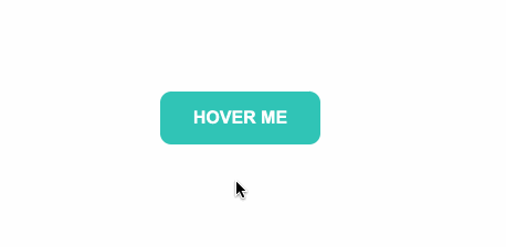
五.圆角效果
HTML
<div id="border-btn">

  <button>Hover me</button>

</div>
CSS
#border-btn {

  display: flex;

  align-items: center;

  justify-content: center;

  height: 100vh;

}

button {

  border: 0;

  border-radius: 10px;

  background: #2ec4b6;

  text-transform: uppercase;

  color: white;

  font-size: 16px;

  font-weight: bold;

  padding: 15px 30px;

  outline: none;

  position: relative;

  transition: border-radius 3s;

  -webkit-transition: border-radius 3s;

}

button:hover {

   border-bottom-right-radius: 50px;

   border-top-left-radius: 50px;

   border-bottom-left-radius: 10px;

   border-top-right-radius: 10px;

}
GIF图
六.冰冻效果
HTML
<div id="frozen-btn">

  <button class="green">Hover me</button>

  <button class="purple">Hover me</button>

</div>
CSS
#frozen-btn {

  display: flex;

  align-items: center;

  justify-content: center;

  height: 100vh;

}

button {

  border: 0;

  margin: 20px;

  text-transform: uppercase;

  font-size: 20px;

  font-weight: bold;

  padding: 15px 50px;

  border-radius: 50px;

  color: white;

  outline: none;

  position: relative;

}

button:before{

  content: '';

  display: block;

  background: linear-gradient(to left, rgba(255, 255, 255, 0) 50%, rgba(255, 255, 255, 0.4) 50%);

  background-size: 210% 100%;

  background-position: right bottom;

  height: 100%;

  width: 100%;

  position: absolute;

  top: 0;

  bottom:0;

  right:0;

  left: 0;

  border-radius: 50px;

  transition: all 1s;

  -webkit-transition: all 1s;

}

.green {

   background-image: linear-gradient(to right, #25aae1, #40e495);

   box-shadow: 0 4px 15px 0 rgba(49, 196, 190, 0.75);

}

.purple {

   background-image: linear-gradient(to right, #6253e1, #852D91);

   box-shadow: 0 4px 15px 0 rgba(236, 116, 149, 0.75);

}

.purple:hover:before {

  background-position: left bottom;

}

.green:hover:before {

  background-position: left bottom;

}
GIF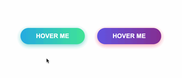
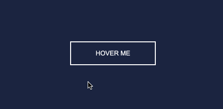
七.闪亮效果
HTML
<div id="shiny-shadow">

  <button><span>Hover me</span></button>

</div>
CSS
#shiny-shadow {

  display: flex;

  align-items: center;

  justify-content: center;

  height: 100vh;

  background: #1c2541;

}

button {

  border: 2px solid white;

  background: transparent;

  text-transform: uppercase;

  color: white;

  padding: 15px 50px;

  outline: none;

  overflow: hidden;

  position: relative;

}

span {

  z-index: 20;

}

button:after {

  content: '';

    display: block;

    position: absolute;

    top: -36px;

    left: -100px;

    background: white;

    width: 50px;

    height: 125px;

    opacity: 20%;

    transform: rotate(-45deg);

}

button:hover:after {

  left: 120%;

  transition: all 600ms cubic-bezier(0.3, 1, 0.2, 1);

   -webkit-transition: all 600ms cubic-bezier(0.3, 1, 0.2, 1);

}
GIF图
八.加载效果
HTML
<div id="loading-btn">

  <button><span>Hover me</span></button>

</div>
CSS
#loading-btn {

  display: flex;

  align-items: center;

  justify-content: center;

  height: 100vh;

}

button {

  background: transparent;

  border: 0;

  border-radius: 0;

  text-transform: uppercase;

  font-weight: bold;

  font-size: 20px;

  padding: 15px 50px;

  position: relative;

}

button:before {

  transition: all 0.8s cubic-bezier(0.7, -0.5, 0.2, 2);

  content: '';

  width: 1%;

  height: 100%;

  background: #ff5964;

  position: absolute;

  top: 0;

  left: 0;

}

button span {

  mix-blend-mode: darken;

}

button:hover:before {

  background: #ff5964;

  width: 100%;

}
GIF图
https://juejin.im/post/6861501624993447950
CSS之创意hover效果的更多相关文章
- HTML页面中5种超酷的伪类选择器:hover效果
想在自己的网站中应用超酷的hover效果吗?也许你可以从如下的这些实例中获得一些灵感,如果你喜欢这些效果,也可以直接拷贝代码并应用到你的站点. 给平淡的站点带来活力 hover效果能给网页增加一些动态 ...
- Web页面中5种超酷的Hover效果
hover 效果能给网页增加一些动态效果,并且使得站点更具有活力.原来的做法是使用javascript来实现这些动态效果,但是随着CSS3的引入和现代浏览器 的支持,我们可以用纯粹的CSS代码来实现这 ...
- 使IE6支持:hover效果
:hover是在CSS中用来制作效果最常用到的一个伪类,比如:标签或div上的鼠标悬停效果 li:hover,div:hover等. 但这种效果是css2及以上版本才添加的,对于只支持css1的浏览器 ...
- 不可思议的纯 CSS 实现鼠标跟随效果
直接进入正题,鼠标跟随,顾名思义,就是元素会跟随着鼠标的移动而作出相应的运动.大概类似于这样: 通常而言,CSS 负责表现,JavaScript 负责行为.而鼠标跟随这种效果属于行为,要实现通常都需要 ...
- Js更改样式导致hover效果消失
[问题来源] 今天做单次倒计时,利用JS更改了button样式之后,再次点击时,发现hover效果消失. 原因: CSS的优先级问题导致 [解决方法] 利用!important提高hover的优先级 ...
- css3 hover效果
html代码: <!DOCTYPE html> <html lang="en"> <head> <meta charset="U ...
- react组件配置样式hover效果的实现
需求 react 自定义一个组件,组件内部样式可以灵活配置 问题 一般样式都可以通过属性传入,比如:颜色,字号等,但是对于一些有hover效果的地方,属性传入后,按照平时css的使用方式不太容易实现 ...
- css做旋转相册效果
css做旋转相册效果 <!DOCTYPE html> <html> <head> <meta charset="UTF-8"> &l ...
- 原生JS、CSS实现的转盘效果(目前仅支持webkit)
这是一个原生JS.CSS实现的转盘效果(题目在这:http://www.cnblogs.com/arfeizhang/p/turntable.html),花了半个小时左右,准备睡觉,所以先贴一段代码, ...
随机推荐
- 【LeetCode】375. Guess Number Higher or Lower II 解题报告(Python)
[LeetCode]375. Guess Number Higher or Lower II 解题报告(Python) 作者: 负雪明烛 id: fuxuemingzhu 个人博客: http://f ...
- codeforces626D . Jerry's Protest
Andrew and Jerry are playing a game with Harry as the scorekeeper. The game consists of three rounds ...
- [JNI开发]使用javah命令生成.h的头文件
第一步:进入对应的.java目录 javac xxx.java 生成对应的xxx.class文件 第二步:退回到/java目录 javah -classpath . -jni 包名.类名
- Chrome升级到91版本以上后Cookies SameSite问题,IdentityServer4登录不上问题?
还原下问题: 跨站Cookie安全级别限制,如过是https不用担心这个问题,但是IP访问,本地测试等就会出现登录不上 针对这个问题,记得早在之前80版本的chrome就会存在的问题,可能大家会用:c ...
- Redis_简介(1)
Redis简介 Redis是一个开源的使用ANSI C语言编写.支持网络.可基于内存亦可持久化的日志型.Key-Value数据库,并提供多种语言的API.从2010年3月15日起,Redis的开发工作 ...
- webpack 多环境打包
目前来说有两种方案: 方案一: 1.修改build文件夹下build.js文件 添加声明变量 2.修改config文件夹下dev.env.js文件 这个是开发环境所用版本 3.修改config文件夹下 ...
- 获取iframe外的document
在iframe中点击弹出层外部分弹出层消失,但是点击iframe外部分就操作不了弹出层了,被这个问题困扰了不少时间,今天得以解决,代码如下: 说明:$(top.document,document).c ...
- 离线环境安装使用 Ansible
之前写了一篇介绍 Ansible 的文章 ,今天回顾看来写的有些匆忙,一些具体的操作步骤都没有讲明白,不利于读者复现学习.最近又申请了一个几百台机器的环境,正好借此机会把如何在离线环境中使用 Ansi ...
- 接口神器之 Json Server 详细指南
简介 json-server 是一款小巧的接口模拟工具,一分钟内就能搭建一套 Restful 风格的 api,尤其适合前端接口测试使用. 只需指定一个 json 文件作为 api 的数据源即可,使用起 ...
- WAFW00F waf识别工具 源码学习
我实习工作的第一个任务根据已有的java waf识别工具 实现了一个python的waf识别工具 代码结构非常乱 仅仅达到了能用的水平. 顶头svp推荐这个项目当时我已经写好了开始用了自己的 稍微看了 ...