CSS定位布局
CSS定位布局
基础知识
在CSS布局中,定位布局也是一种非常常见的技术手段,我们以京东为例:
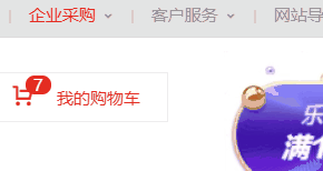
上面是非常好的例子,对于定位布局来说它可以将一个元素放在页面上的任意一个位置。
但是定位布局也不能滥用,因为它可能会出现一些意料之外的问题,所以我们只对一些需要定位的元素进行定位,而不需要定位的元素则使用文档流与浮动即可。
定位类型
我们可以对一个元素使用position让它来进行定位,共有以下的定位选项。
| 选项 | 说明 |
|---|---|
| static | 默认形为,参考文档流 |
| relative | 相对定位 |
| absolute | 绝对定位,脱离文档流 |
| fixed | 固定定位,脱离文档流 |
| sticky | 粘性定位 |
位置偏移
上面说过,定位布局就是为了将一个元素可以放在页面上的任意一个位置而产生的,那么我们就可以对某些以添加定位选项的定位元素设置上,下,左,右的位置偏移。
| 选项 | 说明 |
|---|---|
| top | 距离顶边 |
| bottom | 距离下边 |
| left | 距离左部 |
| right | 距离右边 |
相对定位
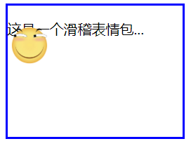
相对定位relative是相对于元素原本的位置进行控制,当元素发生偏移时,原位置保留(未脱离文档流,就会原位置留空)。
原本位置:
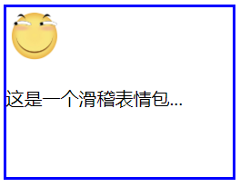
相对定位,距离顶边30px:
我们可以看到,下方的位置并没有去填补<img>原本的位置。


<!DOCTYPE html>
<html lang="en">
<head>
<meta charset="UTF-8">
<meta name="viewport" content="width=device-width, initial-scale=1.0">
<title>Document</title>
<style>
article{
width: 200px;
height: 150px;
border: 2px solid blue;
}
article img{
width: 50px;
height: 50px;
position: relative;
top: 30px;
}
</style>
</head>
<body>
<article>
<img src="./huaji.png" alt="">
<p>这是一个滑稽表情包...</p>
</article>
</body>
</html>
相对定位
绝对定位
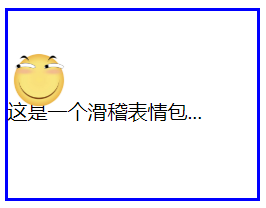
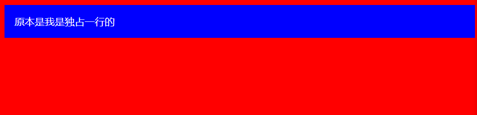
绝对定位absolute是脱离于文档流的,你可以将它理解为漂浮,被绝对定位后的元素拥有inline-block特性(不独占一行,能设置宽高)。
此外还要注意一点,绝对定位的元素是会影响同级的正常文档流元素的,即后面元素会自动向上补齐。
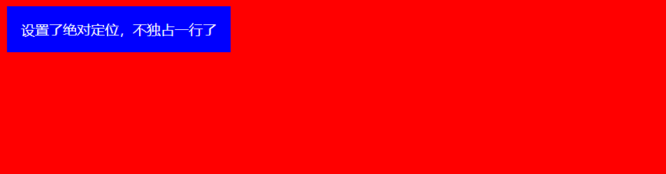
可以看到,下面绝对定位后的<img>标签空间位置被<p>标签占用了。
<!DOCTYPE html>
<html lang="en">
<head>
<meta charset="UTF-8">
<meta name="viewport" content="width=device-width, initial-scale=1.0">
<title>Document</title>
<style>
body{ }
div{ color: white;
padding: 1em;
position: absolute;
}
</style>
</head>
<body>
<div>设置了绝对定位,不独占一行了</div>
</body>
</html>
绝对定位元素不会独占一行
<!DOCTYPE html>
<html lang="en">
<head>
<meta charset="UTF-8">
<meta name="viewport" content="width=device-width, initial-scale=1.0">
<title>Document</title>
<style>
article{
width: 200px;
height: 150px;
border: 2px solid blue;
}
article img{
width: 50px;
height: 50px;
position: absolute;
top: 30px;
}
</style>
</head>
<body>
<article>
<img src="./huaji.png" alt="">
<p>这是一个滑稽表情包...</p>
</article>
</body>
</html>
绝对定位元素文档流空间位会被占据
参照元素
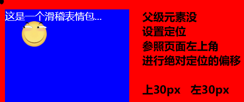
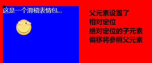
绝对定位的元素不受文档流的控制,所以默认它是按照页面左上角来进行偏移。
但是如果被绝对定位元素的父元素设置了relative或者fixed以及sticky定位的话,则该绝对定位子元素将会参照此父元素进行定位。
<!DOCTYPE html>
<html lang="en">
<head>
<meta charset="UTF-8">
<meta name="viewport" content="width=device-width, initial-scale=1.0">
<title>Document</title>
<style>
body{ }
article{
width: 200px;
height: 150px; color: white;
position: relative;
}
article img{
width: 50px;
height: 50px;
position: absolute;
top: 30px;
left: 30px;
}
</style>
</head>
<body>
<article>
<img src="./huaji.png" alt="">
<p>这是一个滑稽表情包...</p>
</article>
</body>
</html>
参照元素
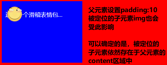
默认位置
如果被定位的子元素没有设置任何偏移,那么它将会受到父元素padding等属性的影响。但是使用定位的元素一般都会进行偏移设置。
<!DOCTYPE html>
<html lang="en">
<head>
<meta charset="UTF-8">
<meta name="viewport" content="width=device-width, initial-scale=1.0">
<title>Document</title>
<style>
body{ }
article{
width: 200px;
height: 150px; color: white;
position: relative;
padding: 10px;
}
article img{
width: 50px;
height: 50px;
position: absolute;
}
</style>
</head>
<body>
<article>
<img src="./huaji.png" alt="">
<p>这是一个滑稽表情包...</p>
</article>
</body>
</html>
默认位置
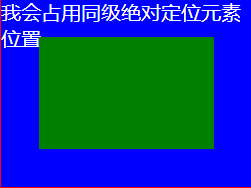
设置尺寸
我们可以为定位的元素设定偏移值来改变该元素的尺寸大小。
<!DOCTYPE html>
<html lang="en">
<head>
<meta charset="UTF-8">
<meta name="viewport" content="width=device-width, initial-scale=1.0">
<title>Document</title>
<style>
body{ }
article{
width: 200px;
height: 150px; color: white;
position: relative;
}
article div{ position: absolute;
left: 30px;
top: 30px;
bottom: 30px;
right: 30px;
}
</style>
</head>
<body>
<article>
<div></div>
<p>我会占用同级绝对定位元素位置...</p>
</article>
</body>
</html>
设置尺寸
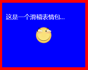
居中定位
通过将 left 设置为50% ,并向左偏移子元素宽度一半可以实现水平居中,垂直居中使用方式类似。
<!DOCTYPE html>
<html lang="en">
<head>
<meta charset="UTF-8">
<meta name="viewport" content="width=device-width, initial-scale=1.0">
<title>Document</title>
<style>
body{ }
article{
width: 200px;
height: 150px; color: white;
position: relative;
padding: 10px;
}
article img{
width: 50px;
height: 50px;
position: absolute;
left: 50%;
top: 50%;
margin-left: -25px;
margin-top: -25px; }
</style>
</head>
<body>
<article>
<img src="./huaji.png" alt="">
<p>这是一个滑稽表情包...</p>
</article>
</body>
</html>
居中定位
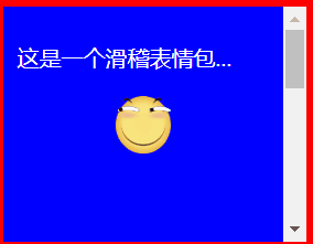
滚动行为
无论是绝对定位或者相对定位的元素,都会随着滚动条发生滚动。
<!DOCTYPE html>
<html lang="en">
<head>
<meta charset="UTF-8">
<meta name="viewport" content="width=device-width, initial-scale=1.0">
<title>Document</title>
<style>
body{ }
article{
width: 200px;
height: 150px; color: white;
position: relative;
padding: 10px;
/* 显示滚动条 Y轴 */
overflow-y: scroll;
}
article img{
width: 50px;
height: 50px;
position: absolute;
left: 50%;
top: 50%;
margin-left: -25px;
margin-top: -25px; }
article p{
/* 内容足够长,出现滚动条 */
height: 500px;
}
</style>
</head>
<body>
<article>
<img src="./huaji.png" alt="">
<p>这是一个滑稽表情包...</p>
</article>
</body>
</html>
滚动行为
z-index
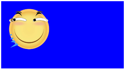
如果两个同级的元素都进行定位且位置相同,那么后定位的元素会层叠在先定位的元素之上,这个时候我们就需要用到z-index来改变层叠优先级。
未定位:
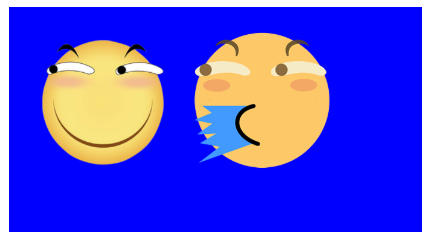
两个都进行绝对定位,依照蓝色父盒子的左上角,层叠在一起,可以看到只显示出一个,这是因为喷水滑稽比普通滑稽要大一点:
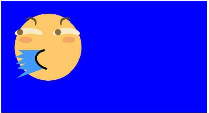
改变喷水滑稽的尺寸大小,就可以它下面的看见普通滑稽了。
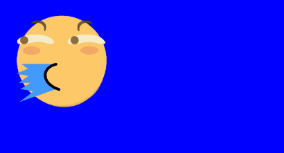
此时我们可以将喷水的滑稽进行偏移挪开,或者使用z-index提升优先级,让原本在下面的普通滑稽层叠在喷水滑稽上面。
<!DOCTYPE html>
<html lang="en">
<head>
<meta charset="UTF-8">
<meta name="viewport" content="width=device-width, initial-scale=1.0">
<title>Document</title>
<style>
article section{
width: 200px;
height: 100px;
padding: 10px; position: relative;
}
article section img:first-of-type{
width: 80px;
position: absolute;
/* 默认的层叠都是0,所以我们提成1即可 */
z-index: 1;
}
article section img:last-of-type{
width: 80px;
position: absolute;
}
</style>
</head>
<body>
<article>
<section>
<img src="./huaji.png" alt="">
<!-- 排列在后的叠在排列前的上面 -->
<img src="./ps.png" alt="">
</section>
</article>
</body>
</html>
z-index
固定定位
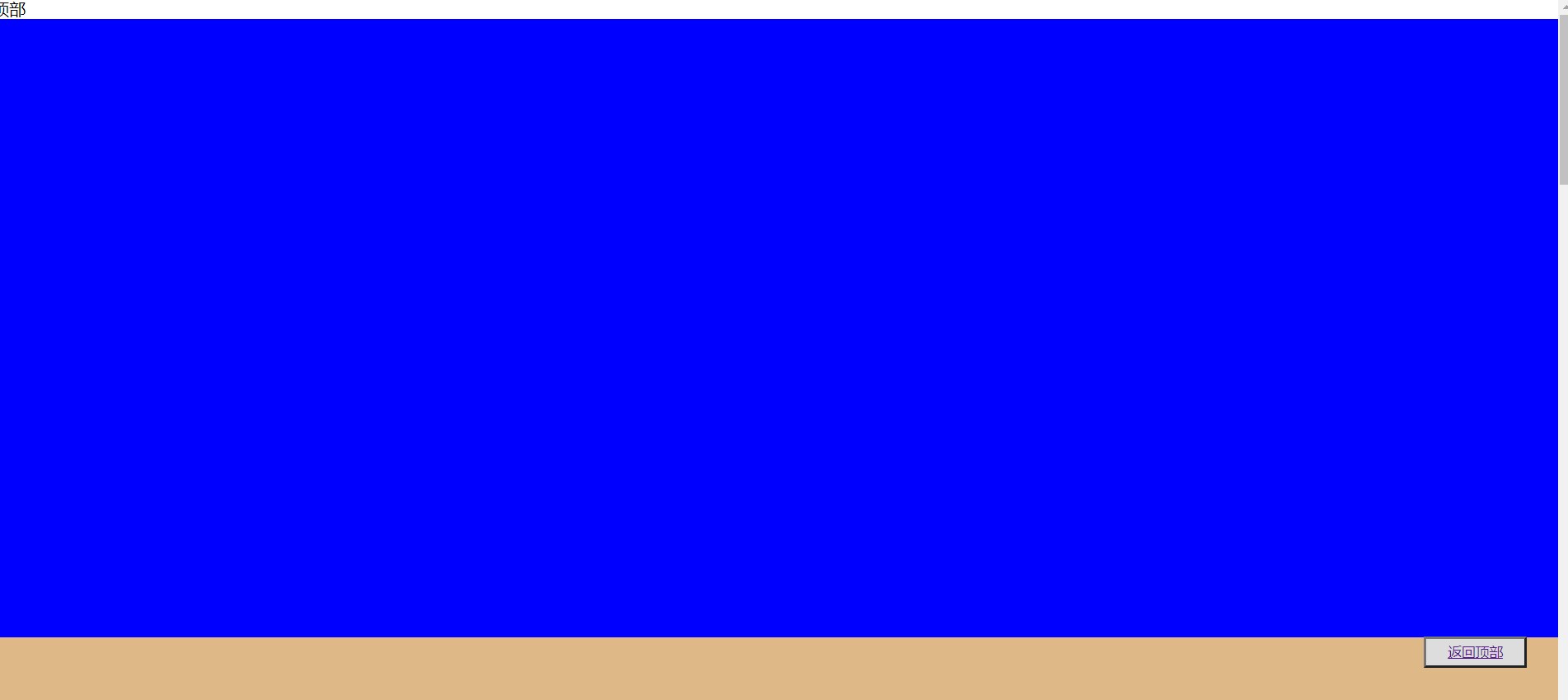
固定定位fixed是脱离文档流(影响后面元素排列,固定定位元素不会留下空间)的一种定位方式,固定定位的元素不会随着滚动条进行滚动,它的偏移参照点是页面左上角。
<!DOCTYPE html>
<html lang="en">
<head>
<meta charset="UTF-8">
<meta name="viewport" content="width=device-width, initial-scale=1.0">
<title>Document</title>
<style>
*{
padding: 0;
margin: 0;
}
main>button{
position: fixed;
height: 30px;
width: 100px; right: 2%;
bottom: 10%;
text-decoration: none;
}
main>section{
height: 600px;
}
main>section:nth-of-type(1){ }
main>section:nth-of-type(2){ }
main>section:nth-of-type(3){ }
main>section:nth-of-type(4){ }
main>section:last-of-type{
}
</style>
</head>
<body>
<main>
<span di="top">顶部</span>
<section> </section>
<section> </section>
<section> </section>
<section> </section>
<section> </section>
<button><a href="#top">返回顶部</a></button>
</main>
</body>
</html>
固定定位
粘性定位
同级粘性定位
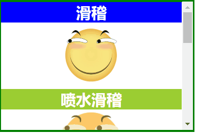
同级粘性定位sticky是会进行层叠的,后面的粘性定位元素不会挤掉上面的粘性定位元素。
同级指的就是不同的粘性定位元素粘的是同一个父级元素。
<!DOCTYPE html>
<html lang="en">
<head>
<meta charset="UTF-8">
<meta name="viewport" content="width=device-width, initial-scale=1.0">
<title>Document</title>
<style>
* {
margin: 0;
padding: 0;
}
img {
width: 100px; }
main {
border: 3px solid green;
width: 300px;
height: 200px;
overflow-y: scroll;
}
main section {
height: 700px;
text-align: center;
}
main section h2 {
color: white;
position: sticky;
top: 0;
}
main section h2:nth-of-type(even) {
}
main section h2:nth-of-type(odd) {
}
</style>
</head>
<body>
<main>
<section>
<h2>滑稽</h2>
<img src="./huaji.png" alt="">
<h2>喷水滑稽</h2>
<img src="./ps.png" alt="">
<h2>墨镜哥</h2>
<img src="./mjg.png" alt="">
<h2>眩晕怪</h2>
<img src="./xyg.png" alt="">
</section>
</main>
</body>
</html>
同级粘性定位
非同级粘性定位
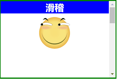
非同级粘性定位sticky是不会进行层叠的,后面的粘性定位元素会挤掉上面的粘性定位元素。
非同级指的就是不同的粘性定位元素粘的不是同一个父级元素。
<!DOCTYPE html>
<html lang="en">
<head>
<meta charset="UTF-8">
<meta name="viewport" content="width=device-width, initial-scale=1.0">
<title>Document</title>
<style>
*{
margin: 0;
padding: 0;
}
img {
width: 100px;
}
main {
border: 3px solid green;
width: 300px;
height: 200px;
overflow-y: scroll;
}
main section{
height: 200px;
text-align: center;
}
main section h2 {
color: white;
position:sticky;
top:0;
}
main section:nth-of-type(even) h2 {
}
main section:nth-of-type(odd) h2 {
}
</style>
</head>
<body>
<main>
<section>
<h2>滑稽</h2>
<img src="./huaji.png" alt="">
</section>
<section>
<h2>喷水滑稽</h2>
<img src="./ps.png" alt="">
</section>
<section>
<h2>墨镜哥</h2>
<img src="./mjg.png" alt="">
</section>
<section>
<h2>眩晕怪</h2>
<img src="./xyg.png" alt="">
</section>
</main>
</body>
</html>
非同级粘性定位
定位使用场景代码
<!DOCTYPE html>
<html lang="en">
<head>
<meta charset="UTF-8">
<meta name="viewport" content="width=device-width, initial-scale=1.0">
<title>Document</title>
<style>
* {
padding: 0;
margin: 0;
}
main {
width: 600px;
padding: 100px;
margin: 0 auto;
}
main article {
width: 150px;
position: relative;
cursor: pointer;
font-size: 14px;
color: #555;
}
main article:hover div:nth-of-type(1) {
border-bottom: none;
}
main article:hover div:nth-of-type(2) {
display: block;
}
main article div {
box-sizing: border-box;
height: 50px;
line-height: 3.5em;
text-align: center;
border: solid 2px blueviolet;
background: white;
}
main article div:nth-of-type(1) {
position: relative;
/* 掩盖第二个DIV的上边框线 */
z-index: 2;
}
main article div:nth-of-type(2) {
display: none;
position: absolute;
right: 0;
/* 掩盖上边框线 */
top: 48px;
left: -150px;
z-index: 1;
}
</style>
</head>
<body>
<main>
<article>
<div>我的购物车</div>
<div>购物车中暂无产品</div>
</article>
</main>
</body>
</html>
定位使用场景代码
CSS定位布局的更多相关文章
- css 定位布局
文档流: 文档流,是指盒子按照html标签编写的顺序依次从上到下,从左到右排列.块元素占一行,行内元素在一行之内从左到在排列,先写的先排列,后写的排在后面,每个盒子都占据自己的位置. 关于定位: 可以 ...
- CSS高级布局
float属性 基本浮动规则 先来了解一下block元素和inline元素在文档流中的排列方式. block元素通常被现实为独立的一块,独占一行,多个block元素会各自新起一行,默认block元素宽 ...
- web开发:定位布局
一.盒子的显隐 二.小米topbar 三.相对定位 四.决定定位 五.固定定位 六.z-index属性 七.流式布局思想 八.hover父子悬浮 一.盒子的显隐 1.同一结构下, 如果采用浮动布局,所 ...
- 奇妙的CSS之布局与定位
前言 关于布局与定位是Web前端开发里非常基础而又重要的部分.介绍相关知识的文章,很容易就可以找到.虽然,这方面的知识点不是很多,但我们如果不弄清楚,在运用时候往往会出现预料之外的布局,这些“意外”有 ...
- CSS之定位布局(position,定位布局技巧)
css之定位 1.什么是定位:css中的position属性,position有四个值:absolute/relative/fixed/static(绝对/相对/固定/静态(默认))通过定位属性可以设 ...
- HTML学习笔记 css定位(静态,相对,固定,绝对布局)偏移案例 第十二节 (原创) 参考使用表
<!DOCTYPE html> <html lang="en"> <head> <meta charset="UTF-8&quo ...
- html5 css练习 定位布局
<!DOCTYPE html><html lang="en"><head> <meta charset="UTF-8&qu ...
- 认识CSS中布局之文档流、浮动、定位以及叠放次序
前端之HTML,CSS(七) CSS CSS布局的核心就是盒子的摆放,即CSS定位.而CSS中定位机制分为:普通流(nomal flow).浮动(float).定位(position). 普通流 普通 ...
- CSS定位与布局:浮动
浮动的特点 浮动(float)属性提出的作用是实现文字的环绕效果,一个元素浮动后,会脱离普通流.主要的特点如下: 浮动的元素会向左或者向右移动直到它的外边缘接触容器框(containing blo ...
随机推荐
- 0.1---selenium+java自动化测试进阶01---PageObject设计模式
一.PageObject设计模式 1.简介 PageObject设计模式,又称页面对象模式,是使用Selenium的广大同行最为公认的一种设计模式.在设计测试时,把元素和方法按照页面抽象出来,分离 ...
- 机器学习——打开集成方法的大门,手把手带你实现AdaBoost模型
本文始发于个人公众号:TechFlow,原创不易,求个关注 今天是机器学习专题的第25篇文章,我们一起来聊聊AdaBoost. 我们目前为止已经学过了好几个模型,光决策树的生成算法就有三种.但是我们每 ...
- Spring Boot 2 实战:利用Redis的Geo功能实现查找附近的位置
1. 前言 老板突然要上线一个需求,获取当前位置方圆一公里的业务代理点.明天上线!当接到这个需求的时候我差点吐血,这时间也太紧张了.赶紧去查相关的技术选型.经过一番折腾,终于在晚上十点完成了这个需求. ...
- Nginx安装配置介绍(二)
一:Nginx安装(Windows) 官网地址:https://nginx.org/en/download.html 解压完成后,文件目录如下: 启动Nginx: 直接双击目录下的nginx.exe, ...
- mongoDB的基本使用方法
MongoDB 安装(乌班图系统) apt install mongodb mongoDB与sql的对比 SQL术语/概念 MongoDB术语/概念 解释/说明 database database 数 ...
- 阿里面试官最喜欢问的21个HashMap面试题
1.HashMap 的数据结构? A:哈希表结构(链表散列:数组+链表)实现,结合数组和链表的优点.当链表长度超过 8 时,链表转换为红黑树. transient Node<K,V>\[\ ...
- Lucene5多条件查询
lucene是一个很强大的搜索工具,最近公司项目上用到,结合JAVA1234所讲,对多条件查询做出总结 先描述一下我的多条件需求,如果和您的类似,继续往下看. 1.我的Lucene搜索会在很多地方使用 ...
- Zookeeper面试专题
Zookeeper面试专题 1. Zookeeper是什么框架 分布式的.开源的分布式应用程序协调服务,原本是Hadoop.HBase的一个重要组件.它为分布式应用提供一致性服务的软件,包括:配置维护 ...
- Maven的pom文件依赖提示 ojdbc6 Missing artifact,需要手动下载并导入maven参考
eg: 需要 ojdbc6.jar 的下载地址 https://www.oracle.com/database/technologies/jdbcdriver-ucp-downloads.html c ...
- 入门大数据---Elasticsearch搭建与应用
项目版本 构建需要: JDK1.7 Elasticsearch2.2.1 junit4.10 log4j1.2.17 spring-context3.2.0.RELEASE spring-core3. ...