纯css3实现的创意图片放大镜
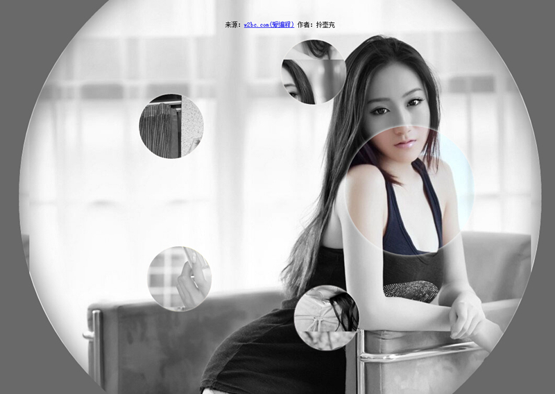
今天要给大家分享的的一款用纯css3实现的图片放大镜特效。页面打开五个小图显示于页面。当鼠标经过图片时,当前图片以灰色背景图的形式展示。效果非常不错。
实现的代码:
html代码:
 <ul class="gallery">

        <li class="gallery__item"></li>

        <li class="gallery__item"></li>

        <li class="gallery__item"></li>

        <li class="gallery__item"></li>

        <li class="gallery__item"></li>

        <li class="gallery__item"></li>

</ul>
css代码:
.gallery

        {

            list-style: none;

        }

        .gallery:before, .gallery__item:last-child

        {

            position: fixed;

            top: 50%;

            left: 50%;

            margin: -31.25em;

            width: 62.5em;

            height: 62.5em;

        }

        .gallery:before

        {

            z-index: -1;

            border-radius: 50%;

            content: '';

            box-shadow: inset 0 0 5em dimgrey, 0 0 0 50vw dimgrey;

        }

        .gallery__item

        {

            background-blend-mode: luminosity;

            transition: -webkit-transform 0.5s cubic-bezier(0.175, 0.885, 0.32, 1.275), background-image 0.5s;

        }

        .gallery__item:not(:last-child)

        {

            position: absolute;

            top: 50%;

            left: 50%;

            width: 32vmin;

            height: 32vmin;

            border-radius: 50%;

            box-shadow: 0 0 .5em white;

        }

        .gallery__item:nth-child(1)

        {

            margin: 13.87457vmin -4.53223vmin;

            -webkit-transform: scale(0.5);

            background: url("imgs/1.jpg") 50% 50% fixed whitesmoke;

        }

        .gallery__item:nth-child(1):hover

        {

            -webkit-transform: scale(1);

            background-blend-mode: normal;

            cursor: pointer;

        }

        .gallery__item:nth-child(1):hover ~ :last-child

        {

            background: url("imgs/1.jpg") 50% 50% fixed dimgray;

        }

        .gallery__item:nth-child(1):hover ~ :last-child:after

        {

            opacity: .001;

        }

        .gallery__item:nth-child(2)

        {

            margin: 4.13825vmin -40.86867vmin;

            -webkit-transform: scale(0.5);

            background: url("imgs/2.jpg") 50% 50% fixed whitesmoke;

        }

        .gallery__item:nth-child(2):hover

        {

            -webkit-transform: scale(1);

            background-blend-mode: normal;

            cursor: pointer;

        }

        .gallery__item:nth-child(2):hover ~ :last-child

        {

            background: url("imgs/2.jpg") 50% 50% fixed dimgray;

        }

        .gallery__item:nth-child(2):hover ~ :last-child:after

        {

            opacity: .001;

        }

        .gallery__item:nth-child(3)

        {

            margin: -33.42845vmin -42.83746vmin;

            -webkit-transform: scale(0.5);

            background: url("imgs/3.jpg") 50% 50% fixed whitesmoke;

        }

        .gallery__item:nth-child(3):hover

        {

            -webkit-transform: scale(1);

            background-blend-mode: normal;

            cursor: pointer;

        }

        .gallery__item:nth-child(3):hover ~ :last-child

        {

            background: url("imgs/3.jpg") 50% 50% fixed dimgray;

        }

        .gallery__item:nth-child(3):hover ~ :last-child:after

        {

            opacity: .001;

        }

        .gallery__item:nth-child(4)

        {

            margin: -46.90963vmin -7.71779vmin;

            -webkit-transform: scale(0.5);

            background: url("imgs/4.jpg") 50% 50% fixed whitesmoke;

        }

        .gallery__item:nth-child(4):hover

        {

            -webkit-transform: scale(1);

            background-blend-mode: normal;

            cursor: pointer;

        }

        .gallery__item:nth-child(4):hover ~ :last-child

        {

            background: url("imgs/4.jpg") 50% 50% fixed dimgray;

        }

        .gallery__item:nth-child(4):hover ~ :last-child:after

        {

            opacity: .001;

        }

        .gallery__item:nth-child(5)

        {

            margin: -17.67475vmin 15.95615vmin;

            -webkit-transform: scale(0.5);

            background: url("imgs/5.jpg") 50% 50% fixed whitesmoke;

        }

        .gallery__item:nth-child(5):hover

        {

            -webkit-transform: scale(1);

            background-blend-mode: normal;

            cursor: pointer;

        }

        .gallery__item:nth-child(5):hover ~ :last-child

        {

            background: url("imgs/5.jpg") 50% 50% fixed dimgray;

        }

        .gallery__item:nth-child(5):hover ~ :last-child:after

        {

            opacity: .001;

        }

        .gallery__item:last-child

        {

            z-index: -2;

        }

        .gallery__item:last-child:after

        {

            position: absolute;

            top:;

            right:;

            bottom:;

            left:;

            opacity: .999;

            background: dimgrey;

            transition: opacity 2s;

            content: '';

        }
注:本文爱编程原创文章,转载请注明原文地址:http://www.w2bc.com/Article/5002
纯css3实现的创意图片放大镜的更多相关文章
- 8个超震撼的HTML5和纯CSS3动画源码
HTML5和CSS3之所以强大,不仅因为现在大量的浏览器的支持,更是因为它们已经越来越能满足现代开发的需要.Flash在几年之后肯定会消亡,那么HTML5和CSS3将会替代Flash.今天我们要给大家 ...
- 11个超震撼的HTML5和纯CSS3动画源码
1.jQuery多功能手风琴个人信息菜单面板 这是一款基于jQuery的手风琴个人信息菜单面板,每一个菜单项展开后可以自定义布局,因此可以为每一个菜单项实现多功能.类似这样的多功能菜单还有jQuery ...
- 纯CSS3实现的一些酷炫效果
之前在网上看到一些用纯CSS3实现的酷炫效果,以为实现起来比较困难,于是想看看具体是怎么实现的. 一.笑脸猫动画 实现效果如下: 这个实现起来确实比较麻烦,很多地方需要花时间,有耐心地调整. 1.先看 ...
- 纯css3圆形从中心向四周扩散动画效果
查看效果:http://hovertree.com/texiao/css3/37/ 先来个简单的示例,例如: @keyframes hovertreemove{from {top:30px;}to { ...
- 纯css3 3D图片立方体旋转动画特效
纯css3 3D立方体模块,鼠标触碰,模块炸开,大立方体中套小立方体 效果展示 手机扫描二维码体验效果: 效果图如下: 源码下载:http://hovertree.com/h/bjaf/0qmul8g ...
- 纯CSS3实现多层云彩变换飞行动画
查看效果:http://hovertree.com/texiao/css3/4/效果2 效果图: 代码如下: <!doctype html> <html lang="zh& ...
- 纯css3艺术文字样式效果代码
效果:http://hovertree.com/texiao/css3/1/ 本效果主要使用text-shadow实现.参考:http://hovertree.com/h/bjaf/css3_text ...
- 纯css3手机页面图标样式代码
全部图标:http://hovertree.com/texiao/css/19/ 先看效果: 或者点这里:http://hovertree.com/texiao/css/19/hoverkico.ht ...
- 纯CSS3实现动态火车行驶特效
上次开完飞机,这次开火车 查看效果:http://hovertree.com/texiao/css3/7/ 效果图: 代码如下: <!DOCTYPE html> <html> ...
随机推荐
- OpenWrt的开机启动服务(init scripts)
参考 https://wiki.openwrt.org/doc/techref/initscripts 以一个简单的例子来说明 #!/bin/sh /etc/rc.common # Example s ...
- 域名无法解析 Linux临时或永久修改DNS
最近给VPS重装了系统,因为服务商不提供DHCP,所以只好手动设置IP和DNS Server.悲催的是系统重装的时候忘记了输入DNS Server,最后导致进去系统后,各种域名无法解析. Linux中 ...
- eclipse中英文版转换(前提:有中文包)
均为命令行启动(一次就可以) 中文版启动:eclipse.exe -nl zh 英文版启动:eclipse.exe -nl en
- Oracle创建库
oracle创建表空间 SYS用户在CMD下以DBA身份登陆: 在CMD中打sqlplus /nolog 然后再 conn / as sysdba --如果路径不存在则要创建路径 --创建临时表空间 ...
- 如何判断微信内置浏览器(JS & PHP)
转自:http://blog.wpjam.com/m/is_weixin/ 为什么要进行判断呢?answer:微信授权登录,微信支付都可以 微信内置浏览器的 User Agent 如何判断微信内置浏览 ...
- mysql数据库的数据类型及约束
本文转自:http://www.cnblogs.com/zbseoag/archive/2013/03/19/2970004.html 1.整型 MySQL数据类型 含义(有符号) tinyint( ...
- 使用Apache FtpServer
Java大法一统天下.遇到任何问题,先查一下Java中的解决方案. 地球上的许多事情,在Java中都能找到完美的解决方案. FtpServer是apache MINA项目的一个子项目,它实现了一个ft ...
- Wunderlist 云端任务管理(Todo list)工具
Wunderlist 是一个云端任务管理(Todo list)工具,支持 iPhone, iPad, Android, Windows, Mac OSX 以及 Web 端轻松同步,实现了真正意义上的跨 ...
- HDU 2604 Queuing (矩阵乘法)
Queuing Time Limit: 10000/5000 MS (Java/Others) Memory Limit: 32768/32768 K (Java/Others)Total Su ...
- JQuery包装集size,length,index,slice,find,filter,is,children,next,nextAll,parent,parents,closest,siblings,add,end,andSelf的用法
在使用Jquery包装集的知识之前首先要注意三个概念(当前包装集.新包装集.包装集内部元素)的区别. <!DOCTYPE html> <html xmlns="http:/ ...