纯css3实现的创意图片放大镜
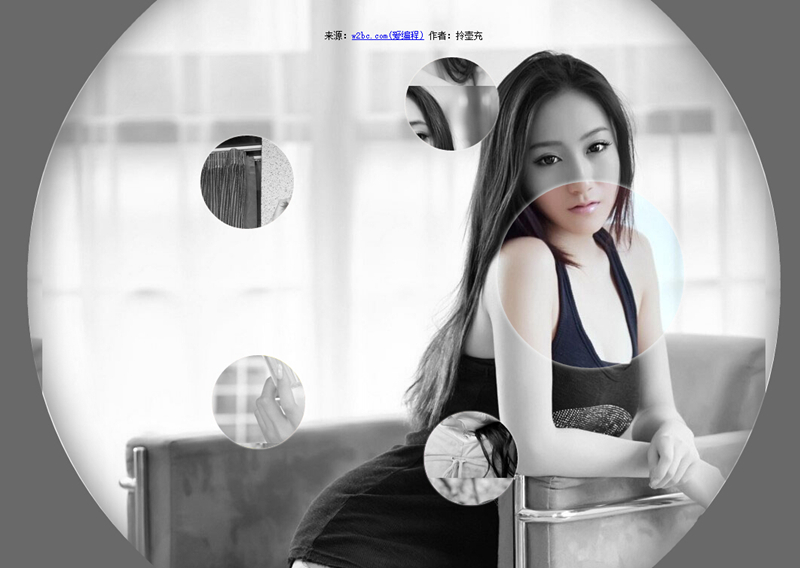
今天要给大家分享的的一款用纯css3实现的图片放大镜特效。页面打开五个小图显示于页面。当鼠标经过图片时,当前图片以灰色背景图的形式展示。效果非常不错。
实现的代码:
html代码:
 <ul class="gallery">

        <li class="gallery__item"></li>

        <li class="gallery__item"></li>

        <li class="gallery__item"></li>

        <li class="gallery__item"></li>

        <li class="gallery__item"></li>

        <li class="gallery__item"></li>

</ul>
css代码:
.gallery

        {

            list-style: none;

        }

        .gallery:before, .gallery__item:last-child

        {

            position: fixed;

            top: 50%;

            left: 50%;

            margin: -31.25em;

            width: 62.5em;

            height: 62.5em;

        }

        .gallery:before

        {

            z-index: -1;

            border-radius: 50%;

            content: '';

            box-shadow: inset 0 0 5em dimgrey, 0 0 0 50vw dimgrey;

        }

        .gallery__item

        {

            background-blend-mode: luminosity;

            transition: -webkit-transform 0.5s cubic-bezier(0.175, 0.885, 0.32, 1.275), background-image 0.5s;

        }

        .gallery__item:not(:last-child)

        {

            position: absolute;

            top: 50%;

            left: 50%;

            width: 32vmin;

            height: 32vmin;

            border-radius: 50%;

            box-shadow: 0 0 .5em white;

        }

        .gallery__item:nth-child(1)

        {

            margin: 13.87457vmin -4.53223vmin;

            -webkit-transform: scale(0.5);

            background: url("imgs/1.jpg") 50% 50% fixed whitesmoke;

        }

        .gallery__item:nth-child(1):hover

        {

            -webkit-transform: scale(1);

            background-blend-mode: normal;

            cursor: pointer;

        }

        .gallery__item:nth-child(1):hover ~ :last-child

        {

            background: url("imgs/1.jpg") 50% 50% fixed dimgray;

        }

        .gallery__item:nth-child(1):hover ~ :last-child:after

        {

            opacity: .001;

        }

        .gallery__item:nth-child(2)

        {

            margin: 4.13825vmin -40.86867vmin;

            -webkit-transform: scale(0.5);

            background: url("imgs/2.jpg") 50% 50% fixed whitesmoke;

        }

        .gallery__item:nth-child(2):hover

        {

            -webkit-transform: scale(1);

            background-blend-mode: normal;

            cursor: pointer;

        }

        .gallery__item:nth-child(2):hover ~ :last-child

        {

            background: url("imgs/2.jpg") 50% 50% fixed dimgray;

        }

        .gallery__item:nth-child(2):hover ~ :last-child:after

        {

            opacity: .001;

        }

        .gallery__item:nth-child(3)

        {

            margin: -33.42845vmin -42.83746vmin;

            -webkit-transform: scale(0.5);

            background: url("imgs/3.jpg") 50% 50% fixed whitesmoke;

        }

        .gallery__item:nth-child(3):hover

        {

            -webkit-transform: scale(1);

            background-blend-mode: normal;

            cursor: pointer;

        }

        .gallery__item:nth-child(3):hover ~ :last-child

        {

            background: url("imgs/3.jpg") 50% 50% fixed dimgray;

        }

        .gallery__item:nth-child(3):hover ~ :last-child:after

        {

            opacity: .001;

        }

        .gallery__item:nth-child(4)

        {

            margin: -46.90963vmin -7.71779vmin;

            -webkit-transform: scale(0.5);

            background: url("imgs/4.jpg") 50% 50% fixed whitesmoke;

        }

        .gallery__item:nth-child(4):hover

        {

            -webkit-transform: scale(1);

            background-blend-mode: normal;

            cursor: pointer;

        }

        .gallery__item:nth-child(4):hover ~ :last-child

        {

            background: url("imgs/4.jpg") 50% 50% fixed dimgray;

        }

        .gallery__item:nth-child(4):hover ~ :last-child:after

        {

            opacity: .001;

        }

        .gallery__item:nth-child(5)

        {

            margin: -17.67475vmin 15.95615vmin;

            -webkit-transform: scale(0.5);

            background: url("imgs/5.jpg") 50% 50% fixed whitesmoke;

        }

        .gallery__item:nth-child(5):hover

        {

            -webkit-transform: scale(1);

            background-blend-mode: normal;

            cursor: pointer;

        }

        .gallery__item:nth-child(5):hover ~ :last-child

        {

            background: url("imgs/5.jpg") 50% 50% fixed dimgray;

        }

        .gallery__item:nth-child(5):hover ~ :last-child:after

        {

            opacity: .001;

        }

        .gallery__item:last-child

        {

            z-index: -2;

        }

        .gallery__item:last-child:after

        {

            position: absolute;

            top:;

            right:;

            bottom:;

            left:;

            opacity: .999;

            background: dimgrey;

            transition: opacity 2s;

            content: '';

        }
注:本文爱编程原创文章,转载请注明原文地址:http://www.w2bc.com/Article/5002
纯css3实现的创意图片放大镜的更多相关文章
- 8个超震撼的HTML5和纯CSS3动画源码
HTML5和CSS3之所以强大,不仅因为现在大量的浏览器的支持,更是因为它们已经越来越能满足现代开发的需要.Flash在几年之后肯定会消亡,那么HTML5和CSS3将会替代Flash.今天我们要给大家 ...
- 11个超震撼的HTML5和纯CSS3动画源码
1.jQuery多功能手风琴个人信息菜单面板 这是一款基于jQuery的手风琴个人信息菜单面板,每一个菜单项展开后可以自定义布局,因此可以为每一个菜单项实现多功能.类似这样的多功能菜单还有jQuery ...
- 纯CSS3实现的一些酷炫效果
之前在网上看到一些用纯CSS3实现的酷炫效果,以为实现起来比较困难,于是想看看具体是怎么实现的. 一.笑脸猫动画 实现效果如下: 这个实现起来确实比较麻烦,很多地方需要花时间,有耐心地调整. 1.先看 ...
- 纯css3圆形从中心向四周扩散动画效果
查看效果:http://hovertree.com/texiao/css3/37/ 先来个简单的示例,例如: @keyframes hovertreemove{from {top:30px;}to { ...
- 纯css3 3D图片立方体旋转动画特效
纯css3 3D立方体模块,鼠标触碰,模块炸开,大立方体中套小立方体 效果展示 手机扫描二维码体验效果: 效果图如下: 源码下载:http://hovertree.com/h/bjaf/0qmul8g ...
- 纯CSS3实现多层云彩变换飞行动画
查看效果:http://hovertree.com/texiao/css3/4/效果2 效果图: 代码如下: <!doctype html> <html lang="zh& ...
- 纯css3艺术文字样式效果代码
效果:http://hovertree.com/texiao/css3/1/ 本效果主要使用text-shadow实现.参考:http://hovertree.com/h/bjaf/css3_text ...
- 纯css3手机页面图标样式代码
全部图标:http://hovertree.com/texiao/css/19/ 先看效果: 或者点这里:http://hovertree.com/texiao/css/19/hoverkico.ht ...
- 纯CSS3实现动态火车行驶特效
上次开完飞机,这次开火车 查看效果:http://hovertree.com/texiao/css3/7/ 效果图: 代码如下: <!DOCTYPE html> <html> ...
随机推荐
- cocos2dx跟eclipse交叉编译“make: * No rule to make target `all' Stop”的解决方案
cocos2dx和eclipse交叉编译“make: *** No rule to make target `all'. Stop”的解决方案 搞cocos2dx在eclipse上的交叉编译. 项目. ...
- How to forcefully delete a daemonset or a pod in kubernetes cluster
I have setup a kubernetes cluster which is working fine. I created deployment with type as daemonset ...
- 配置eclipse插件
http://blog.csdn.net/zhangyabinsky/article/details/7043435
- 用一个URL加一个JAVA壳做成一个安卓应用
若想获得更新版本欢迎加入我们的 “本地应用开发webapp"群,一起协力开发一处编写处处运行的“本地应用”.我们将一直开源,将智慧共享,只有这样我们才能一起将应用体验做好! 特点: 1.程序 ...
- linux服务器的Gzip文件压缩方法[转]
一.gzip介绍 gzip是GNU zip的缩写,它是一个GNU自由软件的文件压缩程序,也经常用来表示gzip这种文件格式.软件的作者是Jean-loup Gailly和Mark Adler.1992 ...
- Chart.js 学习笔记
1.引入Chart.js 文件 <script src="Chart.js"></script> 2.在html中创建画布 <canvas id=&q ...
- SQL中 OVER(PARTITION BY)
OVER(PARTITION BY)函数介绍 开窗函数 Oracle从8.1.6开始提供分析函数,分析函数用于计算基于组的某种聚合值,它和聚合函数的不同之处是:对于每个组返 ...
- SQL Server 2012 Express LocalDB 的作用
微软最新推出的 SQL Server 2012 Express LocalDB 是一种 SQL Server Express 的运行模式,特别适合用在开发环境使用,也内置在 Visual Studio ...
- unity3d 通过添加rigidBody来指明物体是动态的,以避免cache开销
unity3d 通过添加rigidBody来指明物体是动态的,以避免cache开销. 如果不添加rigidBody,则unity会认为它是静态的,会对物理计算进行cache,但如果此物体实际上tran ...
- Spring AOP之Introduction(@DeclareParents)简介(转)
Spring的文档上对Introduction这个概念和相关的注解@DeclareParents作了如下介绍: Introductions (known as inter-type declarati ...