CSS3 按钮特效(一)
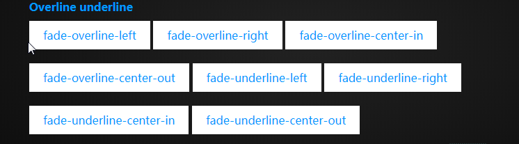
1. 实例

2.HTML 代码
<!DOCTYPE html>

<html lang="en">

<head>

    <meta charset="UTF-8">

    <title>CSS3-Fade</title>

    <link rel="stylesheet" type="text/css" href="./fade.css">

</head>

<body>

    <div class="container">

        <div class="fade fade-in">

            fade-in

        </div>

        <div class="fade fade-top">

            fade-top

        </div>

        <div class="fade fade-bottom">

            fade-bottom

        </div>

        <div class="fade fade-left">

            fade-left

        </div>

        <div class="fade fade-right">

            fade-right

        </div>

        <div class="fade bounce-top">

            bounce-top

        </div>

        <div class="fade bounce-bottom">

            bounce-bottom

        </div>

        <div class="fade bounce-left">

            bounce-left

        </div>

        <div class="fade bounce-right">

            bounce-right

        </div>

        <div class="fade fade-center-out">

            fade-center-out

        </div>

        <div class="fade fade-center-in">

            fade-center-in

        </div>

        <div class="fade fade-middle-out">

            fade-middle-out

        </div>

        <div class="fade fade-middle-in">

            fade-middle-in

        </div>

    </div>

</body>

</html>
3.CSS 代码
*{

    padding:;

    margin:;

}

html{

    background: -webkit-radial-gradient(#222222, #000000);

    background: radial-gradient(#222222, #000000);

    height: 100%;

    text-align: center;

    width:100%;

}

.container{

    width: 800px;

    margin: 200px auto;

    text-align: left;

}

.fade{

    cursor: pointer;

    box-sizing: border-box;

    display: inline-block;

    color: #09f;

    background: white;

    padding: 10px 20px;

    text-align: center;

    margin: 10px 0;

    /* 设置相对定位 */

    position: relative;

    transition: all 0.3s;

    /* 设置层次 会被before after在上面 */

    z-index:;

}

.fade:hover{

    color: white;

}

/* 其实使用背景颜色变化就可以的 但是这里为了做统一*/

.fade:before,.fade:after

{

    display: block;

    transition: all 0.3s;

    background: #09f;

    position: absolute;

    content: '';

    z-index: -1;

}

.fade-left:before,.fade-right:before,

.fade-center-out:before,.fade-center-out:after,

.fade-center-in:before,.fade-center-in:after,

.bounce-left:before,.bounce-right:before

{

    height: 100%;

    top:;

    width:;

}

.fade-middle-out:before,.fade-middle-out:after,

.fade-middle-in:before,.fade-middle-in:after,

.bounce-bottom:before

{

    height:;

    width: 100%;

    left:;

}

/* 弹跳元素设置时间线 使用三次贝塞尔曲线 */

.bounce-top:before,.bounce-bottom:before,

.bounce-left:before,.bounce-right:before{

    transition-timing-function: cubic-bezier(0.52, 1.7, 0.5, 0.4);

}

.fade-in:before{

    height: 100%;

    width: 100%;

    opacity:;

    top:;

    left:;

}

.fade-bottom:before, .fade-top:before,.bounce-top:before{

    height:;

    width: 100%;

    left:;

}

.fade-top:before,.bounce-top:before,.fade-middle-out:before{

    top:;

}

.fade-bottom:before,.fade-middle-out:after,.bounce-bottom:before{

    bottom:;

}

.fade-left:before,.fade-center-in:before,.bounce-left:before{

    left:;

}

.fade-right:before,.fade-center-in:after,.bounce-right:before{

    right:;

}

.fade-center-out:before{

    right: 50%

}

.fade-center-out:after{

    left: 50%

}

.fade-middle-in:before{

    bottom:50%;

}

.fade-middle-in:after{

    top:50%;

}

.fade-in:hover:before{

    opacity:;

}

.fade-left:hover:before,.fade-right:hover:before,

.bounce-left:hover:before,.bounce-right:hover:before

{

    width: 100%;

}

.fade-top:hover:before,.fade-bottom:hover:before,

.bounce-top:hover:before,.bounce-bottom:hover:before{

    height: 100%;

}

.fade-center-out:hover:before,.fade-center-out:hover:after,

.fade-center-in:hover:before,.fade-center-in:hover:after{

    width:50%;

}

.fade-middle-out:hover:before,.fade-middle-out:hover:after,

.fade-middle-in:hover:before,.fade-middle-in:hover:after

{

    height:50%;

}
4. 练习
区别只是 heigth属性所设置的高度大小
CSS3 按钮特效(一)的更多相关文章
- 神奇的CSS3按钮特效
点击这里查看效果 以下是源代码: <!doctype html> <html> <!-- author: @simurai --> <head> < ...
- 10款CSS3按钮 - 程序员再也不用为按钮设计而发愁了...
这次主要给大家分享10款风格各异的CSS3按钮,如果你希望你的页面也能有很炫的样式,那么我相信这10款CSS3按钮就非常适合你,而且每一款都整理了源代码供参考,一起来看看吧. 1.绚丽的CSS3发光按 ...
- 10款CSS3按钮 - 再也不用为按钮设计而发愁了
这次主要给大家分享10款风格各异的CSS3按钮,如果你希望你的页面也能有很炫的样式,那么我相信这10款CSS3按钮就非常适合你,而且每一款都整理了源代码供参考,一起来看看吧. 1.绚丽的CSS3发光按 ...
- 7款外观迷人的HTML5/CSS3 3D按钮特效
1.CSS3超酷3D弹性按钮 按钮实现非常简单 今天我又要向大家分享一款实现超级简单的CSS3 3D弹性按钮,它在鼠标按下时不仅从视觉上感受到3D立体的效果,而且更有弹性的动画特效,非常可爱. 在线演 ...
- 6种炫酷的CSS3按钮边框动画特效
6种炫酷的CSS3按钮边框动画特效Button border animate 用鼠标滑过下面的按钮看看效果! Draw Draw Meet Center Spin Spin Circle Spin T ...
- 一款纯css3实现的鼠标经过按钮特效
今天再给大家带来一款纯css3实现的鼠标经过按钮特效.这款按钮非常简单,但效果很好,非常漂亮.一起看下效果图: 在线预览 源码下载 实现的代码. html代码: <div align=&qu ...
- 7款外观迷人的HTML5/CSS3 3D特效按钮特效
下面我整理了7款外观都十分迷人的HTML5/CSS3 3D按钮特效,有几个还挺实用的,分享给大家. 1.CSS3超酷3D弹性按钮 按钮实现非常简单 之前我们分享过几款不错的CSS3 3D立体按钮,比如 ...
- css3 javascript 实现菜单按钮特效
一个菜单按钮特效案例,简单的实现了动态效果. 代码效果预览地址: http://code.w3ctech.com/detail/2504 <div class="bar" i ...
- 5种漂亮的纯CSS3动画按钮特效
这次我们要来分享一款很不错的CSS3按钮动画,这款CSS3按钮一共有5种动画方式,每一种都是鼠标滑过动画形式,虽然这些动画按钮不是十分华丽,但是小编觉得不像其他按钮那样很难扩展,我们可以修改CSS代码 ...
随机推荐
- EXTJS 4 树形表格组件使用演示样例
EXTJS 4 树形表格组件使用演示样例 一.总体效果图 version=1&modificationDate=1412058826000&api=v2" alt=" ...
- VUE组件如何与iframe通信问题
vue组件内嵌一个iframe,现在想要在iframe内获取父vue组件内信息,由于本人技术有限,采用的是H5新特性PostMessage来解决跨域问题. postMessage内涵两个API: on ...
- 基于字符的打印机 图形化打印机 PostScript解释器
60行*80字符/行=4800字节 300点/英寸(300DPI) 8*10英寸/页打印区域 光栅图像处理器 RIP PostScript程序--- > PostScript解释器 --& ...
- jquery中的工具函数 Utilities
noConflict(deep) 释放$和Jquery的控制权 isFunction(obj) isArray(obj) isWindow(obj) isNumeric(obj) type(obj) ...
- Mybatis中用到的设计模式
Mybatis中用到至少用到以下设计模式, Builder模式,例如SqlSessionFactoryBuilder.XMLConfigBuilder.XMLMapperBuilder.XMLStat ...
- 【转】iOS笔记-自定义控件(OC)
原文网址:http://www.jianshu.com/p/f23862eb7b8a 导读: iOS开发中,很多时候系统提供的控件并不能很好的满足我们的需求,因此,自定义控件便成为搭建UI界面中必不可 ...
- Hibernate关联映射(多对一 --- many-to-one)
转自:https://blog.csdn.net/fengxuezhiye/article/details/7369786?utm_source=blogxgwz9 Hibernate的关联映射关系有 ...
- java笔记之线程简述1
1:线程是依赖于进程而存在. 2:什么是进程? 通过任务管理器我们就看到了进程的存在. 而通过观察,我们发现只有运行的程序才会出现进程. 进程:就是正在运行的程序. 进程是系统进行资源分配和调 ...
- Linux下 本地yum源搭建
第1章 关于yum源 1.1 什么是yum源 yum(Yellow dog Updater, Modified)是一个在 Fedora 和 RedHat 以及 CentOS 中的 Shell 前端软件 ...
- 如何验证自己的网络是否支持ipv6
http://test-ipv6.com/进入得到自己的ipv6地址 然后命令行 ping 一下