
Excel: assign label to scatter chart using specific cell values
ref: https://www.get-digital-help.com/custom-data-labels-in-x-y-scatter-chart/
Improve your X Y Scatter Chart with custom data labels
Author: Oscar Cronquist Article last updated on February 25, 2019
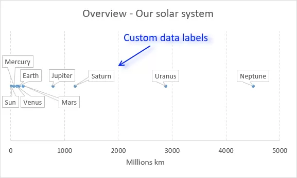
The picture above shows a chart that has custom data labels, they are linked to specific cell values.
What's on this page
- How to apply custom data labels in Excel 2013 and later versions
- How to add data label shapes
- How to rearrange data labels
- Video
- Download Excel file
- Workaround for earlier Excel versions
- Excel Macro - Apply custom data labels
- Where to copy the code
- How to use macro
- Download Excel file
This means that you can build a dynamic chart and automatically change the labels depending on what is shown on the chart.
I have demonstrated how to build dynamic data labels in a previous article if you are interested in using those in a chart.
In a post from March 2013 I demonstrated how to create Custom data labels in a chart.
Unfortunately, that technique worked only for bar and column charts.
You can't apply the same technique for an x y scatter chart, as far as I know.
Luckily the people at Microsoft have heard our prayers.
They have implemented a feature into Excel 2013 that allows you to assign a cell to a chart data point label a, in an x y scatter chart.
I will demonstrate how to do this for Excel 2013 and later versions and a workaround for earlier versions in this article.
How to apply custom data labels in Excel 2013 and later versions
This example chart shows the distance between the planets in our solar system, in an x y scatter chart.
The first 3 steps tells you how to build a scatter chart.
- Select cell range B3:C11
- Go to tab "Insert"
- Click the "scatter" button
- Right click on a chart dot and left click on "Add Data Labels"
- Right click on a dot again and left click "Format Data Labels"
A new window appears to the right, deselect X and Y Value.
Enable "Value from cells"
- Select cell range D3:D11
Click OK
This is what the chart shows, as you can see you need to manually rearrange the data labels and add data label shapes.
Back to top
Video
This following video shows you how to add data labels in an X Y Scatter Chart [Excel 2013 and later versions].
Back to top
Learn more
Axis | Chart Area | Chart Title | Axis Titles | Axis lines | Chart Legend | Tick Marks | Plot Area | Data Series | Data Labels | Gridlines
How to add data label shapes
- Right-click on a data label.
- Click on "Change data label shapes".
- Select a shape.
Back to top
How to change data label locations
You can manually click and drag data labels as needed. You can also let excel change the position of all data labels, choose between center, left, right, above and below.
- Right-click on a data label
Click "Format Data Labels"
Select a new label position.
Back to top
Excel: assign label to scatter chart using specific cell values的更多相关文章
- linux导出Excel The maximum column width for an individual cell is 255 characters
linux环境到处Excel报错: The maximum column width for an individual cell is 255 characters 解决方案: for (int i ...
- POI对EXCEL的操作【重点:如何设置CELL格式为文本格式】
实际开发过程中通常用到的就是从数据库导出EXCEL表格了,JXL可以这样做,其实POI也可以(关于JXL与POI的异同可访问我之前总结的文章),之前写过POI对七种文档(当然也包括EXCEL)的内容读 ...
- R12: How to add Microsoft Excel as Type to the Create Template List of Values in BI Publisher (Doc ID 1343225.1)
Modified: 27-Oct-2013 Type: HOWTO In this Document Goal Solution References APPLIES TO: BI Publisher ...
- 12 Factor CLI Apps
CLIs are a fantastic way to build products. Unlike web applications, they take a small fraction of t ...
- 使用C#和Excel进行报表开发(三)-生成统计图(Chart)
有的Web项目选用Excel作为报表方案,在服务器端生成Excel文件,然后传送到客户端,由客户端进行打印.在国内的环境下,相对PDF方式,Excel的安装率应该比pdf阅读器的安装率要高,同时,微软 ...
- NPOI将DataGridView中的数据导出+导出Chart图表图片至Excel
#region 导出Excel private HSSFWorkbook Workbook = null; private Sheet SheetOne = null; private DataFor ...
- C#组件系列——又一款Excel处理神器Spire.XLS,你值得拥有
前言:最近项目里面有一些对Excel操作的需求,博主想都没想,NPOI呗,简单.开源.免费,大家都喜欢!确实,对于一些简单的Excel导入.导出.合并单元格等,它都没啥太大的问题,但是这次的需求有两点 ...
- C#操作Excel时的格式设定(转)
Excel报表打印的格式设定 1. 表头的设置 Excel._Worksheet myWorksheet; myWorksheet.PageSetup.Orientation = Excel. ...
- 如何用Apache POI操作Excel文件-----如何用Apache POI 画一个离散图
有的时候,我们需要Excel中的数据,通过一个图画,可视化的表现出来. 那么这个时候,应该如何做呢?现在就借花献佛,以Apache POI自己提供的一个例子为例,给大家演示一下POI的API 如何画图 ...
随机推荐
- 打开Excel提示内存不足
来越南出差第一天,有个越南妹子跟我反应说Excel打不开,提示的是很常见的“内存不足”的错误, 这种问题一般的判断就是打开的程序太多了,关掉一些就可以了,重启都没解决, 在网上找了下,腾讯管家的这篇h ...
- Application.CreateForm()和TForm.Create()创建的窗体有什么区别么?二者在使用上各有什么技巧?(50分)
https://wedelphi.com/t/135849/ 请详细些,并给出例子.谢谢. Application.CreateForm()创建的第一个可显示的窗体是自动成为主窗体,并且自动显示,并且 ...
- powered by Fernflower decompiler
About Fernflower Fernflower is the first actually working analytical decompiler for Java and probabl ...
- Java ——继承
本节重点思维导图 面向对象三大特性:封装.继承.多态 面向对象编程的第一原则:面向接口编程 继承 代码利用的方式,子类与父类之间的关系 语法 访问控制修饰符 class 类名 extends父类名{ ...
- idea中配置tomcat详细
1:首先要添加一个tomcat流程 2:配置tomcat: 3:配置tomcat中的deployment(就是配置你需要部署的工程) 4:配置tomcat中需要输出的日志logs 5:启动 tomca ...
- Anaconda版本
1. Anaconda各种版本 https://mirrors.tuna.tsinghua.edu.cn/anaconda/archive/ 2. 多个Python环境 conda info -e c ...
- centos7yum安装VirtualBox
cd 进入目录:/etc/yum.repos.d 新建一个文件virtualbox.repo, 输入如下内容: [virtualbox] name=Oracle Linux / RHEL / Cent ...
- K8S工作原理
kubernetes(k8s)是docker容器用来编排和管理的工具 我们通过kubectl向k8s Master发出指令.kubernetes Master主要是提供API Server.Sched ...
- Find The Multiple (水题)
Given a positive integer n, write a program to find out a nonzero multiple m of n whose decimal repr ...
- 06-REST Framework - API
# Django REST Framework# 1. REST- 前后端分离- API-ApplicationProgrammingInterface - 为了应付千变万化的前端需求- REST:R ...