css3中的 @Keyframes
一、介绍
keyframes被称为关键帧,其类似于Flash中的关键帧。在CSS3中其主要以“@keyframes”开头,后面跟着是动画名称加上一对花括号“{…}”,括号中是一些不同时间段样式规则。
语法:@keyframes animationname {keyframes-selector{css-styles;}}
在@keyframes中定义动画名称时,其中0%和100%还可以使用关键词from和to来代表,其中0%对应的是from,100%对应的是to。
在一个“@keyframes”中的样式规则可以由多个百分比构成的,如在“0%”到“100%”之间创建更多个百分比,分别给每个百分比中给需要有动画效果的元素加上不同的样式,从而达到
一种在不断变化的效果。
举个栗子:
@keyframes changecolor{

  0%{

    background: red;

  }

  20%{

    background:blue;

  }

  40%{

    background:orange;

  }

  60%{

    background:green;

  }

  80%{

    background:yellow;

  }

  100%{

    background: red;

  }

}

div {

  width: 150px;

  height: 100px;

  background: red;

  color:#fff;

  margin: 20px auto;

}

div:hover {

  animation: changecolor 5s ease-out .2s;

}

二 调用动画
animation-name属性主要是用来调用 @keyframes 定义好的动画。需要特别注意: animation-name 调用的动画名需要和“@keyframes”定义的动画名称完全一致(区分大
小写),如果不一致将不具有任何动画效果。
注意:需要在 Chrome 和 Safari 上面的基础上加上-webkit-前缀,Firefox加上-moz-。
/*

注意translate变化的坐标位置

四个角顺时针的坐标(0,0) (100,0) (100,100) (0,100)

因为圆半径为10

所以圆运动的坐标点得在角原来的坐标上-10px

 animation-delay设置0s,这样动画就不会有延迟

*/

@keyframes around{

  0% {

    transform: translate(-10px,-10px);

  }

  25%{

    transform: translate(90px,-10px);

  }

  50%{

    transform: translate(90px, 90px);

  }

  75%{

    transform:translate(-10px,90px);

  }

  100%{

    transform: translate(-10px,-10px);

  }

}

div {

  width: 100px;

  height: 100px;

  border: 1px solid #000;

  margin: 20px auto;

}

div span {

  display: inline-block;

  width: 20px;

  height: 20px;

  background: orange;

  border-radius: 100%;

  /*调用动画名*/

  animation-name:around;

  animation-duration: 10s;

  animation-timing-function: ease;

  animation-delay: 0s;

  /*动画无限循环*/

  animation-iteration-count:infinite;

}

三、设置动画的播放次数
animation-iteration-count属性主要用来定义动画的播放次数。
语法:animation-iteration-count: infinite | <number>
默认值为1,取值为infinite时,动画将无限次播放
@keyframes move {

  0%{

    transform: translate(0);

  }

  15%{

    transform: translate(50px,80px);

  }

  30%{

    transform: translate(100px,0);

  }

  45%{

    transform: translate(150px,80px);

  }

  60%{

    transform:translate(200px,0);

  }

  75%{

    transform: translate(250px,80px);

  }

  100%{

    transform: translate(300px,0);

  }

}

div {

  width:320px;

  height: 100px;

  border: 1px solid #000;

  margin: 20px auto;

}

div span {

  display: inline-block;

  width: 20px;

  height: 20px;

  background: green;

  border-radius: 100%;

  animation-name:move;

  animation-duration: 10s;

  animation-timing-function:ease;

  animation-delay:.1s;

  animation-iteration-count:infinite;

}
四、设置动画播放方向
animation-direction属性主要用来设置动画播放反向
语法:animation-direction:normal | alternate
- normal是默认值,如果设置为normal时,动画的每次循环都是向前播放;
- 另一个值是alternate,他的作用是,动画播放在第偶数次向前播放,第奇数次向反方向播放。
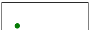
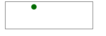
在上面栗子的 div span{…}加上animation-direction:alterate, 如图
五、设置动画的播放状态
animation-play-state属性主要用来控制元素动画的播放状态
有两个参数:running, paused
其中running是其默认值,主要作用就是类似于音乐播放器一样,可以通过paused将正在播放的动画停下来,也可以通过running将暂停的动画重新播放,这里的重新播放不一定
是从元素动画的开始播放,而是从暂停的那个位置开始播放。另外如果暂停了动画的播放,元素的样式将回到最原始设置状态。
@keyframes move {

  0%{

    transform: translateY(40px);

  }

  15%{

    transform: translate(40px,40px);

  }

  30%{

    transform: translate(40px,80px);

  }

  45%{

    transform: translate(40px,40px);

  }

  60%{

    transform: translate(40px,0);

  }

  75%{

    transform: translate(40px,40px);

  }

  90%{

    transform: translate(80px,40px);

  }

  100%{

    transform: translateY(40px);

  }

}

div {

  width: 100px;

  height: 100px;

  border: 1px solid red;

  margin: 20px auto;

}

span {

  display: inline-block;

  width: 20px;

  height: 20px;

  background: orange;

  transform: translateY(90px);

  animation-name: move;

  animation-duration: 10s;

  animation-timing-function: ease-in;

  animation-delay: 0s;

  animation-iteration-count:infinite;

  animation-direction:alternate;

   animation-play-state:paused;

}

div:hover span {

  animation-play-state:running;

}

六、设置动画时间外属性
animation-fill-mode属性定义在动画开始之前和结束之后发生的操作。有四个属性值:none | forwards | backwords |both
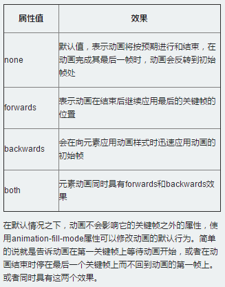
比如,如果想让动画停在最后一幀处:animation-fill-mode:forward;
css3中的 @Keyframes的更多相关文章
- CSS3中的变形与动画(二)
CSS3动画 过渡属性transiton-property 早期在Web中要实现动画效果,都是依赖于JavaScript或Flash来完成.但在CSS3中新增加了一个新的模块transition,它可 ...
- CSS3中的动画效果记录
今天要记录的是CSS3中的三种属性transform.transition以及animation,这三个属性大大提升了css处理动画的能力. 一.Transform 变形 CSS中transform ...
- CSS3中的变形与动画【转】
最近在学习制作移动端的页面,做了一个微信页面的小demo,其中用到了很多的CSS3新增的内容,其中就有CSS3新增的变形和动画.其实这种CSS3的动画效果用JS也可以实现,不过CSS3能开启硬件加速, ...
- css3中transition和animation的回调处理
弱鸡最近在准备面试,网上找了一些题,发现一些基础题也完全答不好(┬_┬)看来还是要再接再励啊w(゚Д゚)w 言归正传,今天的主题是CSS3中的动画回调处理,这里动画执行完毕后触发的事件是transit ...
- css3中变形与动画(三)
transform可以实现矩阵变换,transition实现属性的平滑过渡,animation意思是动画,动漫,这个属性才和真正意义的一帧一帧的动画相关.本文就介绍animation属性. anima ...
- CSS3中动画属性transform、transition和animation
Transform:变形 在网页设计中,CSS被习惯性的理解为擅长表现静态样式,动态的元素必须借助于javascript才可以实现,而CSS3的出现改变了这一思维方式.CSS3除了增加革命性的创新功能 ...
- CSS3中新出现的技术
CSS3中新出现的技术 CSS媒体查询 媒体查询 包含了一个媒体类型和至少一个使用如宽度.高度和颜色等媒体属性来限制样式表范围的表达式.CSS3加入的媒体查询使得无需修改内容便可以使样式应用于某些特定 ...
- CSS3中动画属性transform、transition 和 animation
CSS3中和动画有关的属性有三个 transform.transition 和 animation.下面来一一说明: transform 从字面来看transform的释义为改变,使 ...
- 关于css3中transform的理解(只是改变状态未改变其真正的属性)
众所周知,在css3中可以用animation实现动画效果,在这里用一个transform:translateX举例. <div class="div1"></d ...
随机推荐
- angularJs(1)指令篇
angularJs模板 <!DOCTYPE html> <html> <head lang="en"> <meta charset=& ...
- Oracle 12c DG备库Alert报错ORA-01110
环境是12.2.0.1 version, Oracle Data Guard备库近段时间一直报错,但是备库主库同步一致,数据一致. 2019-03-06T23:42:22.184048+08:00 E ...
- getResourceAsStream小结
前提:我用的是gradle工程,文件放在resource下,resource对应的就是类路径,文件的路径和代码的路径保持一致,如Client的包名和peizhi.properties一致,例如Clie ...
- OS---外存分配方式
1.概述 1.1 在为文件分配外存空间时,所考虑的主要问题:如何有效利用外存空间?如何提高对文件的访问速度? 1.2 常用的外存分配方法:连续分配.链接分配.索引分配(在一个系统中,仅采用一种分配方式 ...
- C# 反射 Type.GetFields 方法
using System.Collections; using System.Collections.Generic; using UnityEngine; using System.Reflecti ...
- Murano Weekly Meeting 2015.10.06
Meeting time: 2015.October.6th 1:00~2:00 Chairperson: Kirill Zaitsev, from Mirantis Meeting summar ...
- window对象的事件:onresize、onpageshow、onload
onresize事件非常容易理解: 即当窗口或者框架的大小发生变化时,就会触发此事件. 实例demo onpageshow事件是当用户浏览网页时触发的. onpageshow 事件类似于 onload ...
- hduoj 2955Robberies
Robberies Time Limit: 2000/1000 MS (Java/Others) Memory Limit: 32768/32768 K (Java/Others) Total ...
- HDU 5340——Three Palindromes——————【manacher处理回文串】
Three Palindromes Time Limit: 2000/1000 MS (Java/Others) Memory Limit: 65536/65536 K (Java/Others ...
- 给主程序签名及第三方dll强签名
给主程序添加签名 添加完成后会自动生成一个*.pfx文件. 给程序添加强签名方法: 本文以Quartz.dll为例,使用vs Tools下的工具命令. 打开命令工具是这个样子, ...