Nine Great Books about Information Visualization
Nine Great Books about Information Visualization
Maybe it’s anachronistic to celebrate static, printed books when so many of us love and create interactive data displays. I don’t care. I love books.
Edward Tufte, the patron saint of information visualization, haspublished four legendary books. Here are nine more indispensable favorites about visualizing information. I’ve limited myself to books I’ve actually read; if you find a favorite missing, leave a response! Let’s start with:
Now You See It
by Steven Few
Steven Few is an unsung hero of information visualization. Steadily he toils in the shadow of The Great and Wonderful Tufte as the vanguard of business intelligence dashboards. Few writes practical, clear, no-nonsense advice about information-dense dashboards. He focuses on execution, not theory, and for that, his most popular title, Now You See It, is great foundational reading.
Few highlights the power of visualizations to help us “think with our eyes” and overcome the limits of human memory (see The Magical Number Seven). From small multiples to brushing data on dashboards, he emphasizes externalizing information processing to help the brain do what it does best — recognize patterns.
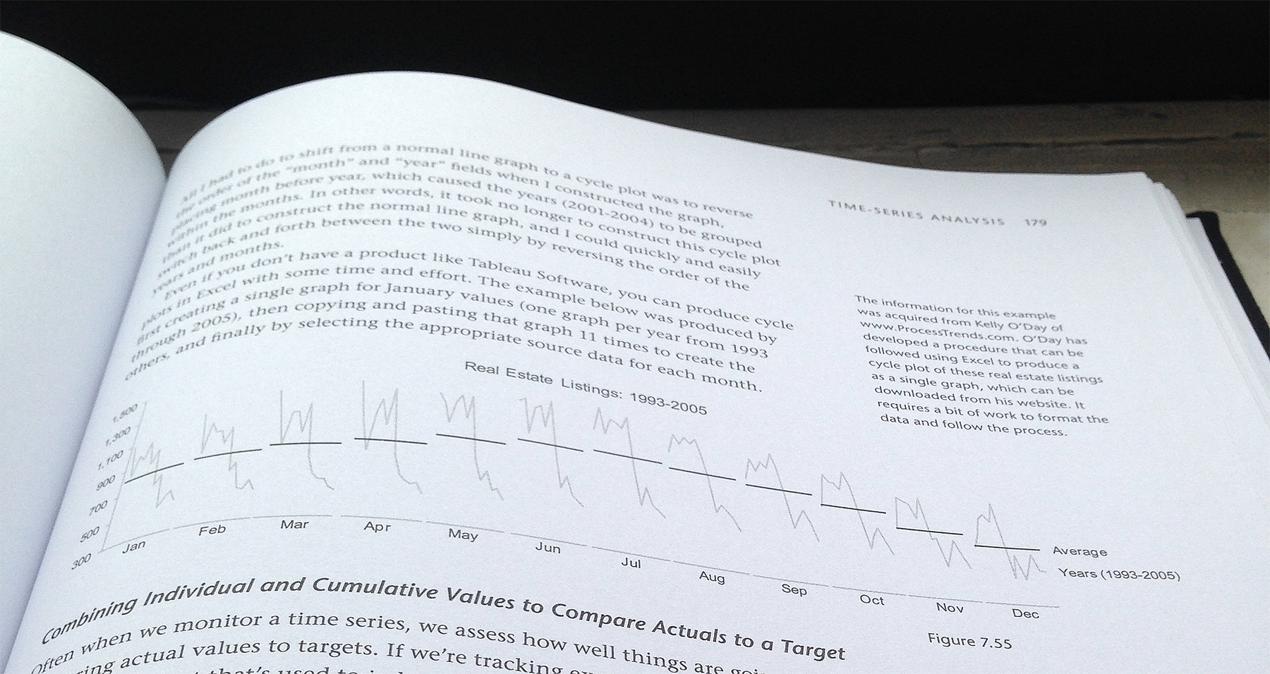
Few also covers a surprising amount of data analysis in Now You See It. The book provides an approachable introduction to data science, from navigating data to common patterns in time-series, deviation, distribution, correlation, and multivariate data. The below graphic is a great example of Few’s approach: here, Few regroups data by month to correct for periodicity and adds an average to help the reader see the patterns in the data.
Semiology of Graphics
by Jacques Bertin
Make no mistake: this is the ur-book of information visualization. Bertin’s masterpiece, published in 1967, outlines an systemic approach to the creation of information graphics as no other book has, before or since. In fact, Bertin provides a simple table that ties together math, music, and graphics, right on the second page of Semiology of Graphics:
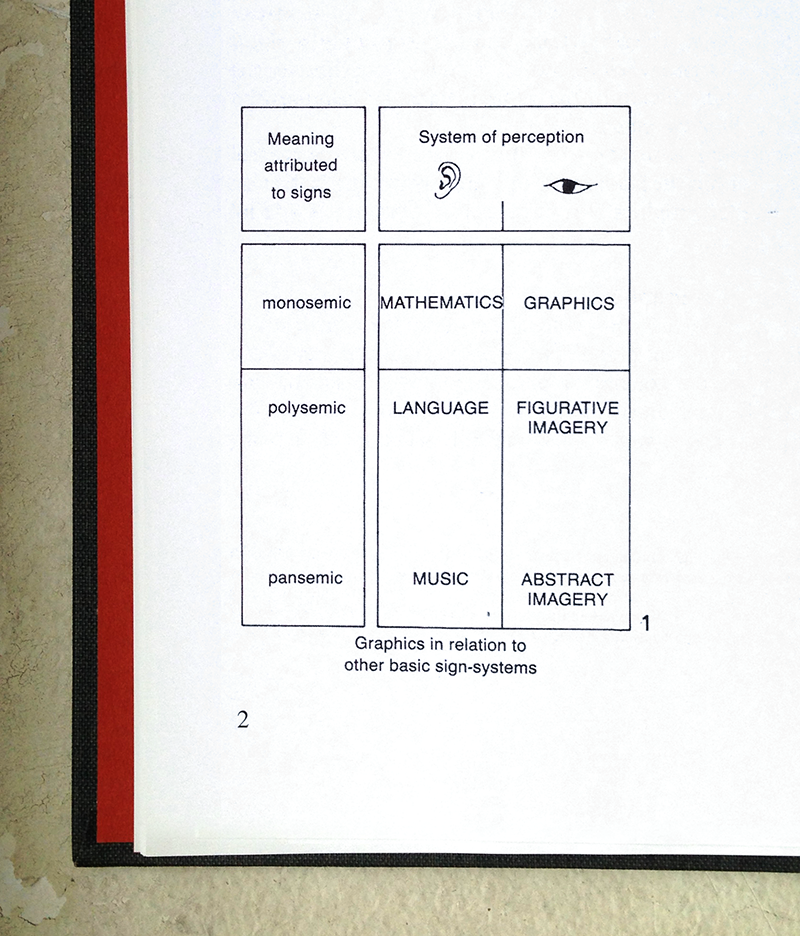
This table exemplifies Bertin’s approach to visualizing information: break a problem into its constituent elements, cross them, then examine and define each intersection. Bertin presents a whole system in Semiology of Graphics: he begins with retinal variables, such as size and color, which express planar dimensions, such as association, order, and quantity. Watch Bertin demonstrate the distinct graphic opportunities that the retinal variables provide for solving the same visual problem:

After addressing fundamentals, Bertin dives into theory. He covers the three questions every visualization should answer, as well as the three functions of visualization: recording, communicating, and processing information — here, by using his infamous “contingency table” and “reorderable matrix.” Bertin covers maps, graphics, and so much more in Semiology — though dense, a read pays dividends.
WSJ Guide to Information Graphics
by Dona M. Wong
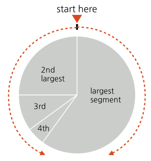
Wong’s reference book, Guide to Information Graphics, is rarely far from my desk. Even after years of designing visualizations, I still turn to page 75 for a quick check on her guidelines for ordering wedges in a pie chart — on the rare occasion I’m designing a pie chart, that is.
If you think that’s a simple and useful diagram, Wong’s book offers many more: 140 pages of ready reference for the working visualization designer. Guide to Information Graphics goes beyond chart fundamentals, too — the book also provides tips for math and copy writing, as well as a fun (and helpful) chapter titled “Tricky Situations”.
Visualize This
by Nathan Yau
Nathan Yau’s Visualize This is a fantastic book for beginners ready to move beyond out-of-the-box visualization tools and to create their own work.
Yau breaks down easy processes to create essential visualizations like bar graphs and U.S. maps. Using R to create visualizations, or taking rough graphs from Excel into Illustrator, are methods I use often, even today. For example, in a few clearly explained pages, Yau teaches how to transform a table of information into an excellent small-multiples visualization like this:

Information Visualization
by Colin Ware
Fair warning: I felt mislead by the title of this book. Though I expected another book about colors, shapes, bar graphs, line charts and the like, I found instead hardware specification for your eyes and brain.Information Visualization explains how our minds process visual information. It’s all there, from an in-depth explanation of how eyes seek edges and patterns, to color theory, to space perception, and even a chapter on the limits of memory.
By way of example, a nugget of knowledge I learned from Information Visualization: extend your arm and hold up your thumb — your thumbnail represents the extent of your focus, or more specifically, your fovea, where the vast majority of the cones that provide color vision cluster. Beyond your thumbnail, your brain is far more responsive to motion than to detail, which helps explain why animation can be incredibly powerful for visualizations and pre-attentive processing.
Designing Interfaces
by Jenifer Tidwell
Though Tidwell’s Designing Interfaces is hardly the only book on its subject, it is perhaps the best book I’ve read about common web design patterns. Anyone interested in designing interactive information visualizations would do well to familiarize herself with these common patterns. Though some forms, such as bar graphs and line graphs, may have matured, interaction with these forms still provides many opportunities for every designer.
In the book, Tidwell provides a practical overview of fundamental interface patterns, from site architecture to forms and controls. Tidwell also describes when to use specifc patterns, framed by the problems these patterns solve and their benefits for users. I was delighted to discover that Chapter 7 specifically addresses “Showing Complex Data” — she’s writing for us! Designing Interfaces is an excellent resource for new designers and great reference for those with experience.
The Visual Miscellaneum
by David McCandless
I picked up the first edition of David McCandless’s book, The Visual Miscellaneum, after a trip to an exhibit at the Cooper Hewitt Design Museum. Bar none, this is the book that convinced me to make information visualization my professional focus.
I fell in love with McCandless’s playful and unpretentious approach to visualizing data and information about the world around us, from budgets to to beards. The enthusiasm that welcomed his work made me believe that I could find a place in the world visualizing information. I turn to his book for inspiration, usually to see this frequently consulted graphic:
World Geographic Atlas
by Herbert Bayer
My favorite book of inspirational data graphics is, naturally, out of print and in demand. I watched eBay for months until I found a slightly damaged copy of World Geographic Atlas for less than four figures. It was worth it.
In 1953, the Container Corporation of America commissioned Bauhaus designer Herbert Bayer to create an atlas to commemorate the company’s 25th year of business. Alongside three other accomplished designers, Bayer worked for five years on an oversize (11.5" x 15.5") book of 368 pages, featuring over 2,200 diagrams. The results are stunning and, to my eye, yet unmatched. Just take a look at this rich spread on the United Kingdom and the Scandinavian countries:

From color choice to icon design, to illustrations, to topographic choropleth maps, this book literally has it all. Find a copy if you can, or, take a few minutes to watch this video.
Metropolitan World Atlas
by Joost Grootens
Joost Grootens is a Dutch graphic designer. Although theMetropolitan World Atlas is not his only covetable book, it is certainly my favorite. Grooten’s style is spare — he designs with only a few colors, one or two typefaces, and repeats, repeats, and repeats structure. This restraint lets his data — geographic or otherwise — take center stage.
Metropolitan World Atlas maps 50 major global cities at the same scale with consistent visualizations of data about those cities, including economic and population factors. It is strangely difficult to find any examples of a scaled comparison of major cities, let alone examples this beautiful and useful. Grootens takes advantage of the physical affordances of the book — comparing two cities is as easy as flipping pages back and forth:
Sadly, Metropolitan World Atlas is another out-of-print treasure. If you can find one, be sure to scoop it up!
Nine Great Books about Information Visualization的更多相关文章
- Trendalyzer is an information visualization software
Trendalyzer is an information visualization software for animation of statistics that was initially ...
- Data Visualization 课程 笔记1
对数据可视化比较有兴趣,因此最近在看coursera上伊利诺伊大学香槟分校的数据可视化课程,做了一些笔记. 1. 定义 Data visualization is a high bandwidth c ...
- 【Repost】A Practical Intro to Data Science
Are you a interested in taking a course with us? Learn about our programs or contact us at hello@zip ...
- 计算机视觉code与软件
Research Code A rational methodology for lossy compression - REWIC is a software-based implementatio ...
- 数据可视化的优秀入门书籍有哪些,D3.js 学习资源汇总
习·D3.js 学习资源汇总 除了D3.js自身以外,许多可视化工具包都是基于D3开发的,所以对D3的学习就显得很重要了,当然如果已经有了Javascript的经验,学起来也会不费力些. Github ...
- Networked Graphics: Building Networked Games and Virtual Environments (Anthony Steed / Manuel Fradinho Oliveira 著)
PART I GROUNDWORK CHAPTER 1 Introduction CHAPTER 2 One on One (101) CHAPTER 3 Overview of the Intern ...
- Fundamentals of Computer Graphics 中文版(第二版) (Peter Shirley 著)
1 引言 2 数学知识 3 光栅算法 4 信号处理 5 线性代数 6 矩阵变换 7 观察 8 隐藏面消除 9 表面明暗处理 10 光线追踪 11 纹理映射 12 完整的图形流水线 13 图形学的数据结 ...
- [z] 人工智能和图形学、图像处理方面的各种会议的评级
转载自:『http://www.cvchina.info/2010/08/31/conference-ranking-byar/』 澳大利亚政府和澳大利亚研究理事会做的,有一定考价值. 会议名称 会议 ...
- [Z] 计算机类会议期刊根据引用数排名
一位cornell的教授做的计算机类期刊会议依据Microsoft Research引用数的排名 link:http://www.cs.cornell.edu/andru/csconf.html Th ...
随机推荐
- js判断input输入框为空时遇到的问题 弹窗后,光标没有定位到输入框,而是直接执行我的处理页面程序
无论是会员注册还是提交订单,我们都要使用到form表单,此时我们在处理数据时,就要判断用户填写的信息.一次是直接通过js判断input输入框是否没有填信息,然后在后台处理文件中通过过滤字符串后再次判断 ...
- java中的上转型对象
1. 定义 如果B类是A类的子类或间接子类,当用B类创建对象b并将这个对象b的引用赋给A类对象a时,如: A a;a = new B();ORA a;B b = new B();a = b; 通俗的说 ...
- Eclipse启动 报错[Failed to load the JNI shared library jvm.dll
准备要做java服务器,在安装开发环境时,启动Eclipse报错[Failed to load the JNI shared library jvm.dll] 研究了下,造成错误的原因是由于eclip ...
- jad批量反编译class和jadeclipse集成到eclipse的设置方法
安装jad配置 1.从http://varaneckas.com/jad/下载windows版本的jad.exe 2.安装完毕后配置jad的系统环境变量 批量解压jar和class文件 1.使用7zi ...
- Myeclipse快捷键的设置
- MVC3.0 提交表单的方法
在views中使用 @using (Html.BeginForm()) 来完成,其中放一个submit类型的提交按钮,如: @using (Html.BeginForm()) { @Html.Vali ...
- jsp中Java代码中怎么获取jsp页面元素
举例,页面元素<td><input value="${sl }" type="text" id="sl" name=& ...
- 谈谈oracle中的临时表
--------------------创建临时表 临时保存从xml字符串解析来的数据--------------------------- 会话级别临时表SQL> create global ...
- C#winform程序自定义鼠标样式
public void SetCursor(Bitmap cursor, Point hotPoint) { int hotX = hotPoint.X; int hotY = hotPoint.Y; ...
- CSS布局模型思考
flow模型:默认布局模型,元素从左向右.从上到下依次排列,块状元素独占一行.Position属性对应值static. float模型:主要效果是让本来独占一行的块状元素变成内联-块状元素,并到一排显 ...