C# WPF 左侧菜单右侧内容布局效果实现
我们要做的效果是这样的,左侧是可折叠的菜单栏,右侧是内容区域,点击左侧的菜单项右侧内容区域则相应地切换。
wpf实现的话,我的办法是用一个tabcontrol,修改tabcontrol的样式模板,首先将控件的TabStripPlacement设置为left使tabcontrol的item header部分靠左内容靠右,然后用一个Expander将TabPanel包住实现可折叠菜单效果,最后就是把用到的控件样式修改一下即可。
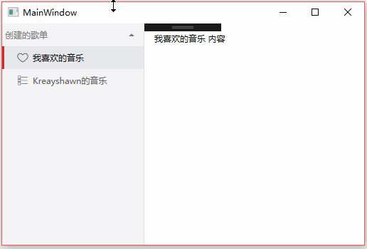
先看下效果图:
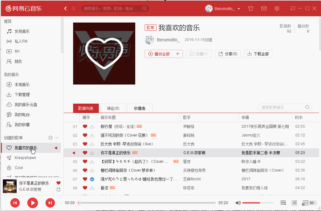
WPF做出来的效果图:
未完善的问题:
不能添加多个可折叠菜单,我暂时没想到比较好的办法。
新建一个项目,名字随你,新建一个自定义用户控件前台修改为:
<TabControl x:Class="cloundmusic_left.controls.itabcontrol"

             xmlns="http://schemas.microsoft.com/winfx/2006/xaml/presentation"

             xmlns:x="http://schemas.microsoft.com/winfx/2006/xaml"

             xmlns:mc="http://schemas.openxmlformats.org/markup-compatibility/2006"

             xmlns:d="http://schemas.microsoft.com/expression/blend/2008"

             xmlns:local="clr-namespace:cloundmusic_left.controls"

             mc:Ignorable="d"

             d:DesignHeight="" d:DesignWidth="">

    <TabControl.Resources>

        <!--折叠菜单的箭头按钮-->

        <ControlTemplate x:Key="ExpanderToggleButton"

                 TargetType="{x:Type ToggleButton}">

            <Border Background="{TemplateBinding Background}" Width="{TemplateBinding Width}" x:Name="Border"

        >

                <VisualStateManager.VisualStateGroups>

                    <VisualStateGroup x:Name="CheckStates">

                        <VisualState x:Name="Checked">

                            <Storyboard>

                                <ObjectAnimationUsingKeyFrames Storyboard.TargetProperty="(UIElement.Visibility)"

                                           Storyboard.TargetName="CollapsedArrow">

                                    <DiscreteObjectKeyFrame KeyTime=""

                                      Value="{x:Static Visibility.Hidden}" />

                                </ObjectAnimationUsingKeyFrames>

                                <ObjectAnimationUsingKeyFrames Storyboard.TargetProperty="(UIElement.Visibility)"

                                           Storyboard.TargetName="ExpandededArrow">

                                    <DiscreteObjectKeyFrame KeyTime=""

                                      Value="{x:Static Visibility.Visible}" />

                                </ObjectAnimationUsingKeyFrames>

                            </Storyboard>

                        </VisualState>

                        <VisualState x:Name="Unchecked" />

                        <VisualState x:Name="Indeterminate" />

                    </VisualStateGroup>

                </VisualStateManager.VisualStateGroups>

                <Grid Margin="0,0,13,0" HorizontalAlignment="Right" VerticalAlignment="Center">

                    <Path x:Name="CollapsedArrow"

            HorizontalAlignment="Center"

            VerticalAlignment="Center"

            Data="M 0 0 L 4 4 L 8 0 Z">

                        <Path.Fill>

                            <SolidColorBrush Color="#7d7d7d" />

                        </Path.Fill>

                    </Path>

                    <Path x:Name="ExpandededArrow"

            HorizontalAlignment="Center"

            VerticalAlignment="Center"

            Visibility="Collapsed"

            Data="M 0 4 L 4 0 L 8 4 Z">

                        <Path.Fill>

                            <SolidColorBrush Color="#7d7d7d" />

                        </Path.Fill>

                    </Path>

                </Grid>

            </Border>

        </ControlTemplate>

        <Style TargetType="{x:Type Expander}">

            <Setter Property="Cursor" Value="Hand"/>

            <Setter Property="Foreground" Value="#7d7d7d"/>

            <Setter Property="Template">

                <Setter.Value>

                    <ControlTemplate TargetType="{x:Type Expander}">

                        <Border BorderBrush="#e1e1e2" BorderThickness="0,0,1,0">

                            <Grid Background="#f5f5f7">

                                <Grid.RowDefinitions>

                                    <RowDefinition Height="Auto" />

                                    <RowDefinition x:Name="ContentRow"

                           Height="" />

                                </Grid.RowDefinitions>

                                <Border MinHeight="" x:Name="Border"

                  Grid.Row=""

                  >

                                    <Grid VerticalAlignment="Center">

                                        <ContentPresenter

                                Margin=""

                                ContentSource="Header"

                                RecognizesAccessKey="True" />

                                        <ToggleButton Background="Transparent" Width="{Binding ElementName=Border,Path=ActualWidth}" Panel.ZIndex="" OverridesDefaultStyle="True"

                            Template="{StaticResource ExpanderToggleButton}"

                            IsChecked="{Binding IsExpanded, Mode=TwoWay,

                  RelativeSource={RelativeSource TemplatedParent}}">

                                        </ToggleButton>

                                    </Grid>

                                </Border>

                                <Border x:Name="Content"

                  Grid.Row=""

                 >

                                    <ContentPresenter/>

                                </Border>

                            </Grid>

                        </Border>

                        <ControlTemplate.Triggers>

                            <Trigger Property="IsExpanded"

                   Value="True">

                                <Setter TargetName="ContentRow"

                    Property="Height"

                    Value="{Binding DesiredHeight, ElementName=Content}" />

                            </Trigger>

                        </ControlTemplate.Triggers>

                    </ControlTemplate>

                </Setter.Value>

            </Setter>

        </Style>

        <Style TargetType="{x:Type TabItem}">

            <Setter Property="OverridesDefaultStyle" Value="True"/>

            <Setter Property="Template">

                <Setter.Value>

                    <ControlTemplate TargetType="{x:Type TabItem}">

                        <Grid SnapsToDevicePixels="true">

                            <Border Cursor="Hand" MinWidth="" MinHeight="" x:Name="Bd" CornerRadius="" Background="Transparent" BorderBrush="{TemplateBinding BorderBrush}" BorderThickness="3,0,0,0" Padding="" Margin="">

                                <Grid VerticalAlignment="Center" HorizontalAlignment="Left">

                                    <StackPanel Orientation="Horizontal">

                                        <ContentPresenter x:Name="Content" Margin="17,0,0,0" ContentSource="Header" HorizontalAlignment="Left" RecognizesAccessKey="True" SnapsToDevicePixels="{TemplateBinding SnapsToDevicePixels}" VerticalAlignment="Center"/>

                                    </StackPanel>

                                </Grid>

                            </Border>

                        </Grid>

                        <ControlTemplate.Triggers>

                            <Trigger Property="IsMouseOver" Value="false">

                                <Setter Property="Foreground" Value="#5c5c5c"/>

                            </Trigger>

                            <Trigger Property="IsMouseOver" Value="true">

                                <Setter Property="Foreground" Value="#000000"/>

                            </Trigger>

                            <Trigger Property="IsSelected" Value="true">

                                <Setter Property="Panel.ZIndex" Value=""/>

                                <Setter Property="Background" TargetName="Bd" Value="#e6e7ea"/>

                                <Setter Property="Foreground" Value="#000000"/>

                                <Setter Property="BorderThickness" TargetName="Bd" Value="3,0,0,0"/>

                                <Setter Property="BorderBrush" TargetName="Bd" Value="#c62f2f"/>

                            </Trigger>

                        </ControlTemplate.Triggers>

                    </ControlTemplate>

                </Setter.Value>

            </Setter>

        </Style>

    </TabControl.Resources>

    <TabControl.Style>

        <Style  TargetType="{x:Type TabControl}">

            <Setter Property="OverridesDefaultStyle"

          Value="True" />

            <Setter Property="TabStripPlacement"

          Value="Left" />

            <Setter Property="SnapsToDevicePixels"

          Value="True" />

            <Setter Property="Template">

                <Setter.Value>

                    <ControlTemplate TargetType="{x:Type local:itabcontrol}">

                        <Grid>

                            <Grid.ColumnDefinitions>

                                <ColumnDefinition Width="" />

                                <ColumnDefinition Width="*" />

                            </Grid.ColumnDefinitions>

                            <!--可折叠菜单-->

                            <Expander Header="{TemplateBinding iTitle}" Grid.Column="">

                                <!--菜单项-->

                                <TabPanel x:Name="HeaderPanel"

                    IsItemsHost="True"

                    KeyboardNavigation.TabIndex=""

                    Background="Transparent" />

                            </Expander>

                            <!--右侧内容区域-->

                            <Border x:Name="Border"

                  Grid.Column=""

                  KeyboardNavigation.TabNavigation="Local"

                  KeyboardNavigation.DirectionalNavigation="Contained"

                  KeyboardNavigation.TabIndex="">

                                <ContentPresenter x:Name="PART_SelectedContentHost"

                              Margin=""

                              ContentSource="SelectedContent" />

                            </Border>

                        </Grid>

                    </ControlTemplate>

                </Setter.Value>

            </Setter>

        </Style>

    </TabControl.Style>

</TabControl>
修改后你的vs也许会抱一个错:
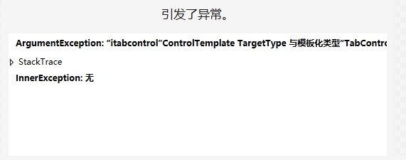

这个报错就像vs错误列表里的警告一样,没啥卵用,不用理它,程序是可以运行的 。
。
ok继续,后台代码加一个依赖属性:
 public string iTitle

        {

            get { return (string)GetValue(iTitleProperty); }

            set { SetValue(iTitleProperty, value); }

        }

        public static readonly DependencyProperty iTitleProperty =

            DependencyProperty.Register("iTitle", typeof(string), typeof(itabcontrol));
然后只要在界面中使用这个控件即可。
呃我发现这个项目并没有什么难点,实现方法开头也说了,所以这里不一步步讲了。
值得一提的是,加入的Expander也就是可折叠菜单的header代表菜单名,这里我是把修改的这个TabControl写在一个自定义控件里的,在界面调用的时候默认是无法给它设置内容的,所以我们要在这个自定义控件中加入一个依赖属性,然后在样式中绑定这个属性。这里就涉及到一个比较有意思的东西,在样式中绑定一个属性也许你没接触过,但是你一定知道Binding的用法,而在样式中是没办法这么用的,那该怎么去做呢?相信你看完代码就知道了。
项目下载:
C# WPF 左侧菜单右侧内容布局效果实现的更多相关文章
- 左侧菜单栏右侧内容(改进,有js效果)
(如有错敬请指点,以下是我工作中遇到并且解决的问题)上一篇文章是简洁版 这是上一篇文章的改进. 上一篇文章的左侧菜单是没有子目录的. 这是效果图: 左侧菜单代码: <div class=&quo ...
- HTMLCSS实现左侧固定宽度右侧内容可滚动
在做移动端页面的时候,经常会碰到一个div中分左右两个div,左侧div固定宽度或百分比,右侧div中内容左右溢出,需要左右滑动才可以浏览到全部内容,为此写了一个demo. 处理这个问题的核心关键点是 ...
- HTML和CSS实现左侧固定宽度右侧内容可滚动
在做移动端页面的时候,经常会碰到一个div中分左右两个div,左侧div固定宽度或百分比,右侧div中内容左右溢出,需要左右滑动才可以浏览到全部内容,为此写了一个demo. 处理这个问题的核心关键点是 ...
- C# 窗体 类似framest 左侧点击右侧显示 左侧菜单右侧显示
首先托一个splitContainer调节大小位置 然后进行再新创建一个窗体名为add 在左侧拖入button按钮 进入代码阶段 更改属性 public Main() { InitializeComp ...
- css布局之左侧固定右侧自适应布局
参考代码如下: <form id="form1" style="height:100%; overflow:hidden;"> <div st ...
- bootstrap实现左侧图片右侧文字布局
效果图 代码 通过class="media-left"来控制相对位置 <!DOCTYPE html> <html> <head lang=" ...
- ifram 实现左侧菜单,右侧显示内容
一般都是左侧的导航栏中的a标签中写一个target(a标签有target属性), 右侧的div标签中写一个iframe,在iframe中有name的属性,在左侧a标签中的target写上iframe中 ...
- ionic js 侧栏菜单 把主要内容区域从一边拖动到另一边,来让左侧或右侧的侧栏菜单进行切换
ionic 侧栏菜单 一个容器元素包含侧边菜单和主要内容.通过把主要内容区域从一边拖动到另一边,来让左侧或右侧的侧栏菜单进行切换. 效果图如下所示: 用法 要使用侧栏菜单,添加一个父元素<ion ...
- ajax实现简单的点击左侧菜单,右侧加载不同网页
实现:ajax实现点击左侧菜单,右侧加载不同网页(在整个页面无刷新的情况下实现右侧局部刷新,用到ajax注意需要在服务器环境下运行,从HBuilder自带的服务器中打开浏览效果即可) 原理:ajax的 ...
随机推荐
- Yii 错误页面处理
[错误页面处理] 訪问一个错误的控制器 訪问一个错误的方法 有些控制器和方法禁止訪问 以上訪问会提示错误信息 404 403 以上错误信息是不方便给外边用户看到的. 1. 安全隐患 2. 用户体 ...
- CImage将图片转为指定像素大小
CFileDialog fDlg(true, "jpg", "", OFN_HIDEREADONLY | OFN_OVERWRITEPROMPT, &q ...
- ArcGIS IQueryFilter接口
樱木 原文IQueryFilter 1.IQueryFilter::SubFields (1)默认值为“*”,即查询时返回整行数据,如果只需要某一个字段数据(比如“Country”字段),则可以指定 ...
- POJ 3627 Bookshelf 贪心 水~
最近学业上堕落成渣了.得开始好好学习了. 还有呀,相家了,好久没回去啦~ 还有和那谁谁谁... 嗯,不能发表悲观言论.说好的. 如果这么点坎坷都过不去的话,那么这情感也太脆弱. ----------- ...
- [AngularJS] Directive for top scroll bar
angular.directive('dblScroll', dblScroll) dblSroll.$inject = [ '$timeout' ]; function dblScroll($tim ...
- Android java.lang.IllegalStateException: Already logged in to server.
今晚在搞openfire时,无意中发现了这样的一个问题:问题描述: java.lang.IllegalStateException: Already logged in to server.原因:wh ...
- Go语言版黑白棋
1.游戏说明 2.无边框窗口实现 3.背景图.最小化.关闭窗口 4.界面其它设计 5.黑白子提示闪烁效果 6.落子 7.初始化棋子.改变角色 8.倒计时 9.吃子 10.棋子个数统计.胜负判断 11. ...
- centos / Linux 服务环境下安装 Redis 5.0.3
原文:centos / Linux 服务环境下安装 Redis 5.0.3 1.首先进入你要安装的目录 cd /usr/local 2.下载目前最新稳定版本 Redis 5.0.3 wget http ...
- [NPM] Run npm scripts in parallel
In this lesson we will look at running several npm scripts in parallel. Sometimes you don’t need scr ...
- [Ramda] Count Words in a String with Ramda's countBy and invert
You can really unlock the power of ramda (and functional programming in general) when you combine fu ...