
bootstrap学习笔记(表单)
1.基础表单 :对于基础表单,Bootstrap并未对其做太多的定制性效果设计,仅仅对表单内的fieldset、legend、label标签进行了定制。
fieldset {

min-width: 0;

padding: 0;

margin: 0;

border: 0;

}

legend {

display: block;

width: 100%;

padding: 0;

margin-bottom: 20px;

font-size: 21px;

line-height: inherit;

color: #333;

border: 0;

border-bottom: 1px solid #e5e5e5;

}

label {

display: inline-block;

margin-bottom: 5px;

font-weight: bold;

}
源码
2.水平表单 类名“form-horizontal”

.form-horizontal .control-label,

.form-horizontal .radio,

.form-horizontal .checkbox,

.form-horizontal .radio-inline,

.form-horizontal .checkbox-inline {

padding-top: 7px;

margin-top: 0;

margin-bottom: 0;

}

.form-horizontal .radio,

.form-horizontal .checkbox {

min-height: 27px;

}

.form-horizontal .form-group {

margin-right: -15px;

margin-left: -15px;

}

.form-horizontal .form-control-static {

padding-top: 7px;

}

@media (min-width: 768px) {

.form-horizontal .control-label {

text-align: right;

  }

}

.form-horizontal .has-feedback .form-control-feedback {

top: 0;

right: 15px;

}
源码
3.内联表单 类名“form-inline”
<form class="form-inline" role="form">

<div class="form-group">

  <label class="sr-only" for="exampleInputEmail2">邮箱</label>

  <input type="email" class="form-control" id="exampleInputEmail2" placeholder="请输入你的邮箱地址">

</div>

<div class="form-group">

  <label class="sr-only" for="exampleInputPassword2">密码</label>

  <input type="password" class="form-control" id="exampleInputPassword2" placeholder="请输入你的邮箱密码">

</div>

<div class="checkbox">

<label>

   <input type="checkbox">记住密码

</label>

</div>

<button type="submit" class="btnbtn-default">进入邮箱</button>

</form>

<--  .sr-only:给残障人员用的 -->

<-- .sr-only {

position: absolute;

width: 1px;

height: 1px;

padding: 0;

margin: -1px;

overflow: hidden;

clip: rect(0, 0, 0, 0);

border: 0;

}  -->
示例
表单控件
1.输入框input: 为了让控件在各种表单风格中样式不出错,需要添加类名“form-control”,下面各个表单控件都能加。
<!doctype html>

<html lang="en">

<head>

    <meta charset="UTF-8">

    <title>表单控件——输入框input</title>

    <link rel="stylesheet" href="//netdna.bootstrapcdn.com/bootstrap/3.1.1/css/bootstrap.min.css">

</head>

<body>

<form role="form">

  <div class="form-group">

    <input type="email" class="form-control" placeholder="Enter email">

    <input type="text" class="form-control" placeholder="Enter Username">

  </div>

</form>

</body>

</html>
示例
type类型:text button checkbox date datetime datetime-local img file hidden month number password radio range reset search submit tel time url week hidden
2.下拉选择框select:多行选择设置multiple属性的值为multiple
<form>

  <div class="form-group">

      <select multiple class="form-control">  //如果是下拉框就不要加multiple

          <option>踢足球</option>

          <option>游泳</option>

          <option>慢跑</option>

          <option>跳舞</option>

      </select>

  </div>

</form>
示例
3.内联表单 类名“form-inline”
<form class="form-inline" role="form">

<div class="form-group">

  <label class="sr-only" for="exampleInputEmail2">邮箱</label>

  <input type="email" class="form-control" id="exampleInputEmail2" placeholder="请输入你的邮箱地址">

</div>

<div class="form-group">

  <label class="sr-only" for="exampleInputPassword2">密码</label>

  <input type="password" class="form-control" id="exampleInputPassword2" placeholder="请输入你的邮箱密码">

</div>

<div class="checkbox">

<label>

   <input type="checkbox">记住密码

</label>

</div>

<button type="submit" class="btnbtn-default">进入邮箱</button>

</form>

<--  .sr-only:给残障人员用的 -->

<-- .sr-only {

position: absolute;

width: 1px;

height: 1px;

padding: 0;

margin: -1px;

overflow: hidden;

clip: rect(0, 0, 0, 0);

border: 0;

}  -->
示例
ea:添加了类名“form-control”类名,则无需设置cols属性。
<form role="form">

  <div class="form-group">

    <textarea class="form-control" rows="3"></textarea>

  </div>

</form>
示例
4.复选框checkbox和单选择按钮radio:水平排列加类名“checkbox-inline”||类名“radio-inline”
<form role="form">

  <div class="form-group">

    <textarea class="form-control" rows="3"></textarea>

  </div>

</form>
示例
4.复选框checkbox和单选择按钮radio:水平排列加类名“checkbox-inline”||类名“radio-inline”
<!doctype html>

<html lang="en">

<head>

    <meta charset="UTF-8">

    <title>表单控件——表单控件大小</title>

    <link rel="stylesheet" href="//netdna.bootstrapcdn.com/bootstrap/3.1.1/css/bootstrap.min.css">

</head>

<body>

<form role="form">

  <h3>案例1</h3>

  <div class="checkbox">

    <label>

      <input type="checkbox" value="">

      记住密码

    </label>

  </div>

  <div class="radio">           //如果要水平class=“radio-inline”

    <label>

      <input type="radio" name="optionsRadios" id="optionsRadios1" value="love" checked>

      喜欢

    </label>

  </div>

    <div class="radio">         //如果要水平class=“radio-inline”

    <label>

      <input type="radio" name="optionsRadios" id="optionsRadios2" value="hate">

      不喜欢

    </label>

  </div>

</form>

</body>

</html>
示例
.radio,

.checkbox {

display: block;

min-height: 20px;

padding-left: 20px;

margin-top: 10px;

margin-bottom: 10px;

}

.radio label,

.checkbox label {

display: inline;

font-weight: normal;

cursor: pointer;

}

.radio input[type="radio"],

.radio-inline input[type="radio"],

.checkbox input[type="checkbox"],

.checkbox-inline input[type="checkbox"] {

float: left;

margin-left: -20px;

}

.radio + .radio,

.checkbox + .checkbox {

margin-top: -5px;

}
源码
.radio-inline,

.checkbox-inline {

display: inline-block;

padding-left: 20px;

margin-bottom: 0;

font-weight: normal;

vertical-align: middle;

cursor: pointer;

}

.radio-inline + .radio-inline,

.checkbox-inline + .checkbox-inline {

margin-top: 0;

margin-left: 10px;

}
水平排列源码
5.控件大小:类名input-sm:让控件比正常大小更小;类名input-lg:让控件比正常大小更大;宽度配合Bootstrap的网格系统
.input-sm {

height: 30px;

padding: 5px 10px;

font-size: 12px;

line-height: 1.5;

border-radius: 3px;

}

select.input-sm {

height: 30px;

line-height: 30px;

}

textarea.input-sm,

select[multiple].input-sm {

height: auto;

}

.input-lg {

height: 46px;

padding: 10px 16px;

font-size: 18px;

line-height: 1.33;

border-radius: 6px;

}

select.input-lg {

height: 46px;

line-height: 46px;

}

textarea.input-lg,

select[multiple].input-lg {

height: auto;

}
源码
6.表单控件状态(焦点状态):类名form-control
.form-control:focus {

border-color: #66afe9;

outline: 0;

  -webkit-box-shadow: inset 0 1px 1pxrgba(0,0,0,.075), 0 0 8px rgba(102, 175, 233, .6);

box-shadow: inset 0 1px 1pxrgba(0,0,0,.075), 0 0 8px rgba(102, 175, 233, .6);

}
源码
7.表单控件状态(禁用状态):form-control别忘记加①在需要禁用的表单控件上加上“disabled”;②fieldset设置了disabled属性,整个域都将处于被禁用状态。
.form-control[disabled],

.form-control[readonly],

fieldset[disabled] .form-control {

cursor: not-allowed;

background-color: #eee;

opacity: 1;

}
源码
8.表单控件状态(验证状态):1、.has-warning:警告状态(黄色) 2、.has-error:错误状态(红色) 3、.has-success:成功状态(绿色)


 :需要类名has-feedback + <span class="glyphicon glyphicon-remove form-control-feedback"></span>
9.表单提示信息:"help-block" 
.help-block {

display: block;

margin-top: 5px;

margin-bottom: 10px;

color: #737373;

}
源码
按钮
建议使用button或a标签来制作按钮
1.基本按钮:类名“btn”
.btn {

display: inline-block;

padding: 6px 12px;

margin-bottom: 0;

font-size: 14px;

font-weight: normal;

line-height: 1.42857143;

text-align: center;

white-space: nowrap;

vertical-align: middle;

cursor: pointer;

  -webkit-user-select: none;

     -moz-user-select: none;

      -ms-user-select: none;

user-select: none;

background-image: none;

border: 1px solid transparent;

border-radius: 4px;

}
源码
2.默认按钮: 类名“btn” + 类名“btn-default” 
.btn-default {

color: #333;

background-color: #fff;

border-color: #ccc;

}
源码


4.按钮大小: .btn-lg:大型按钮 .btn-sm:小型按钮 .btn-cs:超小型按钮
.btn-lg,

.btn-group-lg> .btn {

padding: 10px 16px;

font-size: 18px;

line-height: 1.33;

border-radius: 6px;

}

.btn-sm,

.btn-group-sm> .btn {

padding: 5px 10px;

font-size: 12px;

line-height: 1.5;

border-radius: 3px;

}

.btn-xs,

.btn-group-xs> .btn {

padding: 1px 5px;

font-size: 12px;

line-height: 1.5;

border-radius: 3px;

}
源码
5.块状按钮: 类名“btn-block”
6.禁用状态: 使用disabled类或disabled属性
图像 1.img-responsive:响应式图片,主要针对于响应式设计 2.img-rounded:圆角图片 3.img-circle:圆形图片 4.img-thumbnail:缩略图片
img {

vertical-align: middle;

}

.img-responsive,

.thumbnail>img,

.thumbnail a >img,

.carousel-inner > .item >img,

.carousel-inner > .item > a >img {

display: block;

max-width: 100%;

height: auto;

}

.img-rounded {

border-radius: 6px;

}

.img-thumbnail {

display: inline-block;

max-width: 100%;

height: auto;

padding: 4px;

line-height: 1.42857143;

background-color: #fff;

border: 1px solid #ddd;

border-radius: 4px;

  -webkit-transition: all .2s ease-in-out;

transition: all .2s ease-in-out;

}

.img-circle {

border-radius: 50%;

}
源码
图标
http://getbootstrap.com/components/#glyphicons:查看全部图标
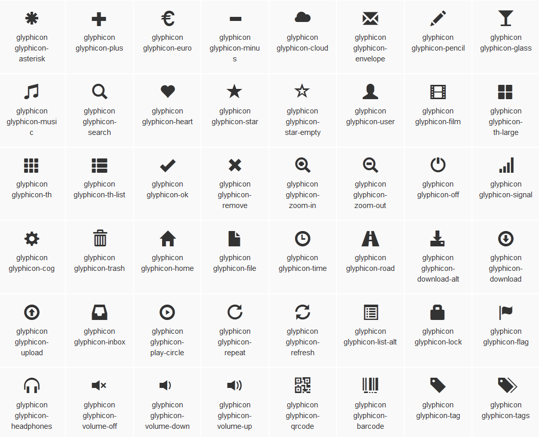
@font-face {

font-family: 'Glyphicons Halflings';

src: url('../fonts/glyphicons-halflings-regular.eot');

src: url('../fonts/glyphicons-halflings-regular.eot?#iefix') format('embedded-opentype'), url('../fonts/glyphicons-halflings-regular.woff') format('woff'), url('../fonts/glyphicons-halflings-regular.ttf') format('truetype'), url('../fonts/glyphicons-halflings-regular.svg#glyphicons_halflingsregular') format('svg');

}

<!--使用-->

.glyphicon {

position: relative;

top: 1px;

display: inline-block;

font-family: 'Glyphicons Halflings';

font-style: normal;

font-weight: normal;

line-height: 1;

  -webkit-font-smoothing: antialiased;

  -moz-osx-font-smoothing: grayscale;

}

.glyphicon-asterisk:before {

content: "\2a";

}
bootstrap学习笔记(表单)的更多相关文章
- Bootstrap学习(2)--表单
Bootstrap里的role属性,增强标签的语义化,提高识别力, 如:<form role="form"> input.select.textarea等元素,在Bo ...
- php学习笔记——表单
13.表单 1)GET vs. POST GET 和 POST 都创建数组(例如,array( key => value, key2 => value2, key3 => value ...
- [html5] 学习笔记-表单新增的元素与属性(续)
本节主要讲解表单新增元素的controls属性.placeholder属性.List属性.Autocomplete属性.Pattern属性.SelectionDirection属性.Indetermi ...
- 9. Javascript学习笔记——表单处理
9. 表单处理 9.1 表单的基础知识 ///表单用 <form> 元素表示,对应的是 HTMLFormElement 类型,继承自 HTMLElement. //属性:action.me ...
- Bootstrap学习-排版-表单
1.标题 <h1>~<h6>,所有标题的行高都是1.1(也就是font-size的1.1倍). 2.副标题 <small>,行高都是1,灰色(#999) <h ...
- JavaScript高级程序设计学习笔记--表单脚本
提交表单 用户单击提交按钮或图像按钮时,就会提交表单.使用<input>和<button>都可以定义提交按钮,只要将其type特性的值设置为"submit" ...
- [html5] 学习笔记-表单新增元素与属性
本节讲的是表单元素的form,formaction属性,frommethod,formenctype属性,formtarget,autofocus属性,required,labels属性. 1.for ...
- Vue.js学习笔记——表单控件实践
最近项目中使用了vue替代繁琐的jquery处理dom的数据更新,个人非常喜欢,所以就上官网小小地实践了一把. 以下为表单控件的实践,代码敬上,直接新建html文件,粘贴复制即可看到效果~ <! ...
- HTML5 学习笔记 表单属性
HTML5新的表单属性 HTML5 的form和input 标签添加了几个新的属性 <form>新属性 autocomplete novalidate input 新属性 autocomp ...
随机推荐
- spring定时任务的注解实现方式
STEP 1:在spring配置文件中添加相应配置,以支持定时任务的注解实现 (一)在xml里加入task的命名空间 <!-- beans里添加:--> xmlns:task=" ...
- JSON.stringify和JSON.parse的使用
JSON.stringify 函数 (JavaScript)将 JavaScript 值转换为 JavaScript 对象表示法 (Json) 字符串.JSON.stringify(value [, ...
- leetcode-166-分数到小数(用余数判断有没有出现小数的循环体)
题目描述: 给定两个整数,分别表示分数的分子 numerator 和分母 denominator,以字符串形式返回小数. 如果小数部分为循环小数,则将循环的部分括在括号内. 示例 1: 输入: n ...
- Window History对象
History 对象属性 length 返回浏览器历史列表中的 URL 数量. History 对象方法 back() 加载 history 列表中的前一个 URL. window.history.b ...
- AsyncTask的前世今生
先看下Java Threading Framework的类图: Callable与Runnable类似,差别在Callable具有返回值,共同点是两个都是执行体,一般都抽象为任务处理. ...
- Redis查询&JDBC查询&Hibernate查询方式的效率比较...
比较三种查询方式查询效率对比...我是用的JavaWeb的方式通过通过JSP页面查询的填写查询的参数...给予反馈.... 整个demo的下载地址:http://files.cnblogs.com/f ...
- (转)十分钟了结MySQL information_schema
十分钟了结MySQL information_schema 原文:http://www.cnblogs.com/shengdimaya/p/6920677.html information_sche ...
- windows 安装openssl
参考文章:http://www.cnblogs.com/tangxin-blog/p/5724071.html 准备条件: 1.VS2012 (携带c++) 2.下载openssl 源码 3.安装Pe ...
- 弹幕和回到顶部前端web
弹幕和回到顶部前端web 弹幕 1.效果演示 2.相关代码 <!DOCTYPE html> <html lang="en"> <head> &l ...
- pict总结
pict总结 pict总结 Friday, September 25, 2015 12:03 PM pict:微软出品的一个自动生成case工具,运用组合测试方法 1 pict安装 2 pict环境变 ...