echarts图表配置
1.柱状图
option = {
xAxis: {
type: 'category',
data: ['Mon', 'Tue', 'Wed', 'Thu', 'Fri', 'Sat', 'Sun']
},
toolbox: {
//show: true,
itemSize: 20,
itemGap: 30,
right: 50,
feature: {
dataView: {show:true},
saveAsImage: {
//excludeComponents :['toolbox'],
pixelRatio: 2
}
}
},
yAxis: {
type: 'value',
show: false,
splitLine: {
show: true,
}
},
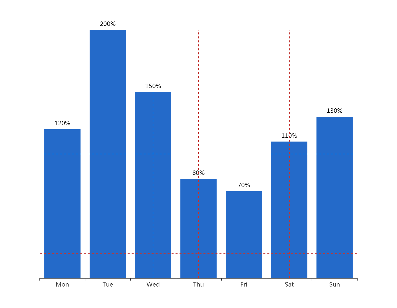
series: [{
data: [120, 200, 150, 80, 70, 110, 130],
type: 'bar',
markLine: {
symbol: ['none', 'none'],
label: {show: false},
data: [
{yAxis: 20},
{yAxis: 100},
{xAxis: 2},
{xAxis: 3},
{xAxis: 5},
{xAxis: 7}
]
},
itemStyle: {
normal: {
color: function(params) {
return '#246AC9';
},
label: {
show: true,
position: 'top',
textStyle: {
color: "black"
},
formatter: '{c}%'
}
}
}
}]
};

option = {

    xAxis: {

        type: 'category',

        boundaryGap: false

    },

    yAxis: {

        type: 'value',

        boundaryGap: [0, '30%']

    },

      toolbox: {

            //show: true,

            itemSize: 20,

            itemGap: 30,

            right: 50,

            feature: {

                dataView: {show:true},

                saveAsImage: {

                    //excludeComponents :['toolbox'],

                    pixelRatio: 2

                }

            }

},

    visualMap: {

        type: 'piecewise',

        show: false,

        dimension: 0,

        seriesIndex: 0,

        pieces: [{

            gt: 1,

            lt: 3,

            color: 'rgba(0, 180, 0, 0.5)'

        }, {

            gt: 5,

            lt: 7,

            color: 'rgba(0, 180, 0, 0.5)'

        }]

    },

    series: [

        {

            type: 'line',

            smooth: 0.6,

            symbol: 'none',

            lineStyle: {

                color: 'green',

                width: 5

            },

            markLine: {

                symbol: ['none', 'none'],

                label: {show: false},

                data: [

                    {yAxis: 100},

                    {yAxis: 300},

                    {xAxis: 2},

                    {xAxis: 3},

                    {xAxis: 5},

                    {xAxis: 7}

                ]

            },

            areaStyle: {},

            data: [

                ['2019-10-10', 200],

                ['2019-10-11', 400],

                ['2019-10-12', 650],

                ['2019-10-13', 500],

                ['2019-10-14', 250],

                ['2019-10-15', 300],

                ['2019-10-16', 450],

                ['2019-10-17', 300],

                ['2019-10-18', 100]

            ]

        }

    ]

};

option ={

  xAxis: {

    type: 'category',

    data: ['AA', 'BB'],

    axisLabel: {

       fontSize: 12,

      color: (value) => {

        // return value == '第一个' ? 'green' : 'red';

        return 'black'

      }

    },

    axisLine: {

      lineStyle: {

        type: 'dashed',

        color: '#ccc', // X轴线的颜色

        width: '1' // 坐标线的宽度

      }

    }

  },

  yAxis: {

    type: 'value',

    show: false,

    splitLine: {

      show: true,

    }

  },

  grid: { // 控制距離上下左右距離

    left: -10, // 配合设置barWidth

    right: 10,

    top: 35,

    bottom: 80,

    containLabel: true

  },

  series: [{

    data: [100, 31],

    type: 'bar',

    barWidth: 18,

    // barGap: '10%',

    // /*多个并排柱子设置柱子之间的间距*/

    // barCategoryGap: '20%',

    // /*多个并排柱子设置柱子之间的间距*/

    markLine: {

      symbol: ['none', 'none'],

      itemStyle: {

        normal: {

          lineStyle: {

            // type: 'solid',

            color: '#4a4c56', // 控制辅助线的颜色

            opacity: 0.5

          },

          label: {

            show: false, // 控制辅助线是否显示后边的东西

            position: 'end'

          }

        },

      },

      label: {

        show: false

      },

      data: [{

          yAxis: 25

        }, {

          yAxis: 50

        }, {

          yAxis: 75

        },

        {

          yAxis: 100

        }

      ]

    },

    itemStyle: {

      normal: {

        color: (params) => {

          console.log(params)

          // return '#fff'; // 控制柱狀條的顏色

          var colorList = ['#0263ff', '#00ffff', '#64BD3D', '#EE9201', '#29AAE3', '#B74AE5', '#0AAF9F', '#E89589', '#16A085', '#4A235A', '#C39BD3 ', '#F9E79F', '#BA4A00', '#ECF0F1', '#616A6B', '#EAF2F8', '#4A235A', '#3498DB'];

          return colorList[params.dataIndex]

        },

        label: {

          show: true,

          position: 'top',

          textStyle: {

            color: "white" // 控制頂部文字的顏色

          },

          formatter: '{c}%'

        }

      }

    }

  }]

};
// let myChart = echarts.init(document.getElementById('main'))
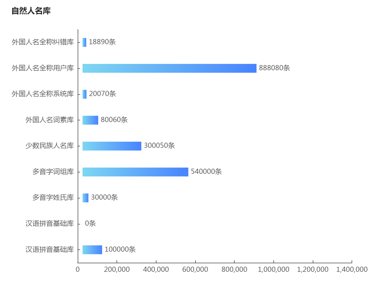
let data = [100000, 0, 30000, 540000, 300050, 80060, 20070, 888080, 18890]
let yAxisData = ['汉语拼音基础库', '汉语拼音基础库', '多音字姓氏库', '多音字词组库', '少数民族人名库', '外国人名词素库', '外国人名全称系统库', '外国人名全称用户库', '外国人名全称纠错库']
option = {
title: {
text: '自然人名库',
left: 18,
top: 10,
textStyle: {
color: '#282828',
fontSize: 16
}
},
color: ['#3398DB'],
fontSize: 14,
tooltip: {
trigger: 'axis',
axisPointer: { // 坐标轴指示器,坐标轴触发有效
type: 'shadow' // 默认为直线,可选为:'line' | 'shadow'
}
},
toolbox: {
//show: true,
itemSize: 20,
itemGap: 30,
right: 50,
feature: {
dataView: {show:true},
saveAsImage: {
//excludeComponents :['toolbox'],
pixelRatio: 2
}
}
},
grid: {
left: '3%',
containLabel: true
},
xAxis: [{
type: 'value',
splitLine: {
show: false
},
max: 1400000,
splitNumber: 8,
axisTick: {
alignWithLabel: true,
inside: true,
lengt: 6
},
axisPointer: {
type: 'none'
},
axisLabel: {
textStyle: {
color: '#5A5A5A',
fontSize: 14
}
}
}],
yAxis: [{
type: 'category',
data: yAxisData,
axisTick: {
alignWithLabel: true,
inside: true
},
axisLabel: {
textStyle: {
color: '#5A5A5A',
fontSize: 14
}
}
}],
series: [{
name: 'assist',
type: 'bar',
stack: '1',
itemStyle: {
normal: {
barBorderColor: 'rgba(0,0,0,0)',
color: 'rgba(0,0,0,0)'
},
emphasis: {
barBorderColor: 'rgba(0,0,0,0)',
color: 'rgba(0,0,0,0)'
}
},
tooltip: {
trigger: 'none'
},
data: [25000, 25000, 25000, 25000, 25000, 25000, 25000, 25000, 25000]
}, {
name: '总条数',
type: 'bar',
stack: '1',
barWidth: 18, // 柱子宽度
itemStyle: {
normal: {
label: {
formatter: '{c}' + '条', // 自定义柱顶显示内容
show: true,
position: 'right',
color: '#5A5A5A',
fontSize: 14
},
color: new echarts.graphic.LinearGradient( // 五个参数,前四个参数分别对应“右/下/左/上”,渐变开始的位置
0, 0, 1, 0, [{
offset: 0,
color: '#7DD7F1'
}, {
offset: 0.25,
color: '#70C2F5'
}, {
offset: 0.5,
color: '#62ADF8'
}, {
offset: 0.75,
color: '#5598FC'
}, {
offset: 1,
color: '#4783FF'
}]
)
}
},
data: data
}]
}
这个来自https://wobuzy.com/2019/11/27/echarts-bar.html
好看的legend添加不同色块+文字跳色
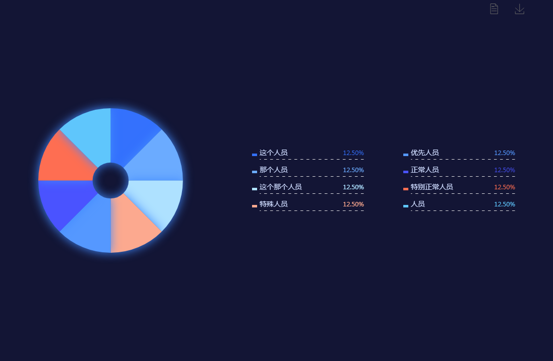
let pieSource = {

        '这个人员': 335,

        '那个人员': 335,

        '这个那个人员': 335,

        '特殊人员': 335,

        '优先人员': 335,

        '正常人员': 335,

        '特别正常人员': 335,

        '人员': 335,

    },

    legendColor = ["#3471fd", "#6babff", "#aee1ff", "#fca98f", "#5598ff", "#4a53ff", "#fe6e52", "#5fc6fc"],

    richStyle = {};

function initData(source) {

    legendColor.map((item, index) => {

        richStyle['style' + index] = {};

        richStyle['style' + index]['color'] = item;

        richStyle['style' + index]['align'] = 'right';

    });

    if (Object.prototype.toString.call(source) === '[object Object]') {

        const arr = [];

        const legendData = [];

        Object.entries(source).forEach((value) => {

            legendData.push(value[0]);

            let obj = {};

            obj.name = value[0];

            obj.value = value[1];

            arr.push(obj);

        });

        source = arr;

        return {

            source,

            legendData

        };

    } else if (source && Object.prototype.toString.call(source) === '[object Array]') {

        let legendData = [];

        source.forEach((item, index) => {

            legendData.push(item.name);

        });

        return {

            source,

            legendData

        };

    }

}

source = initData(pieSource);

option = {

    backgroundColor: '#131535',

     toolbox: {

            //show: true,

            itemSize: 20,

            itemGap: 30,

            right: 50,

            feature: {

                dataView: {show:true},

                saveAsImage: {

                    //excludeComponents :['toolbox'],

                    pixelRatio: 2

                }

            }

},

    tooltip: {

        trigger: 'item',

        textStyle: {

            color: '#fff',

            // fontSize:28

        },

        formatter: "{a} <br/>{b} : {c} ({d}%)"

    },

    color: legendColor,

    legend: [{

            orient: 'vertical',

            left: 500,

            y: 'center',

            icon: 'rect',

            textStyle: {

                color: '#cddafd',

                fontSize: 14,

                rich: richStyle,

                width: 207,

                height: 20,

                backgroundColor: {

                    image: '/asset/get/s/data-1545016257824-mxLqGjr4z.png',

                },

            },

            padding: [30, 0, 30, 0],

            itemWidth: 10,

            itemHeight: 5,

            itemGap: 20,

            data: source.legendData.slice(0, 4),

            formatter: function(name) {

                let oa = option.series[0].data;

                let total = 0;

                oa.forEach((item, index) => {

                    total += item.value;

                });

                for (let i = 0; i < oa.length; i++) {

                    if (name == oa[i].name) {

                        // return name + '  ' + '{style'+i+'|' + (oa[i].value / total * 100).toFixed(2) + '%}';

                        return name + '{style' + i + '|' + (oa[i].value / total * 100).toFixed(2) + '%}';

                    }

                }

            },

        },

        {

            orient: 'vertical',

            left: 800,

            y: 'center',

            icon: 'rect',

            textStyle: {

                color: '#cddafd',

                fontSize: 14,

                rich: richStyle,

                width: 207,

                height: 20,

                backgroundColor: {

                    image: '/asset/get/s/data-1545016257824-mxLqGjr4z.png',

                },

            },

            padding: [30, 0, 30, 0],

            itemWidth: 10,

            itemHeight: 5,

            itemGap: 20,

            data: source.legendData.slice(4),

            formatter: function(name) {

                let oa = option.series[0].data;

                let total = 0;

                oa.forEach((item, index) => {

                    total += item.value;

                });

                for (let i = 0; i < oa.length; i++) {

                    if (name == oa[i].name) {

                        return name + '  ' + '{style' + i + '|' + (oa[i].value / total * 100).toFixed(2) + '%}';

                    }

                }

            },

        }

    ],

    series: [{

        name: '重点人员',

        type: 'pie',

        radius: ['10%', '40%'],

        center: ['20%', '50%'],

        data: source.source,

        itemStyle: {

            normal: {

                label: {

                    show: false

                },

                shadowColor: '#438bff',

                shadowBlur: 20

            },

        }

    }]

};
echarts图表配置的更多相关文章
- ECharts图表——封装通用配置
前言 前段时间在做大屏项目,大量用到echarts图表,大屏对设计规范要求比较高,而大屏项目,经常会因为业务方面的原因.或者是数据方面的原因改动UI设计,所有图表的代码也是三天一小改.五天一大改 因此 ...
- angular2项目关于Echarts图表的处理
在NiceFish项目中关于Echarts组件和指令是直接注册在appModule根模块中的,这样路由只需这样写就可以让浏览器加载图标组件: 在chart组件视图中: <div class=&q ...
- Echarts图表常用功能配置,Demo示例
先看下效果图: 就如上图所示,都是些常用的基本配置. Legend分页,X轴设置,Y轴设置,底部缩放条设置, 数值显示样式设置,工具箱设置,自定义工具按钮, 绑定点击事件等等.这些配置代码中都做了简单 ...
- ***ECharts图表入门和最佳实践
ECharts数据图表系统? 5分钟上手! [ECharts简介] ECharts开源来自百度商业前端数据可视化团队,基于html5 Canvas,是一个纯Javascript图表库,提供直观,生动, ...
- 【可视化】DataV接入ECharts图表库 可视化利器强强联手
DataV接入ECharts图表库 可视化利器强强联手 摘要: 两个扛把子级产品的结合,而且文末有彩蛋. DataV 数据可视化是搭建每年天猫双十一作战大屏的幕后功臣,ECharts 是广受数据可视化 ...
- vue table中使用多选的问题(翻页后如何保存已选项),联动echarts图表实现流量监控
流量监控项目需求: 根据表格数据,添加多选功能,默认全选,根据已选项更新图表视图 1.表格需要多选 2.要联动图表,所以关键是要利用表格多选的触发回调函数 vue table中使用多选: 很简单,只需 ...
- 转:ECharts图表组件入门教程之Theme:ECharts图表的皮肤是什么?如何给图表换主题(皮肤)Theme?
一.什么是ECharts图表的皮肤(主题)? 针对这个问题我只能这样回答,ECharts图表的主题(皮肤)就犹如人的衣服一样,是用来衬托和渲染主体,使其变得更加美观好看的目的.你去过ECharts图表 ...
- vue中添加Echarts图表的使用,Echarts的学习笔记
项目中需要使用一些折线图.柱状图.饼状图等等,之前使用过heightCharts(关于heightCharts请看我的另一篇 http://www.cnblogs.com/jasonwang2y60/ ...
- ECharts 图表设置标记的大小 symbolSize 和获取标记的值
ECharts 是百度出品,一个纯 Javascript 的图表库,可以流畅的运行在 PC 和移动设备上,兼容当前绝大部分浏览器(IE8/9/10/11,Chrome,Firefox,Safari等) ...
随机推荐
- Codeforces Round #830 (Div. 2) A-D
比赛链接 A 题解 知识点:贪心,数论. 先求出序列最大公约数 \(d\) ,如果为 \(1\) 直接输出 \(0\) . 否则,尝试用最后一个数操作, \(gcd(d,n) = 1\) 则可以,花费 ...
- jquery的toggle()函数,显示/隐藏交替
<!DOCTYPE html> <html lang="en"> <head> <script src="jquery.js&q ...
- Oracle中查询表结构的六种方法
首发微信公众号:SQL数据库运维 原文链接:https://mp.weixin.qq.com/s?__biz=MzI1NTQyNzg3MQ==&mid=2247485212&idx=1 ...
- Python基础部分:1、typora软件和对计算机的认识
目录 一.typora软件 1.安装 2.markdown语法 二.计算机的本质 1.进制数 三.计算机五大组成部分概要 1.控制器 2.运算器 3.存储器 4.输入设备 5.输出设备 一.typor ...
- Azure DevOps Server 设置项目管理用户,用户组
一,引言 Azure DevOps Server 搭建完成后,关于如何进行项目管理,项目成员管理等,我们接着上一篇文章,继续讲解 Azure DevOps Server 的用户,用户组.首先,我们需要 ...
- 第2-3-2章 环境搭建-文件存储服务系统-nginx/fastDFS/minio/阿里云oss/七牛云oss
目录 5. 文件服务开发 5.1 环境搭建 5.1.1 数据库环境搭建 5.1.2 Nacos环境搭建 5.1.3 Nginx环境搭建 5.1.4 maven工程环境搭建 5. 文件服务开发 全套代码 ...
- 安装harbor仓库
1.安装docker-compose curl -L "https://github.com/docker/compose/releases/download/1.29.2/docker-c ...
- 关于python实现html转word(docx)
安装 linux平台 sudo apt install pandoc pip3 install pypandoc 示例代码 import pypandoc output = pypandoc.conv ...
- Mybatis SQL 对应Oracle中javaType和jdbcType对应
<resultMap type="java.util.Map" id="resultjcm"> <result property=" ...
- Apache手动安装教程及报错解决梳理
操作参考教程:https://www.cnblogs.com/haw2106/p/9839655.html 下载地址(例):wget https://dlcdn.apache.org/httpd/ht ...