【Demo】CSS3 动画 加载进度条
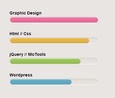
实例结果图:
完整代码:
<!DOCTYPE html>

<html>

    <head>

        <meta charset="UTF-8">

        <title>加载进度条</title>

        <style type="text/css">

            body{

                background: #e9e5e2;

            }

            #skill{

                list-style: none;

                font: 12px "Helvetica Neue", Arial, Helvetica, Geneva, sans-serif;

                width: 296px;

                margin: 50px auto 0;

                position: relative;

                line-height: 2em;

                padding: 30px 0;

            }

            #skill li{

                margin-bottom: 50px;

                background: #e9e5e2;

                background-image: -webkit-gradient(linear, 0 0, 0 100%, from(#e1ddd9), to(#e9e5e2));

                background-image: -webkit-linear-gradient(#e1ddd9, #e9e5e2);

                background-image: -moz-linear-gradient(#e1ddd9, #e9e5e2);

                background-image: -o-linear-gradient(#e1ddd9, #e9e5e2);

                background-image: linear-gradient(#e1ddd9, #e9e5e2);

                height: 20px;

                border-radius: 10px;

                box-shadow: 0 1px 0px #bebbb9 inset,0 1px 0 #fcfcfc;

                -moz-box-shadow: 0 1px 0px #bebbb9 inset, 0 1px 0 #fcfcfc;

                -webkit-box-shadow: 0 1px 0px #bebbb9 inset, 0 1px 0 #fcfcfc;

            }

            #skill li h3{

                position: relative;

                top: -25px;

            }

            .bar{

                height: 18px;

                margin: 1px 2px;

                position: absolute;

                border-radius: 10px;

                -moz-border-radius: 10px;

                -webkit-border-radius: 10px;

                box-shadow: 0 1px 0px #fcfcfc inset, 0 1px 0 #bebbb9;

            }

            .graphic-design{

                width: 100%;

                animation: graphic-design 2s ease-out;

                -moz-animation: graphic-design 2s ease-out;

                -ms-animation: graphic-design 2s ease-out;

                -webkit-animation: graphic-design 2s ease-out;

                background: #f674a4;

                background-image: -webkit-gradient(linear, left top, left bottom, from(#f674a4), to(#e06995));

                background-image: -webkit-linear-gradient(top, #f674a4, #e06995);

                background-image: -moz-linear-gradient(top, #f674a4, #e06995);

                background-image: -ms-linear-gradient(top, #f674a4, #e06995);

                background-image: -o-linear-gradient(top, #f674a4, #e06995);

                background-image: linear-gradient(top, #f674a4, #e06995);

            }

            .html-css{

                width: 90%;

                background: #f0bb4b;

                animation: html-css 2s ease-out;

                -moz-animation: html-css 2s ease-out;

                -ms-animation: html-css 2s ease-out;

                -webkit-animation: html-css 2s ease-out;

                background-image: linear-gradient(top, #f0bb4b, #d9aa44);

                background-image: -webkit-gradient(linear, left top, left bottom, from(#f0bb4b), to(#d9aa44));

                background-image: -webkit-linear-gradient(top, #f0bb4b, #d9aa44);

                background-image: -moz-linear-gradient(top, #f0bb4b, #d9aa44);

                background-image: -ms-linear-gradient(top, #f0bb4b, #d9aa44);

                background-image: -o-linear-gradient(top, #f0bb4b, #d9aa44);

            }

            .jquery{

                width: 80%;

                background-color: #a1ce5b;

                animation: jquery 2s ease-out;

                -moz-animation: jquery 2s ease-out;

                -ms-animation: jquery 2s ease-out;

                -webkit-animation: jquery 2s ease-out;

                background-image: -webkit-gradient(linear, left top, left bottom, from(#a1ce5b), to(#91ba52));

                background-image: -webkit-linear-gradient(top, #a1ce5b, #91ba52);

                background-image: -moz-linear-gradient(top, #a1ce5b, #91ba52);

                background-image: -ms-linear-gradient(top, #a1ce5b, #91ba52);

                background-image: -o-linear-gradient(top, #a1ce5b, #91ba52);

                background-image: linear-gradient(top, #a1ce5b, #91ba52);

            }

            .wordpress{

                width: 70%;

                background-color: #66b3cc;

                animation: wordpress 2s ease-out;

                -moz-animation: wordpress 2s ease-out;

                -ms-animation: wordpress 2s ease-out;

                -webkit-animation: wordpress 2s ease-out;

                background-image: -webkit-gradient(linear, left top, left bottom, from(#66b3cc), to(#5da3ba));

                background-image: -webkit-linear-gradient(top, #66b3cc, #5da3ba);

                background-image: -moz-linear-gradient(top, #66b3cc, #5da3ba);

                background-image: -ms-linear-gradient(top, #66b3cc, #5da3ba);

                background-image: -o-linear-gradient(top, #66b3cc, #5da3ba);

                background-image: linear-gradient(top, #66b3cc, #5da3ba)

            }

            /*动画*/

            @keyframes graphic-design{

                0%{width: 0px;}

                100%{width: 100%;}

            }

            @-moz-keyframes graphic-design{

                0%{width: 0px;}

                100%{width: 100%;}

            }

            @-ms-keyframes graphic-design{

                0%{width: 0px;}

                100%{width: 100%;}

            }

            @-webkit-keyframes graphic-design{

                0%{width: 0px;}

                100%{width: 100%;}

            }

            @keyframes html-css{

                0%{width: 0px;}

                100%{width: 90%;}

            }

            @-moz-keyframes html-css{

                0%{width: 0px;}

                100%{90%;}

            }

            @-ms-keyframes html-css{

                0%{width: 0px;}

                100%{width: 90%;}

            }

            @-webkit-keyframes html-css{

                0%{width: 0px;}

                100%{width: 90%;}

            }

            @keyframes jquery{

                0%{width: 0px;}

                100%{width: 80%;}

            }

            @-moz-keyframes jquery{

                0%{width: 0px;}

                100%{80%;}

            }

            @-ms-keyframes jquery{

                0%{width: 0px;}

                100%{width: 80%;}

            }

            @-webkit-keyframes jquery{

                0%{width: 0px;}

                100%{width: 80%;}

            }

            @keyframes wordpress{

                0%{width: 0px;}

                100%{width: 70%;}

            }

            @-moz-keyframes wordpress{

                0%{width: 0px;}

                100%{70%;}

            }

            @-ms-keyframes wordpress{

                0%{width: 0px;}

                100%{width: 70%;}

            }

            @-webkit-keyframes wordpress{

                0%{width: 0px;}

                100%{width: 70%;}

            }

        </style>

    </head>

    <body>

        <ul id="skill">

            <li><span class="bar graphic-design"></span><h3>Graphic Design</h3></li>

            <li><span class="bar html-css"></span><h3>Html // Css</h3></li>

            <li><span class="bar jquery"></span><h3>jQuery // MoTools</h3></li>

            <li><span class="bar wordpress"></span><h3>Wordpress</h3></li>

        </ul>

    </body>

</html>
【Demo】CSS3 动画 加载进度条的更多相关文章
- bootstrap课程9 bootstrap如何实现动画加载进度条的效果
bootstrap课程9 bootstrap如何实现动画加载进度条的效果 一.总结 一句话总结:在bootstrap进度条的基础上添加js(定时器),动态的改变进度条即可.很简单的. 1.路径导航是什 ...
- 【Web前沿技术】纯 CSS3 打造的10个精美加载进度条动画
之前向大家介绍8款优秀的 jQuery 加载动画和进度条插件,今天这篇文章向大家推荐10个纯 CSS3 代码实现精美加载进度条动画效果的方案.加载动画和进度条在网站和 Web 应用中的使用非常流行,特 ...
- css3 linear-gradient实现页面加载进度条效果
最终效果图: html结构: <div> <p class="p1"> <span></span> < ...
- 【原生JS插件】LoadingBar页面顶部加载进度条
先展示一下已经实现的效果: 预览地址:http://dtdxrk.github.io/js-plug/LoadingBar/index.html 看到手机上的浏览器内置了页面的加载进度条,想用在pc上 ...
- pace.js – 加载进度条插件
这儿只是简单介绍一下这个插件pace.js. 在页面中引入Pace.js,页面就会自动监测你的请求(包括Ajax请求),在事件循环滞后,会在页面记录加载的状态以及进度情况.此插件的兼容性很好,可以兼容 ...
- 混合开发(一)——WebView开发高级技巧之加载网页以及JavaScript,加载进度条
混合开发(一)--WebView开发高级技巧之加载网页以及JavaScript,加载进度条 现在关于混合开发也越来越多了,很多人喜欢跟随,比如HB,比如RN,其实这东西很早就有这么一个概念了,而且说实 ...
- pace.js – 网页自动加载进度条插件
网站顶部的页面加载进度条是怎么实现的,页面的加载进度百分比,有时候获取是比较麻烦的,当然也可以利用一些优秀的JavaScript插件来实现,今天就为大家介绍这样子的一款插件:pace.js. [官方网 ...
- ajax页面加载进度条插件
下面两个都是youtube视频的加载进度条效果的ajax插件 一.官网:http://ricostacruz.com/nprogress/官网 github:https://github.com/rs ...
- 仿UC浏览器图片加载进度条
前几天用UC浏览器看新闻(无意中给UC打了广告),看到它的图片加载进度条,正好最近有时间,所以就自己写了一个. 效果图如下 进度条的底色和填充颜色都可以调整. 首先中间的笑脸作为一个整体,其实现代码如 ...
随机推荐
- Windows使用filezilla搭建FTP服务器
参考:https://segmentfault.com/a/1190000009033181 下载软件https://filezilla-project.org/ 安装过程不详述,默认安装即可 启动软 ...
- Centos6.5SSH登录使用google二次验证
一般ssh登录服务器,只需要输入账号和密码,但为了更安全,在账号和密码之间再增加一个google的动态验证码.谷歌身份验证器生成的是动态验证码,默认30秒更新 工具/原料 CentOS 6.5 X ...
- WebSocket学习记录
参考资料: Java后端WebSocket的Tomcat实现 基于Java的WebSocket推送 java WebSocket的实现以及Spring WebSocket 利用spring-webso ...
- JSONUtil(JAVA对象/List与json互转,xml与json互转)
package com.chauvet.utils.json; import java.io.BufferedReader; import java.io.File; import java.io.F ...
- C# 生成四位数字字母混合验证码
private static void Rand() { var arr = new List<string>(); ; i < ; i++) { arr.Add(i.ToStrin ...
- Oracle性能优化之Oracle里的统计信息
一.什么是统计信息 oracle数据库里的统计信息是如下的一组数据:他们存储在数据字典里,且从多个维度描述了oracle数据库数据对象的详细信息. oracle数据库里的统计信息主要分为以下6种情况: ...
- Nginx文件下载服务器
1. 配置文件 server { listen 80; #端口 server_name localhost; #服务名 charset utf-8; #避免中文乱码 root /data/packag ...
- 针对Redis队列的理解,实例操作(转)
原文:本文出自 “峰云,就她了.” http://rfyiamcool.blog.51cto.com/1030776/1131271 为什么要使用消息队列 用我的话来说, 队列特点是先进先出,在任务 ...
- JAVA 线程状态转换
Thread类中State枚举定义: public enum State { /** * Thread state for a thread which has not yet started. */ ...
- 使用scikit-learn 估计器分类
本章的几个概念: 估计器(estimator) 用于分类.聚类和回归分析 转换器(transformer):用于数据预处理回来数据转换 流水线(pipeline): ...