【全】CSS动画大全之按钮【b】
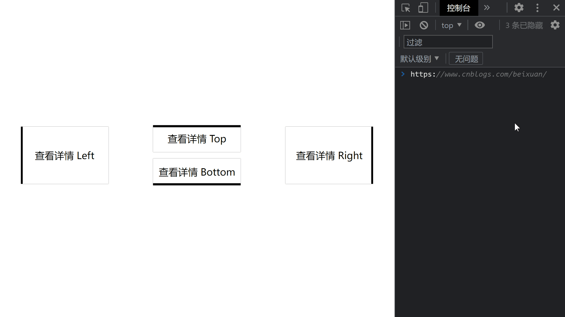
效果预览
代码
<!DOCTYPE html>

<html>

    <head>

        <meta charset="utf-8" />

        <meta name="author" content="https://www.cnblogs.com/beixuan">

        <meta name="version" content="1.0.0">

        <meta name="date" content="2021/12/01 18:00:26">

        <meta name="viewport" content="width=device-width, initial-scale=1">

        <title>CSS动画大全之按钮[b]</title>

    </head>

    <style type="text/css">

      /* 设置 body 内、外边距为 0 */

      body {

        margin: 0;

        padding: 0;

        display: grid;

        grid-template-columns: 100%;

        grid-template-rows: 100%;

        justify-items: center;

        align-items: center;

        width: 100vw;

        height: 100vh;

        background-color: #FFF;

      }

      .page-wrapper {

        display: grid;

        grid-template-columns: 33% 34% 33%;

        grid-template-rows: 100%;

        justify-items: center;

        align-items: center;

        width: 100vw;

        height: 100vh;

      }

      .page-wrapper > div {

        display: inline-block;

      }

      .btn {

        width: 12.5rem;

        height: 3.125rem;

        line-height: 3.125rem;

        font-size: 1.5rem;

        padding: 0.5rem;

        text-align: center;

        box-shadow: 0 0 1px #000;

        position: relative;

        transition: color 0.2s;

        margin-bottom: 1rem;

        cursor: pointer;

      }

      .btn:hover {

        color: #FFF;

      }

      .btn-type-left, .btn-type-right {

        height: 7.85rem;

        line-height: 7.85rem;

      }

      .btn-type-top::after {

        content: '';

        width: 100%;

        height: 0.3rem;

        position: absolute;

        top: 0;

        left: 0;

        background-color: #000000;

        transition: all 0.4s;

        z-index: -1;

      }

      .btn-type-top:hover::after {

        content: '';

        width: 100%;

        height: 100%;

        position: absolute;

        top: 0;

        left: 0;

        background-color: #000000;

      }

      .btn-type-right::after {

        content: '';

        width: 0.3rem;

        height: 100%;

        position: absolute;

        bottom: 0;

        right: 0;

        background-color: #000000;

        transition: all 0.2s;

        z-index: -1;

      }

      .btn-type-right:hover::after {

        content: '';

        width: 100%;

        height: 100%;

        position: absolute;

        bottom: 0;

        right: 0;

        background-color: #000000;

      }

      .btn-type-bottom::after {

        content: '';

        width: 100%;

        height: 0.3rem;

        position: absolute;

        bottom: 0;

        left: 0;

        background-color: #000000;

        transition: all 0.4s;

        z-index: -1;

      }

      .btn-type-bottom:hover::after {

        content: '';

        width: 100%;

        height: 100%;

        position: absolute;

        bottom: 0;

        left: 0;

        background-color: #000000;

      }

      .btn-type-left::after {

        content: '';

        width: 0.3rem;

        height: 100%;

        position: absolute;

        bottom: 0;

        left: 0;

        background-color: #000000;

        transition: all 0.2s;

        z-index: -1;

      }

      .btn-type-left:hover::after {

        content: '';

        width: 100%;

        height: 100%;

        position: absolute;

        bottom: 0;

        left: 0;

        background-color: #000000;

      }

    </style>

    <body>

      <!-- 页面容器 -->

      <div class="page-wrapper">

        <div class="btn btn-type-left">查看详情 Left</div>

        <div>

          <div class="btn btn-type-top">查看详情 Top</div>

          <div class="btn btn-type-bottom">查看详情 Bottom</div>

        </div>

        <div class="btn btn-type-right">查看详情 Right</div>

      </div>

    </body>

</html>
往期回顾
【全】CSS动画大全之按钮【b】的更多相关文章
- 【2016年特别福利】史上最全CSS学习资料大全
css学习篇 [2016年特别福利]史上最全CSS学习资料大全
- 原生html,css+js写下载按钮有提示动画效果的落地页
<!DOCTYPE html> <html lang="en"> <head> <meta charset="UTF-8&q ...
- 这样使用 GPU 渲染 CSS 动画(转)
大多数人知道现代网络浏览器使用GPU来渲染部分网页,特别是具有动画的部分. 例如,使用transform属性的CSS动画看起来比使用left和top属性的动画更平滑. 但是如果你问,“我如何从GPU获 ...
- Web高性能动画及渲染原理(1)CSS动画和JS动画
目录 一. CSS动画 和 JS动画 1.1 CSS动画 1.2 JS动画 1.3 小结 二. 使用Velocity.js实现动画 示例代码托管在:http://www.github.com/dash ...
- 高性能Web动画和渲染原理系列(1)——CSS动画和JS动画
[摘要] 介绍CSS动画和JS动画的基本特点,以及轻量级动画库velocity.js的基本用法. 示例代码托管在:http://www.github.com/dashnowords/blogs 博客园 ...
- JS框架_(JQuery.js)文章全屏动画切换
百度云盘 传送门 密码:anap 文章全屏动画切换效果 <!doctype html> <html lang="zh"> <head> < ...
- Css 动画的回调
在做项目中经常会遇到使用动画的情况.以前的情况是用js写动画,利用setTimeout函数或者window.requestAnimationFrame()实现目标元素的动画效果.虽然后者解决了刷新频率 ...
- [转]CSS hack大全&详解
转自:CSS hack大全&详解 1.什么是CSS hack? CSS hack是通过在CSS样式中加入一些特殊的符号,让不同的浏览器识别不同的符号(什么样的浏览器识别什么样的符号是有标准的, ...
- CSS动画与GPU
写在前面 满世界的动画性能优化技巧,例如: 只允许改变transform.opacity,其它属性不要动,避免重新计算布局(reflow) 对动画元素应用transform: translate3d( ...
- 15个来自 CodePen 的酷炫 CSS 动画效果【下篇】
CodePen 是一个在线的前端代码编辑和展示网站,能够编写代码并即时预览效果.你在上面可以在线分享自己的 Web 作品,也可以欣赏到世界各地的优秀开发者在网页中实现的各种令人惊奇的效果. 今天这篇文 ...
随机推荐
- pytest_重写pytest_sessionfinish方法的执行顺序_结合报告生成到发送邮件
背景: Python + pytest+pytest-testreport生成测试报告,到了生成报告之后,想要发送邮件,之前的方案是配合Jenkins,配置报告的路径进行发送 如果是平时的跑的项目,没 ...
- zabbix---监控Oracle12c数据库
使用插件:orabbix用于监控oracle实例的zabbix插件 orabbix插件下载地址:http://www.smartmarmot.com/product/orabbix/download/ ...
- Linux特殊权限之SBIT
简单点,说话的方式简单点: 用于修饰目录 其他用户x位替换成t 作用:目录属主在该目录下创建的文件只有该属主能删除
- Git配置环境变量
由于学习需要装了git,使用终端查看版本号时 提示 'git' 不是内部或外部命令,也不是可运行的程序 或批处理文件. 原因 因为没有配置Git环境变量 解决方法:配置环境变量 开始菜单=>设置 ...
- shell 根据 指定列 进行 去除 重复行
根据指定列进行去除重复行 这里的重复是指如果两行的某一列数据相同,则认为是重复数据. 例如:第1行与第2行数据,其中的第2列(以- 作为分隔符)明显是重复的. 100069 - ARM Compile ...
- Linux 提权-SUID/SGID_2
本文通过 Google 翻译 SUID | SGID Part-2 – Linux Privilege Escalation 这篇文章所产生,本人仅是对机器翻译中部分表达别扭的字词进行了校正及个别注释 ...
- FPGA bit转bin文件
首先科普一下 什么是bitstream文件 FPGA比特流(bitstream)是一种用于配置可编程逻辑器件的数据格式,特别是现场可编程门阵列(FPGA).比特流包含了硬件逻辑电路.路由信息以及芯片上 ...
- Laravel 组件
创建组件命令 php artisan make:component Alert make:component 命令还将为组件创建视图模板.视图将放在 resources/views/component ...
- thinkphp5 关于跨域的一些坑
1.首先在tp5的入口文件:public/index.php 在里面添加三行: // [ 应用入口文件 ] header("Access-Control-Allow-Origin:*&quo ...
- 集群及分布式定时任务中间件MEE_TIMED
集群及分布式定时任务中间件MEE_TIMED 转载请著名出处:https://www.cnblogs.com/funnyzpc/p/18312521 MEE_TIMED一套开源的定时任务中间件,MEE ...