【全】CSS动画大全之按钮【b】
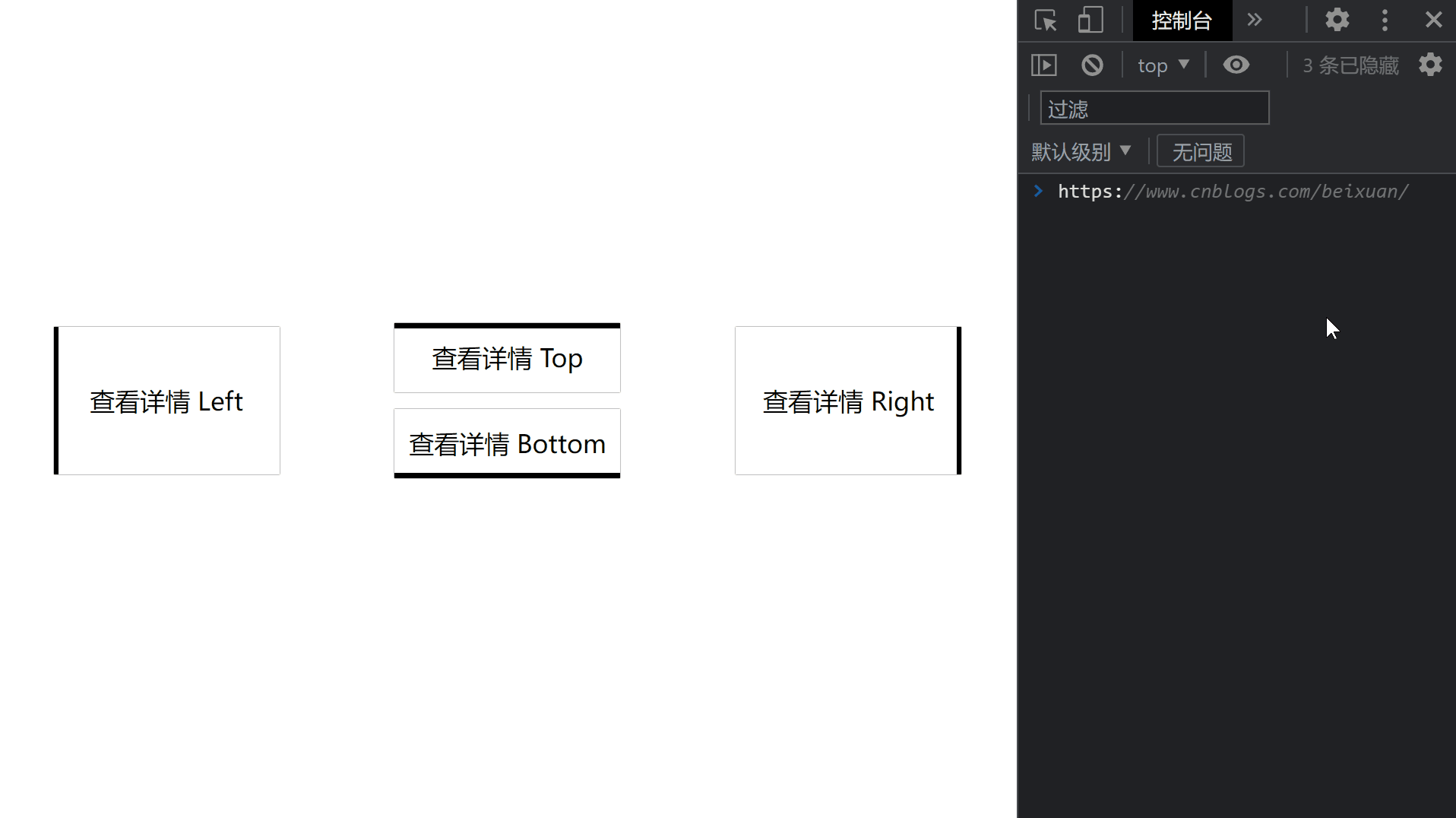
效果预览
代码
<!DOCTYPE html>

<html>

    <head>

        <meta charset="utf-8" />

        <meta name="author" content="https://www.cnblogs.com/beixuan">

        <meta name="version" content="1.0.0">

        <meta name="date" content="2021/12/01 18:00:26">

        <meta name="viewport" content="width=device-width, initial-scale=1">

        <title>CSS动画大全之按钮[b]</title>

    </head>

    <style type="text/css">

      /* 设置 body 内、外边距为 0 */

      body {

        margin: 0;

        padding: 0;

        display: grid;

        grid-template-columns: 100%;

        grid-template-rows: 100%;

        justify-items: center;

        align-items: center;

        width: 100vw;

        height: 100vh;

        background-color: #FFF;

      }

      .page-wrapper {

        display: grid;

        grid-template-columns: 33% 34% 33%;

        grid-template-rows: 100%;

        justify-items: center;

        align-items: center;

        width: 100vw;

        height: 100vh;

      }

      .page-wrapper > div {

        display: inline-block;

      }

      .btn {

        width: 12.5rem;

        height: 3.125rem;

        line-height: 3.125rem;

        font-size: 1.5rem;

        padding: 0.5rem;

        text-align: center;

        box-shadow: 0 0 1px #000;

        position: relative;

        transition: color 0.2s;

        margin-bottom: 1rem;

        cursor: pointer;

      }

      .btn:hover {

        color: #FFF;

      }

      .btn-type-left, .btn-type-right {

        height: 7.85rem;

        line-height: 7.85rem;

      }

      .btn-type-top::after {

        content: '';

        width: 100%;

        height: 0.3rem;

        position: absolute;

        top: 0;

        left: 0;

        background-color: #000000;

        transition: all 0.4s;

        z-index: -1;

      }

      .btn-type-top:hover::after {

        content: '';

        width: 100%;

        height: 100%;

        position: absolute;

        top: 0;

        left: 0;

        background-color: #000000;

      }

      .btn-type-right::after {

        content: '';

        width: 0.3rem;

        height: 100%;

        position: absolute;

        bottom: 0;

        right: 0;

        background-color: #000000;

        transition: all 0.2s;

        z-index: -1;

      }

      .btn-type-right:hover::after {

        content: '';

        width: 100%;

        height: 100%;

        position: absolute;

        bottom: 0;

        right: 0;

        background-color: #000000;

      }

      .btn-type-bottom::after {

        content: '';

        width: 100%;

        height: 0.3rem;

        position: absolute;

        bottom: 0;

        left: 0;

        background-color: #000000;

        transition: all 0.4s;

        z-index: -1;

      }

      .btn-type-bottom:hover::after {

        content: '';

        width: 100%;

        height: 100%;

        position: absolute;

        bottom: 0;

        left: 0;

        background-color: #000000;

      }

      .btn-type-left::after {

        content: '';

        width: 0.3rem;

        height: 100%;

        position: absolute;

        bottom: 0;

        left: 0;

        background-color: #000000;

        transition: all 0.2s;

        z-index: -1;

      }

      .btn-type-left:hover::after {

        content: '';

        width: 100%;

        height: 100%;

        position: absolute;

        bottom: 0;

        left: 0;

        background-color: #000000;

      }

    </style>

    <body>

      <!-- 页面容器 -->

      <div class="page-wrapper">

        <div class="btn btn-type-left">查看详情 Left</div>

        <div>

          <div class="btn btn-type-top">查看详情 Top</div>

          <div class="btn btn-type-bottom">查看详情 Bottom</div>

        </div>

        <div class="btn btn-type-right">查看详情 Right</div>

      </div>

    </body>

</html>
往期回顾
【全】CSS动画大全之按钮【b】的更多相关文章
- 【2016年特别福利】史上最全CSS学习资料大全
css学习篇 [2016年特别福利]史上最全CSS学习资料大全
- 原生html,css+js写下载按钮有提示动画效果的落地页
<!DOCTYPE html> <html lang="en"> <head> <meta charset="UTF-8&q ...
- 这样使用 GPU 渲染 CSS 动画(转)
大多数人知道现代网络浏览器使用GPU来渲染部分网页,特别是具有动画的部分. 例如,使用transform属性的CSS动画看起来比使用left和top属性的动画更平滑. 但是如果你问,“我如何从GPU获 ...
- Web高性能动画及渲染原理(1)CSS动画和JS动画
目录 一. CSS动画 和 JS动画 1.1 CSS动画 1.2 JS动画 1.3 小结 二. 使用Velocity.js实现动画 示例代码托管在:http://www.github.com/dash ...
- 高性能Web动画和渲染原理系列(1)——CSS动画和JS动画
[摘要] 介绍CSS动画和JS动画的基本特点,以及轻量级动画库velocity.js的基本用法. 示例代码托管在:http://www.github.com/dashnowords/blogs 博客园 ...
- JS框架_(JQuery.js)文章全屏动画切换
百度云盘 传送门 密码:anap 文章全屏动画切换效果 <!doctype html> <html lang="zh"> <head> < ...
- Css 动画的回调
在做项目中经常会遇到使用动画的情况.以前的情况是用js写动画,利用setTimeout函数或者window.requestAnimationFrame()实现目标元素的动画效果.虽然后者解决了刷新频率 ...
- [转]CSS hack大全&详解
转自:CSS hack大全&详解 1.什么是CSS hack? CSS hack是通过在CSS样式中加入一些特殊的符号,让不同的浏览器识别不同的符号(什么样的浏览器识别什么样的符号是有标准的, ...
- CSS动画与GPU
写在前面 满世界的动画性能优化技巧,例如: 只允许改变transform.opacity,其它属性不要动,避免重新计算布局(reflow) 对动画元素应用transform: translate3d( ...
- 15个来自 CodePen 的酷炫 CSS 动画效果【下篇】
CodePen 是一个在线的前端代码编辑和展示网站,能够编写代码并即时预览效果.你在上面可以在线分享自己的 Web 作品,也可以欣赏到世界各地的优秀开发者在网页中实现的各种令人惊奇的效果. 今天这篇文 ...
随机推荐
- 前端模拟接口工具推荐—Apifox(mock数据)
参考文章:https://blog.csdn.net/m0_67403272/article/details/123376945 高级mock部分 1.通过设置期望值,选择类型,比对body部分的参数 ...
- 【ClickHouse】6:clickhouse集群高可用
背景介绍: 有四台CentOS7服务器安装了ClickHouse HostName IP 安装程序 程序端口 shard(分片) replica(备份) centf8118.sharding1.db ...
- AI Agent框架(LLM Agent):LLM驱动的智能体如何引领行业变革,应用探索与未来展望
AI Agent框架(LLM Agent):LLM驱动的智能体如何引领行业变革,应用探索与未来展望 1. AI Agent(LLM Agent)介绍 1.1. 术语 Agent:"代理&qu ...
- FFmpeg开发笔记(三十六)Linux环境安装SRS实现视频直播推流
<FFmpeg开发实战:从零基础到短视频上线>一书在第10章介绍了轻量级流媒体服务器MediaMTX,通过该工具可以测试RTSP/RTMP等流媒体协议的推拉流.不过MediaMTX的功能 ...
- vulnhub - ASSERTION1.0.1
vulnhub - ASSERTION 1.0.1 信息收集 nmap -sT --min-rate 10000 -p- 192.168.157.171 sudo nmap -sT -sV -sC - ...
- Redis常见的16个使用场景
1.缓存 String类型 例如:热点数据缓存(例如报表.明星出轨),对象缓存.全页缓存.可以提升热点数据的访问数据. 2.数据共享分布式 String 类型,因为 Redis 是分布式的独立服务,可 ...
- python执行shell并获取结果
在Python中执行Shell命令并获取其结果,通常可以使用subprocess模块.这个模块允许我们启动新的进程,连接到它们的输入/输出/错误管道,并获取它们的返回码.下面是一个详细的示例,展示了如 ...
- css浅谈Flex布局
1.打开Flex布局 .box{ display: flex; } 2.容器的属性 flex-direction flex-wrap flex-flow justify-content align-i ...
- Centos7 安装 rabbitmq-server-3.7.7 图文教程
下载 rabbitmq-server wget https://dl.bintray.com/rabbitmq/all/rabbitmq-server/3.7.7/rabbitmq-server-3. ...
- oeasy教您玩转vim - 69 - # 折叠folding入门
折叠入门 回忆上次 上次学习了一种新的容器 tabs选项卡 tabs选项卡 包含多个选项卡tab 可以列两个tab 一个编写文件 一个执行指令 互不影响 每个 tab选项卡 还可以对应多个wind ...