CSS3之3D立方体效果
下面代码可实现3D立方体,比较好理解,就是让每个面先平移到指定位置,然后旋转90度
<!DOCTYPE html>

<html lang="en">

<head>

    <meta charset="UTF-8">

    <title>3D转换模块-正方体</title>

    <style>

    *{

        margin: 0;

        padding: 0;

    }

    ul{

        width: 200px;

        height: 200px;

        border: 1px solid #000;

        box-sizing: border-box;

        margin: 100px auto;

        position: relative;

        transform: rotateY(0deg) rotateX(0deg);

        transform-style: preserve-3d;

    }

    ul li{

        list-style: none;

        width: 200px;

        height: 200px;

        font-size: 60px;

        text-align: center;

        line-height: 200px;

        position: absolute;

        left: 0;

        top: 0;

    }

    ul li:nth-child(1){

        background-color: red;

        transform: translateX(-100px) rotateY(90deg);

    }

    ul li:nth-child(2){

        background-color: green;

        transform: translateX(100px) rotateY(90deg);

    }

    ul li:nth-child(3){

        background-color: blue;

        transform: translateY(-100px) rotateX(90deg);

    }

    ul li:nth-child(4){

        background-color: yellow;

        transform: translateY(100px) rotateX(90deg);

    }

    ul li:nth-child(5){

        background-color: purple;

        transform: translateZ(-100px);

    }

    ul li:nth-child(6){

        background-color: pink;

        transform: translateZ(100px);

    }

</style>

</head>

<body>

<ul>

    <li>1</li>

    <li>2</li>

    <li>3</li>

    <li>4</li>

    <li>5</li>

    <li>6</li>

</ul>

</body>

</html>
但是缺点是 如果我们旋转每个面面对自己的时候,里面的数字可能并不是正序的,如图:
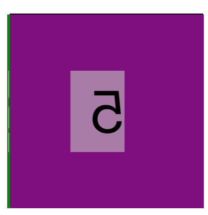
这里的5就是反的,为了解决这个问题,我们需要做的是 针对 上,后,下,前 四个面进行先旋转在平移的处理,就可以保证转向我们的面始终是正序的
代码如下:
<!DOCTYPE html>

<html lang="en">

<head>

    <meta charset="UTF-8">

    <title>3D转换模块-正方体终极</title>

    <style>

        *{

            margin: 0;

            padding: 0;

        }

        ul{

            width: 200px;

            height: 200px;

            border: 1px solid #000;

            box-sizing: border-box;

            margin: 100px auto;

            position: relative;

            transform: rotateY(0deg) rotateX(0deg);

            transform-style: preserve-3d;

        }

        ul li{

            list-style: none;

            width: 200px;

            height: 200px;

            font-size: 60px;

            text-align: center;

            line-height: 200px;

            position: absolute;

            left: 0;

            top: 0;

        }

        /*上面*/

        ul li:nth-child(1){

            background-color: red;

            transform: rotateX(90deg) translateZ(100px);

        }

        /*后面*/

        ul li:nth-child(2){

            background-color: green;

            transform: rotateX(180deg) translateZ(100px);

        }

        /*下面*/

        ul li:nth-child(3){

            background-color: blue;

            transform: rotateX(270deg) translateZ(100px);

        }

        /*

        前面*/

        ul li:nth-child(4){

            background-color: yellow;

            transform: rotateX(360deg) translateZ(100px);

        }

        /*

        左面

        */

        ul li:nth-child(5){

            background-color: purple;

            transform: translateX(-100px) rotateY(90deg);

        }

        /*

        右面

        */

        ul li:nth-child(6){

            background-color: pink;

            transform: translateX(100px) rotateY(90deg);

        }

    </style>

</head>

<body>

<ul>

    <li>1</li>

    <li>2</li>

    <li>3</li>

    <li>4</li>

    <li>5</li>

    <li>6</li>

</ul>

</body>

</html>
如果实现旋转效果,就需要加上CSS3中的animation属性,代码如下:
<!DOCTYPE html>

<html lang="en">

<head>

    <meta charset="UTF-8">

    <title>110-3D转换模块-练习</title>

    <style>

        *{

            margin: 0;

            padding: 0;

        }

        body{

            /*想看到整个立方的近大远小效果, 就给ul的父元素添加透视*/

            perspective: 500px;

        }

        ul{

            width: 200px;

            height: 200px;

            box-sizing: border-box;

            margin: 100px auto;

            position: relative;

            transform: rotateY(0deg) rotateX(0deg);

            transform-style: preserve-3d;

            animation: sport 5s linear 0s infinite normal;

        }

        ul li{

            list-style: none;

            width: 200px;

            height: 200px;

            font-size: 60px;

            text-align: center;

            line-height: 200px;

            position: absolute;

            left: 0;

            top: 0;

        }

        ul li:nth-child(1){

            background-color: red;

            transform: rotateX(90deg) translateZ(100px) scale(2, 1);

        }

        ul li:nth-child(2){

            background-color: green;

            transform: rotateX(180deg) translateZ(100px) scale(2, 1);

        }

        ul li:nth-child(3){

            background-color: blue;

            transform: rotateX(270deg) translateZ(100px) scale(2, 1);

        }

        ul li:nth-child(4){

            background-color: yellow;

            transform: rotateX(360deg) translateZ(100px) scale(2, 1);

        }

        ul li:nth-child(5){

            background-color: purple;

            transform: translateX(-200px) rotateY(90deg);

        }

        ul li:nth-child(6){

            background-color: pink;

            transform: translateX(200px) rotateY(90deg);

        }

        ul li img{

            /*

            注意点:

            只要父元素被拉伸了,子元素也会被拉伸

            */

            width: 200px;

            height: 200px;

        }

        @keyframes sport {

            from{

                transform: rotateX(0deg);

            }

            to{

                transform: rotateX(360deg);

            }

        }

    </style>

</head>

<body>

<ul>

    <li><img src="data:images/banner11.jpg" alt=""></li>

    <li><img src="data:images/banner21.jpg" alt=""></li>

    <li><img src="data:images/banner31.jpg" alt=""></li>

    <li><img src="data:images/banner41.jpg" alt=""></li>

    <li></li>

    <li></li>

</ul>

</body>

</html>
CSS3之3D立方体效果的更多相关文章
- 基于css3的3D立方体旋转特效
今天给大家分享一款基于css3的3D立方体旋转特效.这款特效适用浏览器:360.FireFox.Chrome.Safari.Opera.傲游.搜狗.世界之窗. 不支持IE8及以下浏览器.效果图如下 : ...
- 【CSS3】3D立方体动画
关于CSS3的3D立方体动画 知识点: 1.每个元素有独立的坐标系 2.坐标系随当前元素的改变而发生改变 3.立方体由静态transform参数构成 4.通过给容器添加动画使立方体运动 效果图: &l ...
- CSS3 3D立方体效果-transform也不过如此
CSS3系列已经学习了一段时间了,第一篇文章写了一些css3的奇技淫巧,原文戳这里,还获得了较多网友的支持,在此谢过各位,你们的支持是我写文章最大的动力^_^. 那么这一篇文章呢,主要是通过一个3D立 ...
- css3之3D翻牌效果
最近一直在学css3,发现他真的是越来越牛逼.现在的css3已经不在是以前的css了,它能做出的功能效果是我们没法想象的了.它可以实现flash,可以制作一些js能做出来的效果,还可以写出ps做出 ...
- HTML5和CSS3实现3D转换效果 CSS3的3D效果
上次,我们一起研究了css3的2d模块,这次我们一起来看一下css3的3d模块. 首先,我们来了解一下3d的坐标系,x轴在屏幕上为水平方向,y轴为垂直方向,而z轴为垂直于屏幕的方向. 不理解的话可以参 ...
- 简单几步用纯CSS3实现3D翻转效果
作为前端开发人员的必修课,CSS3翻转能带我们完成许多基本动效,本期我们将用CSS3实现hover翻转效果~ 第一步非常简单,我们简单画1个演示方块,为其 添加transition和transform ...
- CSS3 3D立方体效果
<!DOCTYPE HTML><html><head><meta http-equiv="Content-Type" content=&q ...
- CSS3 实现3D旋转木马效果
基本原理: 1.首先我们需要让图片能旋转的效果,我们让所有图片绝对定位(position:absolute),共用一个中心点. 2.对于舞台我们加一个视距,比如下面的demo是 perspective ...
- Html5+css3实现3D转动效果
由于最近一直在忙着筹划去上海工作的事情,所以博客更新的速度也就慢了下来.前几天面试了几家公司,也拿到几份offer,总结了一些面试中遇到的问题,最近整理一下会和大家一起分享.今天呢,就和大家分享一下前 ...
随机推荐
- ECSIDE标签
ECSIDE标签之<ec:table>标签的属性说明与使用 EC side是基于jsp tag的开源列表组件,可以帮助我们快速实现墙大的列表的jsp标签.EC side可以展现列表(分 ...
- python websocket Django 实时消息推送
概述: WebSocket 是什么? WebSocket 是 HTML5 提供的一种浏览器与服务器间进行全双工通讯的协议.依靠这种协议可以实现客户端和服务器端 ,一次握手,双向实时通信. WebSoc ...
- 在Django中使用ForeignKey()报错问题的解决
在Django2的models中建立一对多的关系使用ForeignKey(): student = models.ForeignKey("Classes") 报错: TypeErr ...
- 关于java的跨平台特性
Write once, compile anywhere,“一次编译,到处运行”的著名口号大家想必都听说过吧一次编译:把java代码(.java文件)通过编译器转换成字节码(.class文件)(符合j ...
- centos7通过yum安装mysql8
1.检查是否安装mariadb rpm -qa | grep mariadb 若有会显示 mariadb-libs-5.5.56-2.el7.x86_64 2.卸载mariadb rpm -e --n ...
- vue-----表单与组件
<!DOCTYPE html><html><head> <meta charset="utf-8"> <meta name=& ...
- 20164301 Exp3 免杀原理与实践
Exp3 免杀原理与实践 1. 实践内容 1.1 正确使用msf编码器,msfvenom生成如jar之类的其他文件,veil-evasion,加壳工具,使用shellcode编程 1.2 通过组合应 ...
- java 大数运算[转]
用JAVA 实现算术表达式(1234324234324 + 8938459043545)/5 + 343434343432.59845 因为JAVA语言中的long 定义的变量值的最大数受到限制,例如 ...
- VS资源收藏<持续更新中>
1.VS插件下载地址:https://marketplace.visualstudio.com/vs
- Galaxian 小蜜蜂
发售年份 1979 平台 街机 开发商 南梦宫(Namco) 类型 射击 https://www.youtube.com/watch?v=XhYVcwhSWjI