HTML+CSS实现鼠标点上去动画效果
<!DOCTYPE html>

<html lang="en">

<head>

    <meta charset="UTF-8">

    <meta name="viewport" content="width=device-width, initial-scale=1.0">

    <meta http-equiv="X-UA-Compatible" content="ie=edge">

    <title>瀑布流</title>

    <link rel="stylesheet" href="css/style.css">

    <script src="js/jquery-3.4.1.js" type="text/javascript"></script>

</head>

<body>

    <section id="titleBar">

        <h2>瀑布流</h2>

    </section>

    <div id="wrap">

        <!-- wrap内快速生成里面div结构的快捷方式 -->

        <!-- (div.box>div.info>((div.pic>img[src="img/$.jpg"])+(div.title>a[href=#]{This is a title})))*10 -->

        <div class="box">

            <div class="info">

                <div class="pic"><img src="img/1.jpg" alt=""></div>

                <div class="title"><a href="#">This is a title.</a></div>

            </div>

        </div>

        <div class="box">

            <div class="info">

                <div class="pic"><img src="img/2.jpg" alt=""></div>

                <div class="title"><a href="#">This is a title.</a></div>

            </div>

        </div>

        <div class="box">

            <div class="info">

                <div class="pic"><img src="img/3.jpg" alt=""></div>

                <div class="title"><a href="#">This is a title.</a></div>

            </div>

        </div>

        <div class="box">

            <div class="info">

                <div class="pic"><img src="img/4.jpg" alt=""></div>

                <div class="title"><a href="#">This is a title.</a></div>

            </div>

        </div>

        <div class="box">

            <div class="info">

                <div class="pic"><img src="img/5.jpg" alt=""></div>

                <div class="title"><a href="#">This is a title.</a></div>

            </div>

        </div>

        <div class="box">

            <div class="info">

                <div class="pic"><img src="img/6.jpg" alt=""></div>

                <div class="title"><a href="#">This is a title.</a></div>

            </div>

        </div>

        <div class="box">

            <div class="info">

                <div class="pic"><img src="img/7.jpg" alt=""></div>

                <div class="title"><a href="#">This is a title.</a></div>

            </div>

        </div>

        <div class="box">

            <div class="info">

                <div class="pic"><img src="img/8.jpg" alt=""></div>

                <div class="title"><a href="#">This is a title.</a></div>

            </div>

        </div>

        <div class="box">

            <div class="info">

                <div class="pic"><img src="img/9.jpg" alt=""></div>

                <div class="title"><a href="#">This is a title.</a></div>

            </div>

        </div>

        <div class="box">

            <div class="info">

                <div class="pic"><img src="img/10.jpg" alt=""></div>

                <div class="title"><a href="#">This is a title.</a></div>

            </div>

        </div>

    </div>

</body>

</html>
css文件如下
body {

    margin:;

    padding:;

}

body {

    background: #ddd url(../img/bg.jpg) repeat;

}

img {

    border: none;

}

a {

    text-decoration: none;

    color: #444;

}

@-webkit-keyframes shade {

    from {

        opacity:;

    }

    15% {

        opacity: 0.4;

    }

    to {

        opacity:;

    }

}

@-moz-keyframes shade {

    from {

        opacity:;

    }

    15% {

        opacity: 0.4;

    }

    to {

        opacity:;

    }

}

@-o-keyframes shade {

    from {

        opacity:;

    }

    15% {

        opacity: 0.4;

    }

    to {

        opacity:;

    }

}

@-ms-keyframes shade {

    from {

        opacity:;

    }

    15% {

        opacity: 0.4;

    }

    to {

        opacity:;

    }

}

@keyframes shade {

    from {

        opacity:;

    }

    15% {

        opacity: 0.4;

    }

    to {

        opacity:;

    }

}

#titleBar {

    width: 600px;

    margin: 20px auto;

    text-align: center;

}

#wrap {

    width: auto;

    height: auto;

    margin: 0 auto;

    position: relative;

}

#wrap .box {

    width: 280px;

    height: auto;

    padding: 10px;

    border: none;

    float: left;

}

#wrap .box .info {

    width: 280px;

    height: auto;

    border-radius: 8px;

    background: #fff;

}

#wrap .box .info .pic {

    width: 260px;

    height: auto;

    margin: 0 auto;

    padding-top: 10px;

}

#wrap .box .info .pic:hover {

    -webkit-animation: shade 3s ease-in-out 1;

    -moz-animation: shade 3s ease-in-out 1;

    -o-animation: shade 3s ease-in-out 1;

    -ms-animation: shade 3s ease-in-out 1;

    animation: shade 3s ease-in-out 1;

}

#wrap .box .info .title:hover {

    -webkit-animation: shade 3s ease-in-out 1;

    -moz-animation: shade 3s ease-in-out 1;

    -o-animation: shade 3s ease-in-out 1;

    -ms-animation: shade 3s ease-in-out 1;

    animation: shade 3s ease-in-out 1;

}

#wrap .box .info img {

    width: 260px;

    border-radius: 3px;

}

#wrap .box .info .title {

    width: 260px;

    height: 40px;

    margin: 0 auto;

    line-height: 40px;

    text-align: center;

    color: #666;

    font-size: 18px;

    font-weight: bold;

    overflow: hidden;

}
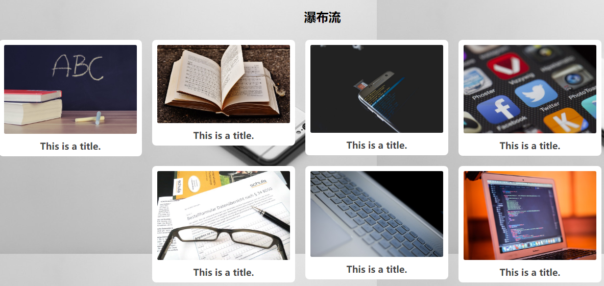
效果图如下
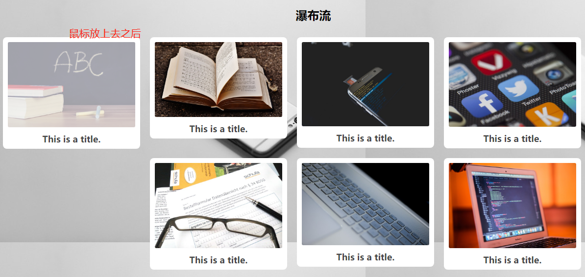
望各位大虾不吝赐教!
谢谢
HTML+CSS实现鼠标点上去动画效果的更多相关文章
- 一款很实用的jQuery鼠标悬浮有动画效果的响应式瀑布流插件
一款很实用的jQuery鼠标悬浮有动画效果的响应式瀑布流插件 在线预览 下载地址 实例代码 <!doctype html> <html lang="zh"> ...
- 鼠标悬停css3动画效果
下载Demo 效果预览 html: <!DOCTYPE html> <html lang="en"> <head> <meta chars ...
- 简单css实现input提示交互动画效果
通过基础CSS实现输入提示交互动画效果,并兼容各浏览器! 1.效果展示 2.css代码 h4 { margin: 30px 0; } input { margin:; font-size: 16px; ...
- 基于jQuery CSS3鼠标点击动画效果
分享基于jQuery CSS3鼠标点击动画效果支持图片或内容滑动,允许设置动画延迟效果.效果图如下: 在线预览 源码下载 实现的代码. html代码: <div class="co ...
- animate.css 一些常用的CSS3动画效果
大家已经开始在项目中使用一些CSS3动画效果了吧,这让网站在高端浏览器上看起来很上流.animate.css是一个老外做的各种CSS3动画的合集,比较全,也很炫,大家可以参考学习一下. 项目主页:ht ...
- CSS控制鼠标滑过时的效果
用css控制鼠标样式的语法如下:<span style="cursor:*">文本或其它页面元素</span>把 * 换成如下15个效果的一种: 下面是对这 ...
- 一个CSS+jQuery的放大缩小动画效果
日期: 2013年9月23日 作者:铁锚 // 今天帮朋友写了一些代码,自己觉得写着写着,好几个版本以后,有点满意,于是就贴出来. // 都是定死了的.因为需求就只有4个元素.如果是要用CSS的cla ...
- 用CSS实现加载的动画效果
用纯CSS实现加载的一些动态效果,可以把加载效果中的元素分成很多个小部分,每个部分都有动画,每个部分的动画再设置相应的延迟效果,这样,看起来就是连贯的加载动画效果.代码如下: 1.效果1 <di ...
- 前端每日实战:140# 视频演示如何用纯 CSS 创作文本的淡入动画效果
效果预览 按下右侧的"点击预览"按钮可以在当前页面预览,点击链接可以全屏预览. https://codepen.io/comehope/pen/ZMwgqK 可交互视频 此视频是可 ...
随机推荐
- VUE 动态菜单管理
业务场景 不同的用户登录,看到的菜单会不一样,因此需要根据不同人登录的身份去后端获取菜单. 实现思路 1.构建路由 2.从后端构建菜单 3.前端获取菜单 4.前端渲染菜单 1.构建路由. export ...
- Linux之ubuntu下载
(转载) ubuntu 16.04国内下载地址: 中科大源 http://mirrors.ustc.edu.cn/ubuntu-releases/16.04/ 阿里云开源镜像站 http://mirr ...
- httprunner学习8-validate校验器
前言 在一个完整的测试用例中,断言是必不可少的,断言是拿实际结果和期望结果去比较,在httprunner中用validate来对比测试结果. validate校验器 在httprunner的源码里,u ...
- Chrome出现“浏览器由所属组织管理”如何解决
之前碰到了这个问题,删除注册表解决了.当时没记下来,今天又碰到了.那就写下来以备之后再碰到吧 删除了注册表\HKEY_LOCAL_MACHINE\SOFTWARE\Policies\Google\Ch ...
- 【转】Linux虚拟网络基础——tap
原文:https://blog.csdn.net/chengqiuming/article/details/80071073 ------------------------------------- ...
- 201671030102陈飞 实验十四 团队项目评审&课程学习总结
项目 内容 这个作业属于哪个课程 2016级计算机科学与工程学院软件工程(西北师范大学) 这个作业的要求在哪里 实验十四 团队项目评审&课程学习总结 课程学习目标 1.掌握软件项目评审会议流程 ...
- Gradle 学习资料
Gradle 学习资料 网址 Gradle 使用指南 http://wiki.jikexueyuan.com/project/gradle/ 寄Android开发Gradle你需要知道的知识 http ...
- 2019牛客暑期多校训练营(第八场)A:All-one Matrices(广告牌问题 单调队列)
题意:给出N*M的01矩阵,求矩阵个数,满足矩阵内全是‘1’,,而且被至少一个’0‘围住.(假设边界外是‘0’.(N,M<3000) 思路:这类问题,一般解决就是两个方向: A:压缩一维,即枚举 ...
- Nginx——跨域造成的504问题
前言 前台域名和后台域名是两个不同不同的二级域名,访问的时候造成了跨域,出现了504错误 解决 修改Nginx配置,将超时的时间设置为1200秒 keepalive_timeout 1200; pro ...
- 利用restassured实现http/https接口请求
话不多说,直接上代码: package com.nuanshui.frms.test.utils.http; import io.restassured.response.Response; impo ...