echarts 各种特效图
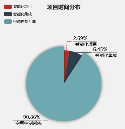
饼图标签展示数值
配置项:


option = {

    title: {

        text: '项目时间分布',

        left: 'center'

    },

    tooltip: {

        trigger: 'item',

        formatter: '{a} <br/>{b} : {c} ({d}%)'

    },

    legend: {

        orient: 'vertical',

        left: 'left',

        data: ['智能化项目', '智能化集成', '空调控制系统']

    },

    series: [

        {

            name: '访问来源',

            type: 'pie',

            radius: '55%',

            center: ['50%', '60%'],

                    label: {

            normal: {

                formatter: "{per|{d}%} \n{hr|}\n  {b|{b}}",

                align: "right",

                rich: {

                    hr: {

                        borderColor: "#aaa",

                        width: "100%",

                        borderWidth: 1,

                        height: 0

                    },

                    b: {

                        fontSize: 14,

                        color: "#000",

                        lineHeight: 20

                    },

                    per: {

                        color: "#000",

                        fontSize: 16,

                        lineHeight: 20

                    }

                }

            }

        },

            data: [

                {value: 5, name: '智能化项目'},

                {value: 12, name: '智能化集成'},

                {value: 169, name: '空调控制系统'},

            ],

            emphasis: {

                itemStyle: {

                    shadowBlur: 10,

                    shadowOffsetX: 0,

                    shadowColor: 'rgba(0, 0, 0, 0.5)'

                }

            }

        }

    ]

};
运行效果:
坐标轴显示箭头,刻度标签超出显示省略号
配置项:
const alarmRankOptions = {

    color: ['rgba(184,114,58,1)'], //['#A96932'],

    tooltip: {

        trigger: 'axis',

        axisPointer: {

            // 坐标轴指示器,坐标轴触发有效

            type: 'shadow' // 默认为直线,可选为:'line' | 'shadow'

        }

    },

    grid: {

        left: '3%',

        right: '4%',

        bottom: '0',

        containLabel: true,

        borderColor: 'red'

    },

    xAxis: [

        {

            type: 'category',

            data: [],

            axisTick: {

                alignWithLabel: true

            },

            // nameLocation:'end',//坐标轴名称显示位置。

            // x轴的字体样式

            axisLabel: {

                show: true,

                textStyle: {

                    color: '#E6EFFF'

                },

                interval: 0 //横轴信息全部显示

            },

            // x轴的颜色和宽度

            axisLine: {

                lineStyle: {

                    color: '#3C6581',

                    width: 1 //这里是坐标轴的宽度,可以去掉

                }

            }

        }

    ],

    yAxis: [

        {

            minInterval: 1,

            type: 'value',

            name: '数量:个',

            nameTextStyle: {

                color: '#E6EFFF'

            },

            axisLabel: {

                show: true,

                textStyle: {

                    color: '#E6EFFF'

                }

            },

            // y轴的颜色和宽度

            axisLine: {

                show: true,

                lineStyle: {

                    color: '#3C6581',

                    width: 1 //这里是坐标轴的宽度

                },

                symbol: ['none', 'arrow'],

                symbolSize: [6, 10] //第一个数字表示宽度(垂直坐标轴方向),第二个数字表示高度(平行坐标轴方向)。

            },

            //背景网格线

            splitLine: {

                show: false,

                lineStyle: {

                    // 使用深浅的间隔色

                    color: '#ccc',

                    type: 'dashed',

                    shadowBlur: 10

                }

            }

        }

    ],

    series: [

        {

            name: '待解决报警数',

            type: 'bar',

            barWidth: '20',

            label: {

                normal: {

                    show: true,

                    position: 'top' //'inside'

                }

            },

            data: [10, 52, 200, 334, 390, 330, 220, 40]

        }

    ]

};

export { alarmRankOptions };
运行结果:

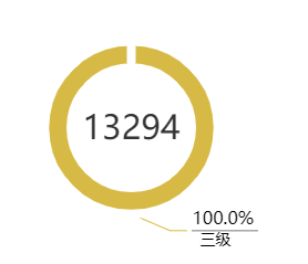
环形图标签显示值
配置项:
export const PieOption = {

    grid: {

        left: 50,

        right: 0,

        top: 0,

        containLabel: true,

        zlevel: 99999

    },

    tooltip: {

        trigger: "item",

        formatter: "{b}: {c}次 ({d}%)"

    },

    color: ["#ee6e6d", "#f19469", "#e7bf5f", "#74b8dd", "#67cb82"],

    title: {

        text: 0,

        textStyle: {

            color: "#3A3A3A",

            fontSize: 30,

            fontWeight: "normal"

        },

        subtext: "",

        subtextStyle: {

            color: "#3A3A3A",

            fontSize: 14

        },

        x: "center",

        y: "49%"

        // y: "46%"

    },

    series: [

        {

            name: "",

            type: "pie",

            // minAngle: 5,              //最小的扇区角度(0 ~ 360),用于防止某个值过小导致扇区太小影响交互

            avoidLabelOverlap: true, //是否启用防止标签重叠策略

            // radius: ["37%", "55%"],

            radius: ["32%", "46%"],

            center: ["50%", "54%"],

            // center: ["50%", "60%"],

            // radius: ["50%", "50%"],

            itemStyle: {

                borderColor: "rgba(255,255,255,1)",

                borderWidth: 8

            },

            label: {

                normal: {

                    formatter: "{per|{d}%} \n{hr|}\n  {b|{b}}",

                    align: "right",

                    rich: {

                        hr: {

                            borderColor: "#aaa",

                            width: "100%",

                            borderWidth: 1,

                            height: 0

                        },

                        b: {

                            fontSize: 14,

                            color: "#000",

                            lineHeight: 20

                        },

                        per: {

                            color: "#000",

                            fontSize: 16,

                            lineHeight: 20

                        }

                    }

                }

            },

            labelLine: {},

            data: [

                {

                    value: 150,

                    name: "一级告警"

                    // itemStyle: {

                    //     color: '#ee6e6d'

                    // }

                },

                {

                    value: 50,

                    name: "二级告警"

                    // itemStyle: {

                    //     color: '#f19469'

                    // }

                },

                {

                    value: 300,

                    name: "三级告警"

                    // itemStyle: {

                    //     color: '#e7bf5f'

                    // }

                },

                {

                    value: 500,

                    name: "四级告警"

                    // itemStyle: {

                    //     color: '#74b8dd'

                    // }

                },

                {

                    value: 350,

                    name: "五级告警"

                    // itemStyle: {

                    //     color: '#67cb82'

                    // }

                }

            ]

        }

    ]

};
运行结果:

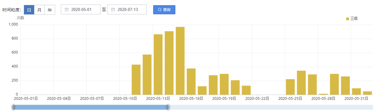
柱状图水平滚动条
配置项:
export const BarOption = {

    color: ["#F1726b", "#f58e6b", "#e7c156", "#73b9dd", "#65ca84"],

    tooltip: {

        trigger: "axis",

        axisPointer: {

            // 坐标轴指示器,坐标轴触发有效

            type: "shadow" // 默认为直线,可选为:'line' | 'shadow'

        }

    },

    dataZoom: ConstDataZoom,

    legend: {

        data: ["一级", "二级", "三级", "四级", "五级"],

        itemWidth: 9,

        itemHeight: 9,

        itemGap: 20,

        right: 45

    },

    grid: {

        left: 50,

        right: 0,

        top: 30,

        containLabel: true

    },

    xAxis: [

        {

            type: "category",

            silent: false,

            data: [

                "1月",

                "2月",

                "3月",

                "4月",

                "5月",

                "6月",

                "7月",

                "8月",

                "9月",

                "10月",

                "11月",

                "12月"

            ],

            axisTick: {

                alignWithLabel: true

            },

            splitLine: {

                show: true,

                lineStyle: {

                    // 网格颜色

                    color: ["#E5EFF5"]

                }

            },

            axisLine: {

                lineStyle: {

                    color: "#ccc"

                }

            },

            axisLabel: {

                color: "#3A3A3A",

                interval: "auto"

            },

            splitArea: {

                show: false

            }

        }

    ],

    yAxis: [

        {

            type: "value",

            name: "次数",

            minInterval: 1, //设置成1保证坐标轴分割刻度显示成整数。

            nameTextStyle: {

                color: "#838383"

            },

            splitLine: {

                show: true,

                lineStyle: {

                    // 网格颜色

                    color: ["#E5EFF5"]

                }

            },

            axisLine: {

                lineStyle: {

                    color: "#E5EFF5"

                }

            },

            axisLabel: {

                color: "#3A3A3A",

                interval: 0

            }

        }

    ],

    series: [

        {

            name: "一级",

            type: "bar",

            data: [320, 332, 301, 334, 390, 320, 332, 301, 334, 390]

        },

        {

            name: "二级",

            type: "bar",

            data: [220, 182, 191, 234, 290, 220, 182, 191, 234, 290]

        },

        {

            name: "三级",

            type: "bar",

            data: [150, 232, 201, 154, 190, 150, 232, 201, 154, 190]

        },

        {

            name: "四级",

            type: "bar",

            data: [220, 182, 191, 234, 290, 220, 182, 191, 234, 290]

        },

        {

            name: "五级",

            barGap: 0,

            type: "bar",

            data: [220, 182, 191, 234, 290, 220, 182, 191, 234, 290]

        }

    ]

};
运行结果:
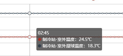
tooltip.formatter保留默认图标
 //tooltip start

      option.tooltip.formatter = function(param) {

        // console.log("param :>> ", param);

        let str = param.length > 0 ? `${param[0].name}<br/>` : "";

        param.forEach((item, idx) => {

          str +=

            renderSpan(item.color) +

            item.seriesName +

            ":" +

            item.value +

            units[idx] +

            "<br/>";

        });

        return str;

      };

      function renderSpan(color) {

        return `<span style="display:inline-block;margin-right:5px;border-radius:10px;width:10px;height:10px;background-color:${color};"></span>`;

      }

      //tooltip end
.............
echarts 各种特效图的更多相关文章
- WPF仿百度Echarts人口迁移图
GitHub地址:https://github.com/ptddqr/wpf-echarts-map/tree/master 关于大名鼎鼎的百度Echarts我就不多说了 不了解的朋友直接看官方的例子 ...
- Echarts中太阳图(Sunburst)的实例
Echarts中太阳图(Sunburst)的实例 目前在项目中要实现一个Echars中的太阳图,但是Echars中的太阳图的数据格式是一个树形结构,如下代码格式如下: var mapData = [ ...
- echarts实现环形图
前端框架使用的angular,使用echarts实现环形图 1. item.component.html <div id="box1" class="pie&quo ...
- 用HTML5绘制的一个星空特效图
<!doctype html> <html lang="en"> <head> <meta charset="UTF-8&quo ...
- echarts BAR堆叠图显示百分比
在使用echarts的堆叠图时,我们鼠标悬停的浮窗里的信息可能并不是我们想要的信息,这个时候需要我们配置一下,因为堆叠图的trigger的类型是坐标轴触发的,数据是多组数据,所以我们需要遍历一下数据, ...
- echarts绘制甘特图
在setoption之后添加这段代码: window.addEventListener('resize', function () { myChart.resize(); }); 图表就能随着 ...
- Echarts 页面多图自适应的解决办法 (转)
项目中用到了echarts的多图表的 问题,如果设置了 window.onresize = option.chart.resize() 只能控制 某个图表的 自适应,如果要是页面上的图表都要自适应. ...
- echarts版本折线图
1.效果如下: 绘制折线图,应该算是说echarts中使用最简单也算使用频率最高的一种功能了吧.根据官网列子能找出规律,只是有些属性对于初接触者来说,会有点陌生,不过仔细阅读一下还是不 ...
- Echarts line折线图使用(vue)
实现 首先引入echarts工具 // vue文件中引入echarts工具 let echarts = require('echarts/lib/echarts') require('echarts/ ...
- ECharts使用—折线图动态加载
最近需求中用到折线图,单线条,多线交错,之前是散点图,用的是另一个 amcharts.js,这个文档也能找的到,回归早本次重点:ECharts 一.首先引入echarts.common.min.js文 ...
随机推荐
- IDA动态调试快捷键
1. F2下断点2. F7进入函数,F8单步调试,F9跳到下一个断点,F2下断点,G调到函数地址3. N重名4. g跳到地址和函数名5. u取消把函数汇编变成机器码6. c就是把机器码变成汇编7. F ...
- 2018-5-28-WPF-Process.Start-出现-Win32Exception-异常
title author date CreateTime categories WPF Process.Start 出现 Win32Exception 异常 lindexi 2018-05-28 10 ...
- 【GUI软件】小红书详情数据批量采集,含笔记内容、转评赞藏等,支持多笔记同时采集!
目录 一.背景介绍 1.1 爬取目标 1.2 演示视频 1.3 软件说明 二.代码讲解 2.1 爬虫采集模块 2.2 软件界面模块 2.3 日志模块 三.获取源码及软件 一.背景介绍 1.1 爬取目标 ...
- 【简说Python WEB】用户身份验证--Werkzeug
目录 [简说Python WEB]用户身份验证--Werkzeug Flask的security扩展 使用Werkzeug生成密码散列值 系统环境:Ubuntu 18.04.1 LTS Python使 ...
- docker-compose 安装LNMP
安装DNMP https://github.com/yeszao/dnmp.git https://blog.csdn.net/weixin_34038293/article/details/9427 ...
- 09. C语言内嵌汇编代码
C语言函数内可以自定义一段汇编代码,在GCC编译器中使用 asm 或 __asm__ 关键词定义一段汇编代码,并可选添加volatile关键字,表示不要让编译器优化这段汇编代码. 内嵌汇编代码格式如下 ...
- leaflet 用自定义pane实现图层顺序调整
在 Leaflet 中,map panes 隐式地将图层组合在一起,而开发者并不知道这一点.这种分组允许 Web 浏览器以比单独处理图层更有效的方式同时处理多个图层. Map panes 使用 z-i ...
- GeminiDB PITR,让游戏回档“进退自如”!
本文分享自华为云社区<GeminiDB PITR,让游戏回档"进退自如"!>,作者:GaussDB 数据库. 在实际业务场景中,客户数据库难免会出现数据损毁.数据丢失. ...
- Swoole 源码分析之 epoll 多路复用模块
首发原文链接:Swoole 源码分析之 Http Server 模块 大家好,我是码农先森. 引言 在传统的IO模型中,每个IO操作都需要创建一个单独的线程或进程来处理,这样的操作会导致系统资源的大量 ...
- 深入理解 Swoole 的底层加载原理
首发原文链接:深入理解 Swoole 的底层加载原理 PHP 扩展加载 我们从 php-src/sapi/cli/php_cli.c:1159 文件的入口函数 int main(int argc, c ...