bootstrap布局 网格系统
Bootstrap 网格系统
本章节我们将讲解 Bootstrap 的网格系统(Grid System)。
Bootstrap 提供了一套响应式、移动设备优先的流式网格系统,随着屏幕或视口(viewport)尺寸的增加,系统会自动分为最多12列。
什么是网格(Grid)?
摘自维基百科:
在平面设计中,网格是一种由一系列用于组织内容的相交的直线(垂直的、水平的)组成的结构(通常是二维的)。它广泛应用于打印设计中的设计布局和内容结构。在网页设计中,它是一种用于快速创建一致的布局和有效地使用 HTML 和 CSS 的方法。
简单地说,网页设计中的网格用于组织内容,让网站易于浏览,并降低用户端的负载。
什么是 Bootstrap 网格系统(Grid System)?
Bootstrap 官方文档中有关网格系统的描述:
让我们来理解一下上面的语句。Bootstrap 3 是移动设备优先的,在这个意义上,Bootstrap 代码从小屏幕设备(比如移动设备、平板电脑)开始,然后扩展到大屏幕设备(比如笔记本电脑、台式电脑)上的组件和网格。
移动设备优先策略
- 内容
- 决定什么是最重要的。
- 布局
- 优先设计更小的宽度。
- 基础的 CSS 是移动设备优先,媒体查询是针对于平板电脑、台式电脑。
- 渐进增强
- 随着屏幕大小的增加而添加元素。
响应式网格系统随着屏幕或视口(viewport)尺寸的增加,系统会自动分为最多12列。
| 1 | 1 | 1 | 1 | 1 | 1 | 1 | 1 | 1 | 1 | 1 | 1 |
| 4 | 4 | 4 | |||||||||
| 4 | 8 | ||||||||||
| 6 | 6 | ||||||||||
| 12 | |||||||||||
Bootstrap 网格系统(Grid System)的工作原理
网格系统通过一系列包含内容的行和列来创建页面布局。下面列出了 Bootstrap 网格系统是如何工作的:
- 行必须放置在 .container class 内,以便获得适当的对齐(alignment)和内边距(padding)。
- 使用行来创建列的水平组。
- 内容应该放置在列内,且唯有列可以是行的直接子元素。
- 预定义的网格类,比如 .row 和 .col-xs-4,可用于快速创建网格布局。LESS 混合类可用于更多语义布局。
- 列通过内边距(padding)来创建列内容之间的间隙。该内边距是通过 .rows 上的外边距(margin)取负,表示第一列和最后一列的行偏移。
- 网格系统是通过指定您想要横跨的十二个可用的列来创建的。例如,要创建三个相等的列,则使用三个 .col-xs-4。
媒体查询
媒体查询是非常别致的"有条件的 CSS 规则"。它只适用于一些基于某些规定条件的 CSS。如果满足那些条件,则应用相应的样式。
Bootstrap 中的媒体查询允许您基于视口大小移动、显示并隐藏内容。下面的媒体查询在 LESS 文件中使用,用来创建 Bootstrap 网格系统中的关键的分界点阈值。
/* 超小设备(手机,小于 768px) *//* Bootstrap 中默认情况下没有媒体查询 *//* 小型设备(平板电脑,768px 起) */@media(min-width:@screen-sm-min){...}/* 中型设备(台式电脑,992px 起) */@media(min-width:@screen-md-min){...}/* 大型设备(大台式电脑,1200px 起) */@media(min-width:@screen-lg-min){...}
我们有时候也会在媒体查询代码中包含 max-width,从而将 CSS 的影响限制在更小范围的屏幕大小之内。
@media(max-width:@screen-xs-max){...}@media(min-width:@screen-sm-min)and(max-width:@screen-sm-max){...}@media(min-width:@screen-md-min)and(max-width:@screen-md-max){...}@media(min-width:@screen-lg-min){...}
媒体查询有两个部分,先是一个设备规范,然后是一个大小规则。在上面的案例中,设置了下列的规则:
让我们来看下面这行代码:
@media(min-width:@screen-sm-min)and(max-width:@screen-sm-max){...}
对于所有带有 min-width: @screen-sm-min 的设备,如果屏幕的宽度小于 @screen-sm-max,则会进行一些处理。
网格选项
下表总结了 Bootstrap 网格系统如何跨多个设备工作:
| 超小设备手机(<768px) | 小型设备平板电脑(≥768px) | 中型设备台式电脑(≥992px) | 大型设备台式电脑(≥1200px) | |
|---|---|---|---|---|
| 网格行为 | 一直是水平的 | 以折叠开始,断点以上是水平的 | 以折叠开始,断点以上是水平的 | 以折叠开始,断点以上是水平的 |
| 最大容器宽度 | None (auto) | 750px | 970px | 1170px |
| Class 前缀 | .col-xs- | .col-sm- | .col-md- | .col-lg- |
| 列 # | 12 | 12 | 12 | 12 |
| 最大列宽 | Auto | 60px | 78px | 95px |
| 间隙宽度 | 30px (一个列的每边分别 15px) |
30px (一个列的每边分别 15px) |
30px (一个列的每边分别 15px) |
30px (一个列的每边分别 15px) |
| 可嵌套 | Yes | Yes | Yes | Yes |
| 偏移量 | Yes | Yes | Yes | Yes |
| 列排序 | Yes | Yes | Yes | Yes |
基本的网格结构
下面是 Bootstrap 网格的基本结构:
<divclass="container"><divclass="row"><divclass="col-*-*"></div><divclass="col-*-*"></div></div><divclass="row">...</div></div><divclass="container">....
让我们来看几个简单的网格实例:
响应式的列重置
以下实例包含了4个网格,但是我们在小设备浏览时无法确定网格显示的位置。
为了解决这个问题,使用 可以使用 .clearfix class和 响应式实用工具来解决,如下面实例所示:(xs超小屏幕每行显示两个,sm小屏幕每行显示4个)
<!DOCTYPE html><html><head><title>Bootstrap 实例 - 响应式的列重置</title><linkhref="/bootstrap/css/bootstrap.min.css"rel="stylesheet"><scriptsrc="/scripts/jquery.min.js"></script><scriptsrc="/bootstrap/js/bootstrap.min.js"></script></head><body><divclass="container"><divclass="row"><divclass="col-xs-6 col-sm-3"style="background-color:#dedef8;

         box-shadow: inset 1px-1px1px#444, inset -1px 1px 1px #444;"><p>Lorem ipsum dolor sit amet, consectetur adipisicing elit.</p></div><divclass="col-xs-6 col-sm-3"style="background-color:#dedef8;box-shadow:

         inset 1px-1px1px#444, inset -1px 1px 1px #444;"><p>Lorem ipsum dolor sit amet, consectetur adipisicing elit, sed do

            eiusmod tempor incididunt ut labore et dolore magna aliqua. Ut

            enim ad minim veniam, quis nostrud exercitation ullamco laboris

            nisi ut aliquip ex ea commodo consequat.

         </p><p>Lorem ipsum dolor sit amet, consectetur adipisicing elit, sed do

            eiusmod tempor incididunt ut.

         </p></div><divclass="clearfix visible-xs"></div><divclass="col-xs-6 col-sm-3"style="background-color:#dedef8;

         box-shadow:inset 1px-1px1px#444, inset -1px 1px 1px #444;"><p>Ut enim ad minim veniam, quis nostrud exercitation ullamco

            laboris nisi ut aliquip ex ea commodo consequat.

         </p></div><divclass="col-xs-6 col-sm-3"style="background-color:#dedef8;box-shadow:

         inset 1px-1px1px#444, inset -1px 1px 1px #444;"><p>Lorem ipsum dolor sit amet, consectetur adipisicing elit, sed do

            eiusmod tempor incididunt ut labore et dolore magna aliqua. Ut

            enim ad minim

         </p></div></div></div></body></html>
尝试一下 »
浏览器上调整窗口大小查看变化,或在您手机上查看效果。
偏移列
偏移是一个用于更专业的布局的有用功能。它们可用来给列腾出更多的空间。例如,.col-xs=* 类不支持偏移,但是它们可以简单地通过使用一个空的单元格来实现该效果。
为了在大屏幕显示器上使用偏移,请使用 .col-md-offset-* 类。这些类会把一个列的左外边距(margin)增加 * 列,其中 * 范围是从 1到 11。
在下面的实例中,我们有 <div class="col-md-6">..</div>,我们将使用 .col-md-offset-3 class 来居中这个 div。
<!DOCTYPE html><html><head><title>Bootstrap 实例 - 偏移列</title><linkhref="/bootstrap/css/bootstrap.min.css"rel="stylesheet"><scriptsrc="/scripts/jquery.min.js"></script><scriptsrc="/bootstrap/js/bootstrap.min.js"></script></head><body><divclass="container"><h1>Hello, world!</h1><divclass="row"><divclass="col-xs-6 col-md-offset-3"style="background-color:#dedef8;box-shadow:

         inset 1px-1px1px#444, inset -1px 1px 1px #444;"><p>Lorem ipsum dolor sit amet, consectetur adipisicing

            elit.

         </p></div></div></div></body></html>
尝试一下 »
结果如下所示:

嵌套列
为了在内容中嵌套默认的网格,请添加一个新的 .row,并在一个已有的 .col-md-* 列内添加一组 .col-md-* 列。被嵌套的行应包含一组列,这组列个数不能超过12(其实,没有要求你必须占满12列)。
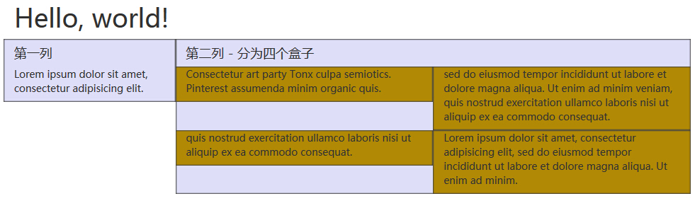
在下面的实例中,布局有两个列,第二列被分为两行四个盒子。
<!DOCTYPE html><html><head><title>Bootstrap 实例 - 嵌套列</title><linkhref="/bootstrap/css/bootstrap.min.css"rel="stylesheet"><scriptsrc="/scripts/jquery.min.js"></script><scriptsrc="/bootstrap/js/bootstrap.min.js"></script></head><body><divclass="container"><h1>Hello, world!</h1><divclass="row"><divclass="col-md-3"style="background-color:#dedef8;box-shadow:

         inset 1px-1px1px#444, inset -1px 1px 1px #444;"><h4>第一列</h4><p>Lorem ipsum dolor sit amet, consectetur adipisicing elit.</p></div><divclass="col-md-9"style="background-color:#dedef8;box-shadow:

         inset 1px-1px1px#444, inset -1px 1px 1px #444;"><h4>第二列 - 分为四个盒子</h4><divclass="row"><divclass="col-md-6"style="background-color:#B18904;

               box-shadow: inset 1px-1px1px#444, inset -1px 1px 1px #444;"><p>Consectetur art party Tonx culpa semiotics. Pinterest

                  assumenda minim organic quis.

               </p></div><divclass="col-md-6"style="background-color:#B18904;

               box-shadow: inset 1px-1px1px#444, inset -1px 1px 1px #444;"><p> sed do eiusmod tempor incididunt ut labore et dolore magna

                  aliqua. Ut enim ad minim veniam, quis nostrud exercitation

                  ullamco laboris nisi ut aliquip ex ea commodo consequat.

               </p></div></div><divclass="row"><divclass="col-md-6"style="background-color:#B18904;

               box-shadow: inset 1px-1px1px#444, inset -1px 1px 1px #444;"><p>quis nostrud exercitation ullamco laboris nisi ut

                  aliquip ex ea commodo consequat.

               </p></div><divclass="col-md-6"style="background-color:#B18904;

               box-shadow: inset 1px-1px1px#444, inset -1px 1px 1px #444;"><p>Lorem ipsum dolor sit amet, consectetur adipisicing elit,

                  sed do eiusmod tempor incididunt ut labore et dolore magna

                  aliqua. Ut enim ad minim.</p></div></div></div></div></div></body></html>
尝试一下 »
结果如下所示:
列排序
Bootstrap 网格系统另一个完美的特性,就是您可以很容易地以一种顺序编写列,然后以另一种顺序显示列。
您可以很轻易地改变带有 .col-md-push-* 和 .col-md-pull-* 类的内置网格列的顺序,其中 * 范围是从 1 到 11。
在下面的实例中,我们有两列布局,左列很窄,作为侧边栏。我们将使用 .col-md-push-* 和 .col-md-pull-* 类来互换这两列的顺序。
<!DOCTYPE html><html><head><title>Bootstrap 实例 - 列排序</title><linkhref="/bootstrap/css/bootstrap.min.css"rel="stylesheet"><scriptsrc="/scripts/jquery.min.js"></script><scriptsrc="/bootstrap/js/bootstrap.min.js"></script></head><body><divclass="container"><h1>Hello, world!</h1><divclass="row"><p>排序前</p><divclass="col-md-4"style="background-color:#dedef8;

         box-shadow: inset 1px-1px1px#444, inset -1px 1px 1px #444;">

         我在左边

      </div><divclass="col-md-8"style="background-color:#dedef8;

         box-shadow: inset 1px-1px1px#444, inset -1px 1px 1px #444;">

         我在右边

      </div></div><br><divclass="row"><p>排序后</p><divclass="col-md-4 col-md-push-8"style="background-color:#dedef8;

         box-shadow: inset 1px-1px1px#444,

         inset -1px1px1px#444;">

         我在左边

      </div><divclass="col-md-8 col-md-pull-4"style="background-color:#dedef8;

         box-shadow: inset 1px-1px1px#444,

         inset -1px1px1px#444;">

         我在右边

      </div></div></div></body></html>
尝试一下 »
结果如下所示:

关注微信下载离线手册

 (群号:335415140)
bootstrap布局 网格系统的更多相关文章
- 测开之路一百零六:bootstrap布局
可以在html的head里面加一些说明 <meta http-equiv="X-UA-Compatible" content="IE=edge">& ...
- 实现bootstrap布局的input输入框中的图标点击功能
使用bootstrap布局可以在input的输入框中添加譬如登录名输入框中的一键清除图标和密码输入框中显示密码的小眼睛图标.如下图: 但是在将图标放入input输入框中,这些小图标是无法获得点击事件的 ...
- BootStrap布局案例
BootStrap布局 bootstrap 2.3版与3.0版的使用区别 http://www.weste.net/2013/8-20/93261.html 以一个博客系统的首页,来介绍如何布局 1, ...
- bootstrap学习笔记--bootstrap布局方式
Bootstrap 3 是移动设备优先的,在这个意义上,Bootstrap 代码从小屏幕设备(比如移动设备.平板电脑)开始,然后扩展到大屏幕设备(比如笔记本电脑.台式电脑)上的组件和网格. 移动设备优 ...
- bootstrap部分---网格系统;(几天没写博客了,为了潜心研究一下bootstrap)
1工作原理: (1)行必须放置在 .container class 内,以便获得适当的对齐(alignment)和内边距(padding). (2)使用行来创建列的水平组. (3)内容应该放置在列内, ...
- 响应式开发(五)-----Bootstrap CSS----------Bootstrap 网格系统
如果我们看过一些bootstrap的框架,经常看到col-sm-3等样式class. Bootstrap 提供了一套响应式.移动设备优先的流式网格系统,随着屏幕或视口(viewport)尺寸的增加,系 ...
- Bootstrap学习-网格系统
1.实现原理 网格系统的实现原理非常简单,仅仅是通过定义容器大小,平分12份(也有平分成24份或32份,但12份是最常见的),再调整内外边距,最后结合媒体查询,就制作出了强大的响应式网格系统.Boot ...
- Bootstrap布局基础
1.栅格系统(布局)Bootstrap内置了一套响应式.移动设备优先的流式栅格系统,随着屏幕设备或视口(viewport)尺寸的增加,系统会自动分为最多12列. 我在这里是把Bootstrap中的栅 ...
- bootstrap 布局(收藏/摘抄)
bootstrap 12栅格 布局
随机推荐
- A/B测试
昨天把前段时间开发的二胡调音器的应用发布到了亚马逊应用程序商店,看到了一个A/B测试的标签,了解一下A/B测试的工作原理. A/B测试是一种新兴的网页优化方法,可以用于增加转化率注册率等网页指标. 使 ...
- Java 或者android 的加密技术
可以将Java文件编译之后得到的class文件(字节码)进行加密. 然后自定义一个classloader-类加载器,在载入class文件之后,对它进行解密,然后就可以正常运行了. 猜测,android ...
- jarsigner 签名android apk
1.查看签名: jarsigner -verify app_signed.apk 查看是否签名,如果已经签名会打印 "jar verified". jarsigner -verif ...
- Spring3 MVC请求参数获取的几种方法
Spring3 MVC请求参数获取的几种方法 一. 通过@PathVariabl获取路径中的参数 @RequestMapping(value="user/{id}/{name}&q ...
- (笔记)Linux内核学习(九)之内核内存管理方式
一 页 内核把物理页作为内存管理的基本单位:内存管理单元(MMU)把虚拟地址转换为物理 地址,通常以页为单位进行处理.MMU以页大小为单位来管理系统中的也表. 32位系统:页大小4KB 64位系统:页 ...
- mysql主从复制原理
复制如何工作 整体上来说,复制有3个步骤: (1) master将改变记录到二进制日志(binary log)中(这些记录叫做二进制日志事件,binary log events): ...
- u3d 性能优化
http://blog.csdn.net/candycat1992/article/details/42127811 写在前面 这一篇是在Digital Tutors的一个系列教程的基础上总结扩展而得 ...
- 并行编程多线程之Parallel
1.简介 随着多核时代的到来,并行开发越来越展示出它的强大威力!使用并行程序,充分的利用系统资源,提高程序的性能.在.net 4.0中,微软给我们提供了一个新的命名空间:System.Threadin ...
- IIS出现The specified module could not be found解决方法
打开IIS 信息服务,在左侧找到自己的计算机,点右键,选择属性,在主属性中选编辑,打开“目录安全性”选项卡,单击“匿名访问和验证控制”里的“编辑”按钮,在弹出的对话框中确保只选中了“匿名访问”和“集成 ...
- DataContractSerializer序列化与反序列化遇到的奇怪问题
private static void Serialize1(string filename, object obj) { var stream = new F ...