数据可视化之 tick_params( 参数 )
参考:https://blog.csdn.net/helunqu2017/article/details/78736554/
初学数据可视化,遇到了tick_params() 里面传参数问题,找了一些资料,觉得这个简单明了,非常好用,推荐看下!
1.tick_params语法
Axes.tick_params(axis=’both’, **kwargs)
参数:
axis : {‘x’, ‘y’, ‘both’} Axis on which to operate; default is ‘both’. (axis:轴)
reset : bool If True, set all parameters to defaults before processing other keyword arguments. Default is False.
which : {‘major’, ‘minor’, ‘both’} Default is ‘major’; apply arguments to which ticks.
direction : {‘in’, ‘out’, ‘inout’} Puts ticks inside the axes, outside the axes, or both.
length : float Tick length in points.
width : float Tick width in points.
color : color Tick color; accepts any mpl color spec.
pad : float Distance in points between tick and label.
labelsize : float or str Tick label font size in points or as a string (e.g., ‘large’).
labelcolor : color Tick label color; mpl color spec.
colors : color Changes the tick color and the label color to the same value: mpl color spec.
zorder : float Tick and label zorder.
bottom, top, left, right : bool or {‘on’, ‘off’} controls whether to draw the respective ticks.
labelbottom, labeltop, labelleft, labelright : bool or {‘on’, ‘off’} controls whether to draw the respective tick labels.
labelrotation : float Tick label rotation
2.tick_params例子:
参数axis的值为’x’、’y’、’both’,分别代表设置X轴、Y轴以及同时设置,默认值为’both’。
ax1.tick_params(axis=’x’,width=2,colors=’gold’)
ax2.tick_params(axis=’y’,width=2,colors=’gold’)
ax3.tick_params(axis=’both’,width=2,colors=’gold’) 
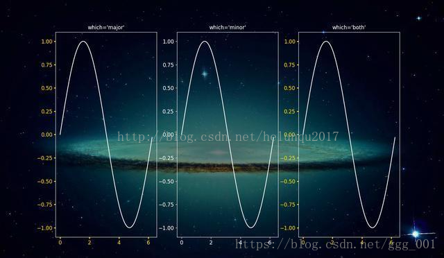
参数which的值为 ‘major’、’minor’、’both’,分别代表设置主刻度线、副刻度线以及同时设置,默认值为’major’ (主刻度线、副刻度线类似于厘米尺。CM与MM的区别)
ax1.tick_params(which=’major’,width=2,colors=’gold’)
ax2.tick_params(which=’minor’,width=2,colors=’gold’)
ax3.tick_params(which=’both’,width=2,colors=’gold’)
参数direction的值为’in’、’out’、’inout’,分别代表刻度线显示在绘图区内侧、外侧以及同时显示
ax1.tick_params(direction=’in’,width=2,length=4,colors=’gold’)
ax2.tick_params(direction=’out’,width=2,length=4,colors=’gold’)
ax3.tick_params(direction=’inout’,width=2,length=4,colors=’gold’)

length和width
参数length和width分别用于设置刻度线的长度和宽度
ax2.tick_params(width=4,colors=’gold’)
ax3.tick_params(length=10,colors=’gold’)

参数pad用于设置刻度线与标签间的距离
ax2.tick_params(pad=1,colors=’gold’)
ax3.tick_params(pad=10,colors=’gold’)

参数color、labelcolor、colors分别用于设置刻度线的颜色、刻度线标签的颜色以及同时设置刻度线及标签颜色
ax1.tick_params(width=4,color=’gold’)
ax2.tick_params(width=4,labelcolor=’gold’)
ax3.tick_params(width=4,colors=’gold’)

参数labelsize用于设置刻度线标签的字体大小
ax1.tick_params(labelsize=’medium’)
ax2.tick_params(labelsize=’large’)
ax3.tick_params(labelsize=15)

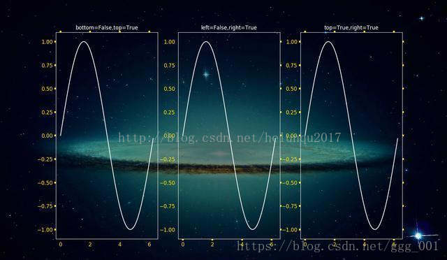
参数bottom, top, left, right的值为布尔值,分别代表设置绘图区四个边框线上的的刻度线是否显示
ax1.tick_params(bottom=False,top=True,width=4,colors=’gold’)
ax2.tick_params(left=False,right=True,width=4,colors=’gold’)
ax3.tick_params(top=True,right=True,width=4,colors=’gold’)
参数labelbottom, labeltop, labelleft, labelright的值为布尔值,分别代表设置绘图区四个边框线上的刻度线标签是否显示
ax1.tick_params(labelbottom=False,labeltop=True,width=4,colors=’gold’)
ax2.tick_params(labelleft=False,labelright=True,width=4,colors=’gold’)
ax3.tick_params(labeltop=True,labelright=True,width=4,colors=’gold’)

数据可视化之 tick_params( 参数 )的更多相关文章
- 【Data Visual】一文搞懂matplotlib数据可视化
一文搞懂matplotlib数据可视化 作者:白宁超 2017年7月19日09:09:07 摘要:数据可视化主要旨在借助于图形化手段,清晰有效地传达与沟通信息.但是,这并不就意味着数据可视化就一定因为 ...
- 【Matplotlib】数据可视化实例分析
数据可视化实例分析 作者:白宁超 2017年7月19日09:09:07 摘要:数据可视化主要旨在借助于图形化手段,清晰有效地传达与沟通信息.但是,这并不就意味着数据可视化就一定因为要实现其功能用途而令 ...
- 基于matplotlib的数据可视化 - 笔记
1 基本绘图 在plot()函数中只有x,y两个量时. import numpy as np import matplotlib.pyplot as plt # 生成曲线上各个点的x,y坐标,然后用一 ...
- (在模仿中精进数据可视化05)疫情期间市值增长top25公司
本文完整代码及数据已上传至我的Github仓库https://github.com/CNFeffery/FefferyViz 1 简介 新冠疫情对很多实体经济带来冲击的同时,也给很多公司带来了新的增长 ...
- 数据可视化案例 | 如何打造数据中心APP产品
意识到数据探索带来的无尽信息,越来越多的企业开始建立自有的数据分析平台,打造数据化产品,实现数据可视化. 在零售商超行业,沃尔玛"啤酒与尿布"的故事已不再是传奇.无论是大数据还是小 ...
- 前端数据可视化echarts.js使用指南
一.开篇 首先这里要感谢一下我的公司,因为公司需求上面的新颖(奇葩)的需求,让我有幸可以学习到一些好玩有趣的前端技术,前端技术中好玩而且比较实用的我想应该要数前端的数据可视化这一方面,目前市面上的数据 ...
- [译]学习IPython进行交互式计算和数据可视化(五)
第四章:交互式绘图接口 本章我们将展示Python的绘图功能以及如何在IPython中交互式地使用它们. NumPy为处理大量的多维数组结构的数据提供了高效的方法.但是看行行列列的数字总不如直接看曲线 ...
- [译]学习IPython进行交互式计算和数据可视化(三)
第二章 在本章中,我们将详细学习IPython相对以Python控制台带来的多种改进.特别的,我们将会进行下面的几个任务: 从IPython中使用系统shell以在shell和Python之间进行强大 ...
- 用ElasticSearch和Protovis实现数据可视化
搜索引擎最重要的目的,嗯,不出意料就是搜索.你传给它一个请求,然后它依照相关性返回你一串匹配的结果.我们可以根据自己的内容创造各种请求结构,试验各种不同的分析器,搜索引擎都会努力尝试提供最好的结果. ...
随机推荐
- go语言入门教程:基本语法—常量constant
一.常量的使用 1.1 常量声明 常量是一个简单值的标识符,在程序运行时,不会被修改的量. const identifier [type] = value 显式类型定义: const b string ...
- ntfs读写工具Paragon NTFS 15无限使用教程
Paragon NTFS mac版是Mac OS平台上最受欢迎的ntfs读写工具,专门开发用来弥补Windows和Mac OS X之间的不兼容性,通过在Mac OS X系统下提供对任何版本的NTFS文 ...
- linux查看与修改交换内存配置(解决zabbix-agent启动报错)
问题 zabbix-agent在一台centos6.5上启动报错: cannot allocate shared memory of size 949056: [28] No space left o ...
- CS 2505 Computer Organization I C09: Rational Number
CS 2505 Computer Organization I C09: Rational Number Type in CVersion 5.00 This is a purely individu ...
- elasticsearch搭建并通过go-mysql-elasticsearch同步db数据达到搜索引擎的目的
logstash-input-jdbc/elasticsearch-jdbc缺点:删除记录没有办法同步,只能两边执行自己的删除命令,版本16年后未更新. go-mysql-elasticsearch缺 ...
- VS2010下安装boost库
在我们的C++项目中安装boost库,下面以VS2010版本作为例子,其它版本的设置也差不多. 一.编译生成boost库 1.下载最新的boost(本人下载的是boost_1_56_0).boost官 ...
- 不校验csrf
from django.views.decorators.csrf import csrf_exempt@csrf_exemptdef a(request): pass
- Bigger-Mai 养成计划,subprocess模块
subprocess模块是python从2.4版本开始引入的模块.主要用来取代 一些旧的模块方法,如os.system.os.spawn*.os.popen*.commands.*等.subproce ...
- 将nginx、mysql、php添加至环境变量
1.问题描述: 修改完nginx配置后想重启nginx服务,执行nginx -s reload 返回了 -bash: nginx: command not found 2.原因: 没有配置环境变量,找 ...
- ASP.NET MVC WebAPI Put和Delete请求出现405(Method not allowed)错误
解决办法: 在站点根目录下的web.config设置如下(主要参考添加项): <system.webServer> <modules> <remove name=&quo ...