transform—3D立方体
1、思路分析
第一步:首先需要一个大盒子,承载立方体的六个面;
第二步:立方体的六个面需要3D转化在特定的位置,拼接成一个立方体;
第三步:设置动画;
2、代码实现
第一步:创建div并且设置样式:
    <style>

      .box {

        width: 150px;

        height: 150px;

        background-color: pink;

        margin: 200px auto;

        position: relative;

      }

      .box > div {

        width: 100%;

        height: 100%;

        position: absolute;

        text-align: center;

        line-height: 150px;

        font-size: 20px;

      }

      </style>

    <div class="box">

        <div class="front">front</div>

        <div class="back">back</div>

        <div class="left">left</div>

        <div class="right">right</div>

        <div class="top">top</div>

        <div class="bottom">bottom</div>

    </div>
第二步:创建六个面,并且在父元素.box 设置立体效果
transform-style: preserve-3d;
      .box .front {

        background-color: lawngreen;

        transform: translateZ(75px);

      }

      .box .back {

        background-color: lightcoral;

        transform: translateZ(-75px);

      }

      .box .left {

        background-color: darkmagenta;

        transform: rotateY(-90deg) translateZ(75px);

      }

      .box .right {

        background-color: paleturquoise;

        transform: rotateY(90deg) translateZ(75px);

      }

      .box .top {

        background-color: salmon;

        transform: rotateX(90deg) translateZ(75px);

      }

      .box .bottom {

        background-color: blue;

        transform: rotateX(-90deg) translateZ(75px);

      }
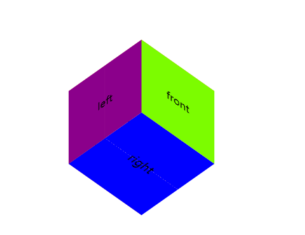
显示效果:
第三步设置动画:
       在.box中设置:animate

      animation: move 5s ease infinite alternate;

      @keyframes move {

        from {

          transform: rotateX(45deg) rotateY(45deg);

        }

        to {

          transform: rotateX(270deg) rotateY(270deg);

        }

      }
3、完整代码
<!DOCTYPE html>

<html lang="en">

<head>

    <meta charset="UTF-8">

    <title>Title</title>

    <style>

      .box {

        width: 150px;

        height: 150px;

        background-color: pink;

        margin: 200px auto;

        position: relative;

        transform-style: preserve-3d;

        transform: rotateX(45deg) rotateY(45deg);

        animation: move 5s ease infinite alternate;

      }

      @keyframes move {

        from {

          transform: rotateX(45deg) rotateY(45deg);

        }

        to {

          transform: rotateX(270deg) rotateY(270deg);

        }

      }

      .box > div {

        width: 100%;

        height: 100%;

        position: absolute;

        text-align: center;

        line-height: 150px;

        font-size: 20px;

      }

      .box .front {

        background-color: lawngreen;

        transform: translateZ(75px);

      }

      .box .back {

        background-color: lightcoral;

        transform: translateZ(-75px);

      }

      .box .left {

        background-color: darkmagenta;

        transform: rotateY(-90deg) translateZ(75px);

      }

      .box .right {

        background-color: paleturquoise;

        transform: rotateY(90deg) translateZ(75px);

      }

      .box .top {

        background-color: salmon;

        transform: rotateX(90deg) translateZ(75px);

      }

      .box .bottom {

        background-color: blue;

        transform: rotateX(-90deg) translateZ(75px);

      }

    </style>

</head>

<body>

    <div class="box">

        <div class="front">front</div>

        <div class="back">back</div>

        <div class="left">left</div>

        <div class="right">right</div>

        <div class="top">top</div>

        <div class="bottom">bottom</div>

    </div>

</body>

</html>
transform—3D立方体的更多相关文章
- CSS3 3D立方体效果-transform也不过如此
CSS3系列已经学习了一段时间了,第一篇文章写了一些css3的奇技淫巧,原文戳这里,还获得了较多网友的支持,在此谢过各位,你们的支持是我写文章最大的动力^_^. 那么这一篇文章呢,主要是通过一个3D立 ...
- 基于css3新属性transform及原生js实现鼠标拖动3d立方体旋转
基于css3新属性transform,实现3d立方体的旋转 通过原生JS,点击事件,鼠标按下.鼠标抬起和鼠标移动事件,实现3d立方体的拖动旋转,并将旋转角度实时的反应至界面上显示 实现原理:通过获取鼠 ...
- 利用CSS3的transform 3D制作的立方体旋转效果
<!doctype html> <html> <head> <meta charset="utf-8"> <title> ...
- css3-实现3D立方体旋转
核心内容: 1.CSS3 中 animation.perspective 属性的熟练运用. 2.CSS3 中的变形属性 transform,在 3D 立体效果中的运用. 3.3D 立方体旋转实现原理. ...
- js拖拽3D立方体旋转
这段时间有点闲,所以就自己找些小玩意来练习练习.今天做了一个可以拖拽页面内空白位置3D立方体就会跟着转动的小例子,布局方面用到css3 3D转换技术,通过transform控制旋转实现的. 上个图 代 ...
- css3实践—创建3D立方体
css3实践-创建3D立方体 要想实现3D的效果,其实非常简单,只需指定一个元素为容器并设置transform-style:preserve-3d,那么它的后代元素便会有3D效果.不过有很多需要注意的 ...
- CSS3之3D立方体效果
下面代码可实现3D立方体,比较好理解,就是让每个面先平移到指定位置,然后旋转90度 <!DOCTYPE html> <html lang="en"> < ...
- 仿智能社官网:原生JS实现简单又酷炫的3D立方体时钟
先放一下我做的效果:https://linrunzheng.github.io/3Dclock/3Dclock/new.html 至于3D立方体怎么做这里就不在阐述了,可以看一下我之前的博客. 这里默 ...
- 3D立方体
效果图 主要用到的3D属性 1.保留子元素的3d属性:transform-style:preserve-3d; 2.2D变形属性: ①transform:translate()平移,分X轴,Y轴,Z轴 ...
随机推荐
- JavaScript基于原型的继承
在一个纯粹的原型模式中,我们会摒弃类,转而专注于对象,基于原型的继承相比基于类的继承的概念上更为简单 if( typeof Object.beget !== 'function') { Object. ...
- http https 干货
HTTPS原理 在谈HTTPS原理之前,首先了解一下Http和Https的区别. Http(全称:Hyper Text Transfer Protocol),一般称为超文本传输协议,也是互联 ...
- 吴裕雄--天生自然java开发常用类库学习笔记:大数操作
import java.math.* ; class MyMath{ public static double add(double d1,double d2){ // 进行加法计算 BigDecim ...
- 吴裕雄 Bootstrap 前端框架开发——Bootstrap 字体图标(Glyphicons):glyphicon glyphicon-glass
<!DOCTYPE html> <html> <head> <meta charset="utf-8"> <meta name ...
- JuJu团队11月29号工作汇报
JuJu团队11月29号工作汇报 JuJu Scrum 团队成员 今日工作 剩余任务 困难 于达 生成所有mini batch, 支持不同batch_size 优化代码 熟悉julia 婷婷 ...
- NO12 useradd-passwd-uname-hostname命令-上传rz下载sz-批量部署- Linux用户相关操作
24 useradd #添加用户 语法:useradd 用户名 例子:ueradd oldboy .25 passwd #为用户设置或修改 ...
- C# 关于AD域的操作 (首博)
前段时间(因为懒得找具体的时间了)公司说让系统可以进行对AD域的操作,包括创建用户.于是上网查资料,了解何为AD域.还不知道的这边请https://www.cnblogs.com/cnjavahome ...
- js 跳转链接
1.跳转链接 在当前窗口打开 window.location.href="http://www.baidu.com" 等价于 <a href="baidu.com& ...
- HDU 5501:The Highest Mark 01背包
The Highest Mark Accepts: 71 Submissions: 197 Time Limit: 2000/1000 MS (Java/Others) Memory Limi ...
- eclipse 安装spring tools suite插件
之前使用idea进行springboot项目的开发学习,但是由于idea是收费的,总是用着用着说验证码到期之类的,总之还是很不爽,于是就想重新采用eclipse开发springboot项目,为了方便s ...