CSS魔法堂:更丰富的前端动效by CSS Animation
前言
在《CSS魔法堂:Transition就这么好玩》中我们了解到对于简单的补间动画,我们可以通过transition实现。那到底多简单的动画适合用transtion来实现呢?答案就是——我们只需定义动画起始和结束帧的状态的动画。一旦关键帧数大于2时,我们必须转向CSS Animation了。本文为这段时间学习的记录,欢迎拍砖。
简单粗暴介绍CSS Animation 规则和属性
定义关键帧动画
语法:
@keyframes <Animation Name> {

  [<Animation Time Offset> {

    /* CSS Properties */

  }]*

}
示例:
@keyframes rotate {

  from { transform: rotate(0deg); }

  to { transform: rotate(360deg); }

}
注意项:
1.<Animation Name>的命名规范
// 命名需要遵循以下规则

const rIsInvalid = /^--|^[0-9]+-|^(?:unset|initial|inherit|none)$/

    , rIsValid = /^[0-9a-z-_\\]+$/i

function isValidAnimationName(animationName: string): boolean{

  return !rIsInvalid.test(animationName) && rIsValid(animationName)

}
2.<Animation Time Offset>取值
0-100%、from,等价与0%、 to,等价与100%。
3.<Animation Name>重复怎么办
@keyframes CSS规则不支持层叠样式,因此当出现多个同名keyframes,那么仅最后出现的那个有效。
/* 无效 */

@keyframes rotate {

  from { transform: rotate(0deg); }

  to { transform: rotate(360deg); }

}

/* 生效 */

@keyframes rotate {

  from { transform: rotate(90deg); }

  to { transform: rotate(-360deg); }

}
4.<Animation Time Offset>重复怎么办
与@keyframes CSS规则一样,标准规定相同的关键帧不产生层叠,仅最后出现的认定为有效。
但实际上FireFox14+和Chrome均将关键帧设计为可层叠的。
@keyframes rotate {

  from { transform: rotate(0deg); }

  from { background: red; }

  /* 上述两条time offset实际上等价于

   * from { transform: rotate(0deg); background: red; }

   */

  to {

    transform: rotate(360deg);

    background: yellow;

  }

}
5.!important导致属性失效
一般情况下使用!important会让CSS属性获得最高权重,但在@keyframes下却会导致该CSS属性失效。
@keyframes rotate {

  from {

    transform: rotate(90deg);

    background: red!important; /* background属性无效 */

  }

  to { transform: rotate(-360deg); }

}
6.必须提供至少两个关键帧
/* 不会根据缓动函数产生动画效果,而是在动画持续时间的最后瞬间移动过去 */

@keyframes move-left{

   to {

	   left: 100px;

   }

}
使用动画
<css-selector> {

  animation: <animation-name>

             <animation-duration>

             <animation-timing-function>

             <animation-delay>

             <animation-iteration-count>

             <animation-direction>

             <animation-fill-mode>

             <animation-play-state>;

}
示例:
.box.rotate {

  animation: rotate 10s infinite alternate;

}
子属性介绍
<animation-name>,指定通过@keyframes定义的补间动画名称。
<animation-duration>,动画持续时长,默认为0s。单位为s和ms。
<animation-delay>,动画播放延迟,默认为0s。单位为s和ms。
<animation-iteration-count>,动画重复播放次数,默认为1,infinite表示无限循环。动画播放总时长为<animation-duration>*<animation-iteration-count>。
<animation-direction>,可选值为normal | reverse | alternate | alternate-reverse,分别表示动画播放顺序是从from到to,从to到from,从from到to再从to到from和从to到from再从from到to。注意:设置alternate|alternate-reverse时,animation-iteration-count必须大于1才能看到效果
<animation-fill-mode>,可选值为none | forwards | backwards | both,用于设置动画开始前和结束后是否应用0%和100%的样式对元素上。分别表示不应用,应用100%的样式,延迟播放期间应用0%的样式和0%和100%的样式均应用。
注意:
- 默认情况下(none),动画结束后会恢复动画前的样式;
- 设置backwards时,值大于0才能看到效果。
<animation-play-state>,可选值running | paused,获取和设置播放状态。注意:通过这个属性,我们仅能实现暂停和继续播放的效果,无法实现重播,更别说回放了
<animation-timing-function>,用于设置缓动函数类型,值为ease | ease-in | ease-out | ease-in-out | linear | step-start | step-end | steps(<integer>, <flag>) | frames(<integer>) | cubic-bezier(<number>,<number>,<number>,<number>)。
其中ease | ease-in | ease-out | ease-in-out | linear | cubic-bezier(<number>,<number>,<number>,<number>)的效果均为连续渐变的,而step-start | step-end | steps(<integer>, <flag>) | frames(<integer>)则为突变效果。下面我们深入理解后者吧。
缓动函数-step解疑专题
step-start实际上等价于steps(10, start),而step-end则等价于steps(10),所以我们只要理解好steps(<integer>, <flag>)即可。
/* 通过设置在一个动画周期内(<animation-duration>)的平均刷新帧数,实现突变动效。具体应用有:游戏精灵行走、打字效果等

 * <number_of_steps> - 两个关键帧间的刷新次数

 * <direction> - 方向,可选值为 end | start。

 *               end为默认值,表示动画一结束,动画效果就结束;

 *               start表示动画一开始就马上执行完第一个关键帧的效果。

 */

steps(<number_of_steps>, <direction>)
从张旭鑫那偷来的解释:
start:表示直接开始。也就是时间才开始,就已经执行了一个距离段。于是,动画执行的5个分段点是下面这5个,起始点被忽略,因为时间一开始直接就到了第二个点:

end:表示戛然而止。也就是时间一结束,当前距离位移就停止。于是,动画执行的5个分段点是下面这5个,结束点被忽略,因为等要执行结束点的时候已经没时间了:
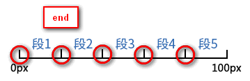
另外通过将<animation-fill-mode>设置为forwards,那么当<direciton>设置为end时,也会显示(保持)动画最后一个关键帧的样式。
事件
const target = document.getElementById("target")

target.addEventListener("animationstart", e => {

  // 动画开始时触发

})

target.addEventListener("animationiteration", e => {

  // 每次重复执行动画时触发

  // 当<animation-iteration-count>为1时,不会触发。

})

target.addEventListener("animationend", e => {

  // 当动画结束时触发

})
搞尽脑汁实现重播效果
到这里我们已经可以通过@keyframes定义和应用CSS Animation了,但我们能否获取对动画效果更多的控制权呢?如开始、暂停、继续、重播。通过<animation-play-state>我们能轻易实现开始、暂停和继续的效果,但重播却没那么容易。
function pause (target: HTMLElement):boolean {

  const isRunning = target.style.animationPlayState == "running"

  if (isRunning) {

    target.style.animationPlayState = "paused"

  }

  return isRunning

}

function play (target: HTMLElement):boolean {

  const isStop = target.style.animationPlayState == "paused"

  if (isStop) {

    target.style.animationPlayState = "running"

  }

  return isStop

}

function replay (target: HTMLElement, animationClassName: string):void {

  // 先移除动画效果

  target.classList.remove(animationName)

  // requestAnimationFrame的回调函数会在下一次界面渲染前执行

  requestAnimationFrame(_ => {

    // 这时动画的影响还在,所以要等界面渲染完后再重新启用动画效果,才能实现重播

	requestAnimationFrame(_ => {

	  target.classList.add(animationName)

	})

  })

}
总结
CSS3为我们提供了动画效果,除了提供比Transition更丰富的可控性,比JavaScript更简易的API,还让我们可以使用GPU来加速呢_
尊重原创,转载请注明来自:https://www.cnblogs.com/fsjohnhuang/p/9289618.html _肥仔John
参考
https://developer.mozilla.org/en-US/docs/Web/CSS/@keyframes
https://designmodo.com/steps-css-animations/
http://lea.verou.me/2011/09/pure-css3-typing-animation-with-steps/
http://jsfiddle.net/simurai/CGmCe/
https://www.zhangxinxu.com/wordpress/2018/06/css3-animation-steps-step-start-end/
CSS魔法堂:更丰富的前端动效by CSS Animation的更多相关文章
- CSS魔法堂:display:none与visibility:hidden的恩怨情仇
前言 还记得面试时被问起"请说说display:none和visibility:hidden的区别"吗?是不是回答完display:none不占用原来的位置,而visibilit ...
- CSS魔法堂:Box-Shadow没那么简单啦:)
前言 说起box-shadow那第一个想法当然就是用来实现阴影,其实它还能用于实现其他好玩的效果的,本篇就打算说说box-shadow的那些事. 二话不说看效果 3D小球 <style typ ...
- CSS魔法堂:重拾Border之——更广阔的遐想
前言 当CSS3推出border-radius属性时我们是那么欣喜若狂啊,一想到终于不用再添加额外元素来模拟圆角了,但发现border-radius还分水平半径和垂直半径,然后又发现border-t ...
- CSS魔法堂:重拾Border之——不仅仅是圆角
前言 当CSS3推出border-radius属性时我们是那么欣喜若狂啊,一想到终于不用再添加额外元素来模拟圆角了,但发现border-radius还分水平半径和垂直半径,然后又发现border-t ...
- CSS魔法堂:重拾Border之——图片作边框
前言 当CSS3推出border-radius属性时我们是那么欣喜若狂啊,一想到终于不用再添加额外元素来模拟圆角了,但发现border-radius还分水平半径和垂直半径,然后又发现border-t ...
- CSS魔法堂:重拾Border之——解构Border
前言 当CSS3推出border-radius属性时我们是那么欣喜若狂啊,一想到终于不用再添加额外元素来模拟圆角了,但发现border-radius还分水平半径和垂直半径,然后又发现border-t ...
- CSS魔法堂:"那不是bug,是你不懂我!" by inline-block
前言 每当来个需要既要水平排版又要设置固定高宽时,我就会想起display:inline-block,还有为了支持IE5.5/6/7的hack*display:inline;*zoom:1;.然后发 ...
- CSS魔法堂:小结一下Box Model与Positioning Scheme
前言 对于Box Model和Positioning Scheme中3种定位模式的细节,已经通过以下几篇文章记录了我对其的理解和思考. <CSS魔法堂:重新认识Box Model.IFC.B ...
- CSS魔法堂:说说Float那个被埋没的志向
前言 定位系统中第一难理解就是Normal flow,而第二就非Float莫属了,而Float难理解的原因有俩,1. 一开头我们就用错了:2. 它跟Normal flow靠得太近了.本文尝试理清Fl ...
随机推荐
- 【Android】ContentValues的用法
ContentValues 和HashTable类似都是一种存储的机制 但是两者最大的区别就在于,contenvalues只能存储基本类型的数据,像string,int之类的,不能存储对象这种东西,而 ...
- 跨域资源共享 CORS 详解(转自阮一峰博客)
CORS是一个W3C标准,全称是"跨域资源共享"(Cross-origin resource sharing). 它允许浏览器向跨源服务器,发出XMLHttpRequest请求,从 ...
- Centos7X部署Zabbix监控
一:yum安装LAMP环境 zabbix-server端防火墙配置(可以选择iptables -F清空) iptables -A INPUT -m state --state NEW -m tcp - ...
- libssl.so.10: cannot open shared object file: No such file or directory
今天在使用yum安装东西的时候报错 yum list There was a problem importing one of the Python modulesrequired to run yu ...
- awk介绍
awk 是一个强大的文本处理工具,它将文本逐行读入,并进行切片,默认以空白格为分割符,对单个切片进行分析,处理. 用法: awk '{pattern + action}' {filenames} 尽管 ...
- Python学习(七) —— 装饰器、迭代器、生成器
一.装饰器(decorator) 1.装饰器的本质是闭包函数,作用:在不改变函数的调用方式的情况下,给函数的前后添加新的功能 #装饰器的固定结构 def warpper(func): #定义装饰器函数 ...
- ghithub中PHPOffice/PHPWord的学习
1.概念:PHPWord是用纯PHP提供了一组类写入和从不同的文档格式的文件阅读库.PHPWord的当前版本支持微软的Office Open XML(OOXML或处理OpenXML),用于Office ...
- HTML中鼠标滚轮事件onmousewheel
IE/Opera属于同一类型,使用attachEvent即可添加滚轮事件. /*IE注册事件*/ if(document.attachEvent){ document.attachEvent('onm ...
- Orleans2.0正式版发布
2.0版本支持.net core. Orleans是一个微软研究创建的用于大规模分布式计算的框架,使用者不需要学习和应用复杂的并发或其他缩放模式. 根据我几个项目的使用经验来说,Orleans虽然有应 ...
- IDEA控制台问题:At least one JAR was scanned for TLDs yet contained no TLD
参考连接: https://www.cnblogs.com/interdrp/p/7763040.html 1.调整Tomcat对应类的log级别 2.观察Tomcat日志打印信息 3.调整${tom ...