
CSS3实现的几个小loading效果
昨晚上闲的没事突然想做几个小loading效果,下面是昨晚上做的几个小案例,分享给大家
1.水波loading:这个loading是我觉得非常简单,但是看上去的效果却非常不错的一个小loading
 这个是效果图片
下面我直接把代码放上来,大家需要的可以直接拉走
核心思想:(旋转,以及overflow:hidden属性),可以把代码中的overflow属性注释掉,保准你看一眼明白了,看不明白回来找我,我对你负责
<!DOCTYPE html>

<html lang="en">

<head>

    <meta charset="UTF-8">

    <meta name="viewport" content="width=device-width, initial-scale=1.0">

    <meta http-equiv="X-UA-Compatible" content="ie=edge">

    <title>Document</title>

    <style>

        * {

            margin:;

            padding: 0

        }

        body {

            background-color: black

        }

        .box {

            margin: 200px auto;

            height: 50px;

            width: 50px;

            border-radius: 10px;

            background-color: rgb(0, 174, 255);

            position: relative;

            overflow: hidden;

            border: 1px solid rgb(0, 174, 255);

            border-top: none;

        }

        .a {

            width: 200px;

            height: 200px;

           background: black;

            position: absolute;

            left: -80px;

            top: -180px;

            border-radius: 80px;

            animation: xuanzhuan 5s linear infinite;

            z-index: 2

        }

        @keyframes xuanzhuan{

            0%{transform: rotate(0deg)}

            100%{transform: rotate(360deg)}

        }

    </style>

</head>

<body>

    <div class="box">

        <div class="a"></div>

        <div class="b"></div>

    </div>

</body>

</html>
2.普通的圆形loading 这个也很简单 没啥好说的,直接上代码了

<!DOCTYPE html>

<html lang="en">

<head>

    <meta charset="UTF-8">

    <meta name="viewport" content="width=device-width, initial-scale=1.0">

    <meta http-equiv="X-UA-Compatible" content="ie=edge">

    <title>Document</title>

    <style>

    *{margin:;padding:}

    li{list-style: none}

    body,html{

        background-color: black;

    }

    ul{

        height: 40px;

        width: 200px;

        margin: 50px auto;

    }

    ul>li{

        float: left;

        height: 20px;

        width: 20px;

        border-radius: 50%;

        background: white;

        margin-left: 10px;

        animation: move 2s infinite alternate;

        transform: scale(0.5)

    }

    ul>li:nth-of-type(2){

        animation-delay: 0.5s;

    }

    ul>li:nth-of-type(3){

        animation-delay:1s;

    }

    @keyframes move{

        0%{transform: scale(0.5);opacity: 0.5}

        100%{transform: scale(1);opacity:;}

    }

    </style>

</head>

<body>

    <ul>

        <li></li>

        <li></li>

        <li></li>

    </ul>

</body>

</html>
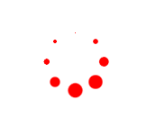
3.圆形转圈loading
思想(把小圆用定位排成圆形,再给每个上添加动画,用delay控制延迟事件即可)
<!DOCTYPE html>

<html>

    <head>

        <meta charset="utf-8" />

        <title></title>

    </head>

    <style>

        *{

            margin:;

            padding:;

        }

        .d1{

            width: 50px;

            height: 50px;

            position: absolute;

            margin: 100px;

        }

        .d1 p{

            width: 14px;

            height: 14px;

            border-radius: 50%;

            background: red;

            position: absolute;

            animation: dong 1.5s linear infinite;

        }

        .d1 p:nth-child(1){

            top:;

            left:;

        }

        .d1 p:nth-child(2){

            top:;

            right:;

        }

        .d1 p:nth-child(3){

            right:;

            bottom:;

        }

        .d1 p:nth-child(4){

            bottom:;

            left:;

        }

        .d1:nth-of-type(2){

            transform: rotate(45deg);

        }

        @keyframes dong{

            0%{

                transform: scale(0);

            }

            50%{

                transform: scale(1);

            }

            100%{

                transform: scale(0);

            }

        }

        .d1:nth-of-type(1) p:nth-of-type(1){

            /*负值:动画直接开始,但跳过前...秒动画*/

            animation-delay: -0.1s;

        }

        .d1:nth-of-type(2) p:nth-of-type(1){

            animation-delay: -0.3s;

        }

        .d1:nth-of-type(1) p:nth-of-type(2){

            animation-delay: -0.5s;

        }

        .d1:nth-of-type(2) p:nth-of-type(2){

            animation-delay: -0.7s;

        }

        .d1:nth-of-type(1) p:nth-of-type(3){

            animation-delay: -0.9s;

        }

        .d1:nth-of-type(2) p:nth-of-type(3){

            animation-delay: -1.1s;

        }

        .d1:nth-of-type(1) p:nth-of-type(4){

            animation-delay: -1.3s;

        }

        .d1:nth-of-type(2) p:nth-of-type(4){

            animation-delay: -1.5s;

        }

    </style>

    <body>

        <div class="d1">

            <p></p>

            <p></p>

            <p></p>

            <p></p>

        </div>

        <div class="d1">

            <p></p>

            <p></p>

            <p></p>

            <p></p>

        </div>

    </body>

</html>
4.交叉效果
这个稍微复杂一点,其实只要捋明白思路,也挺简单的(PS:大家可以把动画挨个取消试试,你就会发现好像并不是很难)

<!doctype html>

<html lang="zh-cn">

<head>

    <meta charset="UTF-8">

    <meta name="renderer" content="webkit">

</head>

<body>

    <style>

        body {

            background-color: #F5F5F5;

            padding: 100px 120px;

        }

        .box {

            margin-left: 500px;

            display: block;

            width: 64px;

            height: 64px;

            transform-origin: 16px 16px;

            /* 旋转 */

            animation: xuanzhuan 5s infinite;

        }

        /* 平移 */

        .ping {

            animation: pingyi 2.5s infinite;

            position: absolute;

        }

       .hang {

            width: 64px;

            height: 24px;

            position: absolute;

        }

        .hang:nth-child(0) {

            transform: rotate(0deg);

        }

        .hang:nth-child(1) {

            transform: rotate(90deg);

        }

        .hang:nth-child(2) {

            transform: rotate(180deg);

        }

        .hang:nth-child(3) {

            transform: rotate(270deg);

        }

        /* 第一个小珠子 */

       .ping:nth-child(1) {

            width: 8px;

            height: 8px;

            top: 50%;

            left: 50%;

            margin-top: -4px;

            margin-left: -4px;

            border-radius: 4px;

            animation-delay: -0.3s;

        }

        /* 第二个小珠子 */

        .ping:nth-child(2) {

            width: 16px;

            height: 16px;

            top: 50%;

            left: 50%;

            margin-top: -8px;

            margin-left: -8px;

            border-radius: 8px;

            -webkit-animation-delay: -0.6s;

            animation-delay: -0.6s;

        }

         /* 第三个小珠子 */

        .ping:nth-child(3) {

            width: 24px;

            height: 24px;

            top: 50%;

            left: 50%;

            margin-top: -12px;

            margin-left: -12px;

            border-radius: 12px;

            animation-delay: -0.9s;

        }

        .blue {

            background-color: #1f4e5a;

        }

        .red {

            background-color: #ff5955;

        }

        .yellow {

            background-color: #ffb265;

        }

        .green {

            background-color: #00a691;

        }

        @keyframes xuanzhuan {

            0% { transform: rotate(0deg);}

            100% { transform: rotate(360deg);}

     }

        @keyframes pingyi {

            0% {transform: translateX(0);}

             25% { transform: translateX(-64px); }

            75% { transform: translateX(32px);}

            100% {transform: translateX(0);}

        }

    </style>

        <div class="box">

            <div class="hang">

                <div class="ping blue"></div>

                <div class="ping blue"></div>

                <div class="ping blue"></div>

            </div>

            <div class="hang">

                <div class="ping yellow"></div>

                <div class="ping yellow"></div>

                <div class="ping yellow"></div>

            </div>

            <div class="hang">

                <div class="ping red"></div>

                <div class="ping red"></div>

                <div class="ping red"></div>

            </div>

            <div class="hang">

                <div class="ping green"></div>

                <div class="ping green"></div>

                <div class="ping green"></div>

            </div>

        </div>

</body>

</html>
5.圆形正方形切换小loading
这个是真的简单!!!!!

<!doctype html>

<html lang="zh-cn">

<head>

<meta charset="UTF-8">

<meta name="renderer" content="webkit">

<link rel="shortcut icon" type="images/x-icon" href="/template/images/ufw.ico">

<title>loading-04</title>

</head>

<body>

<style>

    body{

        padding: 80px 100px;

    }

    .csshub-loading-icon{

        padding:10px;

        width:10px;

        height:10px;

        border-top:20px solid #ED5548;

        border-right:20px solid #599CD3;

        border-bottom: 20px solid #5CBD5E;

        border-left:20px solid #FDD901;

        background:transparent;

        animation: csshub-rotate-right-round 1.2s ease-in-out infinite  alternate ;

    }

    @keyframes csshub-rotate-right-round

        {

        0% { transform: rotate(0deg);}

        50% {transform: rotate(180deg); }

        100% {transform: rotate(360deg);border-radius:50%;}

    }

</style>

    <div class="csshub-loading-icon"></div>

</body>

</html>
好啦,今天先分享这些,以后再有loading我会再补充上来的,嗷,对了,我懒得没做兼容,要是再某些浏览器不能运行,加一下浏览器前缀就好啦
CSS3实现的几个小loading效果的更多相关文章
- JQuery+CSS3实现Ajax加载时loading效果
之前通过Ajax请求加载数据的时候,在数据还没有呈现出来前,为了更好的用户体验,总会弄个loading告诉用户其实内容正在加载,而不是网站崩了.但是貌似之前使用gif图片的情况比较多,可能是为了兼容各 ...
- CSS3+HTML5特效7 - 特殊的 Loading 效果
效果如下 实现原理: 利用CSS3的@keyframes规则创建动画效果: 使用CSS3的animation效果完成滚动切换. 代码说明: 样式表中@-webkit-keyframes及@ke ...
- 用CSS3实现饼状loading效果
原文地址:http://visugar.com/2017/05/17/CSS3%E9%A5%BC%E7%8A%B6loading%E6%95%88%E6%9E%9C/ 写在前面 (附录有源码及效果) ...
- 【转】 CSS3实现10种Loading效果
昨晚用CSS3实现了几种常见的Loading效果,虽然很简单,但还是分享一下,顺便也当是做做笔记…… PS:如需转载,请注明出处! 第1种效果: 代码如下: <div class="l ...
- CSS3轻松实现清新 Loading 效果
至今HTML5中国已经为大家分享过几百种基于 CSS3 的Loading加载动画,效果酷炫代码简洁,非常值得学习借鉴;今天就先给大家分享两个常用的CSS3的Loading的案例. 第一种效果: HTM ...
- CSS3实现10种Loading效果
昨晚用CSS3实现了几种常见的Loading效果,虽然很简单,但还是分享一下,顺便也当是做做笔记…… 第1种效果: 代码如下: <div class="loading"> ...
- CSS3实现8种Loading效果【第二波】
原文:CSS3实现8种Loading效果[第二波] 今晚吃完饭回宿舍又捣鼓了另外几种Loading效果,老规矩,直接“上菜“…… 注:gif图片动画有些卡顿,非实际效果! PS:若要转载请注明出处,尊 ...
- css3 之炫酷的loading效果
css3 之炫酷的loading效果 今天实现了一个炫酷的loading效果,基本全用css来实现,主要练习一下css3的熟练运用 js需要引入jquery 只用到了一点点js 先看效果图 html: ...
- HTML5+CSS3 loading 效果收集--转载
用gif图片来做loading的时代已经过去了,它显得太low了,而用HTML5/CSS3以及SVG和canvas来做加载动画显得既炫酷又逼格十足.这已经成为一种趋势. 这里收集了几十个用html5和 ...
随机推荐
- js 正则语法
原文:一次性搞懂javascript正则表达式之语法 看完原文,对正则中以前一知半解的捕获组与非捕获组.零宽断言有了更深的理解.很感谢原文作者~~ 普通字符 当我们写a的时候,我们指的就是a:当我们写 ...
- 微信小程序导出当前画布指定区域的内容并生成图片保存到本地相册(canvas)
最近在学小程序,在把当前画布指定区域的内容导出并生成图片保存到本地这个知识点上踩坑了. 这里用到的方法是: wx.canvasToTempFilePath(),该方法作用是把当前画布指定区域的内容导出 ...
- Win7上Spark WordCount运行过程及异常
WordCount.Scala代码如下: package com.husor.Spark /** * Created by huxiu on 2014/11/26. */ import org.apa ...
- (转)深入浅出 RPC - 深入篇
版权声明:本文为博主原创文章,未经博主允许不得转载. https://blog.csdn.net/mindfloating/article/details/39474123 <深入篇>我们 ...
- Bash数组
1. 数组申明 declare -a array 2. 数组赋值 #法1 array=(var1 var2 var3 ... varN) #法2 array=([]=var1 []=var2 []=v ...
- Git for Windows之分支管理、分支合并、解决分支冲突
分支是在稳定版本出现bug的情况下,通过分支技术,在保证稳定版本稳定的情况,修改稳定版本的(差异下载的,速度极快,不同于SVN等技术,会将所有的代码下载到本地)副本,通过合并,解决冲突,最后回归到稳定 ...
- Javascript图片预加载详解 分类: JavaScript HTML+CSS 2015-05-29 11:01 768人阅读 评论(0) 收藏
预加载图片是提高用户体验的一个很好方法.图片预先加载到浏览器中,访问者便可顺利地在你的网站上冲浪,并享受到极快的加载速度.这对图片画廊及图片占据很大比例的网站来说十分有利,它保证了图片快速.无缝地发布 ...
- 探讨e.target与e.currentTarget
target与currentTarget两者既有区别,也有联系,那么我们就来探讨下他们的区别吧,一个通俗易懂的例子解释一下两者的区别: <!DOCTYPE html> <html&g ...
- Windows下编译打包Spice PC客户端
目录 1 环境搭建 2 编译客户端 3 打包客户端 1 环境搭建 1.1 准备工作 安装启动: 安装替换图标工具: Resource Hacker 安装exe制作工具: NSIS(提取码:3dfp ...
- myeclipse解决Fail to create the java Virtual Machine
今天在打开myeclipse的时候,就显示出 Fail to create the java Virtual Machine 这样的一个窗口出来. 解决的方案就是在myeclipse的安装目录下找到m ...