
CSS画各种二维图形
1.效果
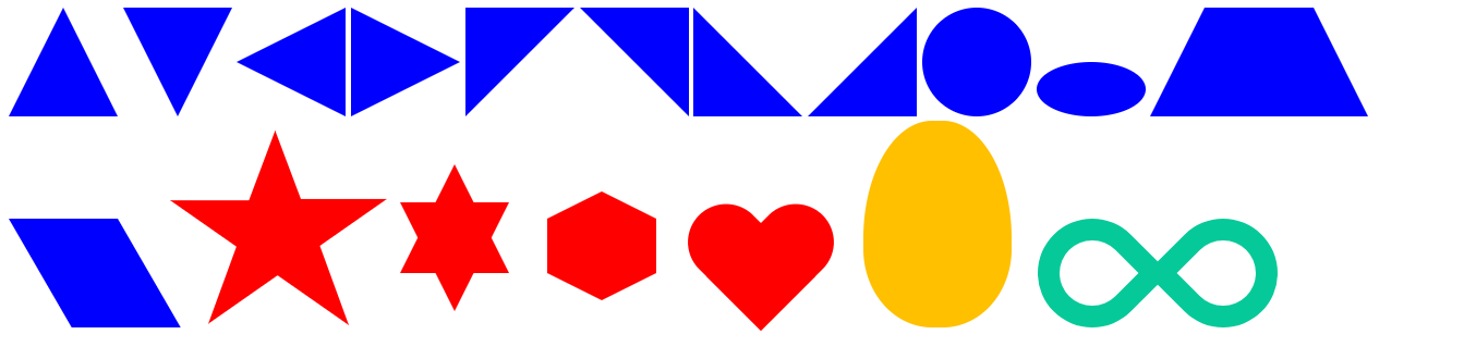
2.源码
<%@ page contentType="text/html;charset=UTF-8" language="java" %>

<html>

<head>

    <style type="text/css">

        #triangle_top{

            display: inline-block;

            width:0;

            height:0;

            border-left:50px solid transparent;

            border-right: 50px solid transparent;

            border-bottom:100px solid blue;

        }

        #triangle_bottom{

            display: inline-block;

            width:0;

            height:0;

            border-left:50px solid transparent;

            border-right:50px solid transparent;

            border-top:100px solid blue;

        }

        #triangle_left{

            display: inline-block;

            width:0;

            height:0;

            border-bottom:50px solid transparent;

            border-top:50px solid transparent;

            border-right:100px solid blue;

        }

        #triangle_right{

            display: inline-block;

            width:0;

            height:0;

            border-bottom:50px solid transparent;

            border-top:50px solid transparent;

            border-left:100px solid blue;

        }

        #right_triangle_top_left{

            display: inline-block;

            width:0;

            height:0;

            border-right:100px solid transparent;

            border-top:100px solid blue;

        }

        #right_triangle_top_right{

            display: inline-block;

            width:0;

            height:0;

            border-left:100px solid transparent;

            border-top:100px solid blue;

        }

        #right_triangle_bottom_left{

            display:inline-block;

            width:0;

            height:0;

            border-right:100px solid transparent;

            border-bottom:100px solid blue;

        }

        #right_triangle_bottom_right{

            display: inline-block;

            width:0;

            height:0;

            border-left:100px solid transparent;

            border-bottom:100px solid blue;

        }

        #circle{

            display: inline-block;

            width: 100px;

            height: 100px;

            background: blue;

            -webkit-border-radius: 50px;

            -moz-border-radius: 50px;

            border-radius: 50px;

        }

        #oval{

            display: inline-block;

            width:100px;

            height:50px;

            background-color: blue;

            -webkit-border-radius:50px/25px;

            -moz-border-radius:50px/25px;

            border-radius:50px/25px;

        }

        #trapezium{

            display: inline-block;

            height: 0;

            width: 100px;

            border-bottom: 100px solid blue;

            border-left: 50px solid transparent;

            border-right: 50px solid transparent;

        }

        #parallelogram{

            display: inline-block;

            height: 100px;

            width: 100px;

            background-color: blue;

            -webkit-transform: skewX(30deg);

            -moz-transform: skewX(30deg);

            -ms-transform: skewX(30deg);

            -o-transform: skewX(30deg);

            transform: skewX(30deg);

            transform-origin: 0 0;

        }

        #star {

            width: 0;

            height: 0;

            display: inline-block;

            border-right: 100px solid transparent;

            border-left: 100px solid transparent;

            border-bottom: 70px solid red;

            -moz-transform: rotate(35deg);

            -webkit-transform: rotate(35deg);

            -ms-transform: rotate(35deg);

            -o-transform: rotate(35deg);

            transform-origin: 80px 120px;

        }

        #star:before {

            content: '';

            height: 0;

            width: 0;

            display: inline-block;

            position: relative;

            top: -45px;

            left: -65px;

            border-left: 30px solid transparent;

            border-right: 30px solid transparent;

            border-bottom: 80px solid red;

            -webkit-transform: rotate(-35deg);

            -moz-transform: rotate(-35deg);

            -ms-transform: rotate(-35deg);

            -o-transform: rotate(-35deg);

            transform: rotate(-35deg);

        }

        #star:after{

            content: '';

            height:0;

            width:0;

            display: inline-block;

            position: relative;

            top: -78px;

            left: -105px;

            border-right: 100px solid transparent;

            border-left: 100px solid transparent;

            border-bottom: 70px solid red;

            -webkit-transform: rotate(-70deg);

            -moz-transform: rotate(-70deg);

            -ms-transform: rotate(-70deg);

            -o-transform: rotate(-70deg);

            transform: rotate(-70deg);

        }

        #star_six_points {

            width: 0;

            height: 0;

            position: relative;

            top: -50px;

            left: 50px;

            display: inline-block;

            border-left: 50px solid transparent;

            border-right: 50px solid transparent;

            border-bottom: 100px solid red;

        }

        #star_six_points:after{

            content: '';

            width:0;

            height:0;

            display: inline-block;

            position: absolute;

            top:35px;

            left:-50px;

            border-left: 50px solid transparent;

            border-right: 50px solid transparent;

            border-top: 100px solid red;

        }

        #hexagon{

            width:100px;

            height:50px;

            display: inline-block;

            position: relative;

            left: 80px;

            top: -50px;

            background-color: red;

        }

        #hexagon:before{

            content: '';

            width:0;

            height:0;

            display: inline-block;

            position: absolute;

            top: -25px;

            left: 0;

            border-left: 50px solid transparent;

            border-right: 50px solid transparent;

            border-bottom: 25px solid red;

        }

        #hexagon:after{

            content: '';

            width:0;

            height:0;

            display: inline-block;

            position: absolute;

            top: 50px;

            left: 0;

            border-left: 50px solid transparent;

            border-right: 50px solid transparent;

            border-top: 25px solid red;

        }

        #heart {

            top:-120px;

            left: 120px;

            position: relative;

            display: inline-block;

        }

        #heart:before,#heart:after {

            content: "";

            width: 70px;

            height: 115px;

            position: absolute;

            background: red;

            display: inline-block;

            -webkit-border-radius: 50px 50px 0 0;

            -moz-border-radius: 50px 50px 0 0;

            border-radius: 50px 50px 0 0;

            -webkit-transform: rotate(-45deg);

            -moz-transform: rotate(-45deg);

            -ms-transform: rotate(-45deg);

            -o-transform: rotate(-45deg);

            transform: rotate(-45deg);

        }

        #heart:after {

            left: 32px;

            -webkit-transform: rotate(45deg);

            -moz-transform: rotate(45deg);

            -ms-transform: rotate(45deg);

            -o-transform: rotate(45deg);

            transform: rotate(45deg);

        }

        #egg{

            width: 136px;

            height: 190px;

            position: relative;

            left: 260px;

            background: #ffc000;

            display: inline-block;

            -webkit-border-radius:63px 63px 63px 63px / 108px 108px 72px 72px;

            -moz-border-radius:63px 63px 63px 63px / 108px 108px 72px 72px;

            border-radius:63px 63px 63px 63px / 108px 108px 72px 72px;

        }

        #infinity{

            width: 220px;

            height: 100px;

            position: relative;

            display: inline-block;

            left: 280px;

        }

        #infinity:before,#infinity:after {

            content: "";

            width: 60px;

            height: 60px;

            position: absolute;

            top: 0;

            left: 0;

            border: 20px solid #06c999;

            -moz-border-radius: 50px 50px 0 50px;

            border-radius: 50px 50px 0 50px;

            -webkit-transform: rotate(-45deg);

            -moz-transform: rotate(-45deg);

            -ms-transform: rotate(-45deg);

            -o-transform: rotate(-45deg);

            transform: rotate(-45deg);

        }

        #infinity:after {

            left: auto;

            right: 0;

            -moz-border-radius: 50px 50px 50px 0;

            border-radius: 50px 50px 50px 0;

            -webkit-transform: rotate(45deg);

            -moz-transform: rotate(45deg);

            -ms-transform: rotate(45deg);

            -o-transform: rotate(45deg);

            transform: rotate(45deg);

        }

    </style>

</head>

<body>

<div id="triangle_top"></div>

<div id="triangle_bottom"></div>

<div id="triangle_left"></div>

<div id="triangle_right"></div>

<div id="right_triangle_top_left"></div>

<div id="right_triangle_top_right"></div>

<div id="right_triangle_bottom_left"></div>

<div id="right_triangle_bottom_right"></div>

<div id="circle"></div>

<div id="oval"></div>

<div id="trapezium"></div>

<div id="parallelogram"></div>

<div id="star"></div>

<div id="star_six_points"></div>

<div id="hexagon"></div>

<div id="heart"></div>

<div id="egg"></div>

<div id="infinity"></div>

</body>

</html>
CSS画各种二维图形的更多相关文章
- matlab绘制二维图形
常用的二维图形命令: plot:绘制二维图形 loglog:用全对数坐标绘图 semilogx:用半对数坐标(X)绘图 semilogy:用半对数坐标(Y)绘图 fill:绘制二维多边填充图形 pol ...
- VS2008集成QT的OpenGL开发(实现二维图形的旋转)
主要是利用Qt中的定时器实现了二维图形的旋转功能: #ifndef QGLTEST_H #define QGLTEST_H #include <QGLWidget> #include &l ...
- 通过Matrix进行二维图形仿射变换
Affine Transformation是一种二维坐标到二维坐标之间的线性变换,保持二维图形的"平直性"和"平行性".仿射变换可以通过一系列的原子变换的复合来 ...
- 二维图形的矩阵变换(三)——在WPF中的应用矩阵变换
原文:二维图形的矩阵变换(三)--在WPF中的应用矩阵变换 UIElement和RenderTransform 首先,我们来看看什么样的对象可以进行变换.在WPF中,用于呈现给用户的对象的基类为Vis ...
- 二维图形的矩阵变换(二)——WPF中的矩阵变换基础
原文:二维图形的矩阵变换(二)--WPF中的矩阵变换基础 在前文二维图形的矩阵变换(一)——基本概念中已经介绍过二维图像矩阵变换的一些基础知识,本文中主要介绍一下如何在WPF中进行矩阵变换. Matr ...
- 3ds max学习笔记(十五)-- 二维图形的操作
(二维图形的创建) 1,在命令面板的[新建],单击第二个按钮: 从中选择对象名称,在视图种单击拖动进行创建,特殊:线:摁[shift]限制水平,垂直方向: 2,二维对象参数: 在渲染中启用:显示二维线 ...
- openGL实现二维图形和三维图形
openGL是一个强大的底层图形库,其命令最初的时候使用C语言实现的.openGL定义了一个图形程序接口,常用于制作处理三维图像,功能强大,调用方便,在图像处理十分受欢迎. 实现图形主要使用的是ope ...
- QT 二维图形 原理、发展及应用
转载自 网易博客:sun的博客 http://zhouyang340.blog.163.com/blog/static/3024095920126710504178/ 2D绘图 Qt4中的2D绘图部分 ...
- Matlab 常用绘图指令(二维图形)
使用matlab的时候常常会忘掉一些指令,每次都要重新查找,挺麻烦的,这里收集一些常用的绘图指令,供自己和大家以后方便查找和使用. 1.例子-包含了常用绘图命令 clear clc %%数据准备 x ...
随机推荐
- Maximum Value(unique函数,lower_bound()函数,upper_bound()函数的使用)
传送门 在看大佬的代码时候遇到了unique函数以及二分查找的lower_bound和upper_bound函数,所以写这篇文章来记录以备复习. unique函数 在STL中unique函数是一个去重 ...
- HDU 4027(线段树)
HDU4027 题意:操作指令为0时,对区间[x,y]之间的数字进行开平方:指令为1的时候,对区间[x,y]之间的数字求和并输出: 思路:线段树处理就OK了,但是64位内的数最多开8次平方就为1了(开 ...
- JavaSE 学习笔记之多线程(十三)
多线程: 进程:正在进行中的程序.其实进程就是一个应用程序运行时的内存分配空间. 线程:其实就是进程中一个程序执行控制单元,一条执行路径.进程负责的是应用程序的空间的标示.线程负责的是应用程序的执行顺 ...
- 洛谷 P2155 BZOJ 2186 codevs 2301 [SDOI2008]沙拉公主的困惑
题目描述 大富翁国因为通货膨胀,以及假钞泛滥,政府决定推出一项新的政策:现有钞票编号范围为1到N的阶乘,但是,政府只发行编号与M!互质的钞票.房地产第一大户沙拉公主决定预测一下大富翁国现在所有真钞票的 ...
- hdu 4888 最大流给出行列和求矩阵
第一步,考虑如何求是否有解.使用网络流求解,每一行和每一列分别对应一个点,加上源点和汇点一共有N+M+2个点.有三类边: 1. 源点 -> 每一行对应的点,流量限制为该行的和 2. 每一行对应的 ...
- prime算法邻接表写法
#include <iostream> #include <queue> using namespace std; typedef struct { long v; long ...
- DOM对象属性(property)与HTML标签特性(attribute)
HTML中property与attribute是极易混淆的两个概念.大多数时候这两个单词都翻译为"属性",为了区分二者,一般将property翻译为"属性",a ...
- CODEVS1281 Xn数列 (矩阵乘法+快速乘)
真是道坑题,数据范围如此大. 首先构造矩阵 [ f[0] , 1] * [ a,0 ] ^n= [ f[n],1 ] [ c,1 ] 注意到m, a, c, x0, n, g<=10^18,所以 ...
- [jdoj1258]野生动物园(change by panxf)_权值线段树_组合数
人品计算 题目大意:n个数的a序列,m组询问.每次询问给出T,A,B,K.求在a序列的[A,B]的位置之内的K小值P,的$C_{T}^{P \% T} \% 10111$. 注释:每组询问保证区间只相 ...
- MongoDB学习笔记一:MongoDB的下载和安装
MongoDB学习笔记一:MongoDB的下载和安装 趁着这几天比較空暇,准备学习一下MongoDB数据库.今天就简单的学习了一些MongoDB的下载和安装.并创建了存储MongoDB的数据仓库. 将 ...