TabTopAutoTextSizeLayout【自定义文字字号区域(动态选项卡数据且可滑动)】
版权声明:本文为HaiyuKing原创文章,转载请注明出处!
前言
自定义顶部选项卡布局LinearLayout类,实现可滑动效果。【实际情况中建议使用RecyclerView】
对《TabTopAutoLayout【自定义顶部选项卡区域(带下划线)(动态选项卡数据且可滑动)】》的实际运用。
效果图

代码分析
简TabTopAutoTextSizeLayout:选项卡布局类——自定义的LinearLayout子类;实现了各个选项卡的布局、状态切换、点击事件的回调。
需要注意:注释掉params.weight = 1;
            //设置要添加的子布局view的参数

            LinearLayout.LayoutParams params = new LayoutParams(LayoutParams.WRAP_CONTENT, LayoutParams.WRAP_CONTENT);

//            params.weight = 1;//在tab_item文件的根节点RelativeLayout中是无法添加的,而这个是必须要写上的,否则只会展现一个view

            params.gravity = Gravity.CENTER;
item的左右边距值需要在代码中设置
//设置内边距【第一个不设置左边距,最后一个不设置右边距】

            int paddingPx = mContext.getResources().getDimensionPixelOffset(R.dimen.tab_top_auto_padding);

            if(index == 0){

                params.setMargins(0,0,paddingPx,0);

            }else if(index == tabTitleList.size() - 1){

                params.setMargins(paddingPx,0,0,0);

            }else{

                params.setMargins(paddingPx,0,paddingPx,0);

            }
可滑动效果是在activity_main布局文件中实现的
    <HorizontalScrollView

        android:id="@+id/tab_hori_layout"

        android:layout_width="match_parent"

        android:layout_height="wrap_content"

        android:scrollbars="none"

        android:layout_margin="20dp">

        <com.why.project.tabtopautotextsizelayout.tab.TabTopAutoTextSizeLayout

            android:id="@+id/tab_textsizeLayout"

            android:layout_width="match_parent"

            android:layout_height="wrap_content"

            android:gravity="center_vertical"

            android:orientation="horizontal"

            />

    </HorizontalScrollView>
使用步骤
一、项目组织结构图

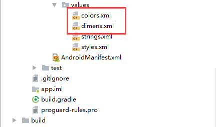
注意事项:
1、导入类文件后需要change包名以及重新import R文件路径
2、Values目录下的文件(strings.xml、dimens.xml、colors.xml等),如果项目中存在,则复制里面的内容,不要整个覆盖
二、导入步骤
将TabTopAutoTextSizeLayout.java文件复制到项目中
package com.why.project.tabtopautotextsizelayout.tab;

import android.content.Context;

import android.graphics.Typeface;

import android.util.AttributeSet;

import android.view.Gravity;

import android.view.LayoutInflater;

import android.view.View;

import android.widget.LinearLayout;

import android.widget.RelativeLayout;

import android.widget.TextView;

import com.why.project.tabtopautotextsizelayout.R;

import java.util.ArrayList;

import java.util.Arrays;

import java.util.List;

/**

 * Created by HaiyuKing

 * Used TabTopAutoLayout的变形运用:文字字号横向列表

 */

public class TabTopAutoTextSizeLayout extends LinearLayout {

    private Context mContext;

    //选项卡标题

    //CharSequence与String都能用于定义字符串,但CharSequence的值是可读可写序列,而String的值是只读序列。

    private CharSequence[] toptab_Titles = {"16"};

    //选项卡的各个选项的标题的集合:用于切换时改变文字颜色

    private List<TextView> topTab_titles = new ArrayList<TextView>();

    public TabTopAutoTextSizeLayout(Context context, AttributeSet attrs) {

        super(context, attrs);

        mContext = context;

        List<CharSequence> toptab_titleList = new ArrayList<CharSequence>();

        toptab_titleList = Arrays.asList(toptab_Titles);

        //初始化view:创建多个view对象(引用tab_bottom_item文件),设置图片和文字,然后添加到这个自定义类的布局中

        initAddBottomTabItemView(toptab_titleList);

    }

    //初始化控件

    private void initAddBottomTabItemView(List<CharSequence> tabTitleList){

        int countChild = this.getChildCount();

        if(countChild > 0){

            this.removeAllViewsInLayout();//清空控件

            //将各个选项卡的各个选项的标题添加到集合中

            topTab_titles.clear();

        }

        for(int index=0;index<tabTitleList.size();index++){

            //设置要添加的子布局view的参数

            LinearLayout.LayoutParams params = new LayoutParams(LayoutParams.WRAP_CONTENT, LayoutParams.WRAP_CONTENT);

//            params.weight = 1;//在tab_item文件的根节点RelativeLayout中是无法添加的,而这个是必须要写上的,否则只会展现一个view

            params.gravity = Gravity.CENTER;

            final int finalIndex = index;

            //============引用选项卡的各个选项的布局文件=================

            View toptabitemView = LayoutInflater.from(mContext).inflate(R.layout.tab_top_auto_textsize_item, this, false);

            //===========选项卡的根布局==========

            RelativeLayout toptabLayout = (RelativeLayout) toptabitemView.findViewById(R.id.toptabLayout);

            //===========设置选项卡的文字==========

            final TextView top_title = (TextView) toptabitemView.findViewById(R.id.top_title);

            //设置选项卡的文字

            top_title.setText(tabTitleList.get(index));

            //===========设置选项卡控件的Tag(索引)==========用于后续的切换更改图片和文字

            top_title.setTag("tag"+index);

            //设置内边距【第一个不设置左边距,最后一个不设置右边距】

            int paddingPx = mContext.getResources().getDimensionPixelOffset(R.dimen.tab_top_auto_padding);

            if(index == 0){

                params.setMargins(0,0,paddingPx,0);

            }else if(index == tabTitleList.size() - 1){

                params.setMargins(paddingPx,0,0,0);

            }else{

                params.setMargins(paddingPx,0,paddingPx,0);

            }

            //添加选项卡各个选项的触发事件监听

            toptabLayout.setOnClickListener(new OnClickListener() {

                public void onClick(View v) {

                    //设置当前选项卡状态为选中状态

                    //修改View的背景颜色

                    setTabsDisplay(finalIndex);

                    //添加点击事件

                    if(textSizeItemSelectListener != null){

                        //执行activity主类中的onBottomTabSelected方法

                        textSizeItemSelectListener.onTextSizeItemSelected(finalIndex);

                    }

                }

            });

            //把这个view添加到自定义的布局里面

            this.addView(toptabitemView,params);

            //将各个选项卡的各个选项的标题添加到集合中

            topTab_titles.add(top_title);

        }

    }

    /**

     * 设置底部导航中图片显示状态和字体颜色

     */

    public void setTabsDisplay(int checkedIndex) {

        int size = topTab_titles.size();

        for(int i=0;i<size;i++){

            TextView topTabTitle = topTab_titles.get(i);

            //设置选项卡状态为选中状态

            if(topTabTitle.getTag().equals("tag"+checkedIndex)){

                topTabTitle.setTypeface(Typeface.defaultFromStyle(Typeface.BOLD));

                //修改文字颜色

                topTabTitle.setTextColor(getResources().getColor(R.color.tab_text_selected_color));

            }else{

                topTabTitle.setTypeface(Typeface.defaultFromStyle(Typeface.NORMAL));

                //修改文字颜色

                topTabTitle.setTextColor(getResources().getColor(R.color.tab_text_normal_color));

            }

        }

    }

    public TextView getTabsItem(int checkedIndex){

        TextView topTabTitle = topTab_titles.get(checkedIndex);

        return topTabTitle;

    }

    /**设置显示的选项卡集合*/

    public void setTabList(ArrayList<CharSequence> toptab_titleList){

        initAddBottomTabItemView(toptab_titleList);

    }

    private OnTextSizeItemSelectListener textSizeItemSelectListener;

    //自定义一个内部接口,用于监听选项卡选中的事件,用于获取选中的选项卡的下标值

    public interface OnTextSizeItemSelectListener{

        void onTextSizeItemSelected(int index);

    }

    public void setOnTopTabSelectedListener(OnTextSizeItemSelectListener textSizeItemSelectListener){

        this.textSizeItemSelectListener = textSizeItemSelectListener;

    }

}
TabTopAutoTextSizeLayout.java
将tab_top_auto_textsize_item.xml文件复制到项目中
<?xml version="1.0" encoding="utf-8"?>

<!--  -->

<RelativeLayout xmlns:android="http://schemas.android.com/apk/res/android"

    android:id="@+id/toptabLayout"

    android:layout_width="wrap_content"

    android:layout_height="wrap_content"

    android:gravity="center"

    >

    <!-- 标题 -->

    <TextView

        android:id="@+id/top_title"

        android:layout_width="wrap_content"

        android:layout_height="wrap_content"

        android:gravity="center"

        android:text=""

        android:textSize="16sp"

        android:textColor="@color/tab_text_normal_color"

        android:layout_centerInParent="true"

        android:paddingLeft="5dp"

        android:paddingRight="5dp"/>

</RelativeLayout>
tab_top_auto_textsize_item.xml
在colors.xml文件中添加以下代码:【后续可根据实际情况更改文字颜色值】
<?xml version="1.0" encoding="utf-8"?>

<resources>

    <color name="colorPrimary">#3F51B5</color>

    <color name="colorPrimaryDark">#303F9F</color>

    <color name="colorAccent">#FF4081</color>

    <!-- *********************************选项卡(文字字号横向列表)区域********************************* -->

    <!-- 选项卡文本颜色 -->

    <color name="tab_text_normal_color">#ff777777</color>

    <color name="tab_text_selected_color">#1A78EC</color>

</resources>
在dimens.xml文件中添加以下代码:【后续可根据实际情况更改底部选项卡区域的边距值】
<resources>

    <!-- *********************************选项卡(文字字号横向列表)区域********************************* -->

    <!-- 选项卡的内边距 -->

    <dimen name="tab_top_auto_padding">10dp</dimen>

</resources>
至此,TabTopAutoTextSizeLayout类集成到项目中了。
三、使用方法
在Activity布局文件中引用TabTopAutoTextSizeLayout布局类【注意:需要重新引用TabTopAutoTextSizeLayout类的完整路径】
<?xml version="1.0" encoding="utf-8"?>

<LinearLayout

    xmlns:android="http://schemas.android.com/apk/res/android"

    android:layout_width="match_parent"

    android:layout_height="match_parent"

    android:orientation="vertical"

    >

    <Button

        android:id="@+id/btn_change"

        android:layout_width="wrap_content"

        android:layout_height="wrap_content"

        android:text="选中字号24"

        android:layout_margin="20dp"

        android:layout_gravity="center"/>

    <HorizontalScrollView

        android:id="@+id/tab_hori_layout"

        android:layout_width="match_parent"

        android:layout_height="wrap_content"

        android:scrollbars="none"

        android:layout_margin="20dp">

        <com.why.project.tabtopautotextsizelayout.tab.TabTopAutoTextSizeLayout

            android:id="@+id/tab_textsizeLayout"

            android:layout_width="match_parent"

            android:layout_height="wrap_content"

            android:gravity="center_vertical"

            android:orientation="horizontal"

            />

    </HorizontalScrollView>

    <TextView

        android:id="@+id/text_size_view"

        android:layout_width="wrap_content"

        android:layout_height="wrap_content"

        android:text="这显示选中的字号"

        android:textColor="@color/tab_text_selected_color"

        android:layout_margin="20dp"

        android:layout_gravity="center"/>

</LinearLayout>
在Activity中使用如下
package com.why.project.tabtopautotextsizelayout;

import android.os.Bundle;

import android.support.v7.app.AppCompatActivity;

import android.view.View;

import android.widget.Button;

import android.widget.TextView;

import com.why.project.tabtopautotextsizelayout.tab.TabTopAutoTextSizeLayout;

import java.util.ArrayList;

public class MainActivity extends AppCompatActivity {

    private Button mChangeBtn;

    private TextView mSelectedTextSizeTV;//选中的文字大小的展现view

    private static String[] fontSizes = {"10","12","14","16","18","20","22","24","26","30","36","42"};

private String fontSizeUnit = "px";

    private TabTopAutoTextSizeLayout mTextSizeLayout;

    @Override

    protected void onCreate(Bundle savedInstanceState) {

        super.onCreate(savedInstanceState);

        setContentView(R.layout.activity_main);

        initViews();

        initDatas();

        initEvents();

    }

    private void initViews() {

        mChangeBtn = (Button) findViewById(R.id.btn_change);

        mSelectedTextSizeTV = (TextView) findViewById(R.id.text_size_view);

        mTextSizeLayout = (TabTopAutoTextSizeLayout) findViewById(R.id.tab_textsizeLayout);

    }

    private void initDatas() {

        ArrayList<CharSequence> textSizeArray = new ArrayList<CharSequence>();//用于展现

        for(int i=0;i<fontSizes.length;i++){

            textSizeArray.add(fontSizes[i]);

        }

        mTextSizeLayout.setTabList(textSizeArray);

    }

    private void initEvents() {

        //模拟更改字体

        mChangeBtn.setOnClickListener(new View.OnClickListener() {

            @Override

            public void onClick(View view) {

                int selectedTextSize = 24;

                mSelectedTextSizeTV.setText(selectedTextSize + fontSizeUnit);

                int selectedIndex = 0;

                for(int i = 0;i<fontSizes.length;i++){

                    if(Integer.parseInt(fontSizes[i]) == selectedTextSize){

                        selectedIndex = i;

                        break;

                    }

                }

                mTextSizeLayout.setTabsDisplay(selectedIndex);

            }

        });

        //字号的点击事件

        mTextSizeLayout.setOnTopTabSelectedListener(new TabTopAutoTextSizeLayout.OnTextSizeItemSelectListener() {

            @Override

            public void onTextSizeItemSelected(int index) {

                mSelectedTextSizeTV.setText(fontSizes[index] + fontSizeUnit);//带单位

            }

        });

    }

}
混淆配置
无
参考资料
暂时空缺
项目demo下载地址
https://github.com/haiyuKing/TabTopAutoTextSizeLayout
TabTopAutoTextSizeLayout【自定义文字字号区域(动态选项卡数据且可滑动)】的更多相关文章
- TabTopAutoLayout【自定义顶部选项卡区域(带下划线)(动态选项卡数据且可滑动)】
版权声明:本文为HaiyuKing原创文章,转载请注明出处! 前言 自定义顶部选项卡布局LinearLayout类,实现带下划线且可滑动效果.[实际情况中建议使用RecyclerView] 备注:如果 ...
- html页面自定义文字水印效果案例
在系统开发过程中,一些数据或页面比较敏感的地方,客户会要求实现水印效果,防止内部人员截图或拍照泄露信息. 自定义文字水印顾名思义就是利用js在完成页面渲染的同时,往页面的最底层动态生成多个带水印信息的 ...
- PHP---微信JS-SDK获取access_token/jsapi_ticket/signature权限签名算法,php/thinkphp实现微信分享自定义文字和图片
PHP---微信JS-SDK获取access_token/jsapi_ticket/signature权限签名算法, php/thinkphp实现微信分享自定义文字和图片. 一.先看微信JS-SDK文 ...
- 关于devexpress报表XtraReport,动态修改报表样式(.repx格式),动态添加数据并使用的理解
一.基本概念: XtraReports 中的每个报表都由 XtraRepot 类的一个实例表示,或者由该类的子类来表示(这种情况更常见). 因此,每个报表都作为带区的容器使用,而每个带区中都包含报表控 ...
- React使用jquery方式动态获取数据
好久没写react了,今天有空写一下来react实现实时请求数据,并刷新数据的小demo. 首先我还是选择了jquery方式中自带的ajax获取数据,首先要引用所需的js包 接下来要写一个自定义的js ...
- 第27讲 UI组件之 ScrollView与底部动态添加数据
第27讲 UI组件之 ScrollView与底部动态添加数据 1. ScrollView(滚动视图) ScrollView(滚动视图)是实现滚动的一个控件,只需要将需要滚动的控件添加到ScrollVi ...
- JVM 内存区域 (运行时数据区域)
JVM 内存区域 (运行时数据区域) 链接:https://www.jianshu.com/p/ec479baf4d06 运行时数据区域 Java 虚拟机在执行 Java 程序的过程中会把它所管理的内 ...
- [JS前端开发] js/jquery控制页面动态载入数据 滑动滚动栏自己主动载入事件
本人小菜鸟一仅仅.为了自我学习和交流PHP(jquery,linux,lamp,shell,javascript,server)等一系列的知识,小菜鸟创建了一个群.希望光临本博客的人能够进来交流.寻求 ...
- WPF 自定义的图表(适用大量数据绘制)下
原文:WPF 自定义的图表(适用大量数据绘制)下 上一篇文章中讲了WPF中自定义绘制大量数据的图标,思路是先将其绘制在内存,然后一次性加载到界面,在后续的调试过程中,发现当数据量到达10W时,移动鼠标 ...
随机推荐
- JAXBContextAPI详解
javax.xml.bind类 JAXBContext java.lang.Object javax.xml.bind.JAXBContext public abstract class JAXBCo ...
- channel.go
) c.RLock() client, ok := c.clients[msg.clientID] c.RUnlock() if ok ...
- BZOJ_5301_[Cqoi2018]异或序列&&CF617E_莫队
Description 已知一个长度为 n 的整数数列 a[1],a[2],…,a[n] ,给定查询参数 l.r ,问在 [l,r] 区间内,有多少连续子 序列满足异或和等于 k . 也就是说,对于所 ...
- java技术树+必读书籍
引子 本篇文章用技术树的形式来展示java相关技术栈.所有技术点有博客的都自带链接,没有的后续加上. 必读书籍推荐: 1.java基础: <effective java>-->四星推 ...
- Postman-----将 A 请求中 response Body 中的参数值传入到下一个请求 B 的 request body 中作为参数发送请求
问题:将A接口中response body的"id"传入到B接口的request body中. 解决办法: 1.在A接口的test中设置环境变量. 代码:var data = JS ...
- 计算机17-3,4作业F
F.complete number problem with formatted output Description 同题目E Input N Output complete numbers w ...
- 【重学计算机】操作系统D3章:存储管理
1. 存储管理的基本概念 逻辑地址:用户地址,从零开始编号 一维逻辑地址:(地址) 二维逻辑地址:(段号: 段内地址) 主存储器的复用方式 按分区:主存划分为多个固定/可变分区,一个程序占一个分区 按 ...
- 别开心太早,Python 官方文档的翻译差远了
近几天,很多公众号发布了 Python 官方文档的消息.然而,一个特别奇怪的现象就发生了,让人啼笑皆非. Python 文档的中文翻译工作一直是“默默无闻”,几个月前,我还吐槽过这件事<再聊聊P ...
- C#获取页面上的Html
//根据Url地址得到网页的html源码 public static string GetWebContent(string Url) { string strResult = "" ...
- Restframe_work 回顾记忆集
目录 Restframe_work 回顾记忆集 rest_framework主要功能介绍 rest_framework主要模块介绍 记忆集 错题集 混淆集 重点集 难点集 Restframe_work ...