ccs之经典布局(二)(两栏,三栏布局)
接上篇ccs之经典布局(一)(水平垂直居中)
四、两列布局
单列宽度固定,另一列宽度是自适应。
1、float+overflow:auto;
固定端用float进行浮动,自适应的用overflow:auto;触发BFC.
2、absolute+margin-left
父容器相对定位,固定端于父容器绝对定位,自适应margin-left设置为固定端width
3、table布局
父容器display:table,内容撑开宽度,所以需要设置width:100%;两端都以display:table-cell
4、css计算属性
固定端float,自适应端的宽度为calc(100%-固定端的宽度)。
5、flex布局
父容器flex布局,固定端固定with,自适应端flex:1实现自适应
<!DOCTYPE html>

<html lang="en">

<head>

    <meta charset="UTF-8">

    <title>两列布局</title>

    <style>

        * {

            margin: 0;

            margin: 0;

        }

        .left,

        .right {

            height: 500px;

        }

        .parent{

            /* position: relative;                  第2种方法*/

            /* display: table;                      第3种方法

            width: 100%;

            table-layout: fixed; */

            /* display: flex;;                      第5种方法 */

        }

        .left {

            width: 300px;

            background: greenyellow;

            /* float: left;                              第1种方法 */

            /* position: absolute;                       第2种方法  */

            /* display: table-cell;                      第3种方法 */

            /* float: left;                              第4种方法 */

        }

        .right {

            background: orange;

            /* overflow: auto;                             第1种方法*/

            /* margin-left: 300px;                         第2种方法 */

            /* display:table-cell;                         第3种方法 */

            /* width: calc(100%-300px);                    第4种方法 */

            /* flex: 1;                                    第5种方法 */

        }

        .inner {

            background: pink;

            height: 100px;

        }

    </style>

</head>

<body>

    <div class="parent">

        <div class="left"></div>

        <div class="right">

            <div class="inner">inner</div>

        </div>

    </div>

</body>

</html>
五、三列布局
三列布局一般情况下指的是左右两边固定,中间自适应的布局方式。
1、float+margin
左右两边是固定端,进行浮动,中间端使用margin来自适应。需要注意一点:使用浮动时,中间列对应的DOM元素在html应该放在最后。
2、中间相对定位,左右绝对定位
左右设置position:absolute,中间position:relative,还需注意的一点是要设置左右两边的top和left.
3、使用table布局
这种布局的时候要注意的是DOM元素的顺序问题,用的少。
4、flex布局,这种就是兼容性的问题。
5、grid布局,这种就是兼容性的问题。
<!DOCTYPE html>

<html lang="en">

<head>

    <meta charset="UTF-8">

    <title>三列布局</title>

    <style>

    *{

        margin:0;

        padding:0;

    }

    .container{

        /* display: table;                         第3种方法

        width: 100%; */

        /* display: flex;                          第4种方法  */

        /* display: grid;

        grid-template-columns: 200px auto 300px;      第5种方法 */

    }

    .right,.left{

        width: 200px;

        height: 500px;

        /* position: absolute;                    第2种方法 */

        /* display: table-cell;                     第3种方法 */

    }

    .left{

        background: chocolate;

        /* float: left;                           第1种方法 */

        /* top:0;                                     第2种方法

        left: 0; */

    }

    .center{

        height: 500px;

        background: yellow;

        min-width: 100px;

        /* margin:0 300px 0 200px;                   第1种方法   */

        /* position:relative;                        第2种方法

        margin: 0 300px 0 200px; */

        /* display: table-cell;                      第3种方法 */

        /* flex:1;                                   第4种方法 */

    }

    .right{

        width: 300px;

        background: yellowgreen;

        /* float: right;                             第1种方法 */

        /* top: 0;                                   第2种方法

        right: 0; */

    }

    </style>

</head>

<body>

    <div class="container">

            <div class="left">左端</div>

            <div class="center">中间</div>    <!--记得第3种方法的时候dom元素的顺序要注意 -->

            <div class="right">右边</div>

    </div>

</body>

</html>
从三列布局中我们可以看到圣杯布局和双飞翼布局,下面对这两种布局做出解释和代码实现。
1、双飞翼布局
要求:header,footer各自占领屏幕所有的宽度,高度自定。
中间的container是一个三栏布局。三栏布局两侧宽度固定不变,中间部分的自动填充整个区域。
代码实现:
a.left,cneter,right 三者都设置左浮动; 设置center的宽度为100%; left设置margin-left:-100%,right设置margin-left:自身的宽度;设置center的main值为左右两个侧栏的距离,margin:0 right宽度 0 left宽度;
2、圣杯布局
要求:header,footer各自占领屏幕所有的宽度,高度自定。
中间的container是一个三栏布局。三栏布局两侧宽度固定不变,中间部分的自动填充整个区域。
代码实现:
3、二者的相同点和不同点
相同:要实现的效果是一样的。两边宽度固定,中间自适应,且中间栏要放在文档前面提前渲染。在问题的解决中三栏都是要浮动的,左右两栏加上负margin让其跟中间栏并排,以形成三栏布局。
不同点:解决中间栏div内容不被挡的思路不一样。
双飞翼布局:为了中间的div不被挡,直接在中间div内部创建了一个子div用于放置内容,在该子div里用margin-left和margin-right为左右两栏留出位置,改变了DOM结构。
圣杯布局:为了中间的div不被挡,将中间div设置了左右padding后,将左右两个div用相对布局position:relative配合right和left属性来使用。不改变DOM结构,但代码量多。
4、圣杯布局和双飞翼布局的另外实现方法
flex/grid
<!DOCTYPE html>

<html lang="en">

<head>

    <meta charset="UTF-8">

    <title>双飞翼布局</title>

    <style>

        * {

            margin: 0;

            padding: 0;

        }

        body {

            font-size: 20px;

            font-weight: bold;

            min-width: 550px;

        }

        .column{

            text-align: center;

            height: 500px;

            line-height: 500px;

        }

        .header,

        .footer {

            height: 50px;

            line-height: 50px;

            text-align: center;

            background: rgb(168, 167, 164);

        }

        .container{

           overflow: hidden;

        }

        .left{

            width: 200px;

            background: palevioletred;

            float: left;

            margin-left: -100%;

        }

        .right{

            width: 190px;

            background: palevioletred;

            float: left;

            margin-left: -190px;

        }

        .center{

            width: 100%;

            float: left;

            background: rgb(140, 240, 93);

        }

        .main{

            margin: 0 190px 0 200px;

        }

    </style>

</head>

<body>

    <div class="header">header</div>

    <div class="container">

        <div class="center column">

            <div class="main">center</div>

        </div>

        <div class="left column">left</div>

        <div class="right column">right</div>

    </div>

    <div class="footer">footer</div>

</body>

</html>
<!DOCTYPE html>

<html lang="en">

<head>

    <meta charset="UTF-8">

    <title>圣杯布局</title>

    <style>

        * {

            margin: 0;

            padding: 0;

        }

        body {

            font-size: 20px;

            font-weight: bold;

        }

        .header,

        .footer {

            height: 50px;

            line-height: 50px;

            text-align: center;

            background: grey;

        }

        .column {

            text-align: center;

            height: 500px;

            line-height: 500px;

        }

        .container{

            /* 这是为了放好中间center的位置 */

            padding:  0 190px 0 200px;

        }

        .center{

            width: 100%;

            background: greenyellow;

            float: left;

        }

        .left{

            width: 200px;

            background: palevioletred;

            float: left;

            margin-left: -100%;

            position: relative;/* 中间栏位置放好后,左栏的位置也相应的右移,通过相对定位的left恢复到正确的位置 */

            left: -200px;

        }

        .right{

            width: 190px;

            background: palevioletred;

            float: right;

            margin-left:-190px;

            position: relative;/* 中间栏位置放好后,右栏的位置也相应的左移,通过相对定位的right恢复到正确的位置 */

          right: -190px;

        }

       .footer{

           clear: both;

       }

    </style>

</head>

<body>

        <div class="header">header</div>

        <div class="container">

            <div class="center column">

                <div class="main">center</div>

            </div>

            <div class="left column">left</div>

            <div class="right column">right</div>

        </div>

        <div class="footer">footer</div>

</body>

</html>
<!DOCTYPE html>

<html lang="en">

<head>

    <meta charset="UTF-8">

    <title>双飞翼布局之flex</title>

    <style>

        * {

            margin: 0;

            padding: 0;

        }

        body {

            font-size: 20px;

            font-weight: bold;

            min-width: 550px;

        }

        .column {

            text-align: center;

            height: 500px;

            line-height: 500px;

        }

        .header,

        .footer {

            height: 50px;

            line-height: 50px;

            text-align: center;

            background: rgb(168, 167, 164);

        }

        .container{

            display: flex;

        }

        .center{

            background: rgb(140, 240, 93);

            flex:1;

            order:2

        }

        .left{

            background: palevioletred;

            width: 200px;

           order:1

        }

        .right{

            background:palevioletred;

            width: 190px;

            order:3;

        }

    </style>

</head>

<body>

    <div class="header">header</div>

    <div class="container">

        <div class="center column">

            <div class="main">center</div>

        </div>

        <div class="left column">left</div>

        <div class="right column">right</div>

    </div>

    <div class="footer">footer</div>

</body>

</html>
<!DOCTYPE html>

<html lang="en">

<head>

    <meta charset="UTF-8">

    <title>双飞翼布局之grid</title>

    <style>

        * {

            margin: 0;

            padding: 0;

        }

        body {

            font-size: 20px;

            font-weight: bold;

            min-width: 550px;

        }

        .column {

            text-align: center;

            height: 500px;

            line-height: 500px;

        }

        .header,

        .footer {

            height: 50px;

            line-height: 50px;

            text-align: center;

            background: rgb(168, 167, 164);

        }

        .container{

            display: grid;

            grid-template-columns:200px auto 190px;

            grid-template-rows: auto;

        }

        .left{

            grid-column: 1/2;

            /* grid-row: 1/2; */

            background: palevioletred;

        }

        .center{

            grid-column: 2/3;

            grid-row: 1/2;

            background: greenyellow;

        }

        .right{

           grid-column: 3/4;

           grid-row: 1/2;

            background: palevioletred;

        }

    </style>

</head>

<body>

    <div class="header">header</div>

    <div class="container">

        <div class="center column">

            <div class="main">center</div>

        </div>

        <div class="left column">left</div>

        <div class="right column">right</div>

    </div>

    <div class="footer">footer</div>

</body>

</html>

六、css3之多列布局
css多列可以更加容易的定义多列文本,像报纸那样。
属性如下:
1、column-count 规定元素应该被分隔的列数
适用于:除了table外的非替换块级元素,table cells,inline-block元素
auto:根据浏览器来计算,integer:取值大于0
2、column-gap 规定列与列之间的间隔大小
3、column-rule 设置或者检索对象列与列之间的边框,复合属性
color-rule-color/color-rule-style/color-rule-width
4、column-fill 设置或检索对象所有列的高度是否统一
auto 列高度自适应内容
balance 所有列的高度以其中最高的一列统一
5、column-span 设置或检索对象元素是否跨所有的列
none不跨列,all 跨所有列
6、column-width 设置或检索对象每列的宽度
7、columns 设置或检索对象的列数和每列的宽度,是一个复合属性
<'column-width'>||<'column-count'>
<!DOCTYPE html>

<html lang="en">

<head>

    <meta charset="UTF-8">

    <meta name="viewport" content="width=device-width, initial-scale=1.0">

    <meta http-equiv="X-UA-Compatible" content="ie=edge">

    <title>Document</title>

    <style>

    div{

        column-count:4;

        column-gap:30px;

        column-rule:2px solid green;

        column-span: all;

        columns: 50px 3;

    }

    </style>

</head>

<body>

    <h2>测试标题测试标题测试标题测试标题</h2>

    <div>测试文字测试文字测试文字测试文字测试文字测试文字测试文字测试文字测试文字测试文字测试文字测试文字测试文字测试文字测试文字测试文字测试文字测试文字测试文字测试文字测试文字测试文字测试文字测试文字测试文字测试文字测试文字测试文字测试文字测试文字测试文字测试文字测试文字测试文字测试文字测试文字测试文字测试文字测试文字测试文字测试文字测试文字测试文字测试文字测试文字测试文字测试文字测试文字测试文字测试文字测试文字测试文字测试文字测试文字测试文字测试文字测试文字测试文字测试文字测试文字测试文字测试文字测试文字测试文字测试文字测试文字测试文字测试文字测试文字测试文字测试文字测试文字测试文字测试文字测试文字测试文字测试文字</div>

</body>

</html>
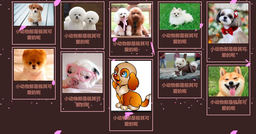
多列用于瀑布流上可以做出很漂亮的效果
<!DOCTYPE html>

<html lang="en">

<head>

    <meta charset="UTF-8">

    <meta name="viewport" content="width=device-width, initial-scale=1.0">

    <meta http-equiv="X-UA-Compatible" content="ie=edge">

    <title>Document</title>

    <style>

        *{

            margin:0;

            padding:0;

            box-sizing:border-box;

        }

        body{

            background-size:500px 500px;

            background:url(../MYPROJECT/imges/a.png),url(../MYPROJECT/imges/bg.gif);

            background-color: hsl(0, 20%, 17%);

        }

        #items{

           width: 90%;

           margin: 10px 5%;

           column-count: 5;

           column-gap: 20px;

           column-fill:auto;

        }

        img{

            display: block;

            width:100%;

        }

        #items div{

            border:2px solid pink;

            margin-bottom: 10px;

            padding:5px;

            break-inside: avoid;

        }

        p{

            font-size: 18px;

            color:#a77869;

            text-align: center;

            font-weight: bold;

            padding:10px 0;

        }

    </style>

</head>

<body>

    <div id="items">

        <div>

            <img src="../MyProject/imges/1.jpg">

            <p>

                小动物那是极其可爱的呢

            </p>

        </div>

        <div>

            <img src="../MyProject/imges/2.jpg">

            <p>

                小动物那是极其可爱的呢

            </p>

        </div>

        <div>

            <img src="../MyProject/imges/3.jpg">

            <p>

                小动物那是极其可爱的呢

            </p>

        </div>

        <div>

            <img src="../MyProject/imges/4.jpg">

            <p>

                小动物那是极其可爱的呢

            </p>

        </div>

        <div>

            <img src="../MyProject/imges/5.jpg">

            <p>

                小动物那是极其可爱的呢

            </p>

        </div>

        <div>

            <img src="../MyProject/imges/6.jpg">

            <p>

                小动物那是极其可爱的呢

            </p>

        </div>

        <div>

            <img src="../MyProject/imges/7.jpg">

            <p>

                小动物那是极其可爱的呢

            </p>

        </div>

        <div>

            <img src="../MyProject/imges/8.jpg">

            <p>

                小动物那是极其可爱的呢

            </p>

        </div>

        <div>

            <img src="../MyProject/imges/9.jpg">

            <p>

                小动物那是极其可爱的呢

            </p>

        </div>

        <div>

            <img src="../MyProject/imges/10.jpg">

            <p>

                小动物那是极其可爱的呢

            </p>

        </div>

    </div>

</body>

</html>
ccs之经典布局(二)(两栏,三栏布局)的更多相关文章
- web标准(复习)--3 二列和三列布局
今天学习二列和三列布局,将涉及到以下内容和知识点 二列自适应宽度 二列固定宽度 二列固定宽度居中 xhtml的块级元素(div)和内联元素(span) float属性 三列自适应宽度 三列固定宽度 三 ...
- css实现常用的两栏三栏布局
1.两栏 <div class="wrapper"> <div class="half left">left box <p> ...
- 【css】css2实现两列三列布局的方法
前言 对于 flex 弹性布局相信大家都有所了解,它是 css3 中的属性,然而它具有一定的兼容性问题.楼主前几天面试时遇到了面试官需要设计一个两列布局,我当然就说父元素 flex 吧哩吧啦,然而需要 ...
- [CSS布局]简单的CSS三列布局
前言 公司终于可以上外网了,近期在搞RN的东西,暂时脑子有点晕,等过段时间再来写点总结.倒是最近有个新学前端的同学经常会问一些基础知识,工作空闲写了小Demo给他看,全是很基础的知识,纯粹是顺便记录在 ...
- Web标准:三、二列和三列布局
知识点: 1.二列自适应宽度 2.二列固定宽度 3.二列固定宽度居中 4.xhtml的块级元素(div)和内联元素(span) 5.float属性 6.三列自适应宽度 7.三列固定宽度 8.三列固定宽 ...
- 如何用CSS实现左侧宽度固定,右侧自适应(两栏布局)?左右固定中间自适应(三栏布局)呢?
在前端日常布局中,会经常遇到左侧宽度固定,右侧自适应或者左右两边固定,中间部分自适应的实用场景.本文例子中将列举出两种常用的两栏布局,左侧固定右侧自适应的常用方法以及代码和五种左右固定中间自适应的常用 ...
- CSS布局——三栏布局
说到三栏布局,很多都会提到圣杯布局和双飞翼布局这两个经典的三栏布局方式.于是,我在网上搜了一些相关资料,阅读并跟着代码敲了一遍,发现在处理三栏布局上,他们采用的都是两边栏固定,中间栏自适应的策略.在处 ...
- css中常用的七种三栏布局技巧总结
三栏布局,顾名思义就是两边固定,中间自适应.三栏布局在开发十分常见,那么什么是三栏布局?例如当当网首页边商品导航和右边导航固定宽度,中间的主要内容随浏览器宽度自适应.效果如下图所示: 下面围绕的这样的 ...
- css-前端实现左中右三栏布局的常用方法:绝对定位,圣杯,双飞翼,flex,table-cell,网格布局等
1.前言 作为一个前端开发人员,工作学习中经常会遇到快速构建网页布局的情况,这篇我整理了一下我知道的一些方法.我也是第一次总结,包括圣杯布局,双飞翼布局,table-cell布局都是第一次听说,可能会 ...
- CSS 布局实例系列(三)如何实现一个左右宽度固定,中间自适应的三列布局——也聊聊双飞翼
今天聊聊一个经典的布局实例: 实现一个三列布局,其中左侧和右侧的部分宽度固定,中间部分宽度随浏览器宽度的变化而自适应变化 可能很多朋友已经笑了,这玩意儿通过双飞翼布局就能轻松实现.不过,还请容我在双飞 ...
随机推荐
- 一、基础篇--1.2Java集合-HashMap和ConcurrentHashMap的区别【转】
http://www.importnew.com/28263.html 今天发一篇”水文”,可能很多读者都会表示不理解,不过我想把它作为并发序列文章中不可缺少的一块来介绍.本来以为花不了多少时间的,不 ...
- PHP中try catch的用法
异常(Exception)用于在指定的错误发生时改变脚本的正常流程. 什么是异常? PHP 5 提供了一种新的面向对象的错误处理方法. 异常处理用于在指定的错误(异常)情况发生时改变脚本的正常流程.这 ...
- 浅谈 Nginx和LVS的各种优缺点
VS的负载能力强,因为其工作方式逻辑非常简单,仅进行请求分发,而且工作在网络的第4层,没有流量,所以其效率不需要有过多的忧虑. LVS基本能支持所有应用,因为工作在第4层,所以LVS可以对几乎所有应用 ...
- ASP.NET解决跨域问题
using System; using System.Collections.Generic; using System.Linq; using System.Web; using System.We ...
- java浮点型数据保留两位小数
/*** * 保留2位小数 * @param floatValue * @return */ float scale(Float floatValue) { DecimalFormat format ...
- Python使用filetype精确判断文件类型
Python使用filetype精确判断文件类型 判断文件类型在开发中非常常见的需求,怎样才能准确的判断文件类型呢?首先大家想到的是文件的后缀,但是非常遗憾的是这种方法是非常不靠谱的,因为文件的后缀是 ...
- Java多线程(1):3种常用的实现多线程类的方法
(1) 继承java.lang.Thread类(Thread也实现了Runnable接口) 继承Thread类的方法是比较常用的一种,如果说你只是想起一条线程.没有什么其它特殊的要求,那么可以使用Th ...
- 使用 WebStorm alt+f2 快速打开浏览器测试的一点bug
这个bug是涉及到中英文文件名的问题(不涉及到路径名): Case 1: 中文文件名 当打开alt+f2快捷方式打开含有中文名的html文件时,路径名直接变为localhost,所以找不到要打开的文件 ...
- ubuntu中配置jdk1.8
方法/步骤 1 首先,百度搜索jdk,选择第一个,网站是Oracle Jdk.点击进去 步骤阅读 2 点击Download,到官网下载linux版本的jdk.选择自己对应的操作系统及32或64位版 ...
- caoz的梦呓:信息安全,别为了芝麻丢了西瓜
猫宁!!! 参考链接:https://mp.weixin.qq.com/s/z6UI-tdhN1CGdqQQuglLVQ 对方公众号:caoz的梦呓 我之前写微博的时候,经常就有读者反馈说,你怎么用3 ...