移动端布局Demo展示图文
上两张图自勉一下(来自刘墉先生的文章,最近看他的作品):然后移动端该愈来愈受到重视,未来的市场我不知道,不过我知道手机的功能越来越强大是不争的事实!移动端布局的积累也需要从现在做起!

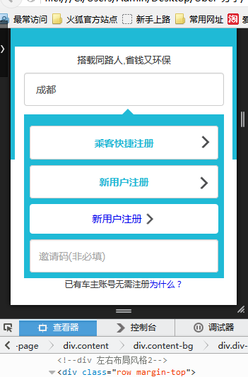
需求一:实现下图效果,注意不同手机的型号:原生称为适配,我们称为自适应不变形
思路一:btn+ima布局风格
<div class="row margin-top">
<div class="col-sm-12">
<div class="form-group text-centr">
<button type="submit" class="btn btn-default ubBtn">
乘客快捷注册
<!-- <i class="check" style="padding-left:3.0rem"> </i> -->
<!-- <img src="./image/checks.png" style="width:20px;height:20px;position: relative;right: -1.6rem;"> -->
</button>
<img src="./image/checks.png" style="width: 20px; height: 20px; position: absolute; top: 3.6rem; right: 0.5rem;">
</div>
</div>
</div>
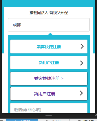
思路二:div 左右布局风格
<div class="row margin-top">

                        <div class="col-sm-8">

                            <button type="submit" class="btn btn-default ubBtn2" >

                                新用户注册

                            </button>

                        </div>

                        <div class="col-sm-4">

                                <img src="./image/checks.png" style="width: 20px; height: 20px;float: right;margin-top: -1rem;margin-right: 0.3rem;">

                         </div>

                </div>
思路三:div 左右布局风格2
<div class="row margin-top">
<div class="col-sm-8">
<a href="#" class="btn btn-a">新用户注册
<span class="msg-span"> </span>
</a>
</div>
<!-- <div class="col-sm-4">
<img src="./image/checks.png" style="width: 20px; height: 20px;float: right;margin-top: -1rem;margin-right: 0.3rem;">
</div> -->
</div>
这个需要<span>有占位,然后如果左侧文字不定 做出来效果也不是很理想,适合固定的界面模式 然后设置span的左边距离
思路四:ul li a span布局
<!-- ul li a span 布局 -->
<div class="row margin-top">
<div class="col-sm-12 navlink">
<ul>
<li>
<a href="">乘客快捷注册
<span class="moreicon">></span>
</a>
</li>
<li>
<a href="">新用户注册
<span class="moreicon">
<img src="./image/checks.png" style="width: 20px; height: 20px;float: right;margin-right: 0.3rem;margin-top: 0.2rem;">
</span>
</a> </li>
</ul>
</div>
</div>
思路五:期待补充中
统一css样式整理:
.wrap-page{background:#ffffff;}

.nav-box{text-align:center;margin-top: 1.0rem}

.success{width:100%;margin:2.65625rem auto;}

.share-txt{font-size: 0.4375rem}

.logo{width: 3.109375rem;margin: 2.5625rem auto auto auto;}

.top-blank{height:0.6875rem;}

.top{background:#1FBAD6;height:10.0rem;}

.content{position: fixed;left: 0.2rem;right: 0.2rem;top: 5.0rem;background: #ffffff;margin: auto 0;width: 96%;}

.content-bg{width: 92%;margin: auto 0;position: relative;left: 0.4rem;}

.div-select{background: #1FBAD6;margin-top: 0.4rem;padding: 0.25rem}

.footer{height: 5.0rem}

.margin-top{margin-top: 0.25rem;}

.ubBtn{width:100%;margin:auto;display:block;height: 1.48rem;color:#1FBAD6;font-weight:}

.ubBtn2{width:100%;margin:auto;display:block;height: 1.48rem;color:#1FBAD6;font-weight:}

.check{background: url(../image/checks.png) right;background-repeat: no-repeat;background-size: 0.55rem 0.55rem;}

.box4{margin: 0 auto;width: 10px;height: 0px;border: 20px solid transparent;border-bottom-color: #1FBAD6;}

.btn-a{background:#ffffff;line-height: 28px;width: 100%;}

.msg-span{background: url(../image/checks.png) right;background-repeat: no-repeat;background-size: 0.55rem 0.55rem;}

.navlink li {

    width: 100%;

    position: relative;

    margin-bottom: 2%;

}

.navlink li a {

    text-align: center;

    font-size: 11pt;

    display: block;

    height: 1.48rem;

    line-height: 1.2rem;

    /*border-radius: 20px;*/

    border-radius: 4px;

    background: #ffffff none repeat scroll 0% 0%;

    border-width: 1px;

    border-style: solid;

    border-color: #202329 #202329 #393E48;

    -moz-border-top-colors: none;

    -moz-border-right-colors: none;

    -moz-border-bottom-colors: none;

    -moz-border-left-colors: none;

    border-image: none;

    padding: 4px 0px;

}


参考:
使用Flexible实现手淘H5页面的终端适配:http://www.w3cplus.com/mobile/lib-flexible-for-html5-layout.html
移动端布局Demo展示图文的更多相关文章
- Android ListView分页载入(服务端+android端)Demo
Android ListView分页载入功能 在实际开发中经经常使用到,是每一个开发人员必须掌握的内容,本Demo给出了服务端+Android端的两者的代码,并成功通过了測试. 服务端使用MyEcli ...
- lesson5:Condition的原理分析及demo展示
Condition 将 Object 监视器方法(wait,notify,和notifyAll)分解成截然不同的对象,以便通过将这些对象与任意Lock实现组合使用,为每个对象提供多个等待 set(wa ...
- jqm的多列布局demo,html5的多列布局demo,多列布局的具体解说,html5开发实例具体解释
因为移动设备屏幕宽度较小,所以一般不建议使用多列布局.但有时你可能须要并排放置一些元素(如button之类的). jQuery Mobile通过约定的类名ui-grid来提供了一种基于css的多列布局 ...
- Netty4 学习笔记之一:客户端与服务端通信 demo
前言 因为以前在项目中使用过Mina框架,感受到了该框架的强大之处.于是在业余时间也学习了一下Netty.因为Netty的主要版本是Netty3和Netty4(Netty5已经被取消了),所以我就直接 ...
- 用css巧妙实现移动端横向滑动展示功能
前言:记得以前处理移动端横向滑动展示都是去用js去解决的,要用js进行蛮多处理,要算li的宽度,然后还要用js设置ul盒子的宽度,又要设置最大滑动距离,最小滑动距离等等.......但是现在发现用cs ...
- 移动端布局 - REM方式
默认以宽度为640px的设计稿为基准页面,然后通过JS获取当前显示设备的尺寸,对应的调整 html 标签的font-size大小,从而实现通过以rem为单位的移动端布局适配. 具体代码 (functi ...
- 前端切图:手机端自适应布局demo
手机端自适应布局demo原型如下: 图片发自简书App 要求如下:适应各种机型源码如下: <!DOCTYPE html > <html> <head> <me ...
- 【css】用css巧妙实现移动端横向滑动展示功能
前言:记得以前处理移动端横向滑动展示都是去用js去解决的,要用js进行蛮多处理,要算li的宽度,然后还要用js设置ul盒子的宽度,又要设置最大滑动距离,最小滑动距离等等.......但是现在发现用cs ...
- 移动端布局的一些设置(在viewport里设置使页面显示相同宽度,显示相同像素大小)
viewport(视口) 具体数值(不设置时默认为980 ,部分安卓手机不支持设置成具体数值) width=device-width 和设备宽度保持一致 user-scalable=no 是否允许用户 ...
随机推荐
- 【CSS3】
Web前端实验室http://demo.doyoe.com/ ::before ::afterCSS3已经将伪元素的前缀更改为双冒号,而伪类则保持为单冒号 backface-visibility ht ...
- Microsoft StreamInsight install
Microsoft StreamInsight 是一个开发平台.安装之后,可通过一组 .NET 命名空间来得到 SDK.有关 StreamInsight 应用程序开发的其他信息,请参阅上面列出的资源. ...
- HDU 4799 LIKE vs CANDLE 树形dp
题意:有n个人,他们的关系,形成一棵有根树(0是树根,代表管理员),每个人有一个价值 现在有一条微博,每个人要么点赞,要么送一个蜡烛 初始一些人利用bug反转了某些人的操作(赞变蜡烛 或者 蜡烛变成赞 ...
- [转]ASP.NET MVC 入门6、TempData
ASP.NET MVC的TempData用于传输一些临时的数据,例如在各个控制器Action间传递临时的数据或者给View传递一些临时的数据,相信大家都看过“在ASP.NET页面间传值的方法有哪几种” ...
- Asm Shader Reference --- Shader Model 2.0 part
ps部分 ps_2_0 概览 Instruction Set Name Description Instruction slot ...
- 【JS】Intermediate8:jQuery:AJAX
1.$.ajax is the main method, allowing you to manually construct your AJAX request 2.eg: gets some da ...
- DevExpress的GridControl控件更新數據問題解決辦法
開發WPF程序時,使用Devexpress的GridControl控件用ItemSource綁定數據,在頁面進行編輯時,當屬性繼承INotifyPropertyChanged接口時會同步更新後臺數據. ...
- 使用cxf写web service的简单实例
增加CXF依赖 <dependency> <groupId>org.apache.cxf</groupId> <artifactId>apache-cx ...
- [置顶] 程序员必知(三):一分钟知道URI编码(encodeURI)
因为浏览器会用一些特殊的字符作为特定的意义,所以在要传输的内容上如果有这些特殊的字符的话,就需要对其进行转义才能正确传输,如以下字符为发送时候的关键字,即特殊字符 ;/?:@&=+$,# 所以 ...
- SmartbBear给出的11条代码审查最佳实践
博客搬到了fresky.github.io - Dawei XU,请各位看官挪步.最新的一篇是:SmartbBear给出的11条代码审查最佳实践.