【css3】--四种气泡
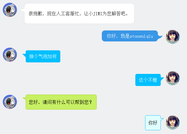
在聊天的场景中,聊天内容需要用到气泡修饰,如下图。下面一一讲解。
图片式:
第一个样式是京东客服,气泡的圆角和钩子都是用了图片。使用了一个table组合成了一个圆角的框框。lm样式拼出了钩子。
 <div class="jimi_lists clearfix">

                <div class="header_img jimi3 fl"></div>

                <table class="msg" cellspacing="0" cellpadding="0">

                    <tbody><tr><td class="lt"></td><td class="tt"></td><td class="rt"></td></tr>

                    <tr><td class="lm"><span></span></td><td class="mm"><span class="wel"><span class="visitor"><p>很抱歉,现在人工客服忙,让小JIMI为您解答吧。</p></span></span></td><td class="rm"></td></tr>

                    <tr><td class="lb"></td><td class="bm"></td><td class="rb"></td></tr><tr><td></td></tr>

                    </tbody>

                </table>

            </div>

            <div class="customer_lists clearfix">

                <div class="header_img jimi3" style="background: url(img/mine.jpg) no-repeat center;">

                    <div class="header_img_hover"></div>

                </div>

                <table class="msg" cellspacing="0" cellpadding="0"><tbody><tr><td class="lt"></td><td class="tt"></td><td class="rt"></td></tr><tr><td class="lm"></td><td class="mm">你好,我是stoneniqiu</td><td class="rm"><span></span></td></tr><tr><td class="lb"></td><td class="bm"></td><td class="rb"></td></tr><tr><td></td><td class="time"></td><td></td></tr></tbody></table>

            </div>
样式:
 .jimi_lists {

    margin: 0 -10px 20px 10px;

    position: relative;

}

 .jimi_lists .header_img.jimi3 {

    background: url(../img/jimi_50_3.png) no-repeat 0 0;

}

 .jimi_lists .header_img {

    width: 50px;

    height: 50px;

    position: absolute;

    top:;

    left:;

}

.fl {

    float: left;

}

 .jimi_lists .msg {

    margin-left: 59px;

    margin-right: 40px;

    margin-top: 2px;

    float: left;

    display: inline;

}

 .jimi_lists .lt {

    background: url(../img/msg_bg_lr.png) no-repeat 0 0;

    width: 26px;

    height: 10px;

}

 .jimi_lists .tt {

    background: url(../img/msg_bg_tb.png) repeat-x 0 -23px;

    height: 10px;

}

.jimi_lists .rt {

    background: url(../img/msg_bg_lr.png) no-repeat -35px 0;

    width: 10px;

    height: 10px;

}

.jimi_lists .lm {

    background: url(../img/msg_bg_lr.png) repeat-y -94px 0;

    width: 26px;

    vertical-align: top;

    position: relative;

}

.jimi_lists .mm {

    padding: 0 5px;

    background-color: #FFF;

    word-break: break-all;

    word-wrap: break-word;

    color: #333;

    line-height: 20px;

}

.jimi_lists .lm span {

    background: url(../img/msg_bg_lr.png) no-repeat 0 -14px;

    display: inline-block;

    width: 26px;

    height: 16px;

    position: absolute;

    top: 5px;

}

.jimi_lists .rm {

    background: url(../img/msg_bg_lr.png) repeat-y -113px 0;

    width: 10px;

}

.jimi_lists .lb {

    background: url(../img/msg_bg_lr.png) no-repeat 0 -43px;

    width: 10px;

    height: 10px;

}

.jimi_lists .bm {

    background: url(../img/msg_bg_tb.png) repeat-x 0 -25px;

    height: 10px;

}

.jimi_lists .rb {

    background: url(../img/msg_bg_lr.png) no-repeat -35px -43px;

    width: 10px;

    height: 10px;

}

.customer_lists {

    position: relative;

    margin: 0 12px 20px 20px;

}

.customer_lists .msg {

    float: right;

    margin-right: 73px;

    _margin-right: 38px;

    margin-top: 2px;

}

.customer_lists .lt {

    background: url(../img/msg_bg_lr.png) no-repeat -47px -0;

    width: 10px;

    height: 10px;

}

.customer_lists .tt {

    background: url(../img/msg_bg_tb.png) repeat-x 0 0;

    height: 10px;

}

.customer_lists .rt {

    background: url(../img/msg_bg_lr.png) no-repeat -63px 0;

    width: 26px;

    height: 10px;

}

.customer_lists .lm {

    background: url(../img/msg_bg_lr.png) repeat-y -126px 0;

    width: 10px;

}

.customer_lists .mm {

    padding: 1px 8px;

    background-color: #3897E7;

    word-break: break-all;

    word-wrap: break-word;

    color: #FFF;

}

.customer_lists .rm {

    background: url(../img/msg_bg_lr.png) repeat-y -129px 0;

    width: 26px;

    vertical-align: top;

    position: relative;

}

.customer_lists .lb {

    background: url(../img/msg_bg_lr.png) no-repeat -47px -36px;

    width: 10px;

    height: 10px;

}

.customer_lists .bm {

    background: url(../img/msg_bg_tb.png) repeat-x -106px -4px;

    height: 10px;

}

.customer_lists .rb {

    background: url(../img/msg_bg_lr.png) no-repeat -63px -36px;

    width: 26px;

    height: 10px;

}

.customer_lists .rm span {

    background: url(../img/msg_bg_lr.png) no-repeat -63px -14px;

    display: inline-block;

    width: 26px;

    height: 16px;

    position: absolute;

    top: 5px;

}

.customer_lists .header_img_hover {

    position: absolute;

    background: url(../img/avatar_mask_01.png);

    top:;

    width: 50px;

    height: 50px;

}

.customer_lists .header_img {

    position: absolute;

    top:;

    right: 14px;

    width: 50px;

    height: 50px;

}

 .clearfix:after {

    content: " .";

    display: block;

    clear: both;

    visibility: hidden;

    height:;

}
背景式:
第二种主要是使用了:before伪类画出了三角形,然后用定位拼在了一起。
  <div class="jimi_lists clearfix">

                <div class="header_img jimi3 fl"></div>

                <div class="bkbubble right">

                     <p>换个气泡如何</p>

                </div>

            </div>

            <div class="customer_lists clearfix">

                <div class="header_img jimi3" style="background: url(img/mine.jpg) no-repeat center;">

                    <div class="header_img_hover"></div>

                </div>

                <div class="bkbubble left">

                    <p>这个不错</p>

                </div>

            </div>
样式:
  .bkbubble.right p:before, .bkbubble.left p:before {

      width:;

    position: absolute;

    top: 12px;

    border-style: solid;

    content: "";

  }

  .bkbubble.left {

      text-align: right;

  }

 .bkbubble.right p:before {

     left: -12px;

    border-color: transparent #00bfff;

    border-width: 0 12px 12px 0;

 }

 .bkbubble.left p:before {

     right: -12px;

    border-color: transparent #00bfff;

    border-width: 0 0 12px 12px ;

 }
更多三角形:http://www.cnblogs.com/lhb25/p/css-and-css3-triangle.html
边框式:
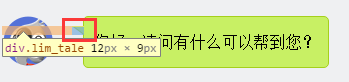
如果要求边框颜色和背景颜色不一样呢?上面的方法就不行了,因为用:before画三角形是利用border的原理,也就是说,在上面这种方式下,气泡边上的小三形是无法呈现两种颜色的,因为他只有一个border的颜色。那就要想办法凑出一个有边框的三角形了。
  <div class="jimi_lists lim_operator clearfix">

                <div class="header_img jimi3 fl"></div>

                <div class="lim_bubble lim_shadow"><p class="lim_dot">您好,请问有什么可以帮到您?</p></div>

                <div class="lim_tale"><div class="radiusborder"></div></div>

            </div>
1.先画一个小矩形。
.lim_operator .lim_tale {

    left: -1px;

    background-color: #c8f064;

    border-color: #a5d01b;

    margin-left: 70px;

}

.lim_tale {

    position: absolute;

    width: 12px;

    height: 8px;

    overflow: hidden !important;

    top: 10px;

    z-index:;

    border-top-style: solid;

    border-top-width: 1px;

}
2.画出斜线。
css里面是没有斜线的,这里是用了一个园的弧形拼出来的。在一个大圆上,截取一段弧,就是一条斜线了。
.lim_operator .radiusborder {

    position: absolute;

    background-color: #EFF0F2;

    top: -29px;

    left: -94px;

    height: 160px;

    width: 160px;

    border-top-style: solid;

    border-top-width: 1px;

    border-right-style: solid;

    border-right-width: 1px;

    border-top-right-radius: 154px;

    border-color: #a5d01b;

}
叠加式:
原理就是相当于用before先画出一个有色背景,再用after画出一个白色背景,然后叠加错开顶部1-2px,这样就出现了一个有边框有背景的三角形。web 微信就是这种做法
.expression:before {

    content: '';

    position: absolute;

    left: 16px;

    top: 100%;

    margin-left: -7px;

    border: 7px solid transparent;

    border-top-color: #CFCFCF

}

.expression:after {

    content: '';

    position: absolute;

    left: 16px;

    top: 100%;

    margin-left: -7px;

    margin-top: -1px;

    border: 7px solid transparent;

    border-top-color: #FFF

}
全部源码:
http://pan.baidu.com/s/1eR7Y8Bw
【css3】--四种气泡的更多相关文章
- Westciv Tools主要为CSS3提供了渐变gradients、盒子阴影box-shadow、变形transform和文字描边四种在线生成效果的工具
Westciv Tools主要为CSS3提供了渐变gradients.盒子阴影box-shadow.变形transform和文字描边四种在线生成效果的工具 1.Westciv Tools 彩蛋爆料直击 ...
- PHP四种基础算法详解
许多人都说 算法是程序的核心,一个程序的好于差,关键是这个程序算法的优劣.作为一个初级phper,虽然很少接触到算法方面的东西 .但是对于冒泡排序,插入排序,选择排序,快速排序四种基本算法,我想还是要 ...
- 前端基础----CSS语法、CSS四种引入方式、CSS选择器、CSS属性操作
一.CSS语法 CSS 规则由两个主要的部分构成:选择器,以及一条或多条声明. 例如: h1 {color:red; font-size:14px;} 二.CSS四种引入方式 1,行内式 行内式是在标 ...
- 用php实现四种常见的排序算法
几种常见的排序 排序是一个程序员的基本功,对于初级phper,更是可以通过排序算法来锻炼自己的思维能力. 所谓排序,就是对一组数据,按照某个顺序排列的过程.下面就总结四种常用的php排序算法,分别是冒 ...
- CSS简单的四种引入方式
CSS一共有四种引入方式 (1)最简单的两种方式是直接在html标签里面引入,或者在html文件前面声明,以下是简单的代码示例 <!DOCTYPE html> <html lang= ...
- javascript语法 1.运算符 2. 流程控制 3. 函数 4. 四种变量 5. 数据类型的运用 6. js页面交互
1.运算符 <!DOCTYPE html> <html> <head> <meta charset="UTF-8"> <tit ...
- CSS插入的四种方式
一.什么是CSS CSS(Cascading style sheets 层叠样式表),CSS可以用以为网页构建样式表,通过样式表来达到对网页进行美化的效果.所谓层叠可以将网页想象成一层层的结构,高层 ...
- 关于计算机学习的书(doc,mobi,epub,pdf四种格式)
关于计算机学习的书(doc,mobi,epub,pdf四种格式) <html> <body> <div> 21天学通C+ +2016/6/22 18:47文條 30 ...
- 四种webAPP横向滑动模式图解—H5页面开发
一.容器整体滑动(DEMO只演示A-B-C-B,下同) 模拟动画效果见下图(上),滑动分解见下图(下): DEMO地址:http://nirvana.sinaapp.com/demo_slider/s ...
随机推荐
- NDB Cluster 存储引擎物理备份
NDB Cluster 存储引擎物理备份NDB Cluster 存储引擎也是一款事务性存储引擎,和Innodb 一样也有redo 日志.NDBCluter 存储引擎自己提供了备份功能,可以通过相关的命 ...
- shell <<EOF
1.考虑下面的需求,在主shell执行命令,进入其他的命令,后面的输入,想作为命令的输入,而不是主shell的输入,怎么办? 2.使用<<EOF,告诉主shell,后续的输入,是其他命令或 ...
- 性能测试之--Apache JMeter安装
Hi,今天给大家分享一下安装JMeter的相关内容~ Apache JMeter 是Apache组织的开源项目,是一个100%纯Java桌面应用,用于压力测试和性能测试. 它能够对HTTP.FTP服务 ...
- 通过Guid获取DirectoryEntry对象
绑定DirectoryEntry对象通常有两种方法,一种是通过字符串(如通过ADsPath),一种是通过Guid(参见:http://msdn.microsoft.com/zh-cn/library/ ...
- [转]LibreOffice-SDK 开发实战:嵌入MFC-View 和 C# Winform
转自:http://www.aqcoder.com/blog/detail/id/1579bb39-9bcd-4c0f-9b02-67a851148196/ 前面片文章中我简要介绍了下 LibreOf ...
- js 变量提升和函数提升原理
关于js的变量,开始的时候我们都会被告知,变量声明应该在引用该变量之前.关于为什么要这样做呢,开始的时候本着会用就行的目的,也没去深究.不过后来经常会发现一些让人很费解的..姑且称为现象吧.先看一段代 ...
- enum类型学习笔记
如:enum color {red,white,yellow,green} 枚举出一种类型中的多个变量 enum本质为int,可以作为int使用: enum默认值为0,1,2... 以上的定义中: e ...
- python3下安装Django
1.下载python3 https://www.Python.org/ 我下载的是Python3.5.1 选的 Windows x86-64 executable installer 2. 打开cmd ...
- 浅析JVM内存结构和6大区域(转)举例非常好
内存作为系统中重要的资源,对于系统稳定运行和高效运行起到了关键的作用,Java和C之类的语言不同,不需要开发人员来分配内存和回收内存,而是由JVM来管理对象内存的分配以及对象内存的回收(又称为垃圾回收 ...
- VBoxManage: error: Cannot register the hard disk 解决办法
将虚拟盘从一个分区拷到另外一个分区上,打开虚拟机挂载这个虚拟盘老是报错,VBoxManage: error: Cannot register the hard disk '/media/New Vol ...