
Python - matplotlib 数据可视化
在许多实际问题中,经常要对给出的数据进行可视化,便于观察。
今天专门针对Python中的数据可视化模块--matplotlib这块内容系统的整理,方便查找使用。
本文来自于对《利用python进行数据分析》以及网上一些博客的总结。
1 matplotlib简介
2 图和子图的建立
2.1 导入matplotlib
import matplotlib.pyplot as plt
import numpy as np
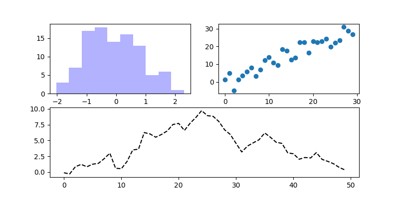
2.2 建立图和子图方式一
plt.plot( )会在最近的一个图上进行绘制
from numpy.random import randn

fig = plt.figure(figsize = (8,4))    #设置图的大小

ax1 = fig.add_subplot(2,2,1)

ax2 = fig.add_subplot(2,2,2)

ax3 = fig.add_subplot(2,1,2)

ax3.plot(randn(50).cumsum(),'k--')   # plt.plot(randn(50).cumsum(),'k--')等效

ax1.hist(randn(100),bins = 10, color = 'b', alpha = 0.3)      #bins 分成多少间隔   alpha 透明度

ax2.scatter(np.arange(30),np.arange(30) + 3*randn(30))

plt.show()
2.3 建立子图方式二
from numpy.random import randn

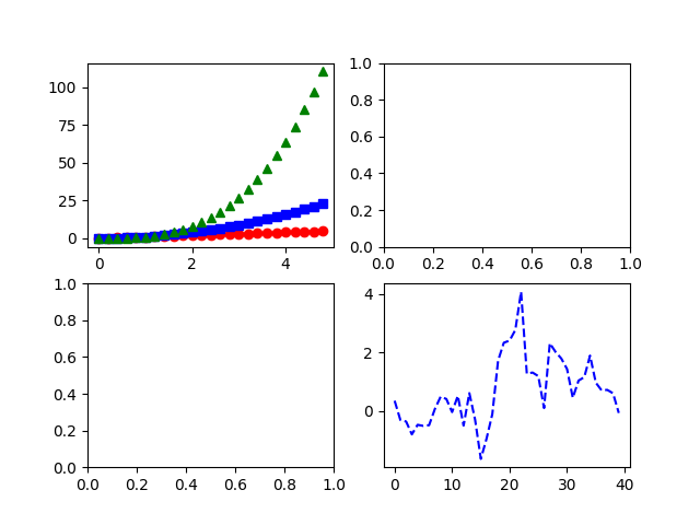
fig, axes = plt.subplots(2,2)                               #以数组方式访问

t = np.arange(0., 5., 0.2)

axes[0,0].plot(t, t, 'r-o', t, t**2, 'bs', t, t**3, 'g^')   #同时绘制多条曲线

axes[1,1].plot(randn(40).cumsum(),'b--')

plt.show()
2.4 主题设置
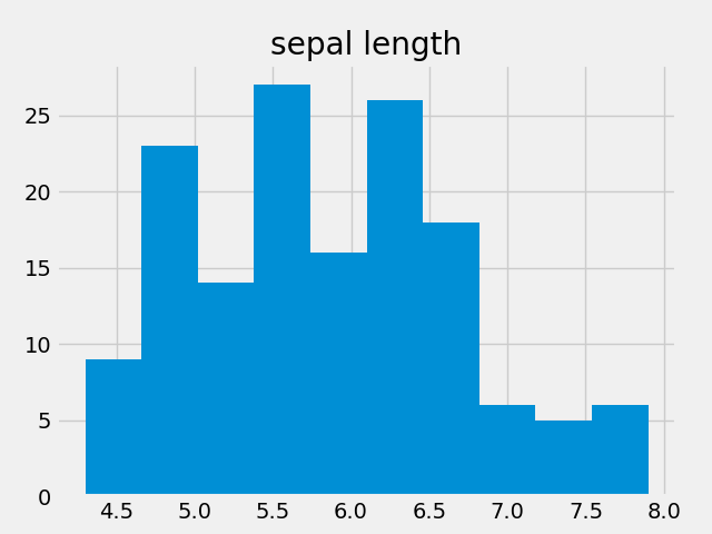
使用style.use()函数
df_iris = pd.read_csv('../input/iris.csv')

plt.style.use('ggplot')    #'fivethirtyeight','ggplot','dark_background','bmh'

df_iris.hist('sepal length')

plt.show()
3 颜色、标记、线型、刻度、标签和图例
from numpy.random import randn

fig = plt.figure()

ax1 = fig.add_subplot(1,1,1)

ax1.plot(randn(30).cumsum(),color = 'b',linestyle = '--',marker = 'o',label = '$cumsum$')  # 线型  可以直接'k--o'

ax1.set_xlim(10,25)

ax1.set_title('My first plot')

ax1.set_xlabel('Stages')

plt.legend(loc = 'best')           #把图放在不碍事的地方  xticks([])设置刻度

plt.show()

等价于下面的代码:
from numpy.random import randn

fig = plt.figure()

ax1 = fig.add_subplot(1,1,1)

ax1.plot(randn(30).cumsum(),color = 'b',linestyle = '--',marker = 'o',label = '$cumsum$')   #图标可以使用latex内嵌公式

plt.xlim(10,25)                   #plt.axis([10,25,0,10])对x,y轴范围同时进行设置

plt.title('My first plot')

plt.xlabel('Stages')

plt.legend(loc = 'best')

plt.show()
4 pandas中的绘图函数
4.1 线型图
from numpy.random import randn

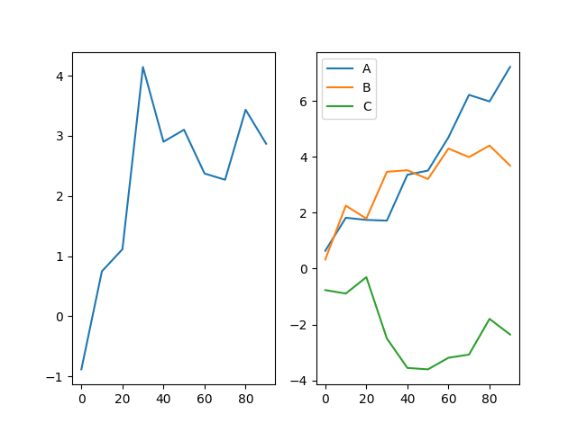
fig, axes = plt.subplots(1,2)

s = pd.Series(randn(10).cumsum(),index = np.arange(0,100,10))

s.plot(ax = axes[0])   # ax参数选择子图

df = pd.DataFrame(randn(10,3).cumsum(0),columns = ['A','B','C'],index = np.arange(0,100,10))

df.plot(ax = axes[1])

plt.show()
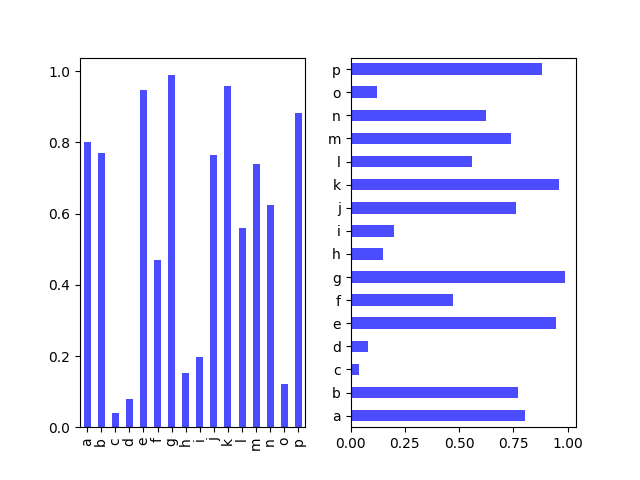
4.2 柱状图
from numpy.random import rand

fig, axes = plt.subplots(1,2)

data = pd.Series(rand(16),index = list('abcdefghijklmnop'))

data.plot(kind = 'bar', ax = axes[0], color = 'b', alpha = 0.7)    #kind选择图表类型  'bar' 垂直柱状图

data.plot(kind = 'barh', ax = axes[1], color = 'b', alpha = 0.7)   # 'barh' 水平柱状图

plt.show()
from numpy.random import rand

fig, axes = plt.subplots(1,2)

data = pd.DataFrame(rand(6,4),

                    index = ['one','two','three','four','five','six'],

                    columns = pd.Index(['A','B','C','D'], name = 'Genus'))

data.plot(kind = 'bar', ax = axes[0], alpha = 0.5)

data.plot(kind = 'bar', ax = axes[1], stacked = True, alpha = 0.5)

plt.show()
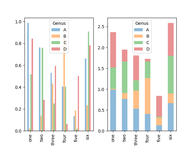
此外,柱状图有一个非常不错的用法,利用value_counts( )图形化显示Series中各值的出现概率,比如s.value_counts( ).plot(kind = 'bar')。
4.3 直方图和密度图
from numpy.random import randn

fig, axes = plt.subplots(1,2)

data = pd.Series(randn(100))

data.hist(ax = axes[0], bins = 50)       #直方图

data.plot(kind = 'kde', ax = axes[1])    #密度图

plt.show()

其实可以一次性制作多个直方图,layout参数的意思是将两个图分成两行一列,如果没有这个参数,默认会将全部的图放在同一行。
df_iris = pd.read_csv('../input/iris.csv')

columns = ['sepal length','sepal width','petal length','petal width']

df_iris.hist(column=columns, layout=(2,2))

plt.show()

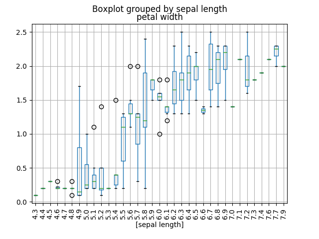
df_iris = pd.read_csv('../input/iris.csv')  #['sepal length','sepal width','petal length','petal width','class']

sample_size = df_iris[['petal width','class']]

sample_size.boxplot(by='class')

plt.xticks(rotation=90)                     #将X轴的坐标文字旋转90度,垂直显示

plt.show()
5 参考资料链接
- Gallery页面
- matplotlib — 绘制精美的图表
- Python — matplotlib绘图可视化知识点整理
- Python数据可视化之matplotlib学习笔记
- https://blog.csdn.net/qq_34264472/article/details/53814635 (仅为记录,方便查找使用)
Python - matplotlib 数据可视化的更多相关文章
- python Matplotlib数据可视化神器安装与基本应用
Matplotlib Matplotlib 是一个非常强大的 Python 画图工具; 手中有很多数据, Matplotlib能帮你画出美丽的: 线图; 散点图; 等高线图; 条形图; 柱状图; 3D ...
- python matplotlib数据可视化
#基于python3 Matplotlib构建的3D图形: 使用pycharm的小伙伴把sciview给关掉: 因为sciview显示的是png图片.3d图形一般我们都需要拖拖拽拽的. 参见: htt ...
- matplotlib 数据可视化
图的基本结构 通常,使用 numpy 组织数据, 使用 matplotlib API 进行数据图像绘制. 一幅数据图基本上包括如下结构: Data: 数据区,包括数据点.描绘形状 Axis: 坐标轴, ...
- python爬虫+数据可视化项目(关注、持续更新)
python爬虫+数据可视化项目(一) 爬取目标:中国天气网(起始url:http://www.weather.com.cn/textFC/hb.shtml#) 爬取内容:全国实时温度最低的十个城市气 ...
- python的数据可视化库 matplotlib 和 pyecharts
Matplotlib大家都很熟悉 不谈. ---------------------------------------------------------------------------- ...
- 【Data Visual】一文搞懂matplotlib数据可视化
一文搞懂matplotlib数据可视化 作者:白宁超 2017年7月19日09:09:07 摘要:数据可视化主要旨在借助于图形化手段,清晰有效地传达与沟通信息.但是,这并不就意味着数据可视化就一定因为 ...
- python爬虫28 | 你爬下的数据不分析一波可就亏了啊,使用python进行数据可视化
通过这段时间 小帅b教你从抓包开始 到数据爬取 到数据解析 再到数据存储 相信你已经能抓取大部分你想爬取的网站数据了 恭喜恭喜 但是 数据抓取下来 要好好分析一波 最好的方式就是把数据进行可视化 这样 ...
- Matplotlib数据可视化(1):入门介绍
1 matplot入门指南¶ matplotlib是Python科学计算中使用最多的一个可视化库,功能丰富,提供了非常多的可视化方案,基本能够满足各种场景下的数据可视化需求.但功能丰富从另一方面来 ...
- Python:数据可视化pyecharts的使用
什么是pyecharts? pyecharts 是一个用于生成 Echarts 图表的类库. echarts 是百度开源的一个数据可视化 JS 库,主要用于数据可视化.pyecharts 是一个用于生 ...
随机推荐
- OpenStack cloud 第一天
这是刚接触openstack时候,看到的第一篇文章,感触很深,自己很喜欢的一个词Horizon就是出自本文 ============================================ ...
- C程序设计语言习题(3-3)
编写函数expand(s1,s2), 将字符串s1中类似于a-z一类的速记符号在字符串s2中扩展为等价的完整列表abc……xyz.该函数可以处理大小写字母和数字,并可以处理a-b-c.a-z0-9与a ...
- 圆形CD绘制 (扇形)
参考: Egret教程Arc是使用示例:http://edn.egret.com/cn/article/index/id/673 我封装的工具类: /** * 圆形进度 * @author chenk ...
- DragonBones龙骨发布后在Egret中的位置
DragonBones发布后的动画,加载到Egret中场景中,原点的位置在哪呢? DragonBones中的图片位置 导出 加载到Egret中.可见DragonBones中的图片位置原点左下方(0,0 ...
- node path的一些理解笔录
例子假如我们有这样的文件结构: app/ -lib/ -common.js -model -task.js -test.js 执行代码: var path = require("path&q ...
- 涨知识,涨知识 :ThinkPHP框架下Where条件查询Mysql数据库某字段是否为空
代码虐我千百遍,我对代码如初恋~ 问题: 查询某字段app_date数据是否为NULL,正常我们实现的办法是: $map['app_data'] = array('eq','null'); $data ...
- vim配置函数跳转(c/c++)
暂时草记一下,有时间好好整理 ctags 如果只是查看函数与变量是在哪里定义的,用ctags就可以了. ctrl+]跳到定义的地方,ctrl+t跳回来. 想要像IDE那样在旁边显示函数与变量列表,用t ...
- linux下git命令
1.初始化: 方式一.git clone,将远程的Git版本库,克隆到本地一份. 方式二.git init和git remote 2.git pull:将其他版本库代码更新到本地.例如:git pul ...
- address sizes : 46 bits physical, 48 bits virtual
processor : 7vendor_id : GenuineIntelcpu family : 6model : 63model name : Intel(R) Xeon(R) CPU E5-26 ...
- 最大生成树——LCA
今天说是要练习LCA结果找了道题看着题解打完了,如此惭愧,Lca还得好好理解啊,感觉在最大生成树上做有点异样,可能还是不是很理解吧,在noip前一定要再把这道题再a一遍,好题啊. 这是2013noip ...