常见css垂直自适应布局(css解决方法)
- css3的盒模型,
css3中添加弹性盒模型,最新弹性盒模型是flex,之前为box
<!DOCTYPE html>
<html >
<head>
<title>div + css宽度自适应(液态布局)</title>
<meta http-equiv="Content-Type" content="text/html; charset=utf-8" />
<style type="text/css">
/*左边栏,设定宽度*/
html,body{
width: 100%;
height: 100%;
margin: 0;
}
#wrap{
display: flex;
width: 100%;
height: 100%;
/*css3 的盒模型设置垂直排序 新老方法 box-orient老方法 flex-direction新方法*/
box-orient:vertical;
flex-direction:column;
}
.wrap_l
{
height: 150px;
width: 150px;
background: yellow;
}
/*中间栏,宽度auto,*/
.wrap_m
{
flex:1;
background: blue;
}
</style>
</head>
<body>
<div id="wrap">
<div class="wrap_l">
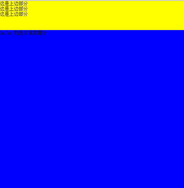
这是上边部分<br />
这是上边部分<br />
这是上边部分
</div>
<div class="wrap_m">
这是下部分
</div>
</div>
</body>
</html>
2.position: absolute;绝对布局解决方案
绝对布局主要相对它的父dom做的操作,一般父dom要有足够的空间,如果涉及嵌套太多,父dom可以设置为postion:relative
<!DOCTYPE html>

<html >

<head>

    <title>div + css宽度自适应(液态布局)</title>

    <meta http-equiv="Content-Type" content="text/html; charset=utf-8" />

    <style type="text/css">

        /*左边栏,设定宽度*/

      html,body{

         width: 100%;

         height: 100%;

         margin: 0;

      }

      #wrap{

            width: 100%;

            height: 100%;

        }

        .wrap_l

        {

            height: 150px;

            width: 150px;

            background: yellow;

        }

        /*中间栏,宽度auto,*/

        .wrap_m

        {

          position: absolute;

          top:150px;

          width: 100%;

          background: blue;

          bottom: 0px;

        }

        </style>

</head>

<body>

    <div id="wrap">

         <div class="wrap_l">

            这是上边部分<br />

            这是上边部分<br />

            这是上边部分

        </div>

        <div class="wrap_m">

            这是下部分

        </div>

</div>

</body>

</html>
3.table布局
也可以用display:table仿table布局
display:table只支持IE8+以上
<!DOCTYPE html>

<html >

<head>

    <title>div + css宽度自适应(液态布局)</title>

    <meta http-equiv="Content-Type" content="text/html; charset=utf-8" />

    <style type="text/css">

        /*左边栏,设定宽度*/

      html,body{

         width: 100%;

         height: 100%;

         margin: 0;

      }

      #wrap{

            width: 100%;

            height: 50%;

            display: table;

        }

        .wrap_l

        {

            height: 100px;

            display: table-row;

            background: yellow;

        }

        /*中间栏,宽度auto,*/

        .wrap_m

        {

          display: table-row;

          background: blue;

        }

        </style>

</head>

<body>

    <div id="wrap">

         <div class="wrap_l">

            这是上边部分<br />

            这是上边部分<br />

            这是上边部分

        </div>

        <div class="wrap_m">

            这是下部分

        </div>

         </div>

        <table style="height:50%;width:100%">

            <tr style="background: red;height:100px"><td > 上部分</td></tr>

            <tr style="background: yellow;"><td > 下部分</td></tr>

        </table>

</div>

</body>

</html>
这就最终的结果
常见css垂直自适应布局(css解决方法)的更多相关文章
- DIV+CSS布局中自适应高度的解决方法
div乱跑问题 (文件<DIV+CSS布局中自适应高度的解决方法.rar>) float 是个很危险的东西 得小心使用 本来有一很好的关于CSS+DIV的论坛 不过现在关门了 甚是可 ...
- CSS流体(自适应)布局下宽度分离原则
CSS流体(自适应)布局下宽度分离原则 这篇文章发布于 2011年02月28日,星期一,00:48,归类于 css相关. 阅读 73990 次, 今日 5 次 by zhangxinxu from h ...
- CSS+DIV自适应布局
CSS+DIV自适应布局 1.两列布局(左右两侧,左侧固定宽度200px;右侧自适应占满) 代码如下: <!doctype html> <html> <head> ...
- 演示:纯CSS实现自适应布局表格
<!DOCTYPE html> <html> <head> <meta charset="utf-8"> <title> ...
- PHP开发中常见的安全问题详解和解决方法(如Sql注入、CSRF、Xss、CC等
页面导航: 首页 → 网络编程 → PHP编程 → php技巧 → 正文内容 PHP安全 PHP开发中常见的安全问题详解和解决方法(如Sql注入.CSRF.Xss.CC等) 作者: 字体:[增加 减小 ...
- easyui 中iframe嵌套页面,大弹窗自适应居中的解决方法。$('#win').window()
easyui 中iframe嵌套页面,大弹窗自适应居中的解决方法.$('#win').window() 以下是左边栏和头部外层遮罩显示和隐藏方法 /*外层 遮罩显示*/ function wrapMa ...
- javascript常见的20个问题与解决方法
<!DOCTYPE html PUBLIC "-//W3C//DTD XHTML 1.0 Transitional//EN" "http://www.w3.org/ ...
- 常见css水平自适应布局
左右布局,左边固定,右边自适应布局 BFC方法解决 <!DOCTYPE html PUBLIC "-//W3C//DTD XHTML 1.0 Transitional//EN" ...
- CSS兼容性问题总结及解决方法
css兼容问题 兼容问题 1.文字本身的大小不兼容.同样是font-size:14px的宋体文字,在不同浏览器下占的空间是不一样的,ie下实际占高16px,下留白3px,ff下实际占高17px,上留白 ...
随机推荐
- C语言创建及解析Json的使用法则
参考原文:http://blog.csdn.net/xukai871105/article/details/33013455 JSON(JavaScriptObject Notation)是一种轻量级 ...
- 5天揭秘js高级技术-第一天
一.基础杂记 1. document.write() <script type="text/javascript"> document.write('<h2> ...
- eclipse新建web项目开发JSP
1.创建项目:file---new--Dynamic Web Project 一直选next,到jsp文件目录所在地,打勾默认自动生成web.xml配置文件,也可以自己设置. 创建JSP文件: 选择创 ...
- REDHAT一总复习1 记录systemd日志条目 rsyslogd配置记录日志指令
显示9:05:00 到9:15:00 之间在/home/student/systemdreview.txt 文件中记录所有systemd日志条目 # echo "journalctl --s ...
- Timequest静态时序分析(STA)基础
Setup Slack Hold Slack Recovery&Removal Recovery: The minimum time an asynchronous signal must b ...
- Jquery制作--焦点图左右轮播
公司项目经常用到轮播焦点图,于是自己写了一个纯jq形式的横向轮播焦点图,可点击小圆点或者左右按钮进行切换,属于定宽类型.改成自适应宽度的也不难,将css里面的bannerCon宽度改为百分比,再在js ...
- 取两个String数组的交集
import org.testng.annotations.Test; import java.util.HashMap; import java.util.LinkedList; import ja ...
- 【清华集训】楼房重建 BZOJ 2957
Description 小A的楼房外有一大片施工工地,工地上有N栋待建的楼房.每天,这片工地上的房子拆了又建.建了又拆.他经常无聊地看着窗外发呆,数自己能够看到多少栋房子. 为了简化问题,我们考虑这些 ...
- oracle 学习笔记(四)
1. SQL(高级查询) 1.1. 子查询 1.1.1. 子查询在WHERE子句中 在SELECT查询中,在WHERE查询条件中的限制条件不是一个确定的值,而是来自于另外一个查询的结果.为了给查询提供 ...
- markdown编辑器sublime text3
安装包管理Package Control ctrl+`或者点击查看-->显示面板,复制下面的代码到面板里. import urllib.request,os; pf = 'Package Con ...