Flutter基础Widget之按钮(RaisedButton、FlatButton、OutlineButton,IconButton)
Flutter中给我们预先定义好了一些按钮控件给我们用,常用的按钮如下

    RaisedButton :凸起的按钮,其实就是Android中的Material Design风格的Button ,继承自MaterialButton

    FlatButton :扁平化的按钮,继承自MaterialButton

    OutlineButton    :带边框的按钮,继承自MaterialButton

    IconButton    :图标按钮,继承自StatelessWidget

我们先来看看MaterialButton中的属性,可以看到能设置的属性还是很多的。

  const MaterialButton({

    Key key,

    @required this.onPressed,

    this.onHighlightChanged,

    this.textTheme,

    this.textColor,

    this.disabledTextColor,

    this.color,

    this.disabledColor,

    this.highlightColor,

    this.splashColor,

    this.colorBrightness,

    this.elevation,

    this.highlightElevation,

    this.disabledElevation,

    this.padding,

    this.shape,

    this.clipBehavior = Clip.none,

    this.materialTapTargetSize,

    this.animationDuration,

    this.minWidth,

    this.height,

    this.child,

  }) : super(key: key);

下面我们来看看常用属性

属性     值类型     说明

onPressed     VoidCallback ,一般接收一个方法     必填参数,按下按钮时触发的回调,接收一个方法,传null表示按钮禁用,会显示禁用相关样式

child     Widget     文本控件

textColor     Color     文本颜色

color     Color     按钮的颜色

disabledColor     Color     按钮禁用时的颜色

disabledTextColor     Color     按钮禁用时的文本颜色

splashColor     Color     点击按钮时水波纹的颜色

highlightColor     Color     点击(长按)按钮后按钮的颜色

elevation     double     阴影的范围,值越大阴影范围越大

padding     EdgeInsetsGeometry (抽象类)     内边距

shape     ShapeBorder(抽象类)     设置按钮的形状

minWidth     double     最小宽度

height     double     高度

而在Android中如果我们要修改按钮样式的话,需要通过selector和Shape等方式进行修改,相比较Flutter来说是要麻烦不少的

RaisedButton

RaisedButton的构造方法如下,由于继承自MaterialButton,所以MaterialButton中的大多数属性这边都能用,且效果一致,这里就不在赘述了

  const RaisedButton({

    Key key,

    @required VoidCallback onPressed,

    ValueChanged<bool> onHighlightChanged,

    ButtonTextTheme textTheme,

    Color textColor,

    Color disabledTextColor,

    Color color,

    Color disabledColor,

    Color highlightColor,

    Color splashColor,

    Brightness colorBrightness,

    double elevation,

    double highlightElevation,

    double disabledElevation,

    EdgeInsetsGeometry padding,

    ShapeBorder shape,

    Clip clipBehavior = Clip.none,

    MaterialTapTargetSize materialTapTargetSize,

    Duration animationDuration,

    Widget child,

  })

下面我们来看一下属性

onPressed

接收一个方法,点击按钮时回调该方法。如果传null,则表示按钮禁用

 return RaisedButton(

      onPressed: null,

    );

如下图所示

下面我们定义一个方法传给onPressed

_log() {

    print("点击了按钮");

  }

  @override

  Widget build(BuildContext context) {

    return RaisedButton(

      onPressed: _log,

    );

  }

点击按钮后会调用log方法。

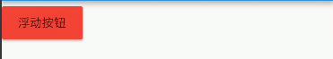
child

按钮文本控件,一般都是传一个Text Widget

 return RaisedButton(

      onPressed: _log,

      child: Text("浮动按钮"),

    );

color

按钮的颜色

return RaisedButton(

      onPressed: _log,

      child: Text("浮动按钮"),

      color: Colors.red,

    );
textColor

按钮的文本颜色

 return RaisedButton(

      onPressed: _log,

      child: Text("浮动按钮"),

      color: Colors.red,

      textColor: Colors.white,

    );

splashColor

点击按钮时水波纹的颜色

   return RaisedButton(

      onPressed: _log,

      child: Text("浮动按钮"),

      color: Colors.red,

      textColor: Colors.white,

      splashColor: Colors.black,

    );

highlightColor

高亮颜色,点击(长按)按钮后的颜色

    return RaisedButton(

      onPressed: _log,

      child: Text("浮动按钮"),

      color: Colors.red,

      textColor: Colors.white,

      splashColor: Colors.black,

      highlightColor: Colors.green,

    );

elevation

阴影范围,一般不会设置太大

    return RaisedButton(

      onPressed: _log,

      child: Text("浮动按钮"),

      color: Colors.red,

      textColor: Colors.white,

      splashColor: Colors.black,

      highlightColor: Colors.green,

      elevation: 30,

    );

padding

内边距,其接收值的类型是EdgeInsetsGeometry类型的,EdgeInsetsGeometry是一个抽象类,我们来看看其实现类

我们一般都用EdgeInsets类中的方法来设置padding

常用方法如下

//单独设置左上右下的间距,四个参数都要填写

const EdgeInsets.fromLTRB(this.left, this.top, this.right, this.bottom);

//单独设置左上右下的间距,四个均为可选参数

  const EdgeInsets.only({

    this.left = 0.0,

    this.top = 0.0,

    this.right = 0.0,

    this.bottom = 0.0

  });

  //一次性设置上下左右的间距

  const EdgeInsets.all(double value)

      : left = value, top = value, right = value, bottom = value;

示例:

EdgeInsets.all()

      padding: EdgeInsets.all(20)

EdgeInsets.fromLTRB()

padding: EdgeInsets.fromLTRB(0,30,20,40)

EdgeInsets.only()

 padding: EdgeInsets.only(top: 30)

shape

shape用来设置按钮的形状,其接收值是ShapeBorder类型,ShapeBorder是一个抽象类,我们来看看有哪些实现类

可以看到,实现类还是很多的,我们主要来看看常用的即可。

    BeveledRectangleBorder 带斜角的长方形边框

    CircleBorder 圆形边框

    RoundedRectangleBorder 圆角矩形

    StadiumBorder 两端是半圆的边框

我们来简单用一用,在用之前我们先来看一下

常用的两个属性

    side 用来设置边线(颜色,宽度等)

    borderRadius 用来设置圆角

side接收一个BorderSide类型的值,比较简单,这里就不介绍了,看一下构造方法

  const BorderSide({

    this.color = const Color(0xFF000000),

    this.width = 1.0,

    this.style = BorderStyle.solid,

  })

borderRadius 接收一个BorderRadius类型的值,常用方法如下

我们可以把borderRadius分为上下左右四个方向,下面的方法都是对这四个方向进行设置,

    all 配置所有方向

    cricular 环形配置,跟all效果差不多,直接接收double类型的值

    horizontal 只配置左右方向

    only 可选左上,右上,左下,右下配置

    vertical 只配置上下方向

具体配置大家自行尝试

我们来简单用一下

BeveledRectangleBorder

带斜角的长方形边框

shape: BeveledRectangleBorder(

         side: BorderSide(

        color: Colors.white,

      ),

      borderRadius: BorderRadius.all(Radius.circular(10))

      ),

CircleBorder

圆形边框

     shape: CircleBorder(

        side: BorderSide(

          color: Colors.white,

        ),

      ),

RoundedRectangleBorder

圆角矩形

     shape: RoundedRectangleBorder(

        borderRadius: BorderRadius.all(Radius.circular(10)),

      ),

StadiumBorder

两端是半圆的边框

 shape: StadiumBorder(),

FlatButton

FlatButton跟RaisedButton用法基本一致,下面我们就直接用一下

/*扁平按钮*/

class FlatBtn extends StatelessWidget {

  _log() {

    print("点击了扁平按钮");

  }

  @override

  Widget build(BuildContext context) {

    return FlatButton(

      onPressed: _log,

      child: Text("扁平按钮"),

      color: Colors.blue,

      textColor: Colors.black,

      shape: RoundedRectangleBorder(

          side: BorderSide(

            color: Colors.white,

            width: 1,

          ),

          borderRadius: BorderRadius.circular(8)),

    );

  }

}

OutlineButton

注意,OutlineButton是一个有默认边线且背景透明的按钮,也就是说我们设置其边线和颜色是无效的,其他属性跟MaterialButton中属性基本一致

下面我们直接来使用

/*带边线的按钮*/

class outlineBtn extends StatelessWidget {

  _log() {

    print("点击了边线按钮");

  }

  @override

  Widget build(BuildContext context) {

    // TODO: implement build

    return OutlineButton(

      onPressed: _log,

      child: Text("边线按钮"),

      textColor: Colors.red,

      splashColor: Colors.green,

      highlightColor: Colors.black,

      shape: BeveledRectangleBorder(

        side: BorderSide(

          color: Colors.red,

          width: 1,

        ),

        borderRadius: BorderRadius.circular(10),

      ),

    );

  }

}

效果如下:

IconButton

IconButton是直接继承自StatelessWidget的,默认没有背景

我们来看一下他的构造方法

const IconButton({

    Key key,

    this.iconSize = 24.0,

    this.padding = const EdgeInsets.all(8.0),

    this.alignment = Alignment.center,

    @required this.icon,

    this.color,

    this.highlightColor,

    this.splashColor,

    this.disabledColor,

    @required this.onPressed,

    this.tooltip

  })

可以看到,icon是必填参数

icon接收一个Widget,但是一般我们都是传入一个Icon Widget

final Widget icon;

其他属性跟MaterialButton中的属性用法基本一致

我们来用一下

/*图标按钮*/

class IconBtn extends StatelessWidget {

  _log() {

    print("点击了图标按钮");

  }

  @override

  Widget build(BuildContext context) {

    return IconButton(

      icon: Icon(Icons.home),

      onPressed: _log,

      color: Colors.blueAccent,

      highlightColor: Colors.red,

    );

  }

}

效果如下

我们也可以传一个Text或其他Widget,这个大家自行尝试吧

Flutter中Button内容大概就是这些
Flutter基础Widget之按钮(RaisedButton、FlatButton、OutlineButton,IconButton)的更多相关文章
- Flutter 基础组件:按钮
前言 Material组件库中提供了多种按钮组件如RaisedButton.FlatButton.OutlineButton等,它们都是直接或间接对RawMaterialButton组件的包装定制,所 ...
- Flutter 基础控件
内容: Button Image.Icon Switch.Checkbox TextField Form 1.Button RaisedButton 漂浮按钮 FlatButton 扁平按钮 Outl ...
- Flutter 基础组件:输入框和表单
前言 Material组件库中提供了输入框组件TextField和表单组件Form. 输入框TextField 接口描述 const TextField({ Key key, // 编辑框的控制器,通 ...
- Bootstrap<基础十四> 按钮下拉菜单
使用 Bootstrap class 向按钮添加下拉菜单.如需向按钮添加下拉菜单,只需要简单地在在一个 .btn-group 中放置按钮和下拉菜单即可.也可以使用 <span class=&qu ...
- Flutter基础用法解析
解析开始 Flutter中一切皆widget,一切皆组件.学习Flutter中,必须首先了解Flutter的widget.先从最基本的MaterialApp和Scaffold开始了解 1 Materi ...
- Flutter 基础组件:Widget简介
概念 在Flutter中几乎所有的对象都是一个Widget.与原生开发中"控件"不同的是,Flutter中的Widget的概念更广泛,它不仅可以表示UI元素,也可以表示一些功能性的 ...
- Flutter基础系列之混合开发(二)
1.混合开发的场景 1.1作为独立页面加入 这是以页面级作为独立的模块加入,而不是页面的某个元素. 原生页面可以打开Flutter页面 Flutter页面可以打开原生页面 1.2作为页面的一部分嵌入 ...
- Flutter中的浮动按钮 FloatingActionButton
FloatingActionButton 简称 FAB ,可以实现浮动按钮,也可以实现类似闲鱼 app 的底部凸起导航 . 常用属性 FloatingActionButton的常用属性,同flutte ...
- Flutter调研(1)-Flutter基础知识
工作需要,因客户端有部分页面要使用flutter编写,需要QA了解一下flutter相关知识,因此,做了flutter调研,包含安装,基础知识与demo编写,第二部分是安装与环境配置. —— Flut ...
随机推荐
- squid 高匿设置
1.透明代理.匿名代理.混淆代理.高匿代理有什么区别 这4种代理,主要是在代理服务器端的配置不同,导致其向目标地址发送请求时,REMOTE_ADDR, HTTP_VIA,HTTP_X_FORWARDE ...
- 关于#ifndef以及#ifndef WIN32
一般用法是这样的: 这里可以定义如下: #define XXXXX #ifdef XXXXX 这里做一些操作,这些操作只有在XXXX已经被define的情况下才会执行到.一般还可能有else,如 #e ...
- vs 开发常用快捷键
alt+shift+enter 编辑区最大化ctrl+] 括号匹配 ctrl+j 强迫智能感知ctrl+shift+空格 强迫智能感知(参数) ctrl+k+d ...
- Oracle管理监控 之 rac环境密码文件管理
密码文件作用: 密码文件用于dba用户的登录认证. dba用户:具备sysdba和sysoper权限的用户,即oracle的sys和system用户. RAC环境中多个节点的密码文件应该保证一致,否则 ...
- 小米范工具系列之五:小米范WEB口令扫描器
最新版本1.2,下载地址:http://pan.baidu.com/s/1c1NDSVe 文件名 webcracker,请使用java1.8运行 小米范WEB口令扫描器的主要功能是批量扫描web口令 ...
- 评论抓取:Python爬取微信在APPStore上的评论内容及星级
#完整程序如下: import requests import re def getHTMLText(url): try: r = requests.get(url) r.raise_for_stat ...
- linux 如何查看防火墙是否开启
service iptables status可以查看到iptables服务的当前状态.但是即使服务运行了,防火墙也不一定起作用,你还得看防火墙规则的设置 iptables -L在此说一下关于启动和关 ...
- 小型网站MYSQL问题二:Percona Xtrabackup实现数据库备份和恢复
1.安装软件仓库(不要问我为什么不用源码安装,好吧,其实我懒.) 1 2 3 4 5 6 7 8 wget https://www.percona.com/downloads/percona-rele ...
- 7.2 Models -- Defining Models
一.概述 1. 模型是一个类,它定义了你呈现给用户的数据的属性和行为.用户希望如果他们离开你的应用程序,并返回后(或如果他们刷新页面)看到的任何东西应该被一个model代表. 2. 确保在ember. ...
- 非线性方程(组):一维非线性方程(一)二分法、不动点迭代、牛顿法 [MATLAB]
1. 二分法(Bisection) 1) 原理 [介值定理] 对于连续的一元非线性函数,若其在两个点的取值异号,则在两点间必定存在零点. [迭代流程] 若左右两端取值不同,则取其中点,求其函数值,取中 ...