多栏布局与JS实现瀑布流
css3属性之多栏布局与JS实现瀑布流
背景:之前打算自己总结一下flex布局的知识点,发现自己无从下手,原因在何处:我反思了一下,其实原因很简单,使用的次数少,更多的时间使用了百分比,浮动和定位解决。这也就显示出了博客和笔记的区别,自己平时做笔记,更多的记录,而不是总结,其实自己没有熟练掌握。
有的时候甚至出现了这样的笔记:
我打算坚持写博客,不论自己总结有多么差劲,也要坚持写,哪怕几年后我看到以前的笔记,自己会偷偷笑出声。想想原来大一时的技术还是那样的稚嫩啊。
Css3多列
1)首提的兼容性问题:IE10以及opera支持多列(column),chrome需要-webkit-前缀,Firefox需要-moz-的前缀,Ie9以及更早版本就不支持多列了。你可以使用这个工具,很方便的查看你的浏览器内核以及版本信息http://ie.icoa.cn/
2)Css3多列属性:css3多列主要是五个属性
column-count <规定元素被分隔的列数>
column-gap <规定列与列之间的间隔>
column-rule <列之间的宽度、样式、颜色>
column-width <列的宽度>
column-span <元素应该横跨的列数>
注意:在设置column-width宽度时,同时设置盒子的width,否则宽度默认为100%,每栏宽度按栏数平均分;盒子每栏宽度必须大于等于column-width设定的值,否则就会减少栏数来增加每栏宽度
css3多列和JS实现瀑布流
给自己安利一波吧,看到网上很多瀑布流的效果,哇,简直棒极了有没有;于是我迫不及待的打开vpn,打开了pinterest的官网。

自己也梳理梳理逻辑:<在写js代码之前,一定要先搞清逻辑,再动手写代码>
我们都不陌生瀑布流是同宽的,但是高度不一,js主要的工作就是根据高度来进行布局,
1)当一行排满后,准备排第二行的时候,把第一个图片放到上一行图片高度最小处,以此类推,
另外有一点就是自动加载,这里我做一个条件来判断是否加载,
2)当最后一个的元素距离网页顶部的高度(offsetTop)+ 这个元素高度的一半 < 垂直方向上滚轮的量(scrollTop) + 网页可见区域的高 时:
我们就加载图片(这里我没有用ajax请求,我用了一个json数组来模拟json数据)
要搞清楚offsetTop、scrollTop、clientHeight这些的具体含义:可以参考前辈的博客。
梳理完逻辑,让我们动手写代码吧:
html比较简单,这里图片我用了placehold的图片占位符,如果你没有很好的素材,这也许是个不错的选择
<body>

<div class="main clearfix" id="main">

    <div class="box">

        <div class="pic"><img src="http://placehold.it/200x300"/></div>

    </div>

    <div class="box">

        <div class="pic"><img src="http://placehold.it/200x300"/></div>

    </div>

    <div class="box">

        <div class="pic"><img src="http://placehold.it/200x300"/></div>

    </div>

    <div class="box">

        <div class="pic"><img src="http://placehold.it/200x200"/></div>

    </div>

    <div class="box">

        <div class="pic"><img src="http://placehold.it/200x200"/></div>

    </div>

    <div class="box">

        <div class="pic"><img src="http://placehold.it/200x300"/></div>

    </div>

    <div class="box">

        <div class="pic"><img src="http://placehold.it/200x300"/></div>

    </div>

    <div class="box">

        <div class="pic"><img src="http://placehold.it/200x300"/></div>

    </div>

    <div class="box">

        <div class="pic"><img src="http://placehold.it/200x300"/></div>

    </div>

    <div class="box">

        <div class="pic"><img src="http://placehold.it/200x150"/></div>

    </div>

    <div class="box">

        <div class="pic"><img src="http://placehold.it/200x200"/></div>

    </div>

    <div class="box">

        <div class="pic"><img src="http://placehold.it/200x300"/></div>

    </div>

    <div class="box">

        <div class="pic"><img src="http://placehold.it/200x200"/></div>

    </div>

    <div class="box">

        <div class="pic"><img src="http://placehold.it/200x300"/></div>

    </div>

    <div class="box">

        <div class="pic"><img src="http://placehold.it/200x300"/></div>

    </div>

    <div class="box">

        <div class="pic"><img src="http://placehold.it/200x300"/></div>

    </div>

    <div class="box">

        <div class="pic"><img src="http://placehold.it/200x300"/></div>

    </div>

    <div class="box">

        <div class="pic"><img src="http://placehold.it/200x300"/></div>

    </div>

    <div class="box">

        <div class="pic"><img src="http://placehold.it/200x300"/></div>

    </div>

    <div class="box">

        <div class="pic"><img src="http://placehold.it/200x300"/></div>

    </div>

    <div class="box">

        <div class="pic"><img src="http://placehold.it/200x100"/></div>

    </div>

    <div class="box">

        <div class="pic"><img src="http://placehold.it/200x300"/></div>

    </div>

    <div class="box">

        <div class="pic"><img src="http://placehold.it/200x150"/></div>

    </div>

    <div class="box">

        <div class="pic"><img src="http://placehold.it/200x300"/></div>

    </div>

    <div class="box">

        <div class="pic"><img src="http://placehold.it/200x200"/></div>

    </div>

    <div class="box">

        <div class="pic"><img src="http://placehold.it/200x300"/></div>

    </div>

</div>
css用了多列的column-width和column-gap属性
* {

            margin:;

            padding:;

        }

        .clearfix:after,

        .clearfix:before {

            content: "";

            display: table;

        }

        .clearfix:after {

            clear: both;

        }

        .main {

            position: relative;

            -webkit-column-width: 210px;

            -webkit-column-gap: 5px;

            -moz-column-gap: 5px;

        }

        .box {

            float: left;

            padding: 15px 0 0 15px;

        }

        .box .pic {

            width: 200px;

            height: auto;

            padding: 10px;

            border-radius: 10px;

            box-shadow: 0px 0 5px #ccc;

        }

        .box .pic img {

            display: block;

            width: 100%;

        }
梳理完了逻辑,该动手写js了
 window.onload = function () {

            waterfall('main', 'box');

            var ImgJson = {

                'data': [

                    {'src': 'http://placehold.it/200x300'}

                ]

            };

            //监听scroll事件

            window.onscroll = function () {

                var isPosting = false;

                if (checkScrollSlide('main', 'box') && !isPosting) {

                    var oParent = document.getElementById('main');

                    for (var i in ImgJson.data) {

                        var oBox = document.createElement('div');

                        oBox.className = 'box';

                        oBox.innerHTML = '<div class="pic"><img src="' + ImgJson.data[i].src + '"></div>';

                        oParent.appendChild(oBox);

                    }

                    isPosting = false;

                    waterfall('main', 'box');

                }

            }

        };

        function waterfall(parent, clsName) {

            //获取元素

            var oParent = document.getElementById(parent);

            //获取所有box

            var aBoxArr = oParent.getElementsByClassName(clsName);

            //单个box的宽度

            var iBoxw = aBoxArr[0].offsetWidth;

            //列数

            var cols = Math.floor(document.documentElement.clientWidth / iBoxw);

            oParent.style.cssText = 'width:' + iBoxw * (cols + 1) + 'px;margin:0 auto;';

            //储存所有高度

            var hArr = [];

            for (var i = 0; i < aBoxArr.length; i++) {

                if (i < cols) {

                    hArr[i] = aBoxArr[i].offsetHeight;

                } else {

                    //获取hArr的最小值

                    var minH = Math.min.apply(null, hArr);

                    //hArr最小值索引index

                    var minHIndex = getMinHIndex(hArr, minH);

                    aBoxArr[i].style.cssText = 'position:absolute;top:' + minH + 'px;left:' + aBoxArr[minHIndex].offsetLeft + 'px';

                    //添加元素之后更新hArr

                    hArr[minHIndex] += aBoxArr[i].offsetHeight;

                }

            }

        }

        //获取最小索引值

        function getMinHIndex(arr, val) {

            for (var i in arr) {

                if (arr[i] == val) {

                    return i;

                }

            }

        }

        //检查是否满足加载数据的条件

        function checkScrollSlide(parent, clsName) {

            var oParent = document.getElementById(parent);

            var aBoxArr = oParent.getElementsByClassName(clsName);

            //最后一个box元素的offsetTop+高度的一半

            var lastBoxH = aBoxArr[aBoxArr.length - 1].offsetTop + aBoxArr[aBoxArr.length - 1].offsetHeight / 2;

            var scrollTop = document.documentElement.scrollTop || document.body.scrollTop;

            var height = document.documentElement.clientHeight || document.body.clientHeight;

            return lastBoxH < scrollTop + height;

        }
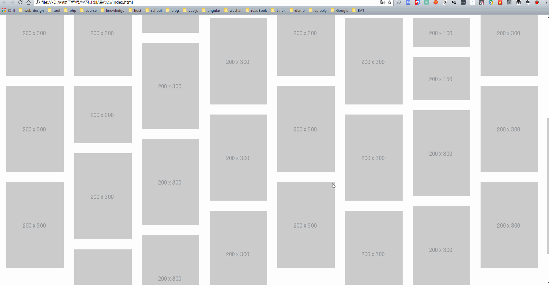
最后走一波效果图
多栏布局与JS实现瀑布流的更多相关文章
- 用js实现瀑布流的一种简单方法
现在说瀑布流式布局似乎有点晚了,但是每一项技术都是向着“精”和“简”的方向在不断发展,在发展到极致之前,需要一个相当漫长的过程,因此,从这个角度来说,当瀑布流被应用得越来越多的时候,反而更应该讨论它, ...
- 原生JS实现瀑布流
浏览网页的时候经常会遇到瀑布流布局的网站.也许有些读者不了解瀑布流.瀑布流,又称瀑布流式布局.是比较流行的一种网站页面布局,视觉表现为参差不齐的多栏布局,随着页面滚动条向下滚动,这种布局还会不断加载数 ...
- js实现瀑布流的一种简单方法实例分享
现在说瀑布流式布局似乎有点晚了,但是每一项技术都是向着“精”和“简”的方向在不断发展,在发展到极致之前,需要一个相当漫长的过程,因此,从这个角度来说,当瀑布流被应用得越来越多的时候,反而更应该讨论它, ...
- 手把手教你js原生瀑布流效果实现
手把手教你js原生瀑布流效果实现 什么是瀑布流效果 首先,让我们先看一段动画: 在动画中,我们不难发现,这个动画有以下特点: 1.所有的图片的宽度都是一样的 2.所有的图片的高度是不一样的 3.图片一 ...
- bootstrap+masonry.js写瀑布流
最近在用bootstrap写一个网站,其中有个图文展示的页面要用到瀑布流的效果.因为项目要求,项目要以bootstrap为基准,不准私自添加内联样式.内部样式,所以,自己写瀑布流就不行了,所以,根据要 ...
- [JS练习] 瀑布流照片墙
记录JS实现瀑布流照片墙效果 首先是前端页面 <!DOCTYPE html> <html lang="en"> <head> <meta ...
- js插件---瀑布流Masonry
js插件---瀑布流Masonry 一.总结 一句话总结:还是要去看官网,比amazeui上面介绍的详细很多 1.瀑布流的原理是什么? 给外层套好相对定位,里面的每一个弄好绝对定位,然后计算出每一个的 ...
- js实现瀑布流以及加载效果
一.瀑布流是个啥? 瀑布流,是比较流行的一种网站页面布局,视觉表现为参差不齐的多栏布局,随着页面滚动条向下滚动,这种布局还会不断加载数据块并附加至当前尾部. 最早采用瀑布流布局的网站是Pinteres ...
- js实现瀑布流加载图片效果
今天学习了一个瀑布流加载效果,很多网站都有瀑布流效果,瀑布流就是很多产品显示在网页上,宽相同,高度不同,表现为多栏布局,随着页面滚动条向下滚动,这种布局还会不断加载数据块并附加至当前尾部.原理是:1. ...
随机推荐
- centos6 安装glibc-2.14.1
CentOS默认的glibc版本为2.12.1, 网上都是给出的升级至glibc-2.14.1的方法, 都是用glibc-2.14.1.tar.gz [root@192-168-0-151 ~]# s ...
- 第二次作业:找Bug
引子 我真的想了一个小时,上哪里去找bug.我昨天还留意到一个bug,今天就不见了.灵光不断,我想起来了.我就要找大公司的产品的bug... 第一部分 调研, 评测 体验. <腾讯桌球>是 ...
- 学习python第五天进制转换
6.进制之间的转换(重要) 二进制:满二进一 范围:0.1符号:0b例如:0b10...[注意]计算机只能识别二进制数据 八进制:满八进一 范围:0~7符号:0o例如:0o66 十进制:满十进一 范围 ...
- 1191. [HNOI2006]超级英雄【二分图】
Description 现在电视台有一种节目叫做超级英雄,大概的流程就是每位选手到台上回答主持人的几个问题,然后根据回答问题的 多少获得不同数目的奖品或奖金.主持人问题准备了若干道题目,只有当选手正确 ...
- 【洛谷】【堆】P1168 中位数
[题目描述:] 给出一个长度为N的非负整数序列A[i],对于所有1 ≤ k ≤ (N + 1) / 2,输出A[1], A[3], …, A[2k - 1]的中位数.即前1,3,5,……个数的中位数. ...
- 【node.js】模块系统、函数
为了让Node.js的文件可以相互调用,Node.js提供了一个简单的模块系统. 一个 Node.js 文件就是一个模块,这个文件可能是JavaScript 代码.JSON 或者编译过的C/C++ 扩 ...
- mongodb的学习-6-命令简单使用
1.创建数据库 use DATABASE_NAME 举例说明: > use another //创建了数据库another switched to db another > db anot ...
- PAT乙级1020
1020 月饼 (25 分) 月饼是中国人在中秋佳节时吃的一种传统食品,不同地区有许多不同风味的月饼.现给定所有种类月饼的库存量.总售价.以及市场的最大需求量,请你计算可以获得的最大收益是多少. ...
- 微信授权获取用户openid前端实现
近来,倒霉的后台跟我说让我拿个openid做微信支付使用,寻思很简单,开始干活. 首先引导用户打开如下链接,只需要将appid修改为自己的就可以,redirect_url写你的重定向url h ...
- 与数论的爱恨情仇--01:判断大素数的Miller-Rabin
在我们需要判断一个数是否是素数的时候,最容易想到的就是那个熟悉的O(√n)的算法.那个算法非常的简单易懂,但如果我们仔细想想,当n这个数字很大的时候,这个算法其实是不够用的,时间复杂度会相对比较高. ...