
5. css定位 居中
1.准备工作
(1)添加背景图片
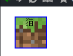
background: url('images/grass.png')
(2)背景图片格式
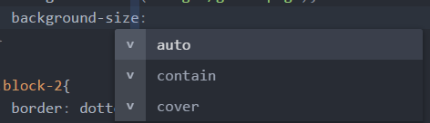
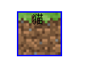
  background-size:contain;    #完全限制在方框

                                                #cover 拉伸覆盖
(3)全部添加
.block-1{

  box-sizing: border-box;

  width: 64px;

  height: 64px;

  background: url('images/grass.png');

  background-size:contain;

}

.block-2{

  box-sizing: border-box;

  width: 128px;

  height: 64px;

  background: url('images/grass.png');

  background-size:contain;

}

.block-3{

  box-sizing: border-box;

  width: 256px;

  height: 64px;

  background: url('images/grass.png');

  background-size:contain;

}
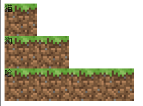
(4)添加个小花
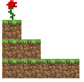
<!DOCTYPE html>

<html>

  <head>

    <meta charset="utf-8">

    <title>Learn css with blocks</title>

    <link rel="stylesheet" href="block.css" media="screen" title="no title" charset="utf-8">

  </head>

  <body>

    <div class="flower"></div>

    <div class="block-1"></div>

    <div class="block-2"></div>

    <div class="block-3"></div>

  </body>

</html>
.block-1{

  box-sizing: border-box;

  width: 64px;

  height: 64px;

  background: url('images/grass.png');

  background-size:contain;

}

.block-2{

  box-sizing: border-box;

  width: 128px;

  height: 64px;

  background: url('images/grass.png');

  background-size:contain;

}

.block-3{

  box-sizing: border-box;

  width: 256px;

  height: 64px;

  background: url('images/grass.png');

  background-size:contain;

}

.flower{

  box-sizing: border-box;

  width: 64px;

  height: 64px;

  background: url('images/rose.png');

  background-size:contain;

}
2.相对定位relative
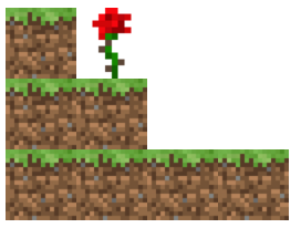
(1)相对定位 position: relative;
.flower{

  box-sizing: border-box;

  width: 64px;

  height: 64px;

  background: url('images/rose.png');

  background-size:contain;

  position: relative;    #相对定位

  left:64px;

  top:64px

}
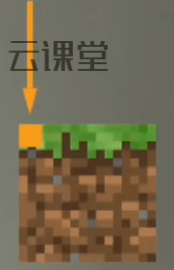
(2)添加图像的原点
  <body>

    <div class="flower">

      <div class="point"></div>

    </div>

    <div class="block-1"></div>

    <div class="block-2"></div>

    <div class="block-3"></div>

  </body>
.point{

  width: 8px;

  height: 8px;

  background: rgb(235, 113, 13)

}
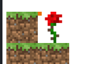
3.绝对定位absolute

(1)添加背景颜色
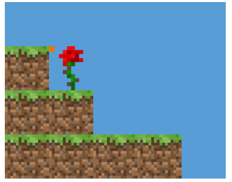
.bg{

  width: 320px;

  height: 256px;

  background: rgb(88, 157, 213);

}
  <body>

    <div class="bg">

      <div class="flower">

        <div class="point"></div>

      </div>

      <div class="block-1"></div>

      <div class="block-2"></div>

      <div class="block-3"></div>

    </div>

  </body>
(2)插一个黄花
      <div class="block-1"></div>

      <div class="yello-flower">

        <div class="point"></div>

      </div>

      <div class="block-2"></div>

      <div class="block-3"></div>
.yello-flower{

  box-sizing: border-box;

  width: 64px;

  height: 64px;

  background: url('images/flower.png');

  background-size: contain;

}

(3)绝对定位
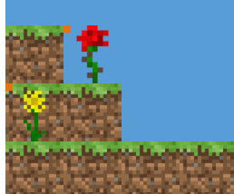
.yello-flower{

  box-sizing: border-box;

  width: 64px;

  height: 64px;

  background: url('images/flower.png');

  background-size: contain;

  position: absolute;    #绝对定位

}
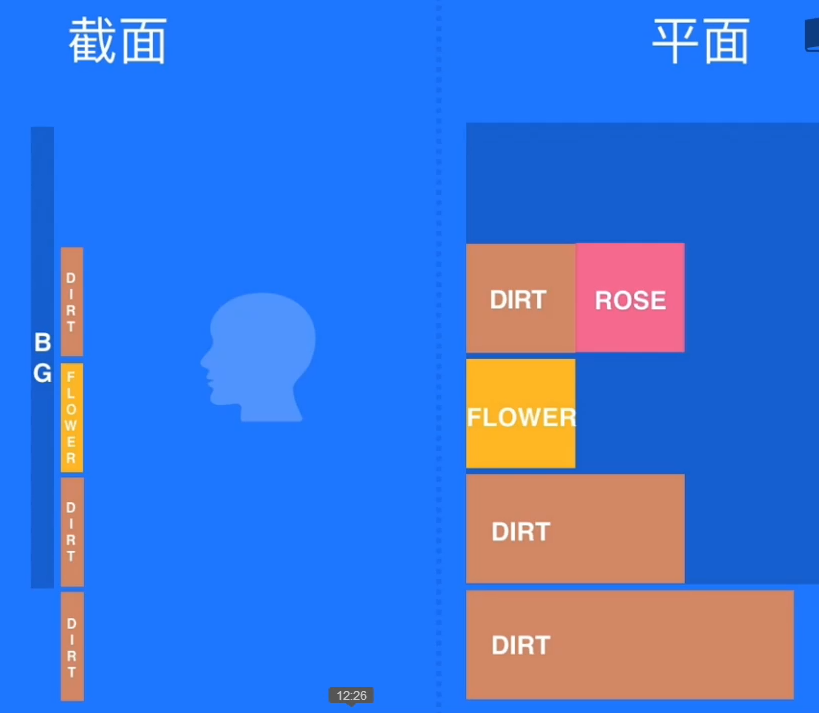
(4)绝对定位的理解

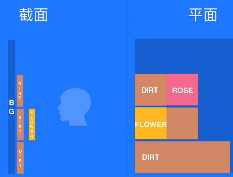
(5)添加偏移量
.yello-flower{

  box-sizing: border-box;

  width: 64px;

  height: 64px;

  background: url('images/flower.png');

  background-size: contain;

  position: absolute;

  left: 128px;       #添加偏移量

}

(6)父级元素必须是定位
- 它的父级元素必须是绝对或者相对定位
- absolute relative
.bg{

  width: 320px;

  height: 256px;

  background: rgb(88, 157, 213);

  position: relative;

}
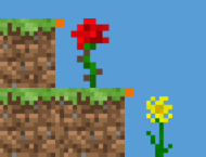
(7)body有定位
- 它会一直向上寻找absolute或者relative
- <body> 标签 它有8px的偏移量,历史原因
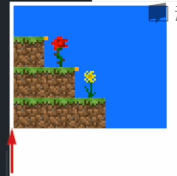
body{

  margin: 0

}
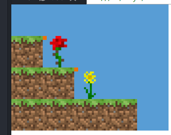
4.基于定位的居中
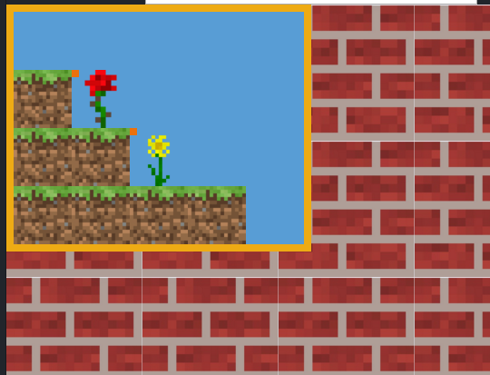
(1)添加边框,和背景图案
.bg{

  border: solid 8px rgb(238, 171, 20);

  width: 320px;

  height: 256px;

  background: rgb(88, 157, 213);

  position: relative;

}

body{

  margin: 0;

  background: url('images/brick.jpg');

  background-size: 150px 150px;

}
(2)flower居中
.flower{

  box-sizing: border-box;

  width: 64px;

  height: 64px;

  background: url('images/rose.png');

  background-size:contain;

  position: relative;

  left:32px;

  top:64px

}
(3)不可以固定尺寸 50% 50%
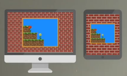


.bg{

  border: solid 8px rgb(238, 171, 20);

  width: 320px;

  height: 256px;

  background: rgb(88, 157, 213);

  position: absolute;

  left: 50%;

  top: 50%

}
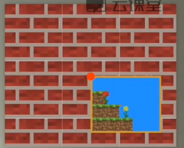
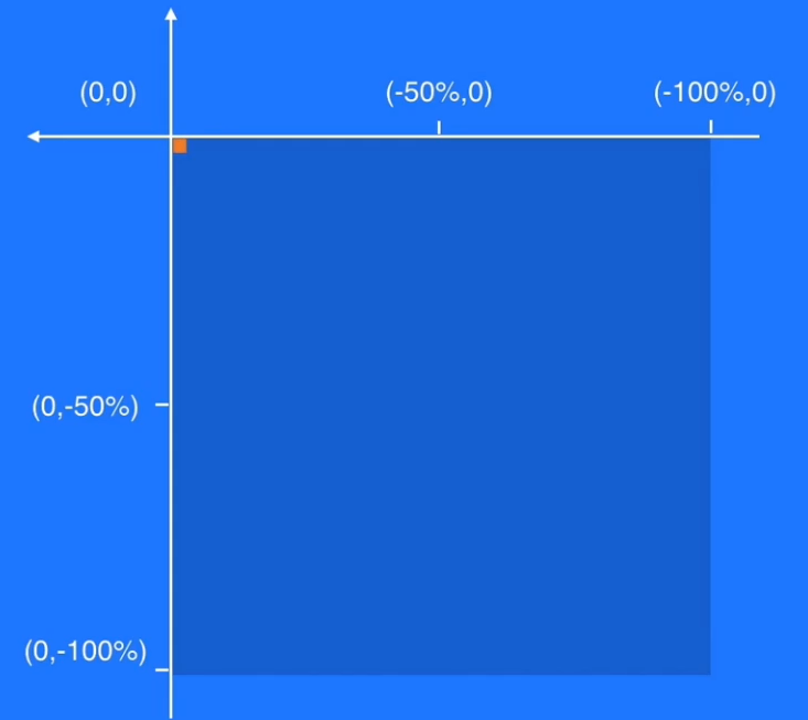
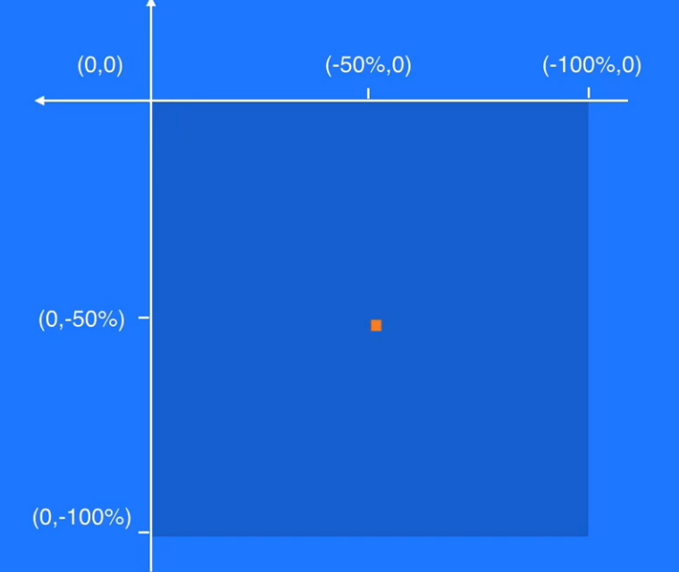
(4) transform修改准星 #css3中出现的
transform: translate(-50%,-50%);
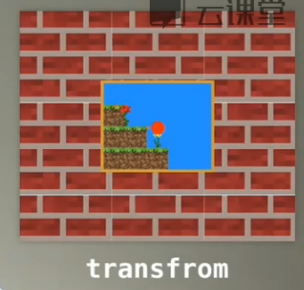
.bg{

  border: solid 8px rgb(238, 171, 20);

  width: 320px;

  height: 256px;

  background: rgb(88, 157, 213);

  position: absolute;

  left: 50%;

  top: 50%;

  transform: translate(-50%,-50%);

}
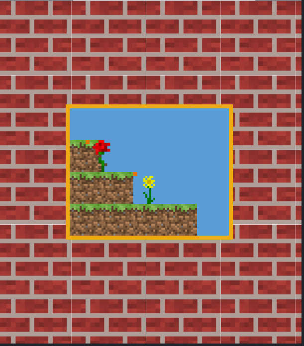
5.完整代码
<!DOCTYPE html>

<html>

  <head>

    <meta charset="utf-8">

    <title>Learn css with blocks</title>

    <link rel="stylesheet" href="block.css" media="screen" title="no title" charset="utf-8">

  </head>

  <body>

    <div class="bg">

      <div class="flower">

        <div class="point"></div>

      </div>

      <div class="block-1"></div>

      <div class="yello-flower">

        <div class="point"></div>

      </div>

      <div class="block-2"></div>

      <div class="block-3"></div>

    </div>

  </body>

</html>
.block-1{

  box-sizing: border-box;

  width: 64px;

  height: 64px;

  background: url('images/grass.png');

  background-size:contain;

}

.block-2{

  box-sizing: border-box;

  width: 128px;

  height: 64px;

  background: url('images/grass.png');

  background-size:contain;

}

.block-3{

  box-sizing: border-box;

  width: 256px;

  height: 64px;

  background: url('images/grass.png');

  background-size:contain;

}

.flower{

  box-sizing: border-box;

  width: 64px;

  height: 64px;

  background: url('images/rose.png');

  background-size:contain;

  position: relative;

  left:32px;

  top:64px

}

.yello-flower{

  box-sizing: border-box;

  width: 64px;

  height: 64px;

  background: url('images/flower.png');

  background-size: contain;

  position: absolute;

  left: 128px;

}

.point{

  width: 8px;

  height: 8px;

  background: rgb(235, 113, 13)

}

.bg{

  border: solid 8px rgb(238, 171, 20);

  width: 320px;

  height: 256px;

  background: rgb(88, 157, 213);

  position: absolute;

  left: 50%;

  top: 50%;

  transform: translate(-50%,-50%);

}

body{

  margin: 0;

  background: url('images/brick.jpg');

  background-size: 150px 150px;

}
5. css定位 居中的更多相关文章
- vue—你必须知道的 js数据类型 前端学习 CSS 居中 事件委托和this 让js调试更简单—console AMD && CMD 模式识别课程笔记(一) web攻击 web安全之XSS JSONP && CORS css 定位 react小结
vue—你必须知道的 目录 更多总结 猛戳这里 属性与方法 语法 计算属性 特殊属性 vue 样式绑定 vue事件处理器 表单控件绑定 父子组件通信 过渡效果 vue经验总结 javascript ...
- css3-7 如何让页面元素水平垂直都居中(元素定位要用css定位属性)
css3-7 如何让页面元素水平垂直都居中(元素定位要用css定位属性) 一.总结 一句话总结:元素定位要用css定位属性,而且一般脱离文档流更加好操作.先设置为绝对定位,上左都50%,然后margi ...
- CSS定位布局
CSS定位布局 基础知识 在CSS布局中,定位布局也是一种非常常见的技术手段,我们以京东为例: 上面是非常好的例子,对于定位布局来说它可以将一个元素放在页面上的任意一个位置. 但是定位布局也不能滥用, ...
- CSS中居中的完全指南(中英对照翻译)
翻译自:https://css-tricks.com/centering-css-complete-guide/ Centering things in CSS is the poster child ...
- CSS定位走一波(定位学习续)
又是新的一周过去了,时间到了,春天绿了,关于HTML5的学习进步了,今天博客更新一些CSS定位的内容,小的一些细节也要牢记,方便做一个更完美的项目. 如何让垂直方向居中,解决方式:在父元素添加over ...
- css定位
文档流 所谓的文档流,指的是元素排版布局过程中,元素会自动从左往右,从上往下的流式排列.并最终窗体自上而下分成一行行, 并在每行中按从左至右的顺序排放元素.脱离文档流即是元素打乱了这个排列,或是从排版 ...
- 常用的CSS定位,XPath定位和JPath定位
CSS定位 举例 描述 div#menu id为menu的div元素 div.action-btn.ok-btn class为action-btn和ok-btn的div元素 table#emailLi ...
- 【转】css布局居中和CSS内容居中区别和对应DIV CSS代码
原文地址:http://www.divcss5.com/jiqiao/j771.shtml css布局居中和CSS内容居中区别和对应DIV CSS代码教程与图文代码案例篇 对于新手来说DIV CSS布 ...
- div+css定位position详解
div+css定位position详解 1.div+css中的定位position 最主要的两个属性:属性 absolute(绝对定位) relative(相对定位),有他们才造就了div+css布局 ...
随机推荐
- 使用python做最简单的爬虫
使用python做最简单的爬虫 --之心 #第一种方法import urllib2 #将urllib2库引用进来response=urllib2.urlopen("http://www.ba ...
- Python用户交互与流程控制
1. 用户交互 python3通过input实现用户交互,与python2的raw_input一样,接收的值都转换成字符串格式.python2中也有一个input,而python2中的input接收的 ...
- CORS跨域限制以及预请求验证
之前我们可以通过“Access-Control-Allow-Origin”,实现跨域请求,那是不是所有跨域请求都可以通过设置Access-Control-Allow-Origin实现跨域请求呢?显然不 ...
- JS判断手机横竖屏
在移动端开发时,有时候需要判断手机的横竖屏,那么就需要用到window.orientation这个参数,通过这个参数可以判断出手机是处在横屏还是竖屏状态. 屏幕方向对应的window.orientat ...
- 2018.8.18 servlet使用的会话跟踪除session外还有哪些方式
解释HTTP HTTP是一种无连接的协议,如果一个客户端只是单纯地请求一个文件(HTML或GIF),服务器端可以响应给客户端,并不需要知道一连串的请求是否来自于相同的客户端,而且也不需要担心客户端是否 ...
- cudpp库的编译和使用
项目主页 http://cudpp.github.io/ 根据这个网址的提示进行 https://github.com/cudpp/cudpp/wiki/BuildingCUDPPwithCMake ...
- 一、初始Object-C
一.OC概述 特点: 1没有包得概念 2关键字以@开头 3.拓展名 .m 二.第一个OC类 1,分为2个文件..m和.h文件 2. .m文件用来实现类 .h用来定义声明类 .h文件中得写法 //@i ...
- BIO与NIO
BIO与NIO 1.传统BIO (1)特点 面向数据流 阻塞式传输 一个客户端对应一个线程 在客户机增多的情况下,线程资源随之增多,会造成cpu资源枯竭 (2)需求 客户机向服务器输出字符串,逐一 ...
- ES6的数组方法之Array.from
首先说说什么是数组:数组在类型划分上归为Object,属于比较特殊的对象,数组的索引值类似于对象的key值. 数组的几个注意点: 1.数组的长度是可读属性,不可更改,数组的长度根据索引最大值. 2.数 ...
- C++声明之CV限定符
目录 1.const 1.1 const obj 如果调用 non-const member fun会编译出错 经典错误 1.2 例子:STD里的操作符重载 1.3 例子:<cpp primer ...