
Photoshop和WPF双剑配合,打造炫酷个性的进度条控件
现在如果想打造一款专业的App,UI的设计和操作的简便性相当重要。UI设计可以借助Photoshop或者AI等设计工具,之前了解到WPF设计工具Expression Blend可以直接导入PSD文件或者AI设计文件(当然不是全部特征支持),最近研究了一下,也费了一番周折,好在最后实现了预期的效果。下面将step by step用示例说明如何先用PS构建一个矢量图形模板,然后用Expression Blend导入PSD文件,并获取PATH的Data值,为打造一款炫酷的个性进度条控件构建美观UI。
1、打开Photoshop,新建一个空白图层,点选PS的图案图章工具:

2、选择画笔,选用喜欢的笔刷(可以到网站上下载免费的笔刷),如下图:
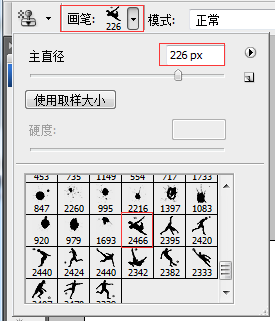
在合适位置点击后,如下图所示。
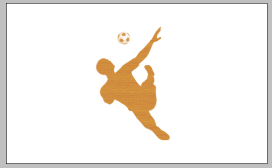
3、按住CTRL,选中图层,切换到路径面板,点击 【从选取创建工作路径】 按钮,如下图:

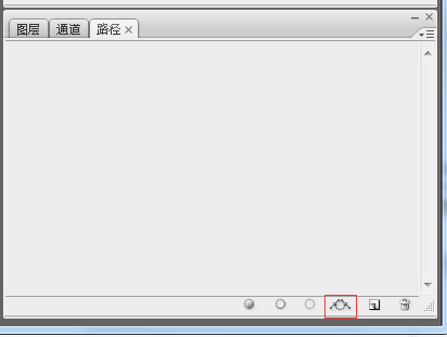
注意上图的红框按钮,就是【从选取创建工作路径】,点击后出现下图:

4、这是最关键的一步,创建矢量蒙板,切换到图层面板,点选【钢笔】工具,在图形上右键菜单中选择【创建矢量蒙板】项,如下图所示:
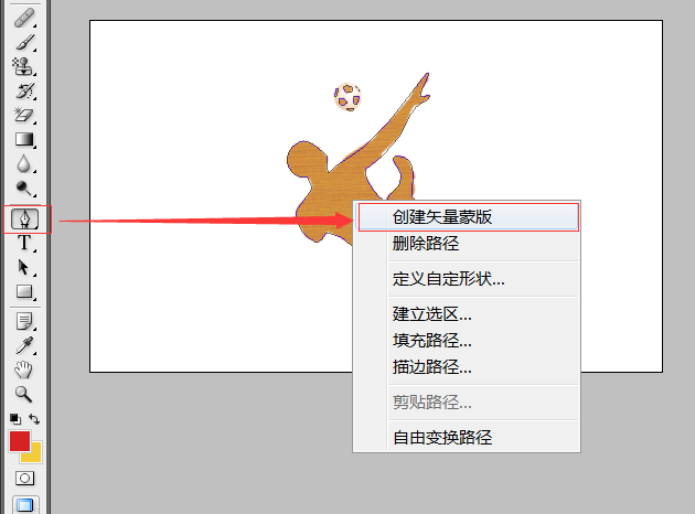
然后PS中可以看到下图的效果,说明创建成功。

保存PS文件为进度条.PSD文件待用。
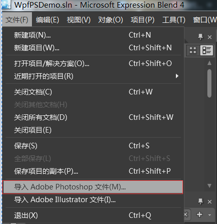
5、打开Expression Blend 4新建一个WPF项目,然后导入PSD文件,如下图:

导入成功后,可以复制该图形的clip数据,这就是WPF中PATH所需要的Data值。
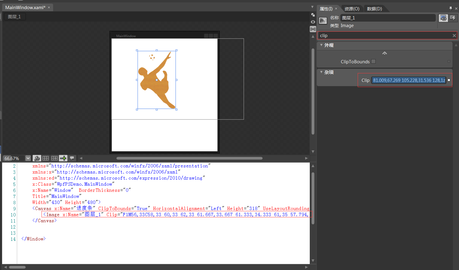
下面来创建一个炫酷的WPF进度条控件。
6、在VS2010中重新打开该项目,并添加一个WPF自定义控件库,如下图:

17 编写控件UI和后台代码,如下所示:
 <ResourceDictionary

     xmlns="http://schemas.microsoft.com/winfx/2006/xaml/presentation"

     xmlns:x="http://schemas.microsoft.com/winfx/2006/xaml"

     xmlns:local="clr-namespace:WpfCustomProgressControl">

     <Style TargetType="{x:Type local:CustomProgressControl}">

         <Setter Property="Template">

             <Setter.Value>

                 <ControlTemplate TargetType="{x:Type local:CustomProgressControl}">

                     <Grid x:Name="PART_container"

                           Background="{TemplateBinding Background}"

                           Width="{TemplateBinding Width}"

                           Height="{TemplateBinding Height}">

                         <Path x:Name="PART_foreground_P"

                               Visibility="Collapsed"

                               Stretch="Fill"

                               Stroke="Transparent"

                               Fill="{TemplateBinding Foreground}"

                               StrokeThickness="2"

                               Data="F1M56,33C58,33 60,33 62,33 61.667,33.667 61.333,34.333 61,35 57.794,34.859 53.856,36.079 56,33z M49,24C54.364,24.735 53.554,24.821 56,28 53.807,30.696 55.287,29.902 51,31 50,30 49,29 48,28 48.333,26.667 48.667,25.333 49,24z M62,22C63.666,22.333 65.333,22.667 67,23 66.333,27.571 65.935,27.376 64,30 63,29.333 62,28.667 61,28 61,27.667 61,27.333 61,27 61.333,25.333 61.667,23.666 62,22z M46,15C46.667,15 47.333,15 48,15 47.333,17.333 46.667,19.667 46,22 45.333,22 44.667,22 44,22 44.667,19.667 45.333,17.333 46,15z M63,13C64.923,14.392 63.599,13.101 65,15 64.333,14.333 63.667,13.667 63,13z M55,12C56.666,12.667 58.333,13.333 60,14 60,15.333 60,16.667 60,18 59.333,18 58.667,18 58,18 54.722,21.928 52.838,16.561 52,14 53,13.333 54,12.667 55,12z M128,1C128.667,1 129.333,1 130,1 128.882,10.058 122.793,12.326 122,23 126.364,22.028 126.876,21.206 131,22 130,23.333 129,24.667 128,26 110.659,32.752 112.704,45.252 103,59 95.769,69.245 82.761,82.131 72,89 72.621,101.092 82.373,112.463 90,118 90.333,118 90.667,118 91,118 93.274,107.421 107.464,106.386 104,92 101.667,87.667 99.333,83.333 97,79 98,78 99,77 100,76 122.812,77.152 112.786,100.488 115,114 116.666,115.666 118.333,117.333 120,119 127.359,142.373 118.776,160.626 106,168 110.337,176.877 114.918,188.188 121,197 127.441,206.332 140.794,210.508 148,220 146.506,223.067 146.885,223.215 144,225 113.08,236.802 62.376,138.34 36,147 34.077,151.751 32.347,152.761 28,155 17.556,150.255 9.333,141.565 9,127 13.999,120.001 19,112.999 24,106 22.667,102.667 21.333,99.333 20,96 7.555,96.019 4.392,90.889 1,82 1.465,74.486 3.768,68.82 9,66 19.848,56.341 31.922,71.946 38,77 37.406,83.299 36.792,87.413 39,92 41.333,89.667 43.667,87.333 46,85 81.009,67.269 105.228,31.536 128,1z" />

                         <Rectangle x:Name="PART_mask"

                                    Fill="{TemplateBinding Background}"

                                    VerticalAlignment="Stretch"

                                    HorizontalAlignment="Stretch" />

                         <Path x:Name="PART_outline_P"

                               Visibility="Collapsed"

                               Stretch="Fill"

                               Stroke="{TemplateBinding BorderBrush}"

                               Fill="Transparent"

                               StrokeThickness="2"

                               Data="F1M56,33C58,33 60,33 62,33 61.667,33.667 61.333,34.333 61,35 57.794,34.859 53.856,36.079 56,33z M49,24C54.364,24.735 53.554,24.821 56,28 53.807,30.696 55.287,29.902 51,31 50,30 49,29 48,28 48.333,26.667 48.667,25.333 49,24z M62,22C63.666,22.333 65.333,22.667 67,23 66.333,27.571 65.935,27.376 64,30 63,29.333 62,28.667 61,28 61,27.667 61,27.333 61,27 61.333,25.333 61.667,23.666 62,22z M46,15C46.667,15 47.333,15 48,15 47.333,17.333 46.667,19.667 46,22 45.333,22 44.667,22 44,22 44.667,19.667 45.333,17.333 46,15z M63,13C64.923,14.392 63.599,13.101 65,15 64.333,14.333 63.667,13.667 63,13z M55,12C56.666,12.667 58.333,13.333 60,14 60,15.333 60,16.667 60,18 59.333,18 58.667,18 58,18 54.722,21.928 52.838,16.561 52,14 53,13.333 54,12.667 55,12z M128,1C128.667,1 129.333,1 130,1 128.882,10.058 122.793,12.326 122,23 126.364,22.028 126.876,21.206 131,22 130,23.333 129,24.667 128,26 110.659,32.752 112.704,45.252 103,59 95.769,69.245 82.761,82.131 72,89 72.621,101.092 82.373,112.463 90,118 90.333,118 90.667,118 91,118 93.274,107.421 107.464,106.386 104,92 101.667,87.667 99.333,83.333 97,79 98,78 99,77 100,76 122.812,77.152 112.786,100.488 115,114 116.666,115.666 118.333,117.333 120,119 127.359,142.373 118.776,160.626 106,168 110.337,176.877 114.918,188.188 121,197 127.441,206.332 140.794,210.508 148,220 146.506,223.067 146.885,223.215 144,225 113.08,236.802 62.376,138.34 36,147 34.077,151.751 32.347,152.761 28,155 17.556,150.255 9.333,141.565 9,127 13.999,120.001 19,112.999 24,106 22.667,102.667 21.333,99.333 20,96 7.555,96.019 4.392,90.889 1,82 1.465,74.486 3.768,68.82 9,66 19.848,56.341 31.922,71.946 38,77 37.406,83.299 36.792,87.413 39,92 41.333,89.667 43.667,87.333 46,85 81.009,67.269 105.228,31.536 128,1z" />

                         <TextBlock x:Name="PART_percentage_text"

                                    VerticalAlignment="Center"

                                    HorizontalAlignment="Center"

                                    FontSize="16"

                                    FontWeight="ExtraBlack"

                                    Foreground="{TemplateBinding TextForeground}"/>

                     </Grid>

                 </ControlTemplate>

             </Setter.Value>

         </Setter>

     </Style>

 </ResourceDictionary>
 using System;

 using System.Collections.Generic;

 using System.Linq;

 using System.Text;

 using System.Windows;

 using System.Windows.Controls;

 using System.Windows.Data;

 using System.Windows.Documents;

 using System.Windows.Input;

 using System.Windows.Media;

 using System.Windows.Media.Imaging;

 using System.Windows.Navigation;

 using System.Windows.Shapes;

 namespace WpfCustomProgressControl

 {

     [TemplatePart(Name = "PART_mask", Type = typeof(Rectangle))]

     [TemplatePart(Name = "PART_container", Type = typeof(Grid))]

     [TemplatePart(Name = "PART_percentage_text", Type = typeof(TextBlock))]

     [TemplatePart(Name = "PART_foreground_P", Type = typeof(Path))]

     [TemplatePart(Name = "PART_outline_P", Type = typeof(Path))]

     public class CustomProgressControl : ProgressBar

     {

         static CustomProgressControl()

         {

             DefaultStyleKeyProperty.OverrideMetadata(typeof(CustomProgressControl), new FrameworkPropertyMetadata(typeof(CustomProgressControl)));

         }

         Rectangle mask;

         Grid container;

         TextBlock percentageText;

         Path foreground_P;

         Path outline_P;

         #region TextForeground 文本

         public SolidColorBrush TextForeground

         {

             get { return (SolidColorBrush)GetValue(TextForegroundProperty); }

             set { SetValue(TextForegroundProperty, value); }

         }

         public static readonly DependencyProperty TextForegroundProperty =

             DependencyProperty.Register("TextForeground", typeof(SolidColorBrush),

                                 typeof(CustomProgressControl),

                                 new FrameworkPropertyMetadata(new SolidColorBrush(Colors.DarkGray)));

         #endregion

         public override void OnApplyTemplate()

         {

             base.OnApplyTemplate();

             foreground_P = this.Template.FindName("PART_foreground_P", this) as Path;

             outline_P = this.Template.FindName("PART_outline_P", this) as Path;

             mask = this.Template.FindName("PART_mask", this) as Rectangle;

             container = this.Template.FindName("PART_container", this) as Grid;

             percentageText = this.Template.FindName("PART_percentage_text", this) as TextBlock;

             if (foreground_P != null)

             {

                 foreground_P.Visibility = Visibility.Visible;

                 outline_P.Visibility = Visibility.Visible;

             }

             Width = double.IsNaN(Width) ?  : Width;

             Height = double.IsNaN(Height) ?  : Height;

             Minimum = double.IsNaN(Minimum) ?  : Minimum;

             Maximum = double.IsNaN(Maximum) ?  : Maximum;

             if (mask != null)

             {

                 var percentageValue = Value / Maximum;

                 var awayMargin = percentageValue * Height;

                 var percentageString = string.Empty;

                 if (percentageValue > )

                     percentageString = (percentageValue * ).ToString("##");

                 else if (percentageValue == )

                     percentageString = "";

                 percentageText.Text = string.Format("{0}%", string.IsNullOrEmpty(percentageString) ? "" : percentageString);

                 mask.Margin = new Thickness(, , , awayMargin);

             }

             container.Clip = new RectangleGeometry

             {

                 Rect = new Rect(, , Width, Height)

             };

             mask.Width = Width;

             mask.Height = Height;

         }

         protected override void OnValueChanged(double oldValue, double newValue)

         {

             base.OnValueChanged(oldValue, newValue);

             if (Value < Minimum)

             {

                 Value = Minimum;

             }

             if (Value > Maximum)

             {

                 Value = Maximum;

             }

             if (mask != null)

             {

                 var percentageValue = Value / Maximum;

                 var awayMargin = percentageValue * Height;

                 var percentageString = string.Empty;

                 if (percentageValue > )

                     percentageString = (percentageValue * ).ToString("##");

                 else if (percentageValue == )

                     percentageString = "";

                 percentageText.Text = string.Format("{0}%", string.IsNullOrEmpty(percentageString) ? "" : percentageString);

                 //蒙板来变更进度

                 mask.Margin = new Thickness(, , , awayMargin);

             }

         }

     }

 }
18 在WpfPSDemo的主界面上拖入控件,并定制属性,代码如下:
 <Window

     xmlns="http://schemas.microsoft.com/winfx/2006/xaml/presentation"

     xmlns:x="http://schemas.microsoft.com/winfx/2006/xaml"

     xmlns:ed="http://schemas.microsoft.com/expression/2010/drawing"

     x:Class="WpfPSDemo.MainWindow"

     x:Name="Window"  BorderThickness="0"

     Title="MainWindow"

     Width="430" Height="480" xmlns:my="clr-namespace:WpfCustomProgressControl;assembly=WpfCustomProgressControl">

     <my:CustomProgressControl  Name="customProgressControl1" Width="200" Height="200" Value="50" Background="Yellow" Foreground="Red" BorderBrush="red" />

 </Window>
 using System;

 using System.Collections.Generic;

 using System.Text;

 using System.Windows;

 using System.Windows.Controls;

 using System.Windows.Data;

 using System.Windows.Documents;

 using System.Windows.Input;

 using System.Windows.Media;

 using System.Windows.Media.Imaging;

 using System.Windows.Shapes;

 using System.Threading;

 namespace WpfPSDemo

 {

     /// <summary>

     /// MainWindow.xaml 的交互逻辑

     /// </summary>

     public partial class MainWindow : Window

     {

         Thread timeThread;

         int i = ;

         public MainWindow()

         {

             this.InitializeComponent();

             this.customProgressControl1.Value = ;

             this.Background = Brushes.Yellow;

             timeThread = new Thread(new ThreadStart(DispatcherThread));

             timeThread.Start();

         }

         public void DispatcherThread()

         {

             //可以通过循环条件来控制UI的更新

             while (true)

             {

                 ///线程方法委托(无参方法)

                 this.customProgressControl1.Dispatcher.BeginInvoke(new Action(UpdateTime));

                 Thread.Sleep();

             }

         }

         private void UpdateTime()

         {

             if (i < )

             {

                 i++;

                 this.customProgressControl1.Value = i;

             }

             else

             {

                 timeThread.Abort();

             }

         }

     }

 }
运行代码,效果如下: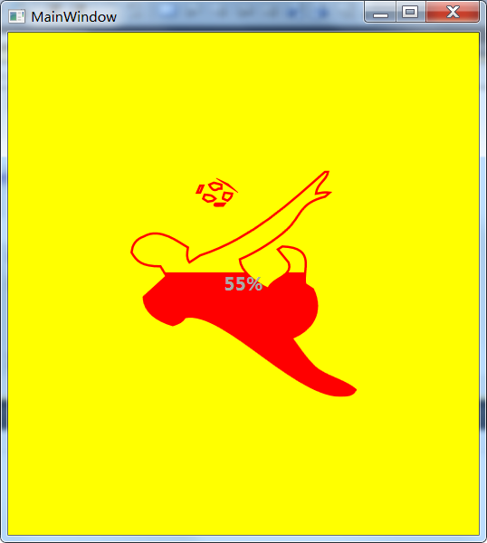
Photoshop和WPF双剑配合,打造炫酷个性的进度条控件的更多相关文章
- 示例:WPF中Slider控件封装的缓冲播放进度条控件
原文:示例:WPF中Slider控件封装的缓冲播放进度条控件 一.目的:模仿播放器播放进度条,支持缓冲任务功能 二.进度: 实现类似播放器中带缓存的播放样式(播放区域.缓冲区域.全部区域等样式) 实现 ...
- WPF自定义控件第一 - 进度条控件
本文主要针对WPF新手,高手可以直接忽略,更希望高手们能给出一些更好的实现思路. 前期一个小任务需要实现一个类似含步骤进度条的控件.虽然对于XAML的了解还不是足够深入,还是摸索着做了一个.这篇文章介 ...
- iOSQuartz2D-02-绘制炫酷的下载进度条
效果图 实现思路 要实现绘图,通常需要自定义一个UIView的子类,重写父类的- (void)drawRect:(CGRect)rect方法,在该方法中实现绘图操作 若想显示下载进度,只需要实例化自定 ...
- Android自定义View(RollWeekView-炫酷的星期日期选择控件)
转载请标明出处: http://blog.csdn.net/xmxkf/article/details/53420889 本文出自:[openXu的博客] 目录: 1分析 2定义控件布局 3定义Cus ...
- Android ViewPager 打造炫酷欢迎页
Android ViewPager 打造炫酷欢迎页 ViewPager是Android扩展v4包中的类,这个类可以让用户切换当前的View.对于这个类的应用场景,稍加修改就可以应用到多个环境下.比如: ...
- Android 教你打造炫酷的ViewPagerIndicator 不仅仅是高仿MIUI
1.概述 哈,今天给大家带来一个ViewPagerIndicator的制作,相信大家在做tabIndicator的时候,大多数人都用过 TabPageIndicator,并且很多知名APP都使用过这个 ...
- JParticles 2.0 发布,打造炫酷的粒子特效
JParticles 2.0 发布,打造炫酷的粒子特效.不好意思哈,在这么繁花似锦的世界里,标题不得不取得吸引眼球一点哈,不然...还是不啰嗦了,我们进入正题吧 简单介绍一下 JParticles 2 ...
- C# WPF 低仿网易云音乐(PC)歌词控件
原文:C# WPF 低仿网易云音乐(PC)歌词控件 提醒:本篇博客记录了修改的过程,废话比较多,需要项目源码和看演示效果的直接拉到文章最底部~ 网易云音乐获取歌词的api地址 http://music ...
- WPF加载Winform窗体时 报错:子控件不能为顶级窗体
一.wpf项目中引用WindowsFormsIntegration和System.Windows.Forms 二.Form1.Designer.cs 的 partial class Form1 设置为 ...
随机推荐
- windows phone listbox的点击事件
前台 <ListBox x:Name="> <ListBox.ItemTemplate> <DataTemplate> <Grid Margin=& ...
- php代码习惯(一)
1: 利用sprintf来绑定变量,分离绑定的参数与语句 $query = sprintf("SELECT * FROM users WHERE user='%s' AND password ...
- Dijkstra算法(一)之 C语言详解
本章介绍迪杰斯特拉算法.和以往一样,本文会先对迪杰斯特拉算法的理论论知识进行介绍,然后给出C语言的实现.后续再分别给出C++和Java版本的实现. 目录 1. 迪杰斯特拉算法介绍 2. 迪杰斯特拉算法 ...
- MongoDB的学习--explain()和hint()
Explain 从之前的文章中,我们可以知道explain()能够提供大量与查询相关的信息.对于速度比较慢的查询来说,这是最重要的诊断工具之一.通过查看一个查询的explain()输出信息,可以知道查 ...
- UML学习总结
UML中的4+1模型 UML的4+1模型是一个叫Kruchten的人发明的,但网上还有其它版本的4+1 模型:Use case view, Logic view, Process view, Impe ...
- expdp/impdp 参数说明,中英对照
任意可以使用expdp/impdp的环境,都可以通过help=y看到帮助文档. 1.expdp参数说明 2.impdp参数说明 3.expdp参数说明(中文) 4.impdp参数说明(中文) 1.ex ...
- ShineTime - 带有 CSS3 闪亮特效的缩略图相册
ShineTime 是一个效果非常精致的缩略图相册,鼠标悬停到缩略图的时候有很炫的闪光效果,基于 CSS3 实现,另外缩略图也会有立体移动的效果.特别适用于个人摄影作品,公司产品展示等用途,快来来围观 ...
- javaccript学习1
1.javascript中的三种消息框 (1)警告框 警告框经常用于确保用户可以得到某些信息. 当警告框出现后,用户需要点击确定按钮才能继续进行操作. 语法: alert("文本" ...
- Android抓包方法(三)之Win7笔记本Wifi热点+WireShark工具
Android抓包方法(三) 之Win7笔记本Wifi热点+WireShark工具 前言 做前端测试,基本要求会抓包,会分析请求数据包,查看接口是否调用正确,数据返回是否正确,问题产生是定位根本原因等 ...
- Windows Azure Virtual Machine (31) 迁移Azure虚拟机
<Windows Azure Platform 系列文章目录> 为什么要写这篇Blog? 之前遇到过很多客户提问: (1)我之前创建的虚拟机,没有加入虚拟网络.现在需要重新加入虚拟机网络, ...