9、线性布局(Row和Column)
自定义的IconContainer
void main() {

  runApp(MaterialApp(

      theme: ThemeData(primarySwatch: Colors.yellow),

      home: Scaffold(

        appBar: AppBar(title: const Text("这是导航栏")),

        body: MyApp(),

      )));

}

class MyApp extends StatelessWidget {

  const MyApp({super.key});

  @override

  Widget build(BuildContext context) {

    return IconContainer(Icons.ac_unit,color: Colors.yellow);

  }

}

//自定义的IconContainer

class IconContainer extends StatelessWidget {

  Color color;

  IconData icon;

  // IconContainer(this.icon ,{super.key,required this.color}); // 与下方效果一样

    // IconContainer(this.icon ,{Key? key,required this.color}) : super(key: key);

  IconContainer(this.icon ,{Key? key, this.color=Colors.red}) : super(key: key); //可传入颜色(也可以不用传入颜色)


@override

  Widget build(BuildContext context) {

    return Container(

      alignment: Alignment.center, //内容居中

      color: color,

      height: 200,

      width: 200,

      child: Icon(icon,size: 50,),

    );

  }

}
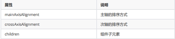
mainAxisAlignment 用于指定子组件在主轴(水平方向)上的对齐方式
MainAxisAlignment.start(默认值):子组件将在主轴的起始位置对齐。
MainAxisAlignment.end:子组件将在主轴的末尾位置对齐。
MainAxisAlignment.center:子组件将在主轴的中心位置对齐。
MainAxisAlignment.spaceBetween:子组件将会均匀地分布在主轴上,首个和最后一个子组件分别与 Row 的起始和末尾位置对齐。
MainAxisAlignment.spaceAround:子组件将会均匀地分布在主轴上,子组件之间以及首个和最后一个子组件与 Row 的边界之间有相等的间距。
MainAxisAlignment.spaceEvenly:子组件将会均匀地分布在主轴上,子组件之间和首个、最后一个子组件与 Row 的边界之间的间距都相等。
MainAxisAlignment.spaceEvenly:子组件将会均匀地分布在主轴上,子组件之间和首个、最后一个子组件与 Row 的边界之间的间距都相等。
crossAxisAlignment 用于指定子组件在交叉轴(垂直方向)上的对齐方式(要有父容器)
CrossAxisAlignment.start:子组件将在交叉轴的起始位置对齐。
CrossAxisAlignment.end:子组件将在交叉轴的末尾位置对齐。
CrossAxisAlignment.center(默认值):子组件将在交叉轴的中心位置对齐。
CrossAxisAlignment.stretch:在交叉轴上拉伸子组件以匹配父容器的高度。
CrossAxisAlignment.baseline:子组件将使用 textDecorationStyle 属性构建一个水平基线对齐。
Row 水平布局组件
class MyRow extends StatelessWidget {

  const MyRow({super.key});

  @override

  Widget build(BuildContext context) {

    return Container(

      width: double.infinity, //无穷的

      height: double.infinity,

      color: Color.fromARGB(255, 7, 189, 158),

      child:  Row(

      mainAxisAlignment: MainAxisAlignment.spaceBetween, //X轴

      crossAxisAlignment:CrossAxisAlignment.center, //相对与Container(父盒子) Y轴

      children: [

        IconContainer(Icons.ac_unit,color: Colors.yellow), //自定义的方法

        IconContainer(Icons.home_max,color: Color.fromARGB(255, 226, 12, 47)),

        IconContainer(Icons.ac_unit,color: Color.fromARGB(255, 9, 31, 155)),

      ],

    ),

    );

  }

}
Column垂直布局组件
class MyColumn extends StatelessWidget {

  // const MyColumn({super.key});

 const MyColumn({Key? key}) : super(key: key);

  @override

  Widget build(BuildContext context) {

        return Container(

      width: double.infinity, //无穷的

      height: double.infinity,

      color: Color.fromARGB(255, 7, 189, 158),

      child:  Column(

      mainAxisAlignment: MainAxisAlignment.spaceBetween, //  Y轴

      crossAxisAlignment:CrossAxisAlignment.end, //相对与Container  X轴

      children: [

        IconContainer(Icons.ac_unit,color: Colors.yellow),

        IconContainer(Icons.home_max,color: Color.fromARGB(255, 226, 12, 47)),

        IconContainer(Icons.ac_unit,color: Color.fromARGB(255, 9, 31, 155)),

      ],

    ),

    );

  }

}
double.infifinity 和double.maxFinite
我想成为我的父母所允许的最大的(double.infinity)
一些小部件允许他们的孩子像他们想要的那样大。
9、线性布局(Row和Column)的更多相关文章
- Flutter 布局类组件:线性布局(Row和Column)
前言 所谓线性布局,即指沿水平或垂直方向排布子组件.Flutter中通过Row和Column来实现线性布局,并且它们都继承自弹性布局(Flex). 接口描述 Row({ Key key, // 表示子 ...
- 12.Quick QML-QML 布局(Row、Column、Grid、Flow和嵌套布局) 、Repeater对象
1.Row布局 Row中的item可以不需要使用anchors布局,就能通过行的形式进行布局. 并且item可以使用Positioner附加属性来访问有关其在Row中的位置及其他信息. 示例如下所示, ...
- Flutter 布局(七)- Row、Column详解
本文主要介绍Flutter布局中的Row.Column控件,详细介绍了其布局行为以及使用场景,并对源码进行了分析. 1. Row A widget that displays its children ...
- 从头学Android之Android布局管理:LinerLayout线性布局
LinerLayout线性布局: 这种布局方式是指在这个里面的控件元素显线性,我们可以通过setOrientation(int orientation)来指定线性布局的显示方式,其值有:HORIZON ...
- Android 线性布局(LinearLayout)相关官方文档 - 指南部分
Android 线性布局(LinearLayout)相关官方文档 - 指南部分 太阳火神的漂亮人生 (http://blog.csdn.net/opengl_es) 本文遵循"署名-非商业用 ...
- Android-RelativeLayout(相对布局)、LinearLayout(线性布局)
RelativeLayout(相对布局):按照各子元素之间的位置关系完成布局. 定位:android:layout_above="@id/xxx" --将控件置于给定ID控件之上 ...
- Android-LinearLayout(线性布局)
布局:Android为我们提供了一个View和ViewGroup子类的集合.ViewGroup类是View的子类,也被称为Layout布局,它提供了流式布局.线性布局等多种布局方式.View是绘制在屏 ...
- android—-线性布局
android五大布局之线性布局. 1.线性布局的特点:各个子元素彼此连接,中间不留空白 而今天我们要讲解的就是第一个布局,LinearLayout(线性布局),我们屏幕适配的使用 用的比较多的就是L ...
- android学习之线性布局
效图如下 移通152余继彪 该布局使用了线性布局完成 父布局为线性布局,黄色和灰色部分为水平的线性布局,剩余50%部分为水平线性布局,该布局中包含了两个垂直的线性布局分别占了三分之1和三分之二
- android开发------编写用户界面之线性布局
一个好的应用程序离不开人性化的用户界面.在学习其他东西之前.理应先学习编写程序的布局(外观) 今天,我们就来学习android的UI布局----LinearLayout. LinearLayout,即 ...
随机推荐
- Linux系列教程——Linux发展介绍、Linux系统安装、查看Linux内核版本和系统版本、Centos7安装jdk1.8
文章目录 1 Linux发展介绍 零 什么是Linux 一 Linux前身 二 Linux诞生 三 开源文化 四 Linux系统特点 五 Linux分支 2 Linux系统安装 Linux虚拟机安装 ...
- PostgreSQL学习笔记-3.基础知识:CROSS、INNER、LEFT OUTER、RIGHT OUTER、FULL OUTER、UNION
PostgreSQL JOIN 子句用于把来自两个或多个表的行结合起来,基于这些表之间的共同字段. 在 PostgreSQL 中,JOIN 有五种连接类型: CROSS JOIN :交叉连接INNER ...
- 漏洞扫描与安全加固之Apache Axis组件
一.Apache Axis组件高危漏洞自查及整改 Apache Axis组件存在由配置不当导致的远程代码执行风险. 1. 影响版本 Axis1 和Axis2各版本均受影响 2. 处置建议 1)禁用此服 ...
- 02-RAID技术 学习心得
RAID 术语 扇区:是磁盘中最小的存储单元,向磁盘读写数据时是以扇区为最小单元进行存储 block:block,是由N个扇区组成一个块: 在磁盘相同偏移处横向逻辑分割,就形成了stripee: 一个 ...
- 【vulnhub】——DC-9靶机
[vulnhub]--DC-9靶机 1. 主机发现 扫描kali主机C段(Kali和DC-9主机在同一个网关下): 发现主机为192.168.108.146,进行详细端口扫描: 可以看到靶机开了一个s ...
- Office XXE攻击
一.什么是Office XXE攻击 Office XXE攻击是xxe攻击的一种,由于.xlsx与.docx是基于xml文件存储内容的,后端在解析这些xml时自然也会存在xxe攻击的可能. 这里是.xl ...
- 【.NET】多线程:自动重置事件与手动重置事件的区别
在多线程编程中,如果每个线程的运行不是完全独立的.那么,一个线程执行到某个时刻需要知道其他线程发生了什么.嗯,这就是所谓线程同步.同步事件对象(XXXEvent)有两种行为: 1.等待.线程在此时会暂 ...
- dfs:马踏棋盘
1 #include<stdio.h> 2 #include<time.h> 3 4 #define X 8 5 #define Y 8 6 7 int chess[X][Y] ...
- 基于资源编排服务(ROS)实现存量资源的IaC化
背景 如今,基础设施即代码(Infrastructure as code,IaC)是云资源管理和编排的趋势,基于 IaC 的管理模式,在提升云资源自动化管理能力,降低管理成本的同时,可以大大降低云资源 ...
- MySQL 出现 Error 1114 (HY000) The table is full 的解决方法
版权声明:原创作品,谢绝转载!否则将追究法律责任. ----- 作者:kirin MySQL 出现 The table is full 只有一个原因,对应的表数据容量达到系统上限 . 这个问题可能是2 ...