9、线性布局(Row和Column)
自定义的IconContainer
void main() {

  runApp(MaterialApp(

      theme: ThemeData(primarySwatch: Colors.yellow),

      home: Scaffold(

        appBar: AppBar(title: const Text("这是导航栏")),

        body: MyApp(),

      )));

}

class MyApp extends StatelessWidget {

  const MyApp({super.key});

  @override

  Widget build(BuildContext context) {

    return IconContainer(Icons.ac_unit,color: Colors.yellow);

  }

}

//自定义的IconContainer

class IconContainer extends StatelessWidget {

  Color color;

  IconData icon;

  // IconContainer(this.icon ,{super.key,required this.color}); // 与下方效果一样

    // IconContainer(this.icon ,{Key? key,required this.color}) : super(key: key);

  IconContainer(this.icon ,{Key? key, this.color=Colors.red}) : super(key: key); //可传入颜色(也可以不用传入颜色)


@override

  Widget build(BuildContext context) {

    return Container(

      alignment: Alignment.center, //内容居中

      color: color,

      height: 200,

      width: 200,

      child: Icon(icon,size: 50,),

    );

  }

}
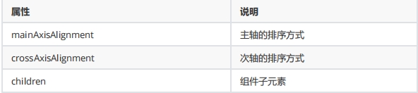
mainAxisAlignment 用于指定子组件在主轴(水平方向)上的对齐方式
MainAxisAlignment.start(默认值):子组件将在主轴的起始位置对齐。
MainAxisAlignment.end:子组件将在主轴的末尾位置对齐。
MainAxisAlignment.center:子组件将在主轴的中心位置对齐。
MainAxisAlignment.spaceBetween:子组件将会均匀地分布在主轴上,首个和最后一个子组件分别与 Row 的起始和末尾位置对齐。
MainAxisAlignment.spaceAround:子组件将会均匀地分布在主轴上,子组件之间以及首个和最后一个子组件与 Row 的边界之间有相等的间距。
MainAxisAlignment.spaceEvenly:子组件将会均匀地分布在主轴上,子组件之间和首个、最后一个子组件与 Row 的边界之间的间距都相等。
MainAxisAlignment.spaceEvenly:子组件将会均匀地分布在主轴上,子组件之间和首个、最后一个子组件与 Row 的边界之间的间距都相等。
crossAxisAlignment 用于指定子组件在交叉轴(垂直方向)上的对齐方式(要有父容器)
CrossAxisAlignment.start:子组件将在交叉轴的起始位置对齐。
CrossAxisAlignment.end:子组件将在交叉轴的末尾位置对齐。
CrossAxisAlignment.center(默认值):子组件将在交叉轴的中心位置对齐。
CrossAxisAlignment.stretch:在交叉轴上拉伸子组件以匹配父容器的高度。
CrossAxisAlignment.baseline:子组件将使用 textDecorationStyle 属性构建一个水平基线对齐。
Row 水平布局组件
class MyRow extends StatelessWidget {

  const MyRow({super.key});

  @override

  Widget build(BuildContext context) {

    return Container(

      width: double.infinity, //无穷的

      height: double.infinity,

      color: Color.fromARGB(255, 7, 189, 158),

      child:  Row(

      mainAxisAlignment: MainAxisAlignment.spaceBetween, //X轴

      crossAxisAlignment:CrossAxisAlignment.center, //相对与Container(父盒子) Y轴

      children: [

        IconContainer(Icons.ac_unit,color: Colors.yellow), //自定义的方法

        IconContainer(Icons.home_max,color: Color.fromARGB(255, 226, 12, 47)),

        IconContainer(Icons.ac_unit,color: Color.fromARGB(255, 9, 31, 155)),

      ],

    ),

    );

  }

}
Column垂直布局组件
class MyColumn extends StatelessWidget {

  // const MyColumn({super.key});

 const MyColumn({Key? key}) : super(key: key);

  @override

  Widget build(BuildContext context) {

        return Container(

      width: double.infinity, //无穷的

      height: double.infinity,

      color: Color.fromARGB(255, 7, 189, 158),

      child:  Column(

      mainAxisAlignment: MainAxisAlignment.spaceBetween, //  Y轴

      crossAxisAlignment:CrossAxisAlignment.end, //相对与Container  X轴

      children: [

        IconContainer(Icons.ac_unit,color: Colors.yellow),

        IconContainer(Icons.home_max,color: Color.fromARGB(255, 226, 12, 47)),

        IconContainer(Icons.ac_unit,color: Color.fromARGB(255, 9, 31, 155)),

      ],

    ),

    );

  }

}
double.infifinity 和double.maxFinite
我想成为我的父母所允许的最大的(double.infinity)
一些小部件允许他们的孩子像他们想要的那样大。
9、线性布局(Row和Column)的更多相关文章
- Flutter 布局类组件:线性布局(Row和Column)
前言 所谓线性布局,即指沿水平或垂直方向排布子组件.Flutter中通过Row和Column来实现线性布局,并且它们都继承自弹性布局(Flex). 接口描述 Row({ Key key, // 表示子 ...
- 12.Quick QML-QML 布局(Row、Column、Grid、Flow和嵌套布局) 、Repeater对象
1.Row布局 Row中的item可以不需要使用anchors布局,就能通过行的形式进行布局. 并且item可以使用Positioner附加属性来访问有关其在Row中的位置及其他信息. 示例如下所示, ...
- Flutter 布局(七)- Row、Column详解
本文主要介绍Flutter布局中的Row.Column控件,详细介绍了其布局行为以及使用场景,并对源码进行了分析. 1. Row A widget that displays its children ...
- 从头学Android之Android布局管理:LinerLayout线性布局
LinerLayout线性布局: 这种布局方式是指在这个里面的控件元素显线性,我们可以通过setOrientation(int orientation)来指定线性布局的显示方式,其值有:HORIZON ...
- Android 线性布局(LinearLayout)相关官方文档 - 指南部分
Android 线性布局(LinearLayout)相关官方文档 - 指南部分 太阳火神的漂亮人生 (http://blog.csdn.net/opengl_es) 本文遵循"署名-非商业用 ...
- Android-RelativeLayout(相对布局)、LinearLayout(线性布局)
RelativeLayout(相对布局):按照各子元素之间的位置关系完成布局. 定位:android:layout_above="@id/xxx" --将控件置于给定ID控件之上 ...
- Android-LinearLayout(线性布局)
布局:Android为我们提供了一个View和ViewGroup子类的集合.ViewGroup类是View的子类,也被称为Layout布局,它提供了流式布局.线性布局等多种布局方式.View是绘制在屏 ...
- android—-线性布局
android五大布局之线性布局. 1.线性布局的特点:各个子元素彼此连接,中间不留空白 而今天我们要讲解的就是第一个布局,LinearLayout(线性布局),我们屏幕适配的使用 用的比较多的就是L ...
- android学习之线性布局
效图如下 移通152余继彪 该布局使用了线性布局完成 父布局为线性布局,黄色和灰色部分为水平的线性布局,剩余50%部分为水平线性布局,该布局中包含了两个垂直的线性布局分别占了三分之1和三分之二
- android开发------编写用户界面之线性布局
一个好的应用程序离不开人性化的用户界面.在学习其他东西之前.理应先学习编写程序的布局(外观) 今天,我们就来学习android的UI布局----LinearLayout. LinearLayout,即 ...
随机推荐
- Go语言精进之路目录
目录 一.介绍 01.Go 语言的前生今世 二.开发环境搭建 01.Go 语言开发环境搭建 三.初识GO语言 01.Go 多版本管理工具 02.第一个 Go 程序"hello,world&q ...
- replace批量替换、表删除数据查询用法
一. select * from baec_file where bacti='1'order by baec01; select baec02,REPLACE(baec02,'白班','A班') f ...
- linux内核离线升级步骤详解【亲测可用】
由于种种原因,linux的内核版本需要升级,但由于生产原因往往不能在线升级,在此记录笔者本人昨晚的的离线升级步骤,亲测可用. 我们知道,红帽和CentOS同源同宗,内核升级步骤也是一样的. 目录 ■ ...
- 基本操作:vscode-git使用和命令
Git简介 GIt /git/ 是一个开源的分布式版本控制系统,可以有效.高速的处理从很小到很大的项目版本管理: 通俗的说,解决的问题是: 正常开发,一个团队需要很多人来共同开发 ...
- idea 连接远程 docker 并部署项目到 docker
目录 idea 连接远程 docker 1. 安装 docker 插件 2. 登录远程服务器,修改docker配置 3. 添加云服务器防火墙规则 4. idea 配置连接 docker 部署项目到 d ...
- 花了三年时间开发的开源项目,终于500 个 Star 了!
waynboot-mall 商城项目从疫情开始初期着手准备,到现在已经经过了 3 年多的时间,从项目初期到现在,一个人持续迭代,修复漏洞,添加功能,经历了前端开发工具从 vue2.vue-cli 切换 ...
- notepad++中使用正则表达式处理数据
如何使用正则表达式提取文本中的特定行? 以下是一个示例文本: [ INFO] HW RTC: 2023-05-15 07:21:00 [ INFO] HW RTC timestamp:16841352 ...
- 数论笔记(Full Version)
数论笔记(Full Version) 一.数论基础: 1.整除: 重新定义除法: 对于计算式:\(a\div b\) 来说,其结果可以变化为以下的式子:$$a = b\lfloor \frac{a}{ ...
- 普冉PY32系列(十) 基于PY32F002A的6+1通道遥控小车I - 综述篇
目录 普冉PY32系列(一) PY32F0系列32位Cortex M0+ MCU简介 普冉PY32系列(二) Ubuntu GCC Toolchain和VSCode开发环境 普冉PY32系列(三) P ...
- Electron-React18-MacOS桌面管理系统|electron27+react仿mac桌面
基于React18+Electron27+ArcoDesign仿macOS桌面端系统框架ElectronMacOS. electron-react-macOs 基于electron27.x+vite4 ...