QML常用控件
这里的控件是显示的元素
1、Item:一切的基类
Item {

      Image {

          source: "tile.png"

      }

      Image {

          x:

          width:

          height:

          source: "tile.png"

      }

      Image {

          x:

          width:

          height:

          fillMode: Image.Tile

          source: "tile.png"

      }

  }
2、Rectangle:矩形
Rectangle{

    width:300;

    height:200;

    color:"#C0C0C0";

    focus:true;

    Keys.enabled:true;

    Keys.onEscapePressed:Qt.quit();

    Keys.onBackPressed:Qt.quit();

    Keys.onPressed:{

        switch(event.key){

        case Qt.Key_0:

        case Qt.Key_1:

        case Qt.Key_2:

        case Qt.Key_3:

        case Qt.Key_4:

        case Qt.Key_5:

        case Qt.Key_6:

        case Qt.Key_7:

        case Qt.Key_8:

        case Qt.Key_9:

            event.accepted=true;

            keyView.text = event.key-Qt.Key_0;

            break;

        }

    }
3、Text:字
Text{

        id:keyView;

        font.bold:true;

        font.pixelSize:;

        text:"Waiting";

        anchors.centerIn:parent;

        color:"#FF0000";

    }
4、Glow:光影
Glow{

        anchors.fill:keyView;

        radius:;

        samples:;

        color:"white";

        source:keyView;

    }
5、PushButton:按钮
 Button{

        id:openBtn;//id

        text:"OPEN";//显示字

        anchors.left: parent.left;

        anchors.leftMargin: ;

        anchors.bottom: parent.bottom;

        anchors.bottomMargin: ;

        style:ButtonStyle{

            background: Rectangle{

                implicitWidth: ;

                implicitHeight: ;

                color:"#FFFFFF";

                border.width: control.pressed?:;

                border.color: (control.hovered || control.pressed)?"green":"#888888";

            }

        }

        onClicked:{

       //点击信号回调

       //fileDialog.open();

        }

    }
6、TabView,用TabViewStyle定制外观,注意手册中TabView没有style属性【实际上有,只是没有加上去】
main.qml:

import QtQuick 2.6

import QtQuick.Window 2.2

import QtQuick.Controls 2.0

import QtQuick.Controls 1.4

Window {

    visible: true

    width:

    height:

    title: qsTr("Hello World")

    TabView{

        anchors.fill: parent;

        style: TabViewStyle {

            frameOverlap:

            tabsAlignment: Qt.AlignHCenter

            tab: Rectangle {

                color: styleData.selected ? "steelblue" :"lightsteelblue"

                border.color:  "steelblue"

                implicitWidth: Math.max(text.width + , )

                implicitHeight:

                radius:

                Text {

                    id: text

                    anchors.centerIn: parent

                    text: styleData.title

                    color: styleData.selected ? "white" : "black"

                }

            }

            frame: Rectangle { color: "steelblue" }

        }

        Tab {

            source:"tab.qml";

        }

        Tab {

            title: "Blue"

            Rectangle { color: "blue" }

        }

        Tab {

            title: "Green"

            Rectangle { color: "green" }

        }

    }

}
tab.qml:

import QtQuick 2.0

import QtQuick.Controls 1.4

Rectangle{

    Button{

        id:btn1;

        text: "";

    }

    Button{

        anchors.left: btn1.right;

        text: "";

    }

}
7、行编辑:TextInput,TextField【比TextInput多了背景颜色设置】
8、块编辑:TextEdit,TextArea【比TextEdit多了背景颜色设置】
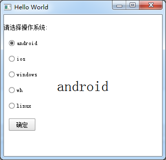
9、ExclusiveGroup,互斥分组,可以在里面放入RadioButton、CheckBox、Action等元素
import QtQuick 2.6

import QtQuick.Window 2.2

import QtQuick.Controls 1.4

Window {

    visible: true

    width:

    height:

    title: qsTr("Hello World")

    Text {

        id: toptext;

        text: qsTr("请选择操作系统:");

        anchors.top: parent.top;

        anchors.topMargin: ;

    }

    Text{

        id:maintext;

        anchors.centerIn: parent;

        font.pixelSize: ;

        text:"no section";

        z:;

    }

    ExclusiveGroup{

        id:eg;

    }

    RadioButton{

        id:btn1;

        text: "android";

        anchors.top:toptext.bottom;

        anchors.left: parent.left;

        anchors.leftMargin: ;

        exclusiveGroup: eg;

        anchors.topMargin: ;

    }

    RadioButton{

        id:btn2;

        text: "ios";

        anchors.top:btn1.bottom;

        anchors.left: parent.left;

        anchors.leftMargin: ;

        exclusiveGroup: eg;

        anchors.topMargin: ;

    }

    RadioButton{

        id:btn3;

        text: "windows";

        anchors.top:btn2.bottom;

        anchors.left: parent.left;

        anchors.leftMargin: ;

        exclusiveGroup: eg;

        anchors.topMargin: ;

    }

    RadioButton{

        id:btn4;

        text: "wh";

        anchors.top:btn3.bottom;

        anchors.left: parent.left;

        anchors.leftMargin: ;

        exclusiveGroup: eg;

        anchors.topMargin: ;

    }

    RadioButton{

        id:btn5;

        text: "linux";

        anchors.top:btn4.bottom;

        anchors.left: parent.left;

        anchors.leftMargin: ;

        exclusiveGroup: eg;

        anchors.topMargin: ;

    }

    Button{

        id:btn;

        text:"确定";

        anchors.top:btn5.bottom;

        anchors.left: parent.left;

        anchors.leftMargin: ;

        anchors.topMargin: ;

        onClicked: {

            maintext.text = eg.current.text;

        }

    }

}
10、RadioButton,单旋按钮,使用RadioButtonStyle来设置风格
11、CheckBox,复选按钮,使用CheckBoxStyle来设置风格
partiallyCheckedEnabled:用来表示可以部分选中
    CheckBox{

        id:btn5;

        text: "linux";

        partiallyCheckedEnabled: true;

        anchors.top:btn4.bottom;

        anchors.left: parent.left;

        anchors.leftMargin: ;

        anchors.topMargin: ;

    }

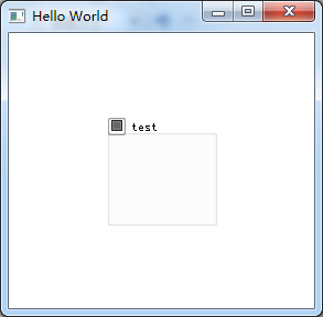
12、GroupBox
import QtQuick 2.6

import QtQuick.Window 2.2

import QtQuick.Controls 1.4

Window {

    visible: true

    width:

    height:

    title: qsTr("Hello World")

    GroupBox{

        id:gb;

        title: "test";

        anchors.centerIn: parent;

        width: ;

        height: ;

        checkable: true;//是否可选

        flat: false;//是否有边框

    }

}
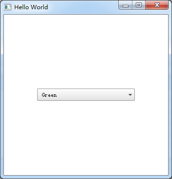
13、ComboBox
import QtQuick 2.6

import QtQuick.Window 2.2

import QtQuick.Controls 1.4

Window {

    visible: true

    width:

    height:

    title: qsTr("Hello World")

    ComboBox {

        anchors.centerIn: parent;

        currentIndex: ;

        //model: [ "Banana", "Apple", "Coconut" ]方式一

        model: ListModel {//方式二

            id: cbItems;

            ListElement { text: "Banana"; color: "Yellow" }

            ListElement { text: "Apple"; color: "Green" }

            ListElement { text: "Coconut"; color: "Brown" }

        }

        textRole: "color";//使用text或者color来显示

        width: ;

        onCurrentIndexChanged: {

            console.debug(cbItems.get(currentIndex).text + ", " + cbItems.get(currentIndex).color);//获取当前内容

        }

    }

}
14、ProgressBar
import QtQuick 2.6

import QtQuick.Window 2.2

import QtQuick.Controls 1.4

Window {

    visible: true

    width:

    height:

    title: qsTr("Hello World")

    Column {

        anchors.centerIn: parent;

        ProgressBar {

            value: 0.5//当前值

        }

        ProgressBar {

            indeterminate: true//忙

        }

    }

}
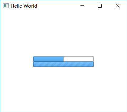
用ProgressBarStyle设置风格
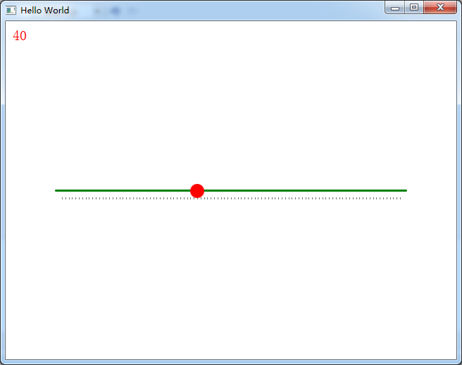
15、Slider,使用SliderStyle来设置风格
Slider由四个部分组成,都可以定义
import QtQuick 2.6

import QtQuick.Window 2.2

import QtQuick.Controls 1.4

import QtQuick.Controls.Styles 1.4

Window {

    visible: true

    width:

    height:

    title: qsTr("Hello World")

    Text{

        id:text;

        anchors.top:parent.top;

        anchors.topMargin: ;

        anchors.left: parent.left;

        anchors.leftMargin: ;

        font.pixelSize: ;

        color:"red";

        text:"noooooo";

    }

    Slider {

        anchors.centerIn: parent;

        width:;

        value: ;

        maximumValue: ;

        stepSize: ;

        tickmarksEnabled: true;

        onValueChanged: {//这个信号没有找到

            text.text=value;

        }

        style:SliderStyle{

            groove: Rectangle{

                width: ;

                height: ;

                radius: ;

                color: "green";

            }

            handle: Rectangle{

                width: ;

                height: ;

                radius: ;

                color: "red";

            }

        }

    }

}
16、Flickable
17、Canvas
import QtQuick 2.6

import QtQuick.Window 2.2

import QtQuick.Controls 1.4

import QtQuick.Controls.Styles 1.4

Window {

    visible: true

    width:

    height:

    title: qsTr("Hello World")

    Canvas {

          id: mycanvas

          width:

          height:

          onPaint: {

              var ctx = getContext("2d");

              ctx.fillStyle = Qt.rgba(, , , );

              ctx.fillRect(, , width, height);

          }

      }

}

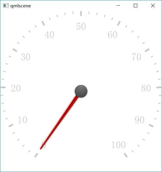
18、仪表盘CircularGauge
import QtQuick 2.5

import QtQuick.Controls 1.4

import QtQuick.Controls.Styles 1.4

import QtQuick.Extras 1.4

  CircularGauge {

      value: accelerating ? maximumValue :

      anchors.centerIn: parent

      property bool accelerating: false

      Keys.onSpacePressed: accelerating = true

      Keys.onReleased: {

          if (event.key === Qt.Key_Space) {

              accelerating = false;

              event.accepted = true;

          }

      }

      Component.onCompleted: forceActiveFocus()

      Behavior on value {

          NumberAnimation {

              duration:

          }

      }

  }
19、GridLayout
GridLayout {

    id: grid

    rows:

    columns:

    width:

    height:

    columnSpacing:

    Text {

        id: textUsr

        text: qsTr("用户名")

        font.pointSize:

        color: "black"

    }

    TextField {

        id: filedUsr

        Layout.preferredHeight:

    }

    Text {

        id: textPaswd

        text: qsTr("密码")

        font.pointSize:

        color: "black"

    }

    TextField {

        id: filedPawd

        Layout.preferredHeight:

    }

}
20、Image
Image {

    id: rdJpg

    anchors.centerIn: parent

    smooth: true

    visible: false

    source: "qrc:/img/rd.jpg"

}
如果是将图片全部存到了资源里,然后Image使用资源里的这些图片,最后打包的程序不需要再打包这些图片,因为已经跟随资源编译到程序里了,所以耗内存
QML常用控件的更多相关文章
- android内部培训视频_第三节(3)_常用控件(ViewPager、日期时间相关、ListView)
第三节(2):常用控件之ViewPager.日期时间相关.ListView 一.ViewPager 实例:结合PagerAdapter滑动切换图片 二.日期时间相关:AnalogClock\Dig ...
- [WinForm]WinForm跨线程UI操作常用控件类大全
前言 在C#开发的WinForm窗体程序开发的时候,经常会使用多线程处理一些比较耗时之类的操作.不过会有一个问题:就是涉及到跨线程操作UI元素. 相信才开始接触的人一定会遇上这个问题. 为了解决这个问 ...
- android内部培训视频_第三节 常用控件(Button,TextView,EditText,AutocompleteTextView)
第三节:常用控件 一.Button 需要掌握的属性: 1.可切换的背景 2.9.png使用 3.按钮点击事件 1) onClick 3) 匿名类 4) 公共类 二.TextView 常用属性 1.a ...
- Xamarin Studio在Mac环境下的配置和Xamarin.iOS常用控件的示例
看过好多帖子都是Win环境装XS,Mac只是个模拟器,讲解在Mac环境下如何配置Xamarin Studio很少,也是一点点找资料,东拼西凑才把Xamarin Studio装在Mac上跑起来,如下: ...
- MFC编程入门之二十二(常用控件:按钮控件Button、Radio Button和Check Box)
本节继续讲解常用控件--按钮控件的使用. 按钮控件简介 按钮控件包括命令按钮(Button).单选按钮(Radio Button)和复选框(Check Box)等.命令按钮就是我们前面多次提到的侠义的 ...
- MFC编程入门之二十(常用控件:静态文本框)
上一节讲了颜色对话框之后,关于对话框的使用和各种通用对话框的介绍就到此为止了.从本节开始将讲解各种常用控件的用法.常用控件主要包括:静态文本框.编辑框.单选按钮.复选框.分组框.列表框.组合框.图片控 ...
- Android中常用控件及属性
在之前的博客为大家带来了很多关于Android和jsp的介绍,本篇将为大家带来,关于Andriod中常用控件及属性的使用方法,目的方便大家遗忘时,及时复习参考.好了废话不多讲,现在开始我们本篇内容的介 ...
- DevExpress winform XtraEditor常用控件
最近在公司里面开始使用DevExpress winform的第三方控件进行开发和维护,这里整理一些常用控件的资料以便于后续查看 ComboBoxEdit 这个控件和winform自带的控件差不多,使用 ...
- 五、Android学习第四天补充——Android的常用控件(转)
(转自:http://wenku.baidu.com/view/af39b3164431b90d6c85c72f.html) 五.Android学习第四天补充——Android的常用控件 熟悉常用的A ...
随机推荐
- 为Flex Builder设置测试服务器
当用Flex Builder测试一个Flex应用时,它默认情况下会调用系统自带浏览器直接从bin-debug文件夹打开相应的html文件.浏览器中URL地址形式如file:///C:/AllESRI/ ...
- 定义一个Rectangle类,该类提供getLength和getWidth方法。
import java.util.Comparator; /** * 定义一个Rectangle类,该类提供getLength和getWidth方法.利用图1-18中的findMax例程编写 * 一种 ...
- Javascript-双色球
<!DOCTYPE html> <html> <head lang="en"> <meta charset="UTF-8&quo ...
- Rest概念学习
参考文章 http://www.cnblogs.com/shanyou/archive/2012/05/12/2496959.html http://www.cnblogs.com/loveis715 ...
- 关于用户登录状态存session,cookie还是数据库或者memcache的优劣
session中保存登陆状态: 优:整个应用可以从session中获取用户信息,并且查询时很方便.在session中保存用户信息是不可缺少的(web应用中) 缺:session中不宜保存大量信息,会增 ...
- 师大校赛D coloring Game 并查集
这题说的是 在一个 森林中 两个人在这棵树上涂颜色,黑色或者白色,第一次只能在1 号节点上涂色 第二次 只能在2上涂,以此类推, 在每个节点上只能涂黑色或者白色,并且相邻的点不能有相同的颜色,最后求不 ...
- jQuery属性--html([val|fn])、text([val|fn])和val([val|fn|arr])
html([val|fn]) 概述 取得第一个匹配元素的html内容,这个函数不能用于XML文档.但可以用于XHTML文档. 在一个 HTML 文档中, 我们可以使用 .html() 方法来获取任意一 ...
- Kylin, Mondrian, Saiku系统的整合
本文主要介绍有赞数据团队为了满足在不同维度查看.分析重点指标的需求而搭建的OLAP分析工具.这个工具对Kylin.Mondrian以及Saiku做了一个整合,主要工作包括一些定制化的修改以及环境的配置 ...
- 转:C# 使用资源文件 Resource.resx 的方法
在写程序时, 可以把用到的 图标,图片,声音等外部资源,放在一个 .resx (资源文件)中. 这样的好处是不用考虑什么路径的问题.而且还对资源有保护的做用. 1.创建一个 ResourceFile ...
- 深入剖析Kubernetes k8s
深入剖析Kubernetes k8s 毫无疑问,Kubernetes 已经成为容器领域当之无愧的事实标准.除了 Google.Microsoft 等技术巨擘们在容器领域里多年的博弈外,国内的 BAT. ...