【原创】display:flex布局大全
全都是自己写的 希望大家可以点个赞 谢谢!
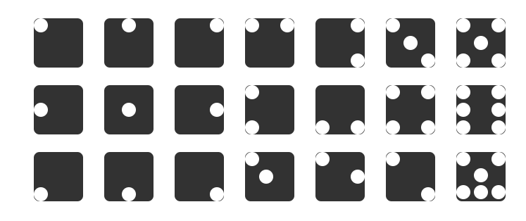
Html代码(没时间精简 请多包涵)
<!DOCTYPE html>
<html lang="en">
<head>
<meta charset="UTF-8">
<meta name="viewport" content="width=device-width, initial-scale=1.0">
<meta http-equiv="X-UA-Compatible" content="ie=edge">
<title>Flex布局大全</title>
<style>
body,html{
width: %;
height: %;
display: flex;
justify-content: space-between;
}
.fore{
width: 700px;
height: 277px;
margin: auto;
display: flex;
justify-content:space-around;
flex-wrap: wrap;
}
.row1,.row2,.row3{
width: 700px;
height: 95px;
display: flex;
justify-content: space-around;
}
.row1{
margin-top: 8px;
}
.father{
background-color: #;
height: 70px;
width: 70px;
border-radius: 8px ;
}
.son{
width: 20px;
height: 20px;
border-radius: 10px;
background-color: #fff;
}
.father2{
display: flex;
justify-content: center;
}
.father3{
display: flex;
justify-content: flex-end;
}
.father4{
display: flex;
justify-content: space-between;
}
.father5{
display: flex;
justify-content: flex-end;
}
.foreSom{
display: flex;
flex-direction: column;
justify-content: space-between;
}
.father6{
display: flex;
justify-content: space-between;
} .foreSon32{
display: flex;
flex-direction: column;
justify-content: center;
}
.foreSon33{
display: flex;
flex-direction: column;
justify-content: flex-end;
}
.father7{
display: flex;
justify-content: space-between;
}
.foreSon51{
display: flex;
flex-direction: column;
justify-content: space-between;
}
.foreSon52{
display: flex;
flex-direction: column;
justify-content: center;
}
.foreSon53{
display: flex;
flex-direction: column;
justify-content: space-between;
} /* 第二行 */
.father2-{
display: flex;
justify-content: flex-start;
align-items: center;
}
.father2-{
display: flex;
justify-content: center;
align-items: center;
}
.father2-{
display: flex;
justify-content: flex-end;
align-items: center;
}
.father2-{
display: flex;
flex-direction: column;
justify-content: space-between;
}
.father2-{
display: flex;
justify-content: space-between;
align-items: flex-end;
}
.father2-{
display: flex;
justify-content: space-between;
flex-wrap: wrap;
}
.foreSon2-{
display: flex;
flex-direction: column;
justify-content: space-between;
} .father2-{
display: flex;
justify-content: space-between;
flex-wrap: wrap;
}
.foreSon2-{
display: flex;
flex-direction: column;
justify-content: space-between;
}
.father3-{
display: flex;
align-items: flex-end;
}
.father3-{
display: flex;
align-items: flex-end;
justify-content: center;
}
.father3-{
display: flex;
align-items: flex-end;
justify-content: flex-end;
}
.father3-{
display: flex;
}
.foreSon3--{
display: flex;
}
.foreSon3--{
align-self: center;
}
.father3-{
display: flex;
justify-content: space-between;
}
.foreSon3--{
align-self: center;
}
.father3-{
display: flex;
justify-content: space-between;
}
.foreSon3--{
align-self: flex-end;
}
.father3-{
display: flex;
flex-wrap: wrap;
}
.foreSon3--{
display: flex;
flex-basis: %;
justify-content: space-between;
}
.foreSon3--{
display: flex;
flex-basis: 70px;
justify-content: center;
}
.foreSon3--{
display: flex;
justify-content: space-between;
flex-basis: %;
} </style>
</head>
<body>
<div class="fore">
<div class="row1">
<div class="father">
<div class="son1 son"></div>
</div>
<div class="father father2">
<div class="son1 son"></div>
</div>
<div class="father father3">
<div class="son1 son"></div>
</div>
<div class="father father4">
<div class="son1 son"></div>
<div class="son1 son"></div>
</div>
<div class="father father5">
<div class="foreSom">
<div class="son1 son"></div>
<div class="son1 son"></div>
</div>
</div>
<div class="father father6">
<div class="foreSon31">
<div class="son1 son"></div>
</div>
<div class="foreSon32">
<div class="son1 son"></div>
</div>
<div class="foreSon33">
<div class="son1 son"></div>
</div>
</div>
<div class="father father7">
<div class="foreSon51">
<div class="son1 son"></div>
<div class="son1 son"></div>
</div>
<div class="foreSon52">
<div class="son1 son"></div>
</div>
<div class="foreSon53">
<div class="son1 son"></div>
<div class="son1 son"></div>
</div>
</div> </div>
<div class="row2">
<div class="father father2-1">
<div class="son1 son"></div>
</div>
<div class="father father2-2">
<div class="son1 son"></div>
</div>
<div class="father father2-3">
<div class="son1 son"></div>
</div>
<div class="father father2-4">
<div class="son1 son"></div>
<div class="son1 son"></div>
</div>
<div class="father father2-5">
<div class="son1 son"></div>
<div class="son1 son"></div>
</div>
<div class="father father2-6">
<div class="foreSon2-6">
<div class="son1 son"></div>
<div class="son1 son"></div>
</div>
<div class="foreSon2-6">
<div class="son1 son"></div>
<div class="son1 son"></div>
</div>
</div>
<div class="father father2-7">
<div class="foreSon2-7">
<div class="son1 son"></div>
<div class="son1 son"></div>
<div class="son1 son"></div>
</div>
<div class="foreSon2-7">
<div class="son1 son"></div>
<div class="son1 son"></div>
<div class="son1 son"></div>
</div>
</div>
</div>
<div class="row3">
<div class="father father3-1">
<div class="son1 son"></div>
</div>
<div class="father father3-2">
<div class="son1 son"></div>
</div>
<div class="father father3-3">
<div class="son1 son"></div>
</div>
<div class="father father3-4">
<div class="foreSon3-4-1">
<div class="son1 son"></div>
</div>
<div class="foreSon3-4-2">
<div class="son1 son"></div>
</div>
</div>
<div class="father father3-5">
<div class="foreSon3-5-1">
<div class="son1 son"></div>
</div>
<div class="foreSon3-5-2">
<div class="son1 son"></div>
</div>
</div>
<div class="father father3-6">
<div class="foreSon3-6-1">
<div class="son1 son"></div>
</div>
<div class="foreSon3-6-2">
<div class="son1 son"></div>
</div>
</div>
<div class="father father3-7">
<div class="foreSon3-7-1">
<div class="son1 son"></div>
<div class="son1 son"></div>
</div>
<div class="foreSon3-7-2">
<div class="son1 son"></div>
</div>
<div class="foreSon3-7-3">
<div class="son1 son"></div>
<div class="son1 son"></div>
<div class="son1 son"></div>
</div>
</div>
</div>
</div> </body>
</html>
全都是自己写的 希望大家可以点个赞!!!(顺便凑下字数)
全都是自己写的 希望大家可以点个赞!!!(顺便凑下字数)
全都是自己写的 希望大家可以点个赞!!!(顺便凑下字数)
全都是自己写的 希望大家可以点个赞!!!(顺便凑下字数)
全都是自己写的 希望大家可以点个赞!!!(顺便凑下字数)
全都是自己写的 希望大家可以点个赞!!!(顺便凑下字数)
全都是自己写的 希望大家可以点个赞!!!(顺便凑下字数)
全都是自己写的 希望大家可以点个赞!!!(顺便凑下字数)
全都是自己写的 希望大家可以点个赞!!!(顺便凑下字数)
全都是自己写的 希望大家可以点个赞!!!(顺便凑下字数)
【原创】display:flex布局大全的更多相关文章
- 1.display:flex布局笔记
/*display:flex布局方式主要运用于垂直居中的效果*/ 一.Flex译为Flexible Box(弹性盒子),任何一个容器都可以指定为Flex布局 注:设置为Flex布局之后,子元素的flo ...
- display:flex 布局教程,弹性布局!
display:flex 布局教程 布局的传统解决方案,基于盒状模型,依赖 display属性 + position属性 + float属性.它对于那些特殊布局非常不方便,比如,垂直居中就不容易实现. ...
- display:flex布局
/*背景 居中 自适应 铺满容器*/ background: center / cover; flex布局是什么? flex是Flexibe Box 的缩写,意思为”弹性布局”, 用来为盒子模型提供最 ...
- HTML/CSS:display:flex 布局教程
网页布局(layout)是 CSS 的一个重点应用. 布局的传统解决方案,基于盒状模型,依赖 display 属性 + position属性 + float属性.它对于那些特殊布局非常不方便,比如,垂 ...
- display:flex 布局详解(2)
1. flex设置元素垂直居中对齐 在之前的一篇文章中记载过如何垂直居中对齐,方法有很多,但是在学习了flex布局之后,垂直居中更加容易实现 HTML代码: <div class=" ...
- display: flex; 布局
废话不多说,供上我学习Flex布局的启蒙文章,一切的答案,尽在这里,仔细阅读,多多回味!保证你有所收获! http://www.ruanyifeng.com/blog/2015/07/flex-gra ...
- display:flex 布局之 骰子
代码部分 html <body> <div class="box"> <div class="a a1"> <span ...
- flex布局大全 2019
有句话叫做:存在即是合理. 最近很喜欢flex布局模式,不过还在摸索中,这里正一边在项目中使用和总结,也在学习一些大牛们总结的东西和布局思考. 鉴于自己很苦恼,到处去ha资料,真的,就没有一个系统的, ...
- flex布局大全
有句话叫做:存在即是合理. 最近很喜欢flex布局模式,不过还在摸索中,这里正一边在项目中使用和总结,也在学习一些大牛们总结的东西和布局思考. 鉴于自己很苦恼,到处去ha资料,真的,就没有一个系统的, ...
随机推荐
- spring boot 配置mybatis plus 控制台打印sql
spring boot 版本2.1.5 mybatis plus 版本3.1.1 aplication.properties中添加 logging.level.com.demo.system.mapp ...
- Java中的单例模式(Singleton Pattern in Java)
Introduction 对于系统中的某个类来说,只有一个实例是很重要的,比如只有一个timer和ID Producer.又比如在服务器程序中,配置信息保留在一个文件中,这些配置信息由一个单例对象统一 ...
- vijos p1449 字符串还原
学习<algorithm>下的reverse函数 #include<iostream> #include<string> #include<algorithm ...
- Envoy 源码分析--LDS
Envoy 源码分析--LDS LDS 是 Envoy 用来自动获取 listener 的 API. Envoy 通过 API 可以增加.修改或删除 listener. 先来总结下 listener ...
- 十五、SQL Server中的事务与锁
(转载别人的内容,值得Mark) 了解事务和锁 事务:保持逻辑数据一致性与可恢复性,必不可少的利器. 锁:多用户访问同一数据库资源时,对访问的先后次序权限管理的一种机制,没有他事务或许将会一塌糊涂,不 ...
- Java:jdbc连接mysql数据库
安装eclipse和mysql的步骤这里不赘述了. 1.一定要下jar包 要想实现连接数据库,要先下载mysql-connector-java-5.1.47(或者其他版本)的jar包.低版本的jar包 ...
- 如何在 Centos7 中安装 gcc
系统环境:Centos7.4 今天在安装 Nodejs8.7 的时候,报了一个警告: WARNING: C++ Compiler too old, need g++ 4.9.4 or clang++ ...
- Android Studio电脑不支持HAXM的解决办法
Intel HAXM is required to run this AVD. Your CPU does not support required features (VT-x or SVM). U ...
- 【Java】Class JavaLaunchHelper is implemented in both ** and **
详细问题描述如下: objc[64179]: Class JavaLaunchHelper is implemented in both /Library/Java/JavaVirtualMachin ...
- [重磅开源] 比SingleR更适合的websocket 即时通讯组件---ImCore开源了
有感而发 为什么说 SignalR 不合适做 IM? IM 的特点必定是长连接,轮训的功能用不上. 因为它是双工通讯的设计,用hub.invoke发送命令给服务端处理业务,其他就和 ajax 差不多, ...