css3基础-动画案例(没啥实用性,纯粹好玩的)
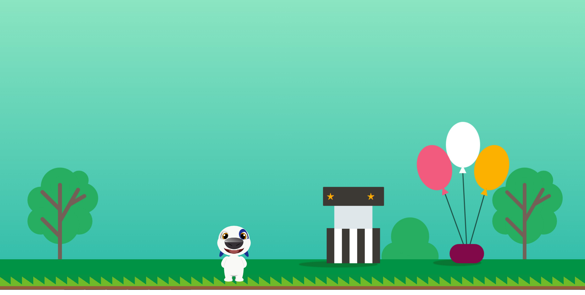
会动的汉克狗:
<!doctype html>

<html lang="en">

<head>

    <meta charset="UTF-8">

    <title>Cartoon Dog</title>

</head>

<body>

    <div class="dog">

        <div class="head">

            <div class="forehead"></div>

            <div class="face"></div>

            <div class="chin"></div>

            <div class="eye">

                <div class="pupil"></div>

            </div>

            <div class="eye right">

                <div class="pupil"></div>

            </div>

            <div class="birthmark"></div>

            <div class="ear"></div>

            <div class="ear right"></div>

            <div class="nose">

                <div class="nostril"></div>

                <div class="nostril right"></div>

            </div>

            <div class="mouth">

                <div class="teen no11"></div>

                <div class="teen no21"></div>

                <div class="tongue"></div>

            </div>

        </div>

        <div class="body">

            <div class="arm"></div>

            <div class="arm right"></div>

            <div class="leg">

                <div class="foot"></div>

            </div>

            <div class="leg right">

                <div class="foot"></div>

            </div>

            <div class="belly"></div>

        </div>

    </div>

    <style>

    :root {

        --bg: rgb(249, 249, 246);

        --hl: rgb(27, 47, 144);

        --t: 2s;

    }

    body {

        background: url(img/bg.jpg) no-repeat;

        background-size: 100%;

        overflow: hidden;

    }

    .dog {

        position: relative;

        top: 78vh;

        left: -10vw;

        /*transform: scale(1, 1);*/

    }

    .head {

        width: 275px;

        height: 275px;

        position: relative;

        margin: 0 auto;

    }

    .ear {

        animation: rotate var(--t) ease-out infinite;

        position: absolute;

        left: 50%;

        margin-left: -38px;

        top: 14px;

        z-index: 0;

        background-color: var(--hl);

        width: 16px;

        height: 70px;

        border-radius: 50%;

    }

    .ear.right {

        animation: rotate-right var(--t) ease-out infinite;

        transform: scale(-1, 1);

        margin-left: 22px;

    }

    .forehead {

        left: 50%;

        transform: translate(-50%, 0);

        top: -22px;

        border-radius: 51px / 43px 43px 5px 5px;

        width: 102px;

        height: 48px;

        background: var(--bg);

        position: absolute;

        z-index: 1

    }

    .face {

        left: 50%;

        transform: translate(-50%, 0);

        width: 110px;

        height: 68px;

        position: absolute;

        background: var(--bg);

        z-index: 1;

        border-radius: 40% / 50%;

    }

    .chin {

        left: 50%;

        transform: translate(-50%, 0);

        width: 104px;

        height: 36px;

        position: absolute;

        background: var(--bg);

        z-index: 1;

        border-radius: 50% / 0 0 36px 36px;

        top: 41px;

    }

    .eye {

        overflow: hidden;

        box-shadow: 2px 0px 0px -1px #000 inset, -1px -1px 7px 1px #bbb;

        left: 50%;

        transform: translate(-43.5px, 0);

        width: 24px;

        height: 24px;

        position: absolute;

        background: var(--bg);

        z-index: 2;

        border-radius: 50% / 20px 12px 12px 4px;

        top: -2px;

    }

    .eye.right {

        box-shadow: 2px 0px 0px -1px #000 inset;

        transform: scale(-1, 1) translate(-21.5px, 0);

    }

    .birthmark {

        left: 50%;

        transform: rotate(-10deg) translate(16.5px, 0);

        width: 30px;

        height: 36px;

        position: absolute;

        background: var(--hl);

        z-index: 2;

        border-radius: 50% / 18px 34px 2px 18px;

        top: -9px;

        z-index: 1

    }

    .birthmark:after {

        content: '';

        width: 100%;

        height: 2px;

        background: var(--bg);

        border-radius: 2px 2px 0 0;

        position: absolute;

        bottom: -1px;

        left: 1px

    }

    .nose {

        left: 50%;

        transform: translate(-50%, 0);

        width: 62px;

        height: 38px;

        position: absolute;

        background: #363035;

        z-index: 2;

        border-radius: 50% / 35% 35% 65% 65%;

        top: 17px

    }

    .nose:before {

        content: '';

        width: 98%;

        height: 40%;

        left: 50%;

        transform: translate(-50%, 0);

        position: absolute;

        background: linear-gradient(30deg, #fff 0%, #fff 5%, #aaa 20%, #363035 100%);

        border-radius: 50% / 90% 90% 10% 10%;

        opacity: 0.8

    }

    .mouth {

        animation: close var(--t) ease-out infinite;

        box-shadow: 0 0 6px 0 #000 inset;

        left: 50%;

        transform: translate(-50%, 0);

        width: 68px;

        height: 27px;

        position: absolute;

        background: #671316;

        z-index: 1;

        border-radius: 50% / 0 0 100% 100%;

        top: 45px

    }

    .mouth:before {

        content: '';

        z-index: 3;

        width: 100%;

        height: 50%;

        left: 50%;

        transform: translate(-50%, 0);

        position: absolute;

        background: var(--bg);

        border-radius: 50% / 0 0 70% 70%

    }

    .pupil {

        animation: tranlate var(--t) ease-out infinite;

        box-shadow: 0 0 6px 0 #000 inset;

        width: 26px;

        height: 26px;

        border-radius: 50%;

        background: #e79101;

        position: absolute;

        left: 3px;

        top: 3px

    }

    .pupil:before {

        border-radius: 50%;

        content: '';

        width: 18px;

        height: 18px;

        position: absolute;

        left: 50%;

        top: 50%;

        transform: translate(-50%, -50%);

        background: #000

    }

    .pupil:after {

        border-radius: 50%;

        content: '';

        width: 6px;

        height: 6px;

        position: absolute;

        left: 27%;

        top: 30%;

        transform: translate(-50%, -50%);

        background: #fff

    }

    .nostril {

        animation: resize var(--t) ease-out infinite;

        position: absolute;

        left: 50%;

        transform: translate(-20px, 0) rotate(28deg);

        top: 22px;

        z-index: 0;

        background: linear-gradient(0deg, #363035 0%, #000 100%);

        width: 15px;

        height: 4px;

        border-radius: 50%;

    }

    .nostril.right {

        transform: scale(-1, 1) translate(-6px, 0) rotate(28deg)

    }

    .teen {

        animation: follow var(--t) ease-out infinite;

        border-radius: 0 0 1px 2px;

        transform: translate(-50%, 0);

        width: 10px;

        height: 3px;

        background: var(--bg);

        position: absolute;

        top: 12px;

        left: 43%;

        z-index: 2

    }

    .teen.no21 {

        transform: scale(-1, 1) translate(-50%, 0)

    }

    .tongue {

        animation: extend var(--t) ease-out infinite;

        box-shadow: 0 0 6px 0 rgba(0, 0, 0, 0.5) inset;

        width: 34px;

        height: 18px;

        border-radius: 50% / 0 0 50% 50%;

        transform: translate(-50%, 0);

        position: absolute;

        left: 50%;

        z-index: 1;

        background: #a2504f

    }

    .body {

        width: 66px;

        height: 70px;

        position: absolute;

        left: 50%;

        transform: translate(-50%, 0);

        background: var(--bg);

        border-radius: 50%;

        top: 74px;

    }

    .arm {

        width: 26px;

        height: 40px;

        position: absolute;

        left: 50%;

        transform: translate(-40px, 0) rotate(22deg);

        background: var(--bg);

        border-radius: 50% / 25px 0 0 15px;

        top: 3px;

    }

    .arm.right {

        transform: scale(-1, 1) translate(-14px, 0) rotate(22deg);

    }

    .arm:before {

        content: '';

        width: 6px;

        height: 28px;

        box-shadow: -1px 0 0 0px #ddd;

        position: absolute;

        right: 8px;

        top: 8px;

        border-radius: 6px / 8px 0 0 20px

    }

    .leg {

        width: 29px;

        height: 50px;

        position: absolute;

        left: 50%;

        transform: translate(-33px, 0);

        background: linear-gradient(-80deg, #000 0%, var(--bg) 17%, var(--bg) 100%);

        border-radius: 50% / 0px 25px 25px 50px;

        top: 37px;

    }

    .leg.right {

        transform: scale(-1, 1) translate(-3px, 0)

    }

    .foot {

        width: 29px;

        height: 15px;

        position: absolute;

        left: 50%;

        transform: translate(-50%, 0);

        background: linear-gradient(-107deg, #000 0%, var(--bg) 17%, var(--bg) 100%);

        border-radius: 50% / 10px 10px 5px 5px;

        bottom: 0px;

    }

    .belly {

        width: 60px;

        height: 36px;

        position: absolute;

        left: 50%;

        transform: translate(-50%, 0);

        background: linear-gradient(0deg, #999 0%, var(--bg) 14%, var(--bg) 100%);

        border-radius: 50% / 0 0 36px 36px;

        bottom: 0px;

    }

    @keyframes rotate {

        0% {

            transform: rotate(0deg)

        }

        ,

        5% {

            transform: rotate(0deg)

        }

        55% {

            transform: rotate(30deg)

        }

        100% {

            transform: rotate(0deg)

        }

    }

    @keyframes rotate-right {

        0% {

            transform: rotate(0deg)

        }

        ,

        5% {

            transform: rotate(0deg)

        }

        55% {

            transform: rotate(-30deg)

        }

        100% {

            transform: rotate(0deg)

        }

    }

    @keyframes tranlate {

        0% {

            transform: translate(0px, 0)

        }

        ,

        5% {

            transform: translate(0px, 0)

        }

        55% {

            transform: translate(2px, 0)

        }

        100% {

            transform: translate(0px, 0)

        }

    }

    @keyframes resize {

        0% {

            height: 4px

        }

        ,

        5% {

            height: 4px

        }

        55% {

            height: 3px

        }

        100% {

            height: 4px

        }

    }

    @keyframes extend {

        0% {

            height: 18px

        }

        ,

        5% {

            height: 18px

        }

        55% {

            height: 25px

        }

        100% {

            height: 18px

        }

    }

    @keyframes close {

        0% {

            height: 27px

        }

        ,

        5% {

            height: 27px

        }

        55% {

            height: 24px

        }

        100% {

            height: 27px

        }

    }

    @keyframes follow {

        0% {

            top: 12px

        }

        ,

        5% {

            top: 12px

        }

        55% {

            top: 10px

        }

        100% {

            top: 12px

        }

    }

    </style>

</body>

</html>
小兔子动画:
<!DOCTYPE html>

<html lang="en">

<head>

    <meta charset="UTF-8">

    <title>index</title>

    <link rel="stylesheet" href="css/index.css">

</head>

<body>

    <!-- 天空 -->

    <div class="sky">

        <!-- 云 -->

        <div id="cloud1" class="cloud"></div>

        <div id="cloud2" class="cloud"></div>

        <div id="cloud3" class="cloud"></div>

        <div id="cloud4" class="cloud"></div>

        <div id="cloud5" class="cloud"></div>

    </div>

    <!-- 草地 -->

    <div class="grass">

        <img class="rabbit" src="img/rabbit.png" alt="rabbit">

    </div>

</body>

</html>
Index.css

*{margin:0;padding:0;}

html,body{width:100%;height:100%;overflow: hidden;}

.sky{

    width:100%;

    height:60%;

    position: relative;

    background: -webkit-linear-gradient(0deg, rgba(196, 228, 253,0), rgba(196, 228, 253,0.8));

    background:    -moz-linear-gradient(0deg, rgba(196, 228, 253,0), rgba(196, 228, 253,0.8));

    background:      -o-linear-gradient(0deg, rgba(196, 228, 253,0), rgba(196, 228, 253,0.8));

    background:         linear-gradient(0deg, rgba(196, 228, 253,0), rgba(196, 228, 253,0.8));

}

.grass{

    width:100%;

    height:40%;

    position: relative;

    background: -webkit-linear-gradient(0deg, rgba(148, 190, 89,0.8), rgba(148, 190, 89,0));

    background:    -moz-linear-gradient(0deg, rgba(148, 190, 89,0.8), rgba(148, 190, 89,0));

    background:      -o-linear-gradient(0deg, rgba(148, 190, 89,0.8), rgba(148, 190, 89,0));

    background:         linear-gradient(0deg, rgba(148, 190, 89,0.8), rgba(148, 190, 89,0));

}

/*云的统一样式*/

.cloud{

    position: absolute;

    background-color: #fff;

    border-radius: 50%;

    width: 100px;

    height: 103px;

    opacity: 0.5;

    z-index: 1;

}

.cloud:before{

    content: '';

    transform: translate(-50%, 0);

    position: absolute;

    left: -49%;

    top: 8px;

    border-radius: 43px;

    background-color: #fff;

    width: 65px;

    height: 103px;

    z-index: 4;

    transform: rotate(-30deg);

}

.cloud:after{

    content: '';

    transform: translate(-50%, 0);

    width: 221%;

    height: 62px;

    border-radius: 52px;

    background-color: #fff;

    position: absolute;

    top: 28px;

    left: 25px;

    z-index: 3;

}

/*每一朵云的单独样式*/

#cloud1{opacity: 0.5;left: 51%;top: 22px;z-index:10;

        animation: cloud_move 15s ease-out infinite;}

#cloud2{opacity: 0.7;left: 11%;top: 85px;z-index:30;

        animation: cloud_move 18s ease-out infinite;}

#cloud3{opacity: 0.8;left: 41%;top: 104px;z-index:50;

        animation: cloud_move 12s ease-out infinite;}

#cloud4{opacity: 0.6;left: 71%;top: 78px;z-index:20;

        animation: cloud_move 26s ease-out infinite;}

#cloud5{opacity: 0.9;left: 91%;top: 138px;z-index:40;

        animation: cloud_move 40s ease-out infinite;}

/*云朵动画*/

@keyframes cloud_move {

    0% {left: 110%;}

    100% {left: -10%;}

}

.rabbit{position: absolute;bottom:50px;right:200px;width:300px;}

自定义属性必须遵循CSS级联规则,使用:root 作用域来定义全局变量,由于自定义属性是全局的,为了避免冲突,最好按照统一的约定来命名变量,如果想让某个变量只在部分元素/组件下可见,只需要在特定的元素下定义该变量,并且自定义全局属性,为了避免冲突,可以简单的遵循BEM命名法来形成”命名空间”
body {

  --foo: #7F583F;

  --bar: #F7EFD2;

}

a {

  color: var(--foo);

  text-decoration-color: var(--bar);

}
css3基础-动画案例(没啥实用性,纯粹好玩的)的更多相关文章
- 写多个物件css3循环动画案例原理
div { background-color: #67CF22; height: 100%; width: 6px; display: inline-block; -webkit-animation: ...
- css3基础教程十六变形与动画animation
前面我们讲过的变形与动画一般都是通过鼠标的单击.获得焦点,被点击或对元素进行一定改变后以后触发效果的,那么有没有像Flash一样自动播放的动画效果呢?答案当然是肯定的,这就是我们今天要讲到的anima ...
- CSS3基础——笔记+实战案例(CSS基本用法、CSS层叠性、CSS继承性)
CSS3基础——笔记 CSS是Cascading Style Sheet的缩写,翻译为"层叠样式表" 或 "级联样式表".CSS定义如何显示HTML的标签央视, ...
- 图解CSS3核心技术与案例实战(1)
前言: 我买了一本<图解CSS3核心技术与案例实战>大漠写的,为了提高自己的自觉性呢,抓紧看书,把读书笔记放在这上面,跟大家一起分享,也为督促自己完成读书计划. 文末有微信公众号,感谢你的 ...
- 编写自己的代码库(css3常用动画的实现)
编写自己的代码库(css3常用动画的实现) 1.前言 在月初的时候,发了CSS3热身实战--过渡与动画(实现炫酷下拉,手风琴,无缝滚动).js的代码库也发过两次,两篇文章.之前也写了css3的热身实战 ...
- 使用css3的动画模拟太阳系行星公转
本文介绍使用css3的animation画一个太阳系行星公转的动画,再加以改进,讨论如何画椭圆的运行轨迹.然后分析京东和人人网使用animation的实际案例,最后结合css3的clip-path做一 ...
- CSS3 基础知识
CSS3 基础知识1.边框 1.1 圆角 border-radius:5px 0 0 5px; 1.2 阴影 box-shadow:2px 3px 4px 5px rgba(0,0,0 ...
- CSS3 基础知识[转载minsong的博客]
CSS3 基础知识1.边框 1.1 圆角 border-radius:5px 0 0 5px; 1.2 阴影 box-shadow:2px 3px 4px 5px rgba(0,0,0 ...
- CSS3基础入门03
CSS3 基础入门03 线性渐变 在css3当中,通过渐变属性实现之前只能通过图片实现的渐变效果.渐变分为线性渐变和径向渐变以及重复渐变三种.线性渐变的模式主要是颜色从一个方向过渡到另外一个方向,而径 ...
随机推荐
- zabbix3.4搭建钉钉报警
1.在钉钉群里添加一个自定义的机器 在设置说明中无需开启Outgoing机制 红色箭头指的信息很重要后面脚本会用到 2.脚本 #!/usr/bin/python # -*- coding: utf-8 ...
- CUDA学习(三)之使用GPU进行两个数组相加
传入两个数组,在GPU中将两个数组对应索引位置相加 #include "cuda_runtime.h" #include "device_launch_parameter ...
- BFS(广度优先搜索华容道游戏)--11--BFS--蓝桥杯卡片换位
题目描述 你玩过华容道的游戏吗?这是个类似的,但更简单的游戏.看下面 3 x 2 的格子 +---+---+---+ | A | * | * | +---+---+---+ | B | | * | + ...
- 【WPF学习】第三十五章 资源字典
如果希望在多个项目之间共享资源,可创建资源字典.资源字典只是XAML文档,除了存储希望使用的资源外,不做其他任何事情. 一.创建资源字典 下面是一个资源字典示例,它包含一个资源: <Resour ...
- 【C/C++】概念: VC虚函数布局引发的问题
在网上看到一个非常热的帖子,里面是这样的一个问题: 在打印的时候发现pFun的地址和 &(Base::f)的地址竟然不一样太奇怪了?经过一番深入研究,终于把这个问题弄明白了.下面就来一步步进行 ...
- ORACLE隐式类型转换
隐式类型转换简介 通常ORACLE数据库存在显式类型转换(Explicit Datatype Conversion)和隐式类型转换(Implicit Datatype Conversion)两 ...
- SpringBoot Jpa 分页查询最新配置方式
这是已经被废弃的接口 Sort sort = new Sort(Sort.Direction.DESC,"bean类中字段"); //创建时间降序排序 Pageable pagea ...
- Go语言实现:【剑指offer】字符流中第一个不重复的字符
该题目来源于牛客网<剑指offer>专题. 请实现一个函数用来找出字符流中第一个只出现一次的字符.例如,当从字符流中只读出前两个字符"go"时,第一个只出现一次的字符是 ...
- 手把手带你阅读Mybatis源码(一)构造篇
前言 今天会给大家分享我们常用的持久层框架——MyBatis的工作原理和源码解析,后续会围绕Mybatis框架做一些比较深入的讲解,之后这部分内容会归置到公众号菜单栏:连载中…-框架分析中,欢迎探讨! ...
- 图像里的"白噪声"——电视机搜不到台时雪花斑点的形成原因
作者:❄️固态二氧化碳❄️ (主页) 链接:图像里的"白噪声"--电视机搜不到台时雪花斑点的形成原因 - 固态二氧化碳的博客 - CSDN博客 来源:CSDN博客 发表时间:201 ...