基于matplotlib的数据可视化 - 柱状图bar
柱状图bar
柱状图常用表现形式为:
plt.bar(水平坐标数组,高度数组,宽度比例,ec=勾边色,c=填充色,label=图例标签)
注:当高度值为负数时,柱形向下
1 语法
bar(*args, **kwargs)
Call signatures::
bar(x, height, *, align='center', **kwargs)
bar(x, height, width, *, align='center', **kwargs)
bar(x, height, width, bottom, *, align='center', **kwargs)
参数
x : sequence of scalars;bar的条形坐标
height : scalar or sequence of scalars;bar的高度
width : scalar or array-like, optional;bar的宽度,默认值0.8
bottom : scalar or array-like, optional;bar的 y 轴方向的基坐标
align : {'center', 'edge'}, optional, default: 'center',``align='edge'``.;与x坐标对其方式
center - bar的每条形图中心位于X值位置
edge - bar的每条形图的左边与X值对齐
如果想实现右边界对齐,可以align = ‘edge’,同时将宽度设置为负数即可
color : scalar or array-like, optional;bar faces颜色
edgecolor : scalar or array-like, optional;bar edges颜色
linewidth : scalar or array-like, optional;bar边缘线宽,若为0,则不绘制边
tick_label : string or array-like, optional;bar的刻度标签,Default: None (Use default numeric labels.)
xerr, yerr : scalar or array-like of shape(N,) or shape(2,N), optional;若非None,则在bar端面处添加水平或垂直误差条,其值为+/- sizes的相对误差,如下图所示

当然也可以通过参数进行控制正负误差,
scalar - 所有bar具有 +/- values
shape(N,) - 每一个bar +/- values
shape(2,N) - 每一个bar 都具有单独的 - and + values,lower errors 包含在 First row,upper errors 位于 second row
None - 没有误差项(默认)
ecolor : scalar or array-like, optional, default: 'black';误差线条的颜色
capsize : scalar, optional;误差条的长度,
log : bool, optional, default: False,若True,设置 y 轴为 log 刻度
orientation : {'vertical', 'horizontal'}, optional;Default: 'vertical',*This is for internal use only.* Please use `barh` for horizontal bar plots.
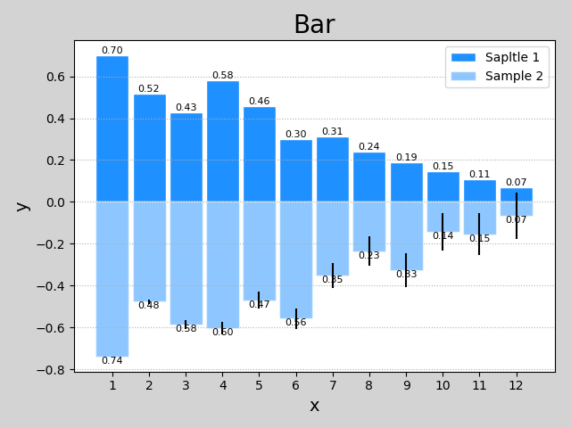
2 示例
import numpy as np
import matplotlib.pyplot as plt

n = 12
x = np.arange(n)
y1 = (1 - x / n) * np.random.uniform(0.5, 1.0, n)
y2 = (1 - x / n) * np.random.uniform(0.5, 1.0, n)

plt.figure('Bar', facecolor='lightgray')
plt.title('Bar', fontsize=20)
plt.xlabel('x', fontsize=14)
plt.ylabel('y', fontsize=14)
plt.xticks(x, x + 1)
plt.tick_params(labelsize=10)
plt.grid(axis='y', linestyle=':')

# 绘制bar
plt.bar(x, y1, 0.9,
        ec='white', fc='dodgerblue',
        label='Sapltle 1'
        )
# ec edgecolor; fc facecolor

# 绘制bar值
for _x, _y in zip(x, y1):
    plt.text(_x, _y, '%.2f' % _y,
             ha='center', va='bottom', size=8
             )

plt.bar(x, -y2, 0.9,
        ec='white', fc='dodgerblue', alpha=0.5,
       label='Sample 2',yerr = x*0.01)

for _x, _y in zip(x, y2):
    plt.text(_x, -_y, '%.2f' % _y,
             ha='center', va='top', size=8)

plt.legend()
plt.show()
3 help(plt.bar)
Help on function bar in module matplotlib.pyplot:

bar(*args, **kwargs)
    Make a bar plot.

    Call signatures::

       bar(x, height, *, align='center', **kwargs)
       bar(x, height, width, *, align='center', **kwargs)
       bar(x, height, width, bottom, *, align='center', **kwargs)

    The bars are positioned at *x* with the given *align* ment. Their
    dimensions are given by *width* and *height*. The vertical baseline
    is *bottom* (default 0).

    Each of *x*, *height*, *width*, and *bottom* may either be a scalar
    applying to all bars, or it may be a sequence of length N providing a
    separate value for each bar.

    Parameters
    ----------
    x : sequence of scalars
        The x coordinates of the bars. See also *align* for the
        alignment of the bars to the coordinates.

    height : scalar or sequence of scalars
        The height(s) of the bars.

    width : scalar or array-like, optional
        The width(s) of the bars (default: 0.8).

    bottom : scalar or array-like, optional
        The y coordinate(s) of the bars bases (default: 0).

    align : {'center', 'edge'}, optional, default: 'center'
        Alignment of the bars to the *x* coordinates:

        - 'center': Center the base on the *x* positions.
        - 'edge': Align the left edges of the bars with the *x* positions.

        To align the bars on the right edge pass a negative *width* and
        ``align='edge'``.

    Returns
    -------
    container : `.BarContainer`
        Container with all the bars and optionally errorbars.

    Other Parameters
    ----------------
    color : scalar or array-like, optional
        The colors of the bar faces.

    edgecolor : scalar or array-like, optional
        The colors of the bar edges.

    linewidth : scalar or array-like, optional
        Width of the bar edge(s). If 0, don't draw edges.

    tick_label : string or array-like, optional
        The tick labels of the bars.
        Default: None (Use default numeric labels.)

    xerr, yerr : scalar or array-like of shape(N,) or shape(2,N), optional
        If not *None*, add horizontal / vertical errorbars to the bar tips.
        The values are +/- sizes relative to the data:

        - scalar: symmetric +/- values for all bars
        - shape(N,): symmetric +/- values for each bar
        - shape(2,N): Separate - and + values for each bar. First row
            contains the lower errors, the second row contains the
            upper errors.
        - *None*: No errorbar. (Default)

        See :ref:`sphx_glr_gallery_statistics_errorbar_features.py`
        for an example on the usage of ``xerr`` and ``yerr``.

    ecolor : scalar or array-like, optional, default: 'black'
        The line color of the errorbars.

    capsize : scalar, optional
       The length of the error bar caps in points.
       Default: None, which will take the value from
       :rc:`errorbar.capsize`.

    error_kw : dict, optional
        Dictionary of kwargs to be passed to the `~.Axes.errorbar`
        method. Values of *ecolor* or *capsize* defined here take
        precedence over the independent kwargs.

    log : bool, optional, default: False
        If *True*, set the y-axis to be log scale.

    orientation : {'vertical',  'horizontal'}, optional
        *This is for internal use only.* Please use `barh` for
        horizontal bar plots. Default: 'vertical'.

    See also
    --------
    barh: Plot a horizontal bar plot.

    Notes
    -----
    The optional arguments *color*, *edgecolor*, *linewidth*,
    *xerr*, and *yerr* can be either scalars or sequences of
    length equal to the number of bars.  This enables you to use
    bar as the basis for stacked bar charts, or candlestick plots.
    Detail: *xerr* and *yerr* are passed directly to
    :meth:`errorbar`, so they can also have shape 2xN for
    independent specification of lower and upper errors.

    Other optional kwargs:

      agg_filter: a filter function, which takes a (m, n, 3) float array and a dpi value, and returns a (m, n, 3) array
      alpha: float or None
      animated: bool
      antialiased or aa: bool or None
      capstyle: ['butt' | 'round' | 'projecting']
      clip_box: a `.Bbox` instance
      clip_on: bool
      clip_path: [(`~matplotlib.path.Path`, `.Transform`) | `.Patch` | None]
      color: matplotlib color spec
      contains: a callable function
      edgecolor or ec: mpl color spec, None, 'none', or 'auto'
      facecolor or fc: mpl color spec, or None for default, or 'none' for no color
      figure: a `.Figure` instance
      fill: bool
      gid: an id string
      hatch: ['/' | '\\' | '|' | '-' | '+' | 'x' | 'o' | 'O' | '.' | '*']
      joinstyle: ['miter' | 'round' | 'bevel']
      label: object
      linestyle or ls: ['solid' | 'dashed', 'dashdot', 'dotted' | (offset, on-off-dash-seq) | ``'-'`` | ``'--'`` | ``'-.'`` | ``':'`` | ``'None'`` | ``' '`` | ``''``]
      linewidth or lw: float or None for default
      path_effects: `.AbstractPathEffect`
      picker: [None | bool | float | callable]
      rasterized: bool or None
      sketch_params: (scale: float, length: float, randomness: float)
      snap: bool or None
      transform: `.Transform`
      url: a url string
      visible: bool
      zorder: float

    .. note::
        In addition to the above described arguments, this function can take a
        **data** keyword argument. If such a **data** argument is given, the
        following arguments are replaced by **data[<arg>]**:

        * All arguments with the following names: 'bottom', 'color', 'ecolor', 'edgecolor', 'height', 'left', 'linewidth', 'tick_label', 'width', 'x', 'xerr', 'y', 'yerr'.
        * All positional arguments.
基于matplotlib的数据可视化 - 柱状图bar的更多相关文章
- 基于matplotlib的数据可视化 - 笔记
1 基本绘图 在plot()函数中只有x,y两个量时. import numpy as np import matplotlib.pyplot as plt # 生成曲线上各个点的x,y坐标,然后用一 ...
- 基于matplotlib的数据可视化 - 饼状图pie
绘制饼状图的基本语法 创建数组 x 的饼图,每个楔形的面积由 x / sum(x) 决定: 若 sum(x) < 1,则 x 数组不会被标准化,x 值即为楔形区域面积占比.注意,该种情况会出现 ...
- 基于matplotlib的数据可视化 - 热图imshow
热图: Display an image on the axes. 可以用来比较两个矩阵的相似程度 mp.imshow(z, cmap=颜色映射,origin=垂直轴向) imshow( X, cma ...
- 基于matplotlib的数据可视化 - 等高线 contour 与 contourf
contour 与contourf 是绘制等高线的利器. contour - 绘制等高线 contourf - 填充等高线 两个的返回值值是一样的(return values are the sam ...
- 基于matplotlib的数据可视化 -
matplotlib.pyplot(as mp or as plt)提供基于python语言的绘图函数 引用方式: import matplotlib.pyplot as mp / as plt 本章 ...
- 基于matplotlib的数据可视化 - 三维曲面图gca
1 语法 ax = plt.gca(projection='3d')ax.plot_surface(x,y,z,rstride=行步距,cstride=列步距,cmap=颜色映射) gca(**kwa ...
- 基于matplotlib的数据可视化(图形填充fill fill_between) - 笔记(二)
区域填充函数有 fill(*args, **kwargs) 和fill_between() 1 绘制填充多边形fill() 1.1 语法结构 fill(*args, **kwargs) args - ...
- matplotlib实现数据可视化
一篇matplotlib库的学习博文.matplotlib对于数据可视化非常重要,它完全封装了MatLab的所有API,在python的环境下和Python的语法一起使用更是相得益彰. 一.库的安装和 ...
- 【Matplotlib】数据可视化实例分析
数据可视化实例分析 作者:白宁超 2017年7月19日09:09:07 摘要:数据可视化主要旨在借助于图形化手段,清晰有效地传达与沟通信息.但是,这并不就意味着数据可视化就一定因为要实现其功能用途而令 ...
随机推荐
- ElasticSearch5.X—模糊查询和获取所有索引字段
最近在做一个分布式数据存储的项目,需要用到ElastciSearch加速数据查询,其中部分功能需要进行模糊查询和统计索引库中已经建立的索引字段,网上查阅了很多资料,最终把这两个问题解决了,不容易!下面 ...
- mssql批量删除数据库里所有的表
go declare @tbname varchar(250) declare #tb cursor for select name from sysobjects where objectprope ...
- 【树莓派】Squid代理以及白名单配置
Squid安装: sudo apt-get install squid3 -y 首先,建议备份一下这个配置文件,以免配错之后,无法恢复,又得重新安装: sudo cp /etc/squid3/squi ...
- vdp介绍
In the new vSphere 5.1, there is a missing component replaced by a new one: VMware Data Recovery (VD ...
- Nginx IP 白名单设置
1:ip.config 192.168.3.15 1;192.168.3.10 1;192.168.0.8 1; 2:nginx.conf #geoIP的白名单 geo $remote_addr $i ...
- pyqt、webkit和qt之间的关系
前言 最近在维护一个PYQT的项目,有很多不明白的地方,总结一下,共其他直接使用pyqt的人参考一下.PyQT是一个生成图形应用程序的工具包.是python语言和成功的Qt库的绑定.Qt库是这个世界上 ...
- sell 项目 订单详情表 设计 及 创建
1.数据库设计 2.订单详情表 创建 /** * 订单详情表 */ create table `order_detail` ( `detail_id` varchar(32) not null, `o ...
- cocos2d-js Shader系列4:Shader、GLProgram在jsb(native、手机)和html5之间的兼容问题。cocos2d-js框架各种坑。
为了让jsb也能顺利跑起滤镜效果,在手机侧折腾了2天,因为每次在真机上运行总要耗那么半分钟,而且偶尔还遇到apk文件无法删除导致运行失败的情况. 这个调试起来,实在让人烦躁加沮丧. 还好,测试上百轮, ...
- Spring Remoting: Hessian
- 〖Linux〗干掉Kubuntu烦人的软件升级提示“Update notification daemon”,Your should update ..
Kubuntu是很好使用,但是升级提示也是太烦人了,开机的时候总是显示如下画面: 使用System Load Indicator(sudo apt-get install indicator-mult ...