基于matplotlib的数据可视化 - 柱状图bar
柱状图bar
柱状图常用表现形式为:
plt.bar(水平坐标数组,高度数组,宽度比例,ec=勾边色,c=填充色,label=图例标签)
注:当高度值为负数时,柱形向下
1 语法
bar(*args, **kwargs)
Call signatures::
bar(x, height, *, align='center', **kwargs)
bar(x, height, width, *, align='center', **kwargs)
bar(x, height, width, bottom, *, align='center', **kwargs)
参数
x : sequence of scalars;bar的条形坐标
height : scalar or sequence of scalars;bar的高度
width : scalar or array-like, optional;bar的宽度,默认值0.8
bottom : scalar or array-like, optional;bar的 y 轴方向的基坐标
align : {'center', 'edge'}, optional, default: 'center',``align='edge'``.;与x坐标对其方式
center - bar的每条形图中心位于X值位置
edge - bar的每条形图的左边与X值对齐
如果想实现右边界对齐,可以align = ‘edge’,同时将宽度设置为负数即可
color : scalar or array-like, optional;bar faces颜色
edgecolor : scalar or array-like, optional;bar edges颜色
linewidth : scalar or array-like, optional;bar边缘线宽,若为0,则不绘制边
tick_label : string or array-like, optional;bar的刻度标签,Default: None (Use default numeric labels.)
xerr, yerr : scalar or array-like of shape(N,) or shape(2,N), optional;若非None,则在bar端面处添加水平或垂直误差条,其值为+/- sizes的相对误差,如下图所示

当然也可以通过参数进行控制正负误差,
scalar - 所有bar具有 +/- values
shape(N,) - 每一个bar +/- values
shape(2,N) - 每一个bar 都具有单独的 - and + values,lower errors 包含在 First row,upper errors 位于 second row
None - 没有误差项(默认)
ecolor : scalar or array-like, optional, default: 'black';误差线条的颜色
capsize : scalar, optional;误差条的长度,
log : bool, optional, default: False,若True,设置 y 轴为 log 刻度
orientation : {'vertical', 'horizontal'}, optional;Default: 'vertical',*This is for internal use only.* Please use `barh` for horizontal bar plots.
2 示例
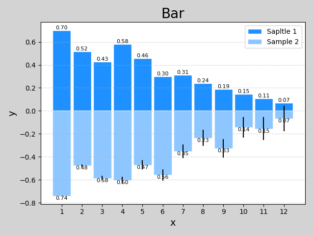
import numpy as np
import matplotlib.pyplot as plt

n = 12
x = np.arange(n)
y1 = (1 - x / n) * np.random.uniform(0.5, 1.0, n)
y2 = (1 - x / n) * np.random.uniform(0.5, 1.0, n)

plt.figure('Bar', facecolor='lightgray')
plt.title('Bar', fontsize=20)
plt.xlabel('x', fontsize=14)
plt.ylabel('y', fontsize=14)
plt.xticks(x, x + 1)
plt.tick_params(labelsize=10)
plt.grid(axis='y', linestyle=':')

# 绘制bar
plt.bar(x, y1, 0.9,
        ec='white', fc='dodgerblue',
        label='Sapltle 1'
        )
# ec edgecolor; fc facecolor

# 绘制bar值
for _x, _y in zip(x, y1):
    plt.text(_x, _y, '%.2f' % _y,
             ha='center', va='bottom', size=8
             )

plt.bar(x, -y2, 0.9,
        ec='white', fc='dodgerblue', alpha=0.5,
       label='Sample 2',yerr = x*0.01)

for _x, _y in zip(x, y2):
    plt.text(_x, -_y, '%.2f' % _y,
             ha='center', va='top', size=8)

plt.legend()
plt.show()
3 help(plt.bar)
Help on function bar in module matplotlib.pyplot:

bar(*args, **kwargs)
    Make a bar plot.

    Call signatures::

       bar(x, height, *, align='center', **kwargs)
       bar(x, height, width, *, align='center', **kwargs)
       bar(x, height, width, bottom, *, align='center', **kwargs)

    The bars are positioned at *x* with the given *align* ment. Their
    dimensions are given by *width* and *height*. The vertical baseline
    is *bottom* (default 0).

    Each of *x*, *height*, *width*, and *bottom* may either be a scalar
    applying to all bars, or it may be a sequence of length N providing a
    separate value for each bar.

    Parameters
    ----------
    x : sequence of scalars
        The x coordinates of the bars. See also *align* for the
        alignment of the bars to the coordinates.

    height : scalar or sequence of scalars
        The height(s) of the bars.

    width : scalar or array-like, optional
        The width(s) of the bars (default: 0.8).

    bottom : scalar or array-like, optional
        The y coordinate(s) of the bars bases (default: 0).

    align : {'center', 'edge'}, optional, default: 'center'
        Alignment of the bars to the *x* coordinates:

        - 'center': Center the base on the *x* positions.
        - 'edge': Align the left edges of the bars with the *x* positions.

        To align the bars on the right edge pass a negative *width* and
        ``align='edge'``.

    Returns
    -------
    container : `.BarContainer`
        Container with all the bars and optionally errorbars.

    Other Parameters
    ----------------
    color : scalar or array-like, optional
        The colors of the bar faces.

    edgecolor : scalar or array-like, optional
        The colors of the bar edges.

    linewidth : scalar or array-like, optional
        Width of the bar edge(s). If 0, don't draw edges.

    tick_label : string or array-like, optional
        The tick labels of the bars.
        Default: None (Use default numeric labels.)

    xerr, yerr : scalar or array-like of shape(N,) or shape(2,N), optional
        If not *None*, add horizontal / vertical errorbars to the bar tips.
        The values are +/- sizes relative to the data:

        - scalar: symmetric +/- values for all bars
        - shape(N,): symmetric +/- values for each bar
        - shape(2,N): Separate - and + values for each bar. First row
            contains the lower errors, the second row contains the
            upper errors.
        - *None*: No errorbar. (Default)

        See :ref:`sphx_glr_gallery_statistics_errorbar_features.py`
        for an example on the usage of ``xerr`` and ``yerr``.

    ecolor : scalar or array-like, optional, default: 'black'
        The line color of the errorbars.

    capsize : scalar, optional
       The length of the error bar caps in points.
       Default: None, which will take the value from
       :rc:`errorbar.capsize`.

    error_kw : dict, optional
        Dictionary of kwargs to be passed to the `~.Axes.errorbar`
        method. Values of *ecolor* or *capsize* defined here take
        precedence over the independent kwargs.

    log : bool, optional, default: False
        If *True*, set the y-axis to be log scale.

    orientation : {'vertical',  'horizontal'}, optional
        *This is for internal use only.* Please use `barh` for
        horizontal bar plots. Default: 'vertical'.

    See also
    --------
    barh: Plot a horizontal bar plot.

    Notes
    -----
    The optional arguments *color*, *edgecolor*, *linewidth*,
    *xerr*, and *yerr* can be either scalars or sequences of
    length equal to the number of bars.  This enables you to use
    bar as the basis for stacked bar charts, or candlestick plots.
    Detail: *xerr* and *yerr* are passed directly to
    :meth:`errorbar`, so they can also have shape 2xN for
    independent specification of lower and upper errors.

    Other optional kwargs:

      agg_filter: a filter function, which takes a (m, n, 3) float array and a dpi value, and returns a (m, n, 3) array
      alpha: float or None
      animated: bool
      antialiased or aa: bool or None
      capstyle: ['butt' | 'round' | 'projecting']
      clip_box: a `.Bbox` instance
      clip_on: bool
      clip_path: [(`~matplotlib.path.Path`, `.Transform`) | `.Patch` | None]
      color: matplotlib color spec
      contains: a callable function
      edgecolor or ec: mpl color spec, None, 'none', or 'auto'
      facecolor or fc: mpl color spec, or None for default, or 'none' for no color
      figure: a `.Figure` instance
      fill: bool
      gid: an id string
      hatch: ['/' | '\\' | '|' | '-' | '+' | 'x' | 'o' | 'O' | '.' | '*']
      joinstyle: ['miter' | 'round' | 'bevel']
      label: object
      linestyle or ls: ['solid' | 'dashed', 'dashdot', 'dotted' | (offset, on-off-dash-seq) | ``'-'`` | ``'--'`` | ``'-.'`` | ``':'`` | ``'None'`` | ``' '`` | ``''``]
      linewidth or lw: float or None for default
      path_effects: `.AbstractPathEffect`
      picker: [None | bool | float | callable]
      rasterized: bool or None
      sketch_params: (scale: float, length: float, randomness: float)
      snap: bool or None
      transform: `.Transform`
      url: a url string
      visible: bool
      zorder: float

    .. note::
        In addition to the above described arguments, this function can take a
        **data** keyword argument. If such a **data** argument is given, the
        following arguments are replaced by **data[<arg>]**:

        * All arguments with the following names: 'bottom', 'color', 'ecolor', 'edgecolor', 'height', 'left', 'linewidth', 'tick_label', 'width', 'x', 'xerr', 'y', 'yerr'.
        * All positional arguments.
基于matplotlib的数据可视化 - 柱状图bar的更多相关文章
- 基于matplotlib的数据可视化 - 笔记
1 基本绘图 在plot()函数中只有x,y两个量时. import numpy as np import matplotlib.pyplot as plt # 生成曲线上各个点的x,y坐标,然后用一 ...
- 基于matplotlib的数据可视化 - 饼状图pie
绘制饼状图的基本语法 创建数组 x 的饼图,每个楔形的面积由 x / sum(x) 决定: 若 sum(x) < 1,则 x 数组不会被标准化,x 值即为楔形区域面积占比.注意,该种情况会出现 ...
- 基于matplotlib的数据可视化 - 热图imshow
热图: Display an image on the axes. 可以用来比较两个矩阵的相似程度 mp.imshow(z, cmap=颜色映射,origin=垂直轴向) imshow( X, cma ...
- 基于matplotlib的数据可视化 - 等高线 contour 与 contourf
contour 与contourf 是绘制等高线的利器. contour - 绘制等高线 contourf - 填充等高线 两个的返回值值是一样的(return values are the sam ...
- 基于matplotlib的数据可视化 -
matplotlib.pyplot(as mp or as plt)提供基于python语言的绘图函数 引用方式: import matplotlib.pyplot as mp / as plt 本章 ...
- 基于matplotlib的数据可视化 - 三维曲面图gca
1 语法 ax = plt.gca(projection='3d')ax.plot_surface(x,y,z,rstride=行步距,cstride=列步距,cmap=颜色映射) gca(**kwa ...
- 基于matplotlib的数据可视化(图形填充fill fill_between) - 笔记(二)
区域填充函数有 fill(*args, **kwargs) 和fill_between() 1 绘制填充多边形fill() 1.1 语法结构 fill(*args, **kwargs) args - ...
- matplotlib实现数据可视化
一篇matplotlib库的学习博文.matplotlib对于数据可视化非常重要,它完全封装了MatLab的所有API,在python的环境下和Python的语法一起使用更是相得益彰. 一.库的安装和 ...
- 【Matplotlib】数据可视化实例分析
数据可视化实例分析 作者:白宁超 2017年7月19日09:09:07 摘要:数据可视化主要旨在借助于图形化手段,清晰有效地传达与沟通信息.但是,这并不就意味着数据可视化就一定因为要实现其功能用途而令 ...
随机推荐
- curl_setopt — 设置 cURL 传输选项
curl_setopt (PHP 4 >= 4.0.2, PHP 5, PHP 7) curl_setopt — 设置 cURL 传输选项 bool curl_setopt ( resource ...
- mysql zerofill 的使用
转自:http://www.jquerycn.cn/blog/mysql/ 那这个int[M]中M是什么意义喃,在定义数值型数据类型的时候,可以在关键字括号内指定整数值(如:int(M),M的最大值为 ...
- Bossies 2015: The Best of Open Source Software Awards
InfoWorld editors and contributors pick the top open source software for data centers, clouds, devel ...
- C#.NET常见问题(FAQ)-如何使用2D绘图控件ZedGraph绘制坐标轴和坐标曲线
添加数据:示例添加了一条sin曲线和一条cos曲线,注意cos曲线比sin曲线点更密集(可以用这种方式控制点的采样疏密程度) 默认显示效果如下图所示,可以框选一个部分看放大效果 右击某个点可以 ...
- 带你走进EJB--将EJB发布为Webservice(1)
Web service是一个平台独立,松耦合基于可编程的web的应用程序,可使用开放的XML标准来描述.发布.发现.协调和配置这些应用程序,用于开发分布式的互操作的应用程序. 简单说Web servi ...
- 微信小程序 - 沉浸式抽屉(非组件)
高度有限制,可作为管理界面,点击下载示例:drawer
- Direct hosting of SMB over TCP/IP
http://support.microsoft.com/kb/204279 System TipThis article applies to a different version of Wind ...
- 如何解析android访问webservice返回的SoapObject数据(可用)
怎么解析android访问webservice返回的SoapObject数据 本帖最后由 kkDragon123 于 2013-03-26 15:50:07 编辑 我的数据如下:mingdanResp ...
- SQL Server配置支持中文
- MyArrayList——自己实现ArrayList
注:转载请注明原文地址:http://www.cnblogs.com/ygj0930/p/5965205.html 代码已移植:https://github.com/ygj0930/MyAr ...