
利用css3实现照片列表展开小demo
效果如下:
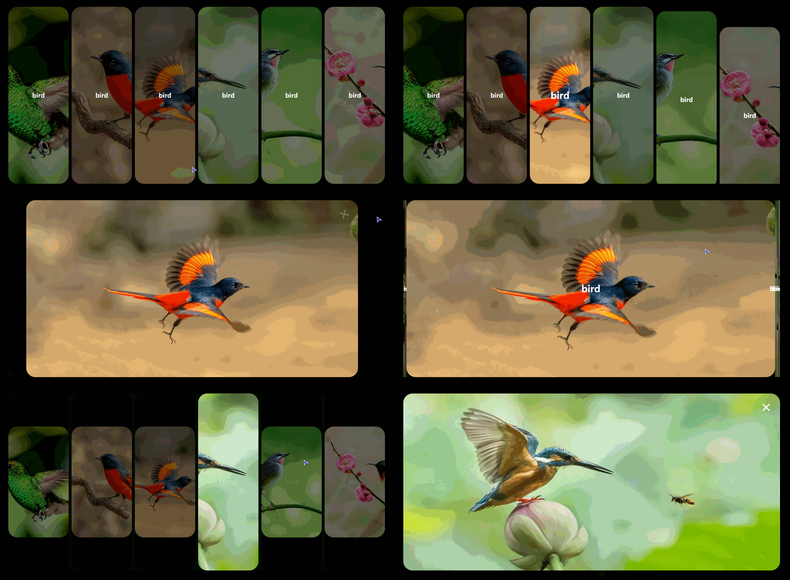
其实实现起来很简单,就是控制 宽 高的变化,然后给他加上transition 过度而已。觉得代码没什么难的地方,就不打注释了,如果哪里有不懂的话,可以直接评论呢。
直接上源码
html代码:
<!DOCTYPE html>

<html lang="en">

<head>

    <meta charset="UTF-8">

    <meta name="viewport" content="width=device-width, initial-scale=1.0">

    <meta http-equiv="X-UA-Compatible" content="ie=edge">

    <title>Document</title>

    <link rel="stylesheet" href="./css/index.css">

</head>

<body>

    <div class="wra">

        <ul class="content">

            <li class="items">

                <div class="inner">

                    <h2>bird</h2>

                    <div class="bg">

                        <div class="close"></div>

                    </div>

                </div>

            </li>

            <li class="items">

                <div class="inner">

                    <h2>bird</h2>

                    <div class="bg">

                        <div class="close"></div>

                    </div>

                </div>

            </li>

            <li class="items">

                <div class="inner">

                    <h2>bird</h2>

                    <div class="bg">

                        <div class="close"></div>

                    </div>

                </div>

            </li>

            <li class="items">

                <div class="inner">

                    <h2>bird</h2>

                    <div class="bg">

                        <div class="close"></div>

                    </div>

                </div>

            </li>

            <li class="items">

                <div class="inner">

                    <h2>bird</h2>

                    <div class="bg">

                        <div class="close"></div>

                    </div>

                </div>

            </li>

            <li class="items">

                <div class="inner">

                    <h2>bird</h2>

                    <div class="bg">

                        <div class="close"></div>

                    </div>

                </div>

            </li>

        </ul>

    </div>

    <script src="./js/jquery.js"></script>

    <script src="./js/index.js"></script>

</body>

</html>
css代码:
*{

    padding: 0;

    margin: 0;

    list-style: none;

    box-sizing: border-box;

}

:root,body,.wra{

    width: 100%;

    height: 100%;

}

.wra{

    background-color: black;

    display: flex;

    justify-content: center;

    align-items: center;

}

.wra .content{

    width: 80%;

    height: 80%;

    display: flex;

    justify-content: space-between;

    align-items: center;

    overflow: hidden;

}

.wra .content .items{

    position: relative;

    height: 100%;

    width: 16%;

    border-radius: 30px;

    transition: height .5s linear, width .7s .5s linear;

}

.wra .content .items:hover .inner .bg{

    opacity: 1;

}

.wra .content .items:hover h2{

    font-size: 30px;

}

.wra .content .items h2{

    position: absolute;

    left: 50%;

    top: 50%;

    transform: translate(-50%, -50%);

    color: #fff;

    font-size: 20px;

    z-index: 1;

    transition: font-size .3s , opacity .3s;

}

.wra.wra-active .content .items h2{

    opacity: 0;

}

.wra .content .items .inner{

    width: 100%;

    height: 100%;

    transition: transform .5s ;

}

.wra .content .items .inner .bg{

    width: 100%;

    height: 100%;

    background-size: cover;

    background-position: center center;

    border-radius: 30px;

    opacity: .5;

    transition: opacity .3s;

}

.wra .content .items:nth-of-type(1) .inner .bg{

    background-image: url('../img/1.jpg');

}

.wra .content .items:nth-of-type(2) .inner .bg{

    background-image: url('../img/2.jpg');

}

.wra .content .items:nth-of-type(3) .inner .bg{

    background-image: url('../img/3.jpg');

}

.wra .content .items:nth-of-type(4) .inner .bg{

    background-image: url('../img/4.jpg');

}

.wra .content .items:nth-of-type(5) .inner .bg{

    background-image: url('../img/5.jpg');

}

.wra .content .items:nth-of-type(6) .inner .bg{

    background-image: url('../img/6.jpg');

}

.wra .content .items.active{

    width: 100%;

}

.wra .content .items.active .inner .bg{

    opacity: 1;

}

.wra.wra-active .content .items:not(.active){

    width: 0%;

    height: 0%;

}

.wra .content .items .inner{

    transform: translateY(101%);

}

.wra.init .content .items .inner{

    transform: translateY(0%);

}

.wra.init .content .items:nth-of-type(2) .inner{

    transition-delay: .2s;

}

.wra.init .content .items:nth-of-type(3) .inner{

    transition-delay: .3s;

}

.wra.init .content .items:nth-of-type(4) .inner{

    transition-delay: .4s;

}

.wra.init .content .items:nth-of-type(5) .inner{

    transition-delay: .5s;

}

.wra.init .content .items:nth-of-type(6) .inner{

    transition-delay: .6s;

}

.wra .content .items .inner .bg .close{

    opacity: 0;

    transform: rotateZ(0deg);

}

.wra .content .items.active .inner .bg .close{

    position: absolute;

    right: 30px;

    top: 30px;

    width: 30px;

    height: 30px;

    opacity: 1;

    transform: rotateZ(360deg);

}

.wra .content .items.active .inner .bg .close{

    transition: opacity .3s linear 1s, transform .5s linear 1s;

}

.wra .content .items.active .inner .bg .close::after,.wra .content .items.active .inner .bg .close::before{

    position: absolute;

    content: "";

    width: 30px;

    height: 4px;

    background-color: #fff;

    top: calc(50% - 2px);

}

.wra .content .items.active .inner .bg .close::after{

    transform: rotateZ(45deg);

}

.wra .content .items.active .inner .bg .close::before{

    transform: rotateZ(-45deg);

}
jquery代码:
setTimeout(function(){

    $('.wra').addClass('init');

},400)

$('.items').on('click', function(){

    $(this).addClass('active');

    $('.wra').addClass('wra-active');

})

$('.close').on('click', function(e){

    e.stopPropagation();

    $('.items').removeClass('active');

    $('.wra').removeClass('wra-active');

})
利用css3实现照片列表展开小demo的更多相关文章
- Android学习小Demo(19)利用Loader来实时接收短信
之前写过一篇文章<Android学习小Demo(13)Android中关于ContentObserver的使用>,在里面利用ContentOberver去监測短信URI内容的变化.我们先来 ...
- [置顶] 利用CXF发布webService的小demo
其实webService的发布不仅仅只有xfire,今天,给大家介绍一下用CXF发布一个webService的小demo,CXF也是我做webService用的第一个框架... 先将相关的jar引进来 ...
- css3的一个小demo(箭头hover变化)
<!DOCTYPE html> <html lang="en"> <head> <meta charset="UTF-8&quo ...
- jQuery/CSS3实现图片层叠展开特效
这是一款基于jQuery和CSS3的图片层叠展开特效,让鼠标滑过图片时即可触发这些特效.其中有一款就像扇子展开收拢一样,看起来效果都非常不错.当然本文主要还是来分析一下用jQuery实现这一效果的方法 ...
- 超可爱 纯CSS3实现的小猪、小老鼠、小牛
原文:超可爱 纯CSS3实现的小猪.小老鼠.小牛 利用纯CSS3绘制一些人物.动物.风景已经不是一件新鲜的事情了,主要是利用CSS3可以让直线变成任意的曲线,于是简单的矢量图形绘制对CSS3来说就小菜 ...
- 使用纯 CSS 实现 Google Photos 照片列表布局
文章太长,因为介绍了如何一步一步进化到最后接近完美的效果的,不想读的同学可以直接跳到最后一个大标题之后看代码.demo及原理就好,或者也可以直接看下面这个链接的源代码. 不过还是建议顺序读下去,因为后 ...
- Nancy之基于Nancy.Owin的小Demo
前面做了基于Nancy.Hosting.Aspnet和Nancy.Hosting.Self的小Demo 今天我们来做个基于Nancy.Owin的小Demo 开始之前我们来说说什么是Owin和Katan ...
- 利用CSS3实现图片无间断轮播图的实现思路
前言:图片轮播效果现在在各大网站都是非常普遍的,以前我们都是通过postion的left or right来控制dom的移动,这里我要说的是利用css3来制作轮播!相比以前通过postion来移动do ...
- 利用CSS3实现圆角的outline效果的教程
一.首先,outline是个很牛的东西1. border近亲outline和border是近亲,为什么这么讲呢?首先,都是给元素外面套框框的:其次,支持的属性值几乎都是一样的,例如,outline-s ...
随机推荐
- this()与super()
1. 构造器中第一行默认是super(),一旦直接父类的构造器中没有无参的,那么必须显式调用父类的某个有参构造. 2. 构造器中第一行的super()可以换成this(),但是this()和super ...
- Ngnix01
Nginx(一)------简介与安装 目录 1.Nginx 的简介 2.Nginx 的常用功能 3.Nginx 安装 ①.下载地址 ②.Windows 版本安装 ③.Linux 版本安装 说到 ...
- 【DeepLearning】基本概念:卷积、池化、Backpropagation
终于有了2个月的空闲时间,给自己消化沉淀,希望别有太多的杂事打扰.在很多课程中,我都学过卷积.池化.dropout等基本内容,但目前在脑海中还都是零散的概念,缺乏整体性框架,本系列博客就希望进行一定的 ...
- 免费申请HTTPS通配符证书
前言 在阿里云买了一个域名giantliu.cn 部署了自己的博客系统 https://www.giantliu.cn/ 所有用https证书是Let's Encrypt免费申请的 因为申请的免费证书 ...
- AtCoder 1807 食塩水
题意 有 \(n\) 瓶食盐水,第 \(i\) 瓶为质量 \(w_i\),浓度 \(p_i\%\) 的食盐水,需要选出 \(k\) 瓶食盐水混合在一起,问最大浓度. \(\texttt{Data Ra ...
- 4G工业路由器的信号强度应该怎么保证呢?
在M2M无线方面,最薄弱的环节是差的间歇性的信号强度.低信号电平导致系统性能差,响应时间慢和可靠性问题.对于系统安装人员和其他4G工业路由器供应商,如何确保最佳的蜂窝信号强度? 检查2G/3G/4G信 ...
- 华为hcip学习备考心得
大家好我是林中鸟,经过几个月的学习终于顺利拿下了华为的hcip:写这篇文章主要目的是想和大家分享一下我学习备考中的一些经历. 2020年由于疫情影响,社会各行各业都遭受重创,同时也打乱的我的生活规划: ...
- 这篇文章揭开python进程、线程、协程神秘的面纱
1.概念 [关注公众号"轻松学编程"了解更多. 回复"协程"获取本文源代码.] 从计算机硬件角度: 计算机的核心是CPU,承担了所有的计算任务. 一个CPU,在 ...
- NOIP 2012 P1081 开车旅行
倍增 这道题最难的应该是预处理... 首先用$set$从后往前预处理出每一个点海拔差绝对值得最大值和次大值 因为当前城市的下标只能变大,对于点$i$,在$set$中二分找出与其值最接近的下标 然后再$ ...
- 1到n整数中1出现的次数
1到n整数中1出现的次数 题目描述 输入一个整数n, 求1~n这n个整数的十进制表示中1出现的次数. 例如, 输入12, 1~12这些整数中包含1的数字有1, 10, 11和12, 1一共出现了4次 ...